Aaron Gustafson walks through making websites mobile-friendly: whether to build a separate site or use stylesheets and media queries, how to handle tables and navigation on small screens, and why WebKit dominance matters. He covers meta viewport tags, font sizing, CSS gradients, and hardware-accelerated animations with live examples.
Chapters
Freelance web developer. I primarily do front-end engineering. I do occasionally do back-end and some development stuff. If you guys were here for the message thing earlier, I didn't really want to bring it up when they were all in here. I was still at that company when we built that back-end. Like, that was my last big hurrah there. Probably the most complicated thing I've ever built. So I have a kind of vested interest in seeing that coming up in source so I can actually use it. Today I'm just going to talk about CSS from mobile. Why you want to do a mobile stylesheet, the difference in doing mobile stylesheet versus actually a whole separate site for mobile, what the advantages and disadvantages are, some facts and figures, and then I'll get into some real-world examples from the Barcamp Chattanooga site, how we implemented that. So first, I bought that really cool Keynote remote from Apple today. It doesn't really want to work on the multiple Wi-Fis here. Now this remote's not working. It's the new That's remote. really cool. Before the iPhone, mobile internet usage on a browser was less than half a percent of the entire traffic on the internet. It didn't matter. Nobody really cared. Nobody did anything about it. The iPhone made it a real player. Now in just— it's been 2 and a half, 3 years since the iPhone came out. 50% of all traffic online worldwide originates from a mobile device. Of that, mobile Safari is 67% of those devices, which means mobile Safari on an iPhone or iPod Touch is 10% of all the traffic on the internet in the world. Yeah. I think you may also want to point out that some of the other WebKit browsers also report as mobile Safari, so— Yeah, we're going to leave that. Yeah, thanks. So we bring that up because there's— Quite a few mobile platforms. They each have their own browser. We're going to break it down by platform and look at the browsers. Mobile Safari, which actually should have been the Cocoa Touch— I just mislabeled that because I was really tired when I did this— is 66% of all the mobile devices that are on the internet. This is by traffic. This is not by sales. You've got Java ME, which runs things like Opera Mini, Windows Mobile at 7%, Android and Symbian tied at 6%, and then a couple other ones— Bruz, the Verizon platform, Palm. This is before the Pre came out, but they've sold 200,000. I don't really think it's going to bump this number much. So that's the different platforms that are on the net. But more interesting to us as a front-end engineer is How those break down to actual rendering engines? So as you were saying, when you take all the platforms that run a WebKit rendering engine, you get 76% roughly of all the mobile traffic on the web. And that leaves Opera Mini, IE Mobile, which God bless you if you have to support that, and then Palm, BlackBerry, and other. For my money, When you break 75%, I quit supporting the rest of it unless my client wants to pay me double my rate. I'm not kidding about that. It's— IE is not worth it. IE6 is not worth it on non-mobile devices. They pay out the nose for me to support it because it's all of my time. Opera will behave very similarly to WebKit. It doesn't follow the specific rules we're going to look at, the actual, like, the dash WebKit rules, but you're going to still get a pretty good experience if you code it correctly for WebKit, and that covers 88% of the market. So that seems to me like unless you just know that your client is deploying nothing but BlackBerrys in their system, there's not much of a payoff to support those. There's 2 approaches to how you can do this. There's actually 3. We're going to talk today about Some sites actually redirect you to a whole other domain with other layouts. You know, it's a whole other CMS running it. That's a lot of work for not a lot of benefit to have to maintain 2 sites. If we're going to assume that we're going to keep one site and just change how it looks for the mobile device, we can go with a separate stylesheet. Or as I just learned this week, you can actually do an @media hack in your stylesheet and have one stylesheet with just another set of rules inside of it that are overriding the first set. Okay. We'll show you how to do both of those. So the first one is simply you start here. This is the actual Marcant page. You know, flips these out. This is our main CSS file. It has all of our rules in it. And then we have this one, which should be— this is actually a CSS3 HTML5-ish selector. The only screen and max-width equals 480 pixels. This goes by browser width, and the only browsers that can currently handle this are WebKit. That may change in the future, but for the time being, this will give you mobile Safari WebKit browsers only. We throw in a second stylesheet, and then we just override rules as we need to in that one. If you guys have questions as I'm going, feel free to stop me. We'll do questions at the end too. The other way to do it, and I haven't actually tried this yet, I just saw this on a tutorial that came out this week, is it's the same rule, but you do it in your CSS file. You make this wrapper around it, and then you put rules inside of big braces, and this gets you one file. There is some advantages to that. It's less files to download, especially on a mobile connection where it's already, you know, you don't have too many pipes to begin with. It's one file. So you're saying that you're not going to be able to use the to CSS maintain for SVN or Git or whatever. You're only looking at one place. I don't know if it validates because I haven't tried it yet, so if validation is a problem for you or a concern for you, this may not validate. A couple other things that you want to do— this is actual markup changes you want to make to your site to make it mobile Safari ready. You know this meta viewport? And this is a tag that the mobile Safari and all the WebKit browsers— when I say mobile Safari today, I mean WebKit browsers in general— can read. And there's a bunch of different things you can tell it. So width, we're going to tell it to be the device width. That means if it's vertical on an iPhone, it's 320 wide. If I rotate it, it goes to 480. So that sets the width of the page to be however wide the view we're looking at is. You can set that to any valid CSS width value. You can make it be 100 pixels if you wanted to. You can make it be 700, whatever you want to do. There's reasons you would want to do a value other than device-width, but for our purposes, if we're actually going to do a pure mobile experience, that's the right one to go with. Initial-scale is 1. That tells it not to scale the text differently than we tell it to. And because we're being smart enough to actually deal with the font size for this platform, we don't want it then multiplying that out for us. We want to tell it not to. And then user scalable is no. And you'll see like on the on the Barcamp site, like because we've made it fit in that column, we don't actually need to be able to zoom in and out. And so that just gets confusing for the user if they can because they're lost. So we turn off user scaling. You can use these in any combination. You can do it. Separate tags. All that's documented on apple.com. There's links at the end of this for all that. And this slideshow is going to be on SlideShare. It's on the Barcamp site already. So if you want any of the links I'm talking about, that's there. Our first CSS rule that I always do when I'm doing a site for mobile: font-size 17px. I know we're not supposed to ever do that because IE hates it. You know, IE won't do its thing if you do pixel values. IE's not serving this. We don't care. This is the time you can actually do 17 pixels, and it's not a bad practice. If people tell you that's wrong, their standardese doesn't understand real life. Font family. I override my font family and go with something that's native. If I want to go with a serif, I'll go with Georgia or Helvetica. You don't necessarily have to. You can let the font. It'll fall back and do its thing. But I'd rather just know what I'm talking about. And then I use the UI layout system from Yahoo. So we have BD for body and SB for sidebar. In our main markup, those are floated left and right to do a multi-column layout. We just set them to float none, and now we've got a one-column layout for our site. Because you don't really want to do multi-columns on a mobile site. Next step is going to be reusing graphic elements, and this means— if you look at the BarCamp site, for instance, I didn't actually do this because I discovered this about 4 weeks ago. This is a fairly new rule. I think it's iPhone OS 3 that added this to Safari. WebKit background size lets you take an image— like our big header is fairly large— with this rule, without actually making a separate image, to have to put on the server and maintain and upload and all that. We just tell it to shrink the image we already have. You can go— it's an x and y value in that order. Either one can be auto. If they're both auto, it's the size of the original image. In the case we're doing here, we're telling it to be auto and 40 pixels. And that just says, make this image 40 pixels tall, however wide that works out to be, to be properly scaled. OK. If it's a huge logo like our Barcamp one, you are downloading a file that's way too big for the phone. So that may not be the smartest thing. It's one of the reasons we have a separate file on the Barcamp site, because it's about 100K difference in the 2 sizes. But if it's a lightweight image anyway, this just saves you from maintaining more graphics if you want to make a change later. The next step is to reduce graphic elements. And the reason we want to reduce graphic elements is it's another file download, it's more assets, it's more pipeline, it's more things in memory, and the less of that we have, the better experience it's going to be on a mobile platform. So anywhere that you're using a gradient fill and you normally would have like a PNG file, you can replace it with WebKit gradient. And this is a crazy syntax that You need to go look at examples and just copy and paste till you get it down. You can do multi-step gradients where you've got like 7 different color stripes going along the way, whatever you want to do. All that gets rendered by the GPU of the hardware. So it's really fast. It's only the one line of text versus a whole image file. And you can use it anywhere that you could use a normal URL value. So you can't use those like the color. You can't do like a gradient color on text, but you can do a gradient background. And this is what the one from my personal website looks like. Okay, gradient. We want a linear. You can do linear or radial. We want it to start at the center top, end at the center bottom. We start at RGBA , which is 50% transparent black. Color stop, 0.1, which would be 10% of the way down. Make it go white, and then have it fade to white. This was the way I hacked my site to have a drop shadow background on an element, which you could also do box shadow. There's reasons why that doesn't really work for what I want to do. The next step, as you just saw the last one, is RGBA. You guys familiar with like using RGB values in CSS? If you've done CSS, I'm assuming Firefox since 3.0, Safari since. 3.0 and mobile Safari support RGBA, and the A is alpha, and that 4th number is a decimal from 0 to 1 that says how transparent to make it. So rather than making— like, if you're doing the typical lightbox thing and you make the black PNG that's 70% opacity and you upload it and blah blah blah, you tell it to be black with a 70% opacity of 0.7, and now you don't even have a graphic. That's one less file to upload. It's easier to maintain. This works on a lot of browsers. Coming to IE9, we'll see. If they get the numbers right, I'll just be happy. Just kill IE, period. Yeah, I want to go blow up random one day. This is what it looks like for the header file if I want to do a 50% Opacity of a black background. Oh, and just back on that one, because there is the opacity tag, you might think, well, why don't you just use that? If you use the opacity tag, the entire element you're talking about becomes transparent. That just changes whatever color it is. So you can have semi-transparent text over a solid color background, or a semi-transparent background with solid color text. You're not taking the whole element and making it transparent, you're making the color value transparent. Here's a few best practices when you're thinking about doing these mobile sites. Reduce the number of assets. Every pipeline you have to open, every file you have to download, every image, CSS file, JavaScript file, whatever, it's hitting this magical limit that Apple will not tell us of how many files Safari can handle before where it has to reload your page when you reopen the browser. You know, some sites, you're like, if you close your mobile Safari and then reopen it, they're just there and they work and you're done. Other pages have to reload and refresh and redownload everything. Yahoo has done quite a bit of research on this. There's a great video that I have a link to that talks about kind of where they think this number is. It appears to be somewhere around 25%. K of assets is where you hit this magical refresh limit. Sounds really low, but if we're moving everything to mostly text gradients and all that, you can actually get it down. Use CSS to replace assets where possible. That's what we just talked about. Do the gradients in CSS. Scale your files, that kind of thing. Do you know if mobile Safari supports gzipping? If you gzip your CSS file? Yes. Yeah, it does. But I don't think that has a— I think it's the— if I remember from the videos that I'm on, the uncompressed size is what counts towards your limit before it has to refresh, because that's what it's actually— Well, I was more wondering about bandwidth down, down, down. Yeah, yeah. I know that's one of the problems. iPhones are still having problems with 3G. Hide objects the platform cannot view. Donald and I and the Chatterati guys recently got to do the mayor's State of the City address live webcast with a Ford 8S, which was awesome. We built a whole live site where you could watch the video, watch the Twitter stream, Flickr, all the stuff you're watching on the Buzz page today. That's where that code came from. Mobile— the only mobile device that has Flash in the major browsers is Android. It's mobile Flash. It doesn't work. run the Ustream Flash Player anyway. So we put a simple rule in that object, embed, display none. Don't show them that little blue question mark of, oh my God, I don't have Flash. Just don't show it to them. They'll never know it was there. It doesn't matter. Better than that, if you could— and of course we couldn't in our situation— would be to replace it with a video tag, which is now supported, and give it an H.264 file and show them the video. But that's for a whole other discussion, much less CSS. Use native font faces and sizes. Go with the stack that's on mobile Safari. We're talking Helvetica, Arial, Georgia, Comic Sans, sadly. Courier New, fortunately, is the monospace font. And that's really about it for native fonts. Oh, Times. But call for those and call for a native font size. The default font size of a native app that Apple writes is 17px. You start there and work your way up and down for headlines and such. You get the native look and feel. There's a really great article and a video on Apple's developer site that talks how to make a web app that looks like a native app. That's linked at the end of the slideshow that I recommend you check out. It gives you Very like specific. Here's the RGB values for your backgrounds. Make it the right color. Here's the spacing, and like it's three pixels this way and two pixels this way and one pixel this way, and it looks just like the iPhone apps. Reduce multi-column layouts to a single layout. This may seem obvious to some people; it may not. But you've got this scrolling device, and although it's really awesome that you can zoom in and out and do. All that. Like, you can't leave. You go to, like, the New York Times. It's much of a better experience for your visitor to just scroll down one list and see it all. So, and sometimes that means you need to rearrange the order of the page for it to make sense. For instance, on the BarCamp page, we'll see some screenshots here in a minute. Our header's at the top, and above that on the main, on the regular site, is the date and time. Location, and then this ribbon nav. On the mobile site, we move the logo to the top, put the date under that, and we change to a select box nav because that's a much easier interface to read on the mobile device. But you might also see things where you have your nav in the actual markup, it comes after the main content just because it's on the right, but it may make more sense to move that nav like absolutely positioning up to the top of the page so that you can jump around easy. You don't have to scroll through the whole article just to click a link. Use native-esque controls. This— I'm talking about your form inputs, which if you don't do any custom CSS to, will obviously just look native. Apple provides a way, and there's documentation again in the link at the end of the slideshow, to actually do a special WebKit rule on different elements to make them look like native sliders, native scrollbars, native checkboxes and buttons. And you can actually make a really nice native-looking app, a little on/off button slider thing you can replace a checkbox with. And then finally, and this is one people don't think about much, at least from what I've seen, change overflow: auto elements to overflow: visible. If you've got a box on your page that is set to scrollable, If your content gets too big, most people don't know that if you are on that box on the iPhone, you can take two fingers and scroll it and scroll that box. But it never shows you scroll bars. You don't know that it's overflowing. There's no way to really visually tell that you're missing content. So just make it visible. Like don't hide content that you want them to see. And here's some real-world examples. Let's get to a couple of things I talked about. Bringing the nav into this, this is just a little bit of jQuery. It's like maybe 5 lines. It looks at every link in the nav, turns it into an option in a select field. When you click on that option, it uses the URL from the original link and shoots you off to it, and it hides that nav. This is a lot more intuitive on the phone because we have too many links to do a vertical— horizontal list, and a vertical list would be this whole first page. So This just seemed to make the most sense for us. This is our treatment for a pull quote, a block quote on the right side. It doesn't make nearly as much sense in the mobile version to just indent it and italicize it because you're not going to see what's under it until this is different. So knocking it into the corner, putting a strike on the side, adding in this dash, which is actually done with like the concept of parentheses. That's how This is much more obviously a quote to a photo than that would be just made wide. Any other questions about this page specifically you guys want to talk about, like just thought process, changes we made? This was probably the craziest one, and I'm kind of surprised we were able to do it the way that we did. This is a table. I'm not scared of tables, especially for tabular data like a big schedule block. So we have this table that's a schedule that is 700— no, it's 900 pixels wide. This is 320 pixels wide. How do we translate it? And what we did was we made a lot of display block and display none. It turns these table cells into normal sort of div shapes. It's all the same page, the same markup, but you get it in this list form, which it just makes a lot more sense with the phone. So how exactly did you accomplish that? Is it still a table, or did you have to use jQuery to— No, that's all CSS. That's just— you tell the table to be display block, you tell the TRs to be display inline, and the TDs to be display block, and they start acting like divs. And then you just start playing with the spacing and all that. This is our Buzz page, the automatic refreshing page. This is obviously really wide. It has big icons. We shrink the icons in half, make them twice as big for this version. We let it out a little more so it's a little easier to read. All this JavaScript still works, like, right off the bat. OK. And here's some additional resources, some links I was talking about. developer.apple.com/safari. This is a great place. It's a great place for the mobile version and the regular web desktop version. webkit.org, the open source place, will document all these sort of proprietary features and ask WebKit ones. A couple of List Apart articles about how to get these mobile style sheets working the best. We didn't talk about this today at all, but this is a really cool feature. You can actually do animation in CSS with the modern WebKit builds, which means it's all hardware accelerated. It's better than doing it in JavaScript, and the syntax is as clunky as that gradient one was, but when you do a simple thing in JavaScript like change style or change display none to display block, you can have a CSS rule that tells it how to handle that and does like a 3-second animation that will look way better than a JavaScript one. Okay. Notes from this presentation today are on my site, or they will be after the weekend's out. And then the link to this slide share is there at the bottom. So if you guys have questions, I'll be happy to take them about this or anything else you want to talk about. Yeah. Can you talk a little bit about minification? Minification? Yeah. If you don't— if you guys don't know what minification is, you run your CSS file, your JavaScript files, all that kind of thing through— you can do it by hand, but God help you. There's some sort of processor that takes out all the additional whitespace. So a minified CSS file will wind up being all one long line. It kills all the commenting and all that kind of thing. It just makes the file size smaller. It's really great for mobile, because you can cut a lot of stuff down. It also lets you get in the good habit commenting your code well, because those comments don't actually have to get published to your live site because you're going to process it first. So you document for yourself thoroughly and don't care how much file size that is because you're going to kill it anyway. I use YUI Compressor. You can go download it for free. It's a little Java JAR file. You run it from the command line on any Unix-based system. There are ways to do it automatically on the server. Yeah. They're not quite as efficient, but you can do it. What do you use, Aaron? I actually built a subdomain that is just called compressstudiesdesigns.net, and then it's allowed only to touch our stuff, and then we can run anything on the GET string to it. It'll compress multiple files together and, you know, all that as one. Yeah, and the thing you're talking about there, compressing multiple files together, is if you've got several JavaScript files If you run them through a really good compressor, you can get them into one file and get them in the right order. And that's, again, getting your asset number down. That's good practice for web in general. We have these broadband connections that are way fast, and the browsers are way fast now. The more you help them be fast, the snappier your site feels. Anybody else have questions? Yeah. Can you go over in more detail what you did with the The tabs at the top of your site when you put it on the— Yeah, let me show you. I'll show you the JavaScript if you want. One awesome thing about Snow Leopard, it never remembers where you were. Every time I want to open this, I have to go back and make room on my phone. Can you guys see that file size? Okay. Um, so this is the function. The bar game chat popup will not nav. We get all the links. This is all jQuery, so you don't have to move the syntax. This is definitely the fastest way for me to write JavaScript. We get all the links to a thing. We build a select box, select class nav, that we're going to wind up appending everything to. We run an each function, so we loop over all of them. We make a new option tag for each one. We give it the value. We set the value tag of the href of the original link. We set the text to match the text of the original link. Then we do if option value equals window.location.pathname. In other words, if the one that we're looking at is the URL we're on, make that selected so that that's the one you're seeing in the nav when you load the page. And then we append the option to the selected items. So you're appending the value to the selected items? We tell the select field that when it changes, set the menu location to the value of the select. I have a very fast timeout on my computer, sorry. And then lastly, we replace the original app with the select box. Does that make sense, or do you want to go over some more of it? Yeah, that makes a lot of sense. You go right on. Fair enough. Yeah, all this stuff, I mean, obviously CSS and JavaScript, whether you like it or not, are open source, whether that's your intention. But the BarCamp site itself is going to be open source, the whole system, the whole platform. Anything you guys see on this stuff, joke around, use it, it's awesome. I would be happy for you guys to use stuff that I've worked on. I don't know if some of you guys might not know this, it's kind of unrelated, But this whole namespace thing in JavaScript, if you're not doing that, I would start getting into it. There's a couple of ways to do it. But basically, I don't write any functions that are global functions unless I need to use them globally. I don't do any variables that aren't stuck down in a function or something where it's wrapped up and it can't affect the global thing. So if you do var i equals 0 and start doing a loop in JavaScript, you're cool. If you did i equals 0, that sets it for everything else that runs. So if for whatever reason some other script you're using on your page, a plugin, had an i that was checking out the i variable and it wasn't resetting itself properly, it would pick up your value. You can like pollute other JavaScript. So the namespacing thing is It's just a good practice. I know a lot of people may not understand why they look that way, so I wanted to explain it. Any other questions? You said that there— are there always going to be situations where you have to create an entirely separate site just for a mobile experience? Yeah, I'm sure there are. If you didn't hear the question in the back, it's, are there times that you have to make a separate site just for mobile? I guess right now, like, you have things where, like, Firefox and WebKit are beginning to support things like video and audio tags. So, you know, if you want to do it to the mobile, that's the way to do it. It doesn't really work on the desktop. You could probably make it work with some JavaScript. You might want to do it for that if you're doing, like, a mobile video site. If you have a site that has just a little a bit lot of video, like, a YouTube video or something, of cruft in it that you want to trim out so you just have less markup for mobile to get the bandwidth down, you could. I would argue you should probably get that cruft out for your desktop experience too. But that's a personal thing. You may not be able to do that. There's plenty of examples where the stuff I'm doing, I'd much prefer to make a second version of the site for mobile that's just completely stripped down. Yeah. But then you get into this disparity thing, right? Like, if you're serving separate content, one of them may wind up getting not updated as often or not maintained as well. Back in the day, we had the whole, you know, splash page. Click for the Flash version, click for the HTML version. Depending on which one you hated more, you didn't update the other one. Yeah. It wasn't the same experience. both sides. So the more you can have one file you're dealing with for anything— images, HTML, whatever— the more likely you are to actually keep it up to date for every experience and not forget, as I did this morning when I changed the wrapper size on the site, that I needed to go overwrite it on the mobile site. Crap. The mobile site's been broken for 6 weeks because I didn't look at it. It's maintained separately. I didn't know. Any more questions?
More from Aaron






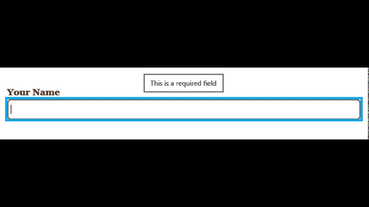
Falling in Love With Forms - Required Field (Narrator + Internet Explorer 11)