Long vs Short Landing Page – One Converted At 80.27%
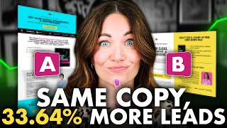
Alex Cattoni tested two landing page layouts for his free swipe file. The short page that fit above the fold with an embedded form converted at 81.20%, while the longer page with a pop-up converted at 60.81%. The shorter design reduced friction and won by 33.64%.
Chapters
My team and I have been split testing a brand new landing page format for the past couple of months. And let me tell you, the results shocked me. I tested two pages with the exact same headline, the exact same benefit bullets, the exact same copy, the exact same call to action, and pretty much the exact same images. The only significant difference was the length and the layout of the page. One was short and and one was long. Can you guess which one boosted my opt in conversion rate by 33.64%? Yeah, my jaw was on the floor too. Today I am showing you a side by side comparison of these two landing page layouts I tested, including exactly why a pretty relatively small change made such a massive difference in my conversion rate. If you're a freelancer, business owner or service provider who does marketing for yourself or or for your clients, this one is definitely for you. And hey, while you're here, don't forget to subscribe below for more show don't tell marketing tutorials just like this one. All right, so let's dive in. Both of these landing pages are promoting my free social media swipe file that includes 99 hot hook templates. And if you haven't grabbed your copy yet, then what are you even doing? The link for that is in the description box below and you'll definitely want to grab your copy at the end of this video video. Now, as I mentioned earlier, I intentionally kept the messaging on both of these pages the same, the same headline, the same benefits, and the same cta because I only wanted to test the length and layout of the page. Now, I actually got the idea to test this new landing page layout from my buddy Stu McLaren who recently shared with me a landing page that boosted his cold traffic opt in conversion rate from 18 to 39%. Now, I don't know about you, but when someone tells me something converted well, I must must test it immediately because as we should all know as marketers by now, just because it worked for one person does not mean it'll work for you too. So you always want to test. But guess what? It did work. And in my case, it worked even better than I could have imagined. So let's talk actual numbers because you guys know I don't do vague trust me tips. I make data backed decisions and believe in show don't tell marketing way. You can make smarter decisions in your business based on proven strategies, not generic chatgpt advice. Yeah, I said it. Okay, so before the new layout was implemented, my conversion rate for my hot hooks guide landing page was 60.81%. Now, I have to say this landing page gets mostly warmish traffic because these are people who come to me from my YouTube channel, like you guys, or Instagram, or my other social media content. And while we do run some paid ads during the timeframe of this test and in fact months before it, no paid traffic was sent to either of these pages, the old page or the new page. And this is why I was already getting a pretty high conversion rate on this landing page and much higher than the average conversion rate, which according to multiple sources like Unbounce and HubSpot happens to be approximately 6%. But by simply changing the layout of this page, we boosted our opt in conversion rate to a massive 81.26. That is a huge difference when you consider that not much else on the page changed. Yes, there were a few minor differences and I will show you those in just a moment, but that is pretty mind blowing. The new landing page format was rolled out on June 30th of this year. So a couple of months ago. So before we look at the actual pages and exactly what we changed, here's the exact data from the 30 day period before and after that new page went live. So the original version of the page had 467 unique visitors during that previous 30 day window. And of those 467 unique visitors, it had 284 conversions or opt ins for a conversion rate of 60.81%. Then the new page went live and for those next 30 days it received 678 unique visitors and 551 conversions bringing the conversion rate to 81.20. Crazy, right? And to be honest, I didn't quite believe it at first. I was like really? When you've been in marketing for as long as I have, you get really familiar with average conversion rates and it is really rare to see this much of an improvement in results, especially on such a simple test and a simple change. So I actually made my team triple check and cross reference every single opt in with my Google Analytics, my Seg metrics and my Kit accounts. And just to make sure, and you guys, these stats were dead on. The page really saw that much of an improvement. Now it's time for the moment you have all been waiting for. Let's look at the pages side by side. So I'm going to do a side by side comparison of these two pages and talk about why I think the new version converts so, so much better. All right, so the very first thing you will notice about these pages is the length and if you didn't already guess, the original page was much longer than the new page. In fact, the new version has been condensed and formatted in a way that the entire page, the entire thing, fits above the fold. Which means the viewer or the visitor, if they're viewing on desktop, does not need to scroll at all to read everything that's on the page and opt in for what they came for. Whereas on the original page, the viewer has to scroll in order to read all of the copy. But what is super interesting here is that there isn't any more or less copy between these two versions. It really is just formatting. Now the other thing you'll notice here is that the colors are slightly different and that's because we just rebranded our entire site and that teal color is being phased out. So on the new page I just went with our classic yellow color because I knew that that color wasn't going anywhere. So while keeping the color of the pages the same would have made for a cleaner test because we're really just comparing the the layout and not the colors. I wanted to make sure that the new page we were building would still work with our new color palette and of course make sure it would still convert. And it absolutely did. Next, you can see that both versions of the page start with the exact same headline. 99 social media hooks that capture attention get more clicks, engagement and conversions. Then in the original version, there's a third headline that says click below to get free and instant access to the copy posse's Save Sizzling hooks swipe file. And then it had a little button there that you could click on and an opt in box would pop up. And right under that it has what I call an authority banner with all of those media logos. Now the good thing about this page is that we do have the button above the fold, which is really important because you never want to have your viewer have to scroll in order to figure out how to get the thing that they came there for. You want to give it to them straight away. So the original page did do that. Now in the new version of the page, I did remove that third line of text to optimize space space and I included the following headline. Use these fill in the blank hook templates to write attention grabbing hooks for your captions, Real cover photos, headlines, subject lines, ads, YouTube video titles and sales page openers. Now you can see that we do have that exact copy in the original version as well, but you just have to scroll in order to see it. It's the headline on the second section and, and this is subtle, but absolutely key in the new layout. The the opt in form is embedded right there in the page, whereas in the original, as you saw earlier, you had to click that button first and then the form would then pop up. So remember this, any extra click creates friction, and friction is a conversion killer. While a single button may look cleaner on the actual page itself, having the form directly embedded right there on the page does remove an entire click from the opt in process. And of course, that could contribute to that higher conversion rate. Then in both versions, we go on to list out the exact same very short and concise benefit bullets, which basically just communicate exactly what's inside this freebie that they're signing up for. And then we also include a cover image of the lead magnet on both versions, which just adds a little visual element so people can see exactly what they're getting. Then in the original version, we added another opt in button here, right in that section. Both versions then have a short bio about me and who I am am. Of course, this helps build trust with people who don't know me yet. And the only change that we made here in the new version was to slightly shorten this bio to only the most important points. So, as you can see in the original version, the viewer actually has to scroll to get to that bio section and to read about, you know, who I am and what I'm all about. For the new version, you can see that we included the authority banner right there under my bio, whereas in the original version, as I mentioned, it was up at the top of the page. So the elements are, you know, still there. They're just in different places. Places. And then lastly, on the original version, you can see that we added another call to action section at the very bottom of the page, prompting people to sign up. Now, this is important when you do have a longer page, because if the viewer needs to scroll, you want to make sure that a call to action is the very last thing that they see. So if you counted, yes, the original had three call to action buttons that would then pop up a form. And it took about three to four scrolls on desktop to get from the top to the bottom of the page. And in the new version, the entire page was above the fold. On desktop had one singular call to action form and button directly on the page. And the shorter page, as you know, out converted the longer page by a massive 33.64%. So what is the big takeaway here? What should you implement in your own marketing on your own Landing pages. Well, the first thing you know I'm going to say is that you absolutely have to test this for yourself. I'd be really curious to see what kind of results you got on your test, but if I were to make a data backed declaration here, I would say this short, simple landing pages work very well, especially for warmer traffic and freebies that require very little education. Tell people what they're getting and how to get it asap. Now I still think longer pages work well for lead magnets that require a greater level of commitment from the visitor. Like say signing up and then showing up to a masterclass or a webinar. But hey, you know I will be testing that too and you better believe I will report back right here. So I'm dying to know what split test do you want to see next? Comment below and let me know. Then make sure to subscribe to my channel so you don't miss it. And hey, while you're down there, go ahead and grab your free copy of my 99 hot hooks swipe file so you can see our brand new landing page in action. And if you love geeking out on split testing, data breakdowns and real time marketing lessons like this, then you are definitely going to want to check out the next video from me or right here. And I will see you next week with a brand new video. Until then, I'm Alex. Ciao for now. All right guys, if you enjoyed that video, make sure to check out the next one for me right here and you can click right here to get a free gift. Okay, so my team and I just discovered a massive blind spot in our funnel that's been quietly slowing down sales, dragging out the customer lifecycle, and potentially costing us thousands of dollars every single month. And want to know the craziest part? We didn't even realize it was happening.
More from Alex
Best Instagram Marketing Strategy For Small Business 2026 (PROVEN & PROFITABLE)
You know those headlines that make you click even when you swear you won’t? 👀