Mother Nature knew what it was doing with these color combos #graphicdesign #design #designinspo
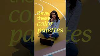
In this brief video, the speaker presents nature‑inspired color palettes for website design, emphasizing that these real‑world hues are both beautiful and accessible. Marking Global Accessibility Awareness Month, the talk highlights the importance of high contrast—citing examples like deep blue skies against white clouds or green leaves against dark bark—as a key to readability. Practical advice is offered: use strong contrast (dark text on light backgrounds or vice versa) and avoid problematic red‑green pairings to accommodate color‑blind users. Viewers are encouraged to save the palettes, apply the tips to improve inclusive design, and follow the channel for future creative inspiration.
Chapters
More from Cardinal




Chef Noah was tired of dull tools - so he made his own #cooking #knives #chef #fyp #kitchen #shorts

every day Chef Noah wakes up and chooses violence... professionally🔪 @forgetotable #knives #chef

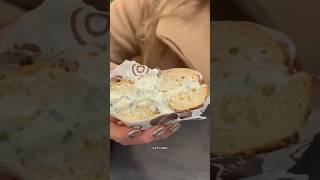
Trying Modern Bread & Bagel for the first time 🥯 #nyc #glutenfree #food #shorts #foodreview