Learn to visualize multiple groups and variables in ggplot2. Scale boxplot widths by sample size, use violin plots and density curves for group comparisons, and create 2D density contours to reveal bimodal patterns like those in the Old Faithful geyser data.
Chapters
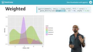
To wrap up our discussion of statistical plots, let's see how we can use them when comparing multiple groups or variables. Let's begin with groups, by which I mean levels within a factor variable. In this case, it's the eating habits of different mammals. The distribution that we are interested in is the amount of total sleep time experienced by each mammal. Up until this point we would have used a plot like this, which is just jittered points. But we've seen that we can also use boxplots, so that's pretty straightforward. I should point out that although we could use boxplots in this case, it's not really reasonable since the insectivore group only has five observations. A problem with box plots is that they don't show information about the number of observations. We can remedy this problem by setting the width of each box relative to the N value for each group. Density plots could work in this situation. The advantage here is that we can overlay multiple density plots on top of each other so we can compare distributions more easily, which is pretty nice. However, we once again lose information about the group size since it appears that insectivores the blue curve is very abundant. To correct for this, we can weight each density curve according to the proportional number of observations of each group. The resulting plot shows that herbivores are the most abundant group and there are very few observations in insectivores. If we want to see multiple density plots side by side, we could facet our plot. But there is an alternative. The violin plot is a relatively new plot type which is gaining in popularity. The violin plot basically puts a density plot onto a vertical axis and then mirrors it to create a symmetrical two dimensional shape. This can really aid in comparing different distributions. Just like with the regular density plot, we should also consider weighting each group according to its n value. Once again we see that insectivores are not very abundant. With these plots we can compare many groups within a variable. The other type of comparison I mentioned was to compare separate variables. For that, let's take a look at a classic example. The eruption time and waiting duration of the Old Faithful Geyser in Yellowstone National Park. At the outset it appears as if the main relationship between these two variables is linear, which would be correct. But more subtle than that, the data is also bimodal on both axes. That is you either wait a long time and get a long eruption, or you wait a short time and get a short eruption. There are relatively few data points in between. For this we can use a 2D density plot which appears as something like a contour plot. If you've ever seen a topographical map, the concept is the same the more concentric a ring is, the higher the density. A nice effect here is to fill in the regions according to their density. We encountered monochromatic color scales in the first two courses, but which I advocated for in the case of continuous data. However, the Viridi's color scale has recently gained in popularity and we'll explore some advantages of this scale in the exercises. A two dimensional density plot emphasizes the bimodal nature of this data set, so sometimes it can be quite useful to consider distributions in two dimensions. We'll see density plots make a reappearance when we talk about ternary plots in the next chapter where we have three variables. Another advantage of the ggplot2 structure is that we can use the underlying statistics with a different geome. So instead of producing a contour or filled density plot, we can calculate the density by representing the values using a grid of circles whose size varies according to the underlying density. Okay, that's enough discussion for now. Let's take a closer look at two dimensional density plots in the exercises.