Learn graphical tools like histograms, bee swarm plots, and ECDFs to explore data visually. The course moves from visual analysis to computing statistics and probability distributions, using Python's numpy.random module for simulation-based analysis without heavy math.
Chapters
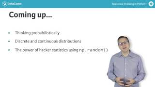
You now have some great graphical EDA tools. You can quickly generate and investigate a histogram. You can immediately get a feel for your data by plotting all of them with bee swarm plots or ECDFs in almost every data set we encounter in this course and in ITS SQL and also in real life. We start with graphical eda. Remember what Tookey said. Exploratory data analysis can never be the whole story, but nothing else can serve as the foundation stone. In the next chapter, you will build upon graphical EDA with quantitative eda, which allows you to compute useful summary statistics. With your foundation stone in place, you will spend the last half of this course learning to think probabilistically. You will learn about probability distributions for both discrete and continuous variables, which provide the mathematical foundation for you to draw meaningful conclusions about your data. We will not get mired in mathematical details, but rather will unleash the power of the numpy random module to use hacker statistics in order to simulate the probabilistic stories and distributions that we encounter. You will find that by writing a few lines of Python code you can perform even putatively complicated statistical analyses. As you work through this course and ITS SQL, you will grow ever closer to being able to tell what Tukey calls the whole story. Now let's get to work.