Intro to statistics with R - Looking at distributions by using histograms
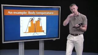
Histograms reveal distribution shapes that summary statistics hide. A body-temperature dataset shows how outliers create skew, while combining treated and untreated children produces a bimodal distribution. Many statistical tests assume normality, so you need to plot your data in R first.
Chapters
But histograms can reveal a lot of information captured that's not captured by summary statistics. So just for an example, let's run with this body temperature example. Assume a few kids in the class are sick, just a couple, they have the flu, for example, and they have a really high body temperature. We might not capture that just by getting, say, the average body temperature across the whole group, especially if it's a really large group. Right. Those couple of kids who are sick won't really show up. But if we look at the histogram, then what we'll see is we have like, here's one kid out here who has a temperature of like over 101. And so it's not quite normal. It's more like this, right? If I had to smooth it out. So that's what's called a skewed distribution. And this is a positive skew. And the way to remember that is the skew is where there's few. So there are fewer scores at the positive or high end of this distribution. That's why it's a positive skew. Okay? So the skew is where there's few. This is a positively skewed distribution. This is the same exact graphic just presented, again in Celsius instead of in Fahrenheit. And again, we don't get a nice normal distribution. We get something that looks more like that. It's not quite as skewed as I drew before, but you get the point. It's a little bit positively skewed. Now, again, not all distributions are normal. We're going to assume normal distributions for a lot of the statistical procedures that we do in this course. But we need to examine that first. So a first step in a lot of our labs and a lot of the homework assignments will be to plot histograms and determine if we have normal distributions. But there are lots of distributions that are not normal. So let's look at a couple that are not normal. So again, I'm going to run with this body temperature example for a few more slides and say we have one group of children, the entire group had the flu. Say a whole classroom full of children got sick with the flu, and then they were treated. They were given, say, antibiotics. And one thing that can happen with antibiotics is it can actually suppress your body temperature a bit. So after getting the antibiotics, that group of children, their body temperatures might be a little bit below average relative to normal. And then let's compare them to a second group, a second classroom of kids who also got infected with the Flu, but maybe say a week later. So their body temperatures are still high. Okay, let's look at that in graphics. Again, I'm going to do this first in Fahrenheit, then in Celsius. So here's on the left, a normal distribution. It's pretty normal, but it's a little bit below average. Remember, I said the average is 98.6. And in this case we're actually a little bit below 98. It looks like is the average for that group. And here again, we've got a pretty normal, not perfectly normal, but pretty normal distribution. And this group is a little bit above average. So we've got, you know, the average looks like it's approaching 100. So this is the group of children who are still sick. They haven't had the antibiotics yet. Imagine that. I didn't know that these were two separate classrooms of children. Imagine I just looked at their body temperatures and plotted the histogram, all of them together. So let's put them together. So if we put those two distributions together, the group of children who are on the antibiotics and their body temperature is a little bit below average. With the group of children who, who are still sick and haven't received the antibiotics, their body temperature is still above normal. What you'll see is a distribution that looks like this. It's actually bimodal, meaning it has two modes. So if you look at it carefully, you can see there's sort of a normal distribution there and a normal distribution there. It's the two distributions put together. So if you didn't know that, it might be hard to see. But the more practice you get at looking at histograms, the more you'll start to see these evidence of non normal distributions. So this is an example of something that looks not normal. Instead, I would describe this as bimodal. Again, I'm just doing the same exact thing, except here I'm plotting everything in degrees Celsius instead of degrees Fahrenheit. So here this group is a little. If you look at the average, they're a little below average. If you look at the average for this group on the right, they're a little above average. If we put them together again, what we see is something that looks a little bimodal. You get these two peaks. There's pe peak here and a peak here. Remember, in a normal distribution, there's just one peak right at the center of the distribution. Here we're seeing two peaks. And again, it's evidence that we have these two different samples of children that were put together. So the point of that exercise and the point of looking at all those histograms is to just make this simple point that not all distributions are normal. Yes, we are going to assume a lot of normal distributions as we go forward in this course. It's easy, especially for introductory statistics, to assume a normal distribution, but we'll make that assumption. Then we'll test it by looking at histograms. By running descriptive statistics in R, we'll see if we have normal distributions or not. So we'll assume normal distributions. But just keep in mind, not all distributions are normal. So simply viewing a histogram often reveals whether it's not normal. You might have a positive skew, you might have a negative skew, you might have something that's bimodal, you might have something that looks completely out of whack, not normal at all. Sometimes it's hard to determine just by looking at the histogram, and it's a judgment call. There are no hard and fast rules about this. So in that case, summary statistics will help. And we'll talk more about that in the next lecture on summary statistics. So the only way to really get a good handle on what does a normal distribution look like and what does a non normal distribution look like is just to look at more and more histograms. The more experience you get with this, the more you'll be able to say, ah, yeah, that's normal enough for our statistical procedure. We'll go ahead or that's. That's too positively skewed. That's too negatively skewed. Negatively skewed. So the best way to do that is just get experience. So let's look at more distributions. This can get a little tedious. So while we do it, we'll imagine that we're wine tasting or you're at home. You could start drinking wine right now if you haven't already. I haven't yet. It's still in the morning here in the US on the East Coast. So let's go wine tasting. So in this example, suppose that we have 100 wine experts and they're going to drink and rate the overall quality of eight different wines. They're going to rate four red wines and four white wines. And in all the examples, higher scores indicate higher quality. So if they give it a score in the 90s, that means they really liked it. And let's say we had four countries submit two wines each. So Argentina, Australia, France and the us Each one submitted a red and each one submitted a white. We, again, just did this for fun. My assistant on this is from France, and so we had a lot of fun doing this example. So let's say Argentina submitted a Malbec. They're very known for their quality Malbecs and a Chardonnay. Australia, let's say they submitted a Shiraz and a Pinot Grigio. France, let's say they submitted a Bordeaux and Sauvignon Blanc. And the U.S. let's say they submitted a Cabernet and a Riesling. And they say riesling from the U.S. but, yes, upstate New York has really great Ries. Rieslings, which is where I'm from. So that wasn't random. I had to slip that in. That was personal. So the US Submitted a Cabernet, probably from California, a Riesling from upstate New York, let's say. Okay, to preview what we did again, we just made up this example. We had a lot of fun making this example up, and we made it up so that the red wines, the distributions of the ratings are normal in the red wines, but if you look at the ratings of the white wines, those are all not normal.
More from Richie

#359 My Best Friend is AI with Valerie Tiberius, Professor of Philosophy at University of Minnesota







How AI Agents Will Work While You Sleep | Ruslan Salakhutdinov, Professor at Carnegie Mellon

#358 How AI Agents Will Work While You Sleep | Ruslan Salakhutdinov, Professor at Carnegie Mellon

