Advanced ggplot2 course covering specialized plots like box plots and density plots, geographic visualizations and animated maps, deep dives into ggplot2 internals via the GRID package, and capstone projects including building custom geoms and recreating Edward Tufte's weather plot.
Chapters
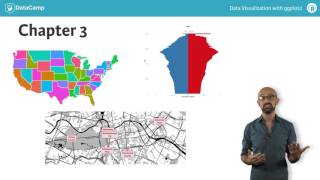
Welcome to the third course in Datacam series on data visualization with ggplot2. This course assumes you're familiar with the functions and concepts in data visualization that I introduced in my first two courses. Those courses should have given you a pretty good idea about what good data visualization is and how to achieve it. Since this is an advanced course, we're going to dig a bit deeper into some more advanced ggplot2 functions. But before we get to that, we'll cap off the material we began in the first two courses by rounding out your knowledge with some niche topics. We'll begin by exploring two kinds of specialized plots. In chapter one, we'll consider the first type of specialized plots, those suited for a data savvy audience. These are statistical plots that you wouldn't normally see in the popular press, like box plots and density plots. Plus we'll consider how to combine several variables. In chapter two, we'll move on to the second type of specialized plots, those that are suited for very specific data types. We'll begin by putting some fundamental concepts of working with large data sets into perspective, and then we'll see some specific cases like ternary plots, networks and diagnostic plots. This topic will continue into chapter three when we consider two main classes of choropleths and cartographic maps. Finally, we'll see many concepts come together with the last type of specialized plot animations, which adds video frames as another mapping aesthetic. Depending on your area of expertise, you may find that you seldom have the need to use these specialized plot types, but it's still useful to know what's possible within the ggplot2 framework. In the fourth chapter, we're going to get under the hood by digging into the internals of ggplot2objects. For this, we'll begin by looking at the basics of the GRID package on which ggplot2 is built. The next step is to begin manipulating graphical objects that we've made with ggplot2 and look at more efficient ways of doing that with some built in functions in ggplot2, such as ggplot build. In the last part, we'll make use of a useful accessory package called Grid extra. In the fifth chapter, we'll bring our series on ggplot2 to a close with two case studies. In the first case study, we'll look at a feature that was introduced in ggplot2 release 2.0 making extensions we'll understand how to build a new GEOM or stats function from scratch. This will allow US to use ggplot2 to create exactly the statistics and visualizations we want in a more straightforward manner. In the second case study, we're going to reproduce a classic plot by Edward Tufte using data familiar to the weather. Using ggplot2, we'll create a unique plot drawing on what we've learned over all three courses. And to cap it all off, we're going to combine our Tufty weather plot with ggplot 2 extensions and turn our unique plot type into a flexible, efficient and reproducible plot type that we can use with any data set of the appropriate type. Alright, before we get into all of that, let's get started on some brief refresher exercises.