Rickveta introduces ggplot2 for data visualization, explaining the difference between exploratory plots for analysis and explanatory plots for presentations. He uses examples like brain and body weights of 62 mammals and Anscombe's quartet to show why visual inspection catches patterns that statistics alone miss.
Chapters
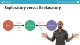
Welcome to the DataCamp series on data visualization with ggplot2. My name is Rickveta and I'll be the instructor for the series. For the past four years, I've been training scientists in a variety of sub disciplines on how to better understand and use visualizations, and I'm very excited to provide this course at datacamp. So what is dataviz? Data visualization is an essential component of your skill set as a data scientist. Dataviz is statistics and design combined in meaningful and appropriate ways. That means that on the one hand, Datoviz is a form of graphical data analysis emphasizing accurate representation and interpretation of data. But on the other hand, dataviz relies on good design principles to not only make our plots attractive, but also meaningful. By meaningful I mean that good design aids in both the understanding and communication of results. On top of that, there's an element of creativity. Since at its heart dataviz is a form of visual communication, it's important to understand the distinction between exploratory and explanatory plots. Exploratory visualizations are easily generated, data heavy and intended for a small specialist audience, for example yourself or your colleagues. Their primary purpose is graphical data analysis. Explanatory visualizations are labor intensive, data specific and intended for a broader audience, for example Publications or presentations. They are part of the communications process. As a data analyst, your job involves exploring your data but also explaining it to a specific audience. Good design begins with thinking about the audience. Sometimes that just means ourselves. Let's go through a short example. Consider this data set containing the average brain and body weights of 62 land mammals from the mass package. We're interested in looking at the relationship between these two continuous variables. So the most obvious first step is to make a scatter plot like this one. So we begin to explore our data, which reveals an expected positive skew on both axes. This isn't surprising since there are two mammals, the African and Asian elephants, with both very large brain and body weights. We can extend our plot by applying a linear model, but given the nature of the data, you can probably already imagine that this is a pretty poor model. Because a few extreme values have a large influence. A long transformation of both variables allows for a better fit. Although we began with a rough exploratory plot that informed us about our data and led to a meaningful result, now we're ready to share our results as an explanatory plot. Don't worry if you don't understand all of this code at the moment. By the end of the series we'll will have covered all the concepts used here. Another example of the usefulness of data visualization as a data analysis tool is this classic example from Francis Anscombe, first published in 1973. When we imagine a linear model as presented on this anonymous plot, we imagine that we are describing data that looks something like this, which would be a fairly accurate representation. However, the same model could be describing a very different data set, for example showing a parabolic relationship where this model would be much better suited to the data at hand. Or it may be describing data in which an extreme value has a large effect which becomes clear when the outlier is removed. And sometimes the model may be describing a relationship where in fact there is none at all because of some obscure extreme value which may very well be false. Here, four different data sets are described by the same linear model. If we relied solely on the numerical output without plotting our data, we'd have missed distinct and interesting underlying trends. These examples should give you an idea of what we set out to do with visualizations. Although it's clearly based in statistics and graphical data analysis, visualization is a creative process that involves some amount of trial and error. In this series of courses, we're going to see some familiar data sets such as the classic IRIS dataset. We're going to understand how to explore our data from many different perspectives and use visual tools like color appropriately. We'll also understand how the structure of our data helps us to make meaningful comparisons. We'll also use a variety of data sets built into R, such as the VOCAB data frame in the CAR package to understand common pitfalls and best practices, such as what is the best plot type for accurately representing the nature of our data. Once we have a solid understanding of these concepts, we're going to go through a case study using the California Health Interview Survey. These are some examples of the plots we'll make at the end of the second course using this population health data. I hope this introduction has shown you that dataviz is not just about making pretty plots, but that it is an integral part of your skill set as a data scientist. We'll cover dataviz in detail from a theoretical and practical perspective. In three courses, the focus will be on the grammar of graphics as implemented by the ggplot2 package. Alright, let's review these concepts in the next exercises.