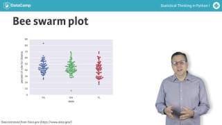
A bee swarm plot shows each county's Democratic vote share as individual points instead of binned bars, revealing that Obama won less than 50% of votes in most counties across swing states. Using Seaborn with a tidy Pandas DataFrame, you can spread points horizontally to avoid overlap and see the full data without losing detail.
Chapters
The histogram of county level election data was informative. We learned that more counties voted for McCain than for Obama. Since our goal is to learn from data, this is great. However, a major drawback of using histograms is that the same data set can look different depending on how the bins are chosen, and choice of bins is in many ways arbitrary. This leads to binning bias. You might interpret your plot differently for two different choices of binning. An additional problem with histograms is that we are not plotting all of the data. We are sweeping the data into bins and losing their actual values. To remedy these problems, we can make a bee swarm plot, also known as a swarm plot. This is best shown by example. Here is a bee swarm plot of the vote totals in the three swing states. Each point in the plot represents the share of the vote that Obama got in a single county. The position along the Y axis is the quantitative information. The data are spread along X to make them visible, but their precise location along the X axis is unimportant. Notably, we no longer have any binning bias and all data are displayed. This plot may be conveniently generated using Seaborn. A requirement is that your data are in a well organized Pandas data frame where each column is a feature and each row an observation. In this case, an observation is a county and the features are the state and the Democratic share of the vote. To make the plot, you need to specify which column gives the values for the y axis, in this case the share of the vote that went to Democrat Barack Obama, and the values for the x axis, in this case the state. And of course you need to tell it which data frame contains the data. From this plot too, we can clearly see that Obama got less than 50% of the vote in the majority of the counties in each of the three swing states. This time the plot is more detailed than the histogram, but without too much added visual complexity. Now it's your turn to make some bee swarm plots.