When beeswarm plots fail with large overlapping datasets, use empirical cumulative distribution functions instead. Learn to build an ECDF in Python with np.sort and np.arange, then overlay multiple ECDFs to compare county-level voting patterns across Ohio, Pennsylvania, and Florida.
Chapters
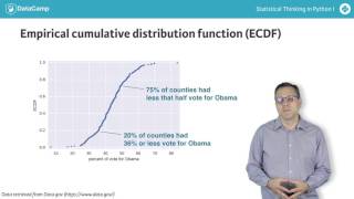
We saw in the last video the clarity of bee swarm plots. However, there is a limit to their efficacy. For example, imagine we wanted to plot the county level voting data for all states east of the Mississippi river and all states west. We make the same swarm plot as before, but using a data frame that contains all states, with each being classified as being east or west of the Mississippi. The beeswarm plot has a real problem. The edges have overlapping data points, which was necessary in order to fit all of the points onto the plot. We are now obfuscating data, so using a be swarm plot is not the best option here. As an alternative, we can compute an empirical cumulative distribution function or ecdf. Again, this is best explained by example. Here is a picture of an ECDF of the percentage of swing state votes that went to Obama. An X value of an ECDF is the quantity you are measuring in this case the percent of vote that went to Obama. The Y value is the fraction of data points that have a value smaller than the corresponding x value. For example, 20% of counties in swing states had 36% or less of its people vote for Obama. Similarly, 75% of counties in swing states had 50% or less of its people vote for Obama. Let's look at how to make one of these from our data. The x axis is the sorted data. We need to generate it using the numpy function sort. So we need to import numpy, which we do using the alias NP as is commonly done. Then we can use NP sort to generate our X data. The Y axis is evenly spaced data points with a maximum of one, which we can generate using the NP arange function and then dividing by the total number of data points. Once we specify the x and y values, we plot the points. By default, PLT plot plots lines connecting data points to plot our ecdf, we just want points. To achieve this, we pass the string period and the string none to the keyword arguments marker and line style respectively. As you remember from my forceful reminder in an earlier video, we label the axes. Finally, we use the PLT margins function to make sure none of the data points run over the side of the plot area. Choosing a value of 0.02 gives us a 2% buffer all around the plot. The result is the beautiful ECDF I just showed you. You can also easily plot multiple ECDFs on the same plot. For example, here are the ECDFs for the three swing states. We see that Ohio and Pennsylvania are similar, with Pennsylvania having slightly more Democratic counties. Florida, on the other hand, had a greater fraction of heavily Republican counties. In my workflow, I almost always plot the ECDF first. It shows all the data and gives a complete picture of how the data are distributed. But don't take my word for how great ECDFs are. You can see for yourself in the exercises.