Learn to visualize Fisher's Iris dataset with pandas and matplotlib. Create scatter plots, box plots, and histograms with customizable bins and ranges. The tutorial shows how a normalized histogram reveals multiple subpopulations in sepal length and introduces cumulative distribution functions for probability queries.
Chapters
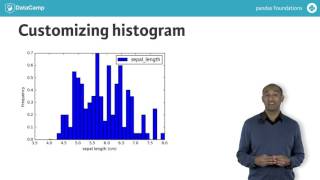
Knowing now how to inspect data in Pandas, let's discuss exploratory data analysis or eda. We'll apply EDA visually. First we'll consider Fisher's iris flower data. There are 150 observations with four measurements from each. There are also three distinct flower species. We start with importing Pandas and matplotlib Pyplot. We load the dataframe and examine it with head. First let's draw some data. With the data frame plot method, we can specify particular column names for the x and y axes. The result is not all that useful because by default plot creates a line plot for this unordered four dimensional data set. A line plot doesn't make a lot of sense. We'll try again, this time specifying kind equals scatter. Let's also label the axes with units of measurement. The scatter plot is better. We'll see later how to distinguish the different species. Individual variable distributions are likely more informative than plotting two variables against each other. For instance, specifying kind box for, say the sepal length makes a box plot. The resulting box plot shows the range, the minimum and maximum values with the whiskers, the interquartile range with the box edges and the median inside. We'll define these terms clearly later. Another common plotting tool for EDA is a histogram. Here we use kind equals historical. Recall that histograms show frequencies of measurements counted within certain bins or intervals. The result approximates a probability distribution function or PDF of the sepal lengths of all the iris flowers. It could be bell shaped, but it's hard to tell with bins this wide. We can redraw the histogram to get a better sense of the data. Other hist arguments can be passed using the dataframe plot interface. For instance, bins is the number of intervals to use in building the histogram Range gives the extremes of the bins normed tells whether to rescale counts to add to one cumulative tells whether to draw the histogram or its cumulative distribution function. More on this shortly. In fact, any matplotlib options can be specified using keyword arguments with plot. Using more keyword options improves the histogram. Here we specify 30 bins and a range from 4 to 8 and a normed histogram. The customized histogram shows at least three distinct Ps in the distribution of sepal lengths. This suggests groups or subpopulations in the data. Another useful plot is is the cumulative distribution function or CDF computed by adding up the areas of the rectangles under a normalized histogram. CDFs are used to compute the probability of observing a value in a given range, for instance a sepal width between 2 and 4 cm. This is easy to plot with the dataframe plot method. Intuitively, the CDF evaluated at, say, sepal length 5 cm returns the probability of observing a flower with sepal length up to 5cm. A CDF is often a somewhat smooth curve, increasing from 0 to 1. One warning at present, there are three different data frame plotting idioms in Pandas. For instance, we can use iris plot kind hist or iris plot hist with the same syntax for arguments. There is also iris hist. The syntax has defaults that are slightly different in the latter call. These variants work for hist, scatter box and related plot functions. Check the documentation for details. That's enough on visual EDA for now. It's your turn to try some exercises on your own.