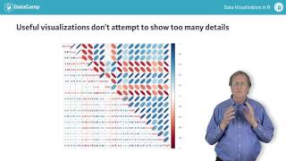
R's base graphics let you spot patterns humans naturally see, but overly complex visualizations backfire. Dense plots with too much detail or hundreds of tiny subplots hide information instead of revealing it. Overlay multiple scatter plots in one clear visualization rather than cramming data into unreadable grids.
Chapters
Because we have a highly developed ability to perceive patterns, data visualizations like those provided by base graphic functions in R can be an extremely effective way of identifying important features in our data. If we allow our visualizations to become too complex, however, they lose their utility. Excess complexity can take many forms, including plots with too many details, details or arrays of too many plots. Attempting to include too many plots can result in an array of individual plots that are too small to show any useful details, as in the upper left plot seen here. The lower right plot contains the same details as the upper left one, but it is large enough to show these details clearly. This plot is another example of excess complexity. As we saw in the last chapter, correlation plots generated using the core plot package can give us useful insights into the relationships between several numerical variables. This example shows that if we attempt to push this idea too far, it loses its utility. Here we are attempting to look at a correlation plot relating 18 numerical variables, giving an array of 3, 300, and 24 individual plots all too small to allow us to see much, especially the numerical results in the lower left portion of this array. Because arrays of multiple plots can be extremely effective if they are constructed carefully, this chapter focuses on different ways of doing this. One alternative that can sometimes be equally effective is to display several data visualizations on one plot, as in the case of a scatter plot.