Learn three ways to check if data is normally distributed: histograms, density plots, and Q-Q plots. The tutorial shows these tools work well on simulated normal data, then applies them to Old Faithful geyser eruptions, which reveal a bimodal distribution that departs from normality.
Chapters
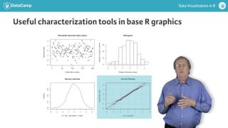
In looking at a new data set, it's useful to start by looking at one variable at a time to see whether it conforms to our expectations for numerical data. A common expectation is the values should conform approximately to the Gaussian or normal distribution described by the Bell curve shown here. Under this assumption, the observed data values are clustered around the mean value. Here the value is 0, indicated with the solid red line becoming less likely as we move further away from the central value. The standard measure of scatter or spread in Gaussian data is the standard deviation, and this plot shows how the likelihood of observing data values decreases as we move out from the mean. First one standard deviation away, the green dashed lines, then two the yellow lines, and finally three the blue lines. These expectations are not always met, but they have led to the development of several useful graphical tools for characterizing numerical data. Here, the upper left plot shows 200 simulated Gaussian data values, and the other three plots show their characterizations using three of these tools. The upper right plot shows the histogram, probably the best known of these tools. It is constructed by first dividing the range of the data values into subsets or bins and then counting the number of values that appear in each bin. The basic histogram is a bar plot where each bar represents a bin and the height represents the number of observations in that bin. The lower left shows a density plot, which we can think of as a normalized and smoothed histogram. If our data values approximately satisfied the Gaussian data assumption, this plot should look like the Bell curve shown earlier. Because this example is based on simulated Gaussian data, this density plot should have this shape, and it does at least roughly. The fact that it is only approximately bell shaped is a consequence of the finite size of our data sample, and it emphasizes that while density plots are good enough to be very useful, they are not perfect. The lower right shows a normal Q q plot, not as well known as these other tools, but extremely useful. It is constructed by first first sorting the data values from smallest to largest and then plotting them against an x axis derived from the Gaussian distribution. For Gaussian data, these sorted points should be very close to the solid reference line shown in this plot. This plot was generated with the qqplot function from the CHAR package, which provides 95% confidence intervals the dashed red lines around the reference line to help us see how well our data conforms to the Gaussian assumption. Since all of these data points fall within these limits, the Gaussian data assumption appears excellent here, as it should. Here are the results when we apply these tools to a real data set. The upper left plot shows the duration values from the geyser data frame in the MASS package, describing the durations of 299 eruptions of the Old Faithful Geyser in Yellowstone National Park. As before, the other three plots show the histogram in the upper right, the density plot in the lower left, and the normal Q Q plot in the lower right. Here, the density plot is probably the most useful, highlighting the fact that these data values exhibit a bimodal distribution with not one but two most likely values. Now it's your turn. The following exercises give you a chance to try these tools for yourself.