A Discussion About Google's Mobile Algorithm Update with Thomas Petty
Eric Cook and Jeff Simpkins talk with Thomas Petty about Google's mobile algorithm update coming in April 2015. They cover responsive design, how to test if your site is mobile-friendly, and what businesses need to do before the change rolls out.
Chapters
Well, greetings everybody. Welcome to the Wednesday, April 8th, 2015 episode of Free Webinar Wednesdays. This is Eric Cook, and I'm with WSI Internet Consulting where we work with businesses and organizations in helping them better understand and leverage the power of the Internet as a strategic business tool. You can learn more about me and WSI online at www.poweredbywsi.com. With me this week and back in the saddle because we had to take some time off, but we're here, is Mr. Jeff Simpkins, my good friend and Free Webinar Wednesday partner. Jeff, say hello to everybody out there in Free Webinar Wednesday world.
Hello everybody, this is Jeff Simpkins. I am with Community Bank Consulting, Inc., and you can learn more about me and Community Bank Consulting online at www.communitybankconsulting.com.
communitybankconsulting.com.
Excellent.
We were off last week, Jeff, but last week was a momentous occasion for us, and I've been receiving all sorts of congratulatory wishes via LinkedIn because I have Free Webinar Wednesdays listed as one of my employers/jobs. But I want to officially congratulate you on 6 years and a week of doing Free Webinar Wednesdays.
I noticed on LinkedIn that you hit 6 years and I even congratulated you.
I know, I saw that. I was going to congratulate you too, but you don't have it listed on yours. Maybe I'm padding my LinkedIn more so than you are. I had the opportunity to tell somebody just the other day, because he said, well, It was funny, he says, well, how did you get into podcasting? And I said, well, it's not really a podcast because we kind of look at stuff and a podcast really involves just audio. But I said, my good buddy Jeff came up and we both were a fan of the book Book Yourself Solid by Michael Port. And one of his strategies of keeping in touch was always have something you can invite somebody to. And if somebody's not interested in hiring you or I right away, Because, you know, this is free, so we don't make money at Free Webinar Wednesdays. But if somebody's not interested in hiring us but is interested in keeping in touch and getting valuable information that hopefully will lead to maybe a business deal at some point down the road, I think the conversation went, well, what about a webinar? Well, what about maybe a weekly webinar? Well, what if we did a weekly webinar on Wednesdays? And then it just kind of morphed into that and we just played off of the W. So who'd have thought 6 years from then we'd still be going? And with the exception of every once in a while when we have conflicts, I think we've done a pretty good job keeping it going. So kudos to you.
You got it.
And thanks to everybody that has followed us and helped spread the word. And I think we're up to a little over 1,600 individuals that are part of our email distribution list that get reminded for our weekly sessions. So it's been a fun little community and some good stuff.
I'm actually looking online right now and we're getting closer to 1,700.
Maybe we'll top 2,000 by the end of the year, so who knows. But we certainly appreciate everybody's support and spreading the word and great guests like the one that we're going to introduce here shortly as well that have joined us on multiple occasions. So we'll go ahead and cover a couple housekeeping items for those of you that are joining us brand spanking new. We record Premier Wednesdays.
I see we've got a few folks on the phone. I see we have a few folks on the phone, so make sure we give them disclosure.
Yep, why don't you go ahead and take care of that.
If you're dialed in on the telephone, the default number is in Toronto, Canada. So if you are in the United States and don't mean to be placing a call to Canada, You need to look at the audio section of your GoToMeeting control panel and click on Add Additional Numbers and look up the US number.
Or whatever number you might be calling from. So maybe you're calling from the United Kingdom or Australia, although they're probably close to cocktail hour and/or sleeping by now, so you never know. But we do get some international attendees as well, so it's always kind of cool to have folks outside of the United States join us. So good point. So thank you for that public service announcement, Jeffrey. So we'll get back to the other housekeeping items. Free Webinar Wednesdays is recorded, and these recordings are made available at freewebinarwednesdays.com. So after today's session, you can hop over there and check it out, share it with a friend or colleague, and they can see what's going on. And from that page, they can also register so they can get the weekly announcements. And we also Encourage and very much appreciate comments from the audience. So if you'd like to go ahead and open up your chat box, and if you've got a comment or a question for today's session, feel free to type it in there, and Jeff and I will be monitoring those, and we'll make sure that we ask it when we get a break in the presentation. So with that, what I would like to do now is I'm going to go ahead and start working my little magic here. And we're going to find— let me see if I can find Mr. Petty here in my presenter area. Hold on just a quick second. Now where is he?
There he is.
I was having a hard time finding Tom. So while I finish that, maybe I should stop talking and trying to work the computer at the same time. It's my good pleasure to welcome back to the show, because he's been a guest on a number of occasions when we've wanted to talk about Google stuff, is my good friend and president of Bay Area Search Engine Academy, Mr. Thomas Petty. From San Francisco. So Thomas, welcome back to Free Webinar Wednesdays.
Hey Jeff, hey Eric, thanks so much. Yeah, I apologize for that. I don't know what happened, my internet just died, so I had to— I just completely lost you and had to start back up again. So hopefully you can hear me okay.
Well then, I wasn't going crazy. I was looking for you in the presenter panel and I couldn't find your name, and I'm like, I know he was just here, I was just talking to him.
Yeah, yeah, so I don't have any idea, you know, the bad things that you said about me before I got back on, so—
Well, I resisted the typical, because I think every time you've been on, I've called you the internet rock star Tom Petty, and I know that you obviously get the, you know, the name is very similar to Mr. Tom Petty that is also part of the Heartbreakers, but you are the Tom Petty that is part of the Bay Area Search Engine Academy, so very different. But still a rock star in my book because you spend a lot of time.
Yes.
Yeah, well, I tell people that this is my day job. At night I'm a rock star, but during the day I'm a day job marketer.
There you go. Yeah. So today we're going to talk about what has been coined on the internet— I don't know if it is going to be of this magnitude— but Mobilegeddon, the first time in Google's history that they've Kind of pre-announced, hey, we're going to be making an update. They've been sending notifications through folks' Webmaster Tools. And on April 21st, there's going to be some changes that are going to come around from our friends at mobile. And they're going to acknowledge some attention that they're paying towards mobile devices and mobile formatting of websites on those mobile devices. So we've asked you to join us today and kind of help us separate myth from reality and what we can do and why businesses should be concerned and to answer all sorts of wonderful questions that I'm sure the audience will have. So with that, we'll let you go ahead and get started. We can see your slides.
Okay, good. Alright, so yeah, we'll talk about Mobilegeddon. I'm not sure that that's really a great term, but I'll talk about that a little bit. And like I said, I didn't hear what your introduction of me was. So I've got a little slide here of, you know, who, who am I and who's this guy that's going to be flapping his lips about all this stuff. But basically, I'm a trainer at the Bay Area Search Engine Academy, and we teach business owners how to market online. And that could be through search engine optimization. There's lots and lots of ways of getting found online. At the end, I'll talk about how you can get my report About 10 different ways to get found online today. And so that's kind of the focus of the Bay Area Search Engine Academy. We are located in the San Francisco Bay Area of California. I'm also a certified usability analyst from Human Factors, which means I'm an expert in web usability and how people access and use web tools. And then I am also, like Eric, with WSI and do lead generation and digital marketing for my clients. And in my volunteer time, I'm the board chair of the American Red Cross Northern California Blood Services Region here in California. So the Red Cross has 26 regions across the country, and the Northern California Blood Services Region services— collects blood and blood products from donors And distributes them to area hospitals. So if you have not given blood recently, I encourage you to go to redcrossblood.org and look for a local blood drive, and please sign up. We need more blood donors. We don't have enough across the country, and especially in the San Francisco Bay Area, we've only— we actually have to import blood from other regions in the country because we don't have enough donors.
Thank you.
So it is a life-saving gift, and I encourage you to do that. So that's a little bit about me. So today what we're going to be talking about are, like Eric said, mobile— being mobile aware on your website. And there's actually—
I think we lost you. Jeff, can you confirm on your end, did we lose audio with Tom?
Yeah, I think Tom's internet may have gone down.
Yep. So we'll go ahead and we'll send Tom a little note here just to make sure that he knows we lost audio. Tom, you there?
I am here. Oh, okay. Now it says audio connection restored. Can you hear me now?
We can now.
Yep, we've got you back. And we've lost you again. So this is where Jeff and I, if you were here in person, we'd be doing a little dance, maybe a little jig in front of the audience to try to entertain you. We would be maybe humming the Jeopardy theme song. Tom, I don't know. It looks like you're on voice over IP. Maybe we can try if you can dial into the phone number. That might help with at least the audio quality. So I see that he's dropped off. So we'll give him a moment.
I'm not hearing noise, so I think he may be here.
This is one of the joys of a live show as well, so you always get the advantage. That was one of the other things that came up when we were having the discussion yesterday about how did you get into podcasting. There was a discussion about somebody else that was doing a podcast and how after they do the podcast they pull it down and they edit it and they change information, you know, they kind of take out the pregnant pauses and all that other stuff. And I said, no, we pretty much just go kind of raw. We let it happen the way that it happens. And if it's got some warts, then it's got some warts. So that's just the way that it goes.
You used to spend hours every week editing, and then we learned some things we could do to prevent the need for editing. Yeah.
Yep, we've made that a little bit easier, and it helps that YouTube now allows for videos longer than 10 minutes to be posted, so that has also been a nice little plus as well. So, all right, Tom, are you there?
Nope, not yet. I think the internet gremlins may be out today. I was on a call before this one, and we were having voice over IP issues. Significant voice over IP issues as well.
Yeah.
Many of you in our audience are affiliated with WSI and know that Baltich has been a guest on here a number of times. He sent out a really good communication on LinkedIn yesterday on the exact topic that we are going to be discussing. Did you get that, Eric?
I did. I did.
Yep.
So I said, well, Valted, you should sit in on the presentation that we're going to be doing with Tom, and then maybe we could have you come back. And he said that it's, it's probably going to be a lot of the same because I don't think there's really many different ways to slice this. But I think the unique part, like I said in the intro, is the fact that this is one of the first times that Google has actually sent a warning shot across the bow to businesses and webmasters Usually when things like Panda and Penguin come along and they do their algorithm updates, they don't really tell you that it's coming. And it just makes an adjustment and it penalizes you for things that you maybe thought were okay but end up not being okay. And with this now, they've basically given well over a month, almost 2 months worth of notice. Because I think it was in February when they started providing at least alerts through Webmaster Tools, which is a sister service to Google Analytics that hopefully most of you out there that— if you're not with WSI, if you're with somebody else, hopefully your webmaster has set those up. But I know as a general course of operation for us, we set up Google Analytics and Webmaster Tools for all of our clients. That gives us some insight on what's going on. But they've been making notifications in that platform To say, hey, you've got some issues. When your site loads, it loads too small, and the text is too close together. So people with fingers bigger than needles are going to have a hard time maybe navigating your site. It's been a good little checklist to go through, and it's prompted some calls with clients to review and to say, hey, is mobile something that is on your list? Unfortunately, it's not a flip the switch and make it mobile-friendly, there is going to be a little bit of development work involved. And we've added some tools to our quiver at WSI that make it a little bit easier to use. So if you're not prepared as a business to do a complete rewrite to something like a responsive mobile website, there are solutions that we've got where we can provide a mobile version. We can pull content in as well as images and color schemes so it looks very complementary to your website. and make that a mobile presence for you, almost as a stopgap in between going to what they recommend really is a truly mobile responsive website. So if you're having some problems getting to the point— I see Tom has just connected and said, what's the phone number? So let me go ahead and see if I can shoot him that information as well. But we do have some ways that we can help at least get you prepared and The sooner you act, the sooner we can be prepared by April 21st, although that deadline is coming here very shortly.
So let me— All right.
Okay, so looks like the internet gremlins really nailed Mr. Petty. So he is sending me a message from his iPhone to try to get the dial-in number. So we'll see if we can go ahead and get him connected here. Unfortunately, maybe I shouldn't have responded the way that I did.
What's that? Unfortunately, I can't help you at the moment because I am in the middle of a reboot.
Yeah. Well, let me— I'm going to go ahead, actually, while we're doing this, I'm going to show my screen real quick while we're waiting for Tom to come back. One of the things that you can test, and Google has actually produced a mobile testing tool, and what I did is I just created a shortened link. So if anybody out there, and I'll post this as a link in the chat box as well, but I use Bitly quite often. And you can see I've created a Bitly link called bit.ly/g4google-m4mobile-t4test. And so that Google Mobile Test will give you the ability to go ahead and It brings you over to a mobile-friendly. And so I'll just pick one of the sites that I know happens to be mobile-friendly because we just got done doing it for a bank here in Charlotte, Michigan. If you go in— By the way, it's spelled exactly like Charlotte, North Carolina. It is, yeah. So I'm sure it probably drives you nuts, Jeff, when I say Charlotte and you're like, no, it's Charlotte. But Michigan versus North Carolina. But when you go in and you put your website address in, what Google is going to do is it's going to visit your site and it's going to take a peek and it's going to see whether or not this shows up as a mobile-friendly page. And in this instance, it comes back and it says, awesome. Congratulations. Googlebot sees the page. Looks like everything is good to go. So you're all set. That's what I thought. If you put this in and you don't get the awesome response and it comes back red with little check marks, there's a good chance you're probably going to get some sort of a slap from Google come August— or not August, April, the other A month— April 21st when they do their update. So that's just one of the things that you're definitely going to want to make sure that you keep in mind. So again, that's bit.ly. /g for Google, m for mobile, -t for test, for Google Mobile Testing. So—
Hey guys.
That's a great tool. You've actually shown that before. And Tom is back. Yeah.
Yeah, I think I'm back. I don't know what's going on. And then I tried to dial in, and then I think Citrix crashed. And I don't know what's going on.
Love it. Yeah.
Well, we've been just chatting, going back and forth, showed everybody the mobile testing tool from Google that at least is a way. So if that's something that you're planning on covering, we kind of did that. But I'm going to go ahead and send you the presentation controls.
All right, cool. And let me get back to my presentation. So yeah, I apologize for that. There we go. I don't know what's going on. I'm gonna— do you happen to know the phone number just in case so I can dial in? Because I couldn't find that.
When you get logged into the platform, if you go into your audio tab, I think it's unique at the individual level, maybe. Okay, if you go into your audio tab, once you change it from mic and speakers to telephone, it's going to give you that dial number with the additional number option to pick the United States, and then you can dial that. I think it's a 312 number.
Okay, okay. All right, well, if I lose you again, I will email you the presentation and then I'll dial in on my cell phone.
Perfect.
But hopefully we're good to go. So anyway, without all of that, so yeah, basically 3 ways to be mobile aware. So there's different ways that you can set up your website so that it is mobile aware. I'll talk a little bit about that. What is Google saying these days? And I think that Big concern from people is, you know, are you losing business if you're not mobile aware? And people are calling this, as you mentioned earlier, Mobilegeddon, which maybe is appropriate, maybe not. I'm not sure. It seems a little overly dramatic to me. And then what do you need to do to get prepared for Google's next update? So that's kind of what I'm going to talk about. Go ahead. Were you going to say something?
No. Nope.
Well, I guess now that there's a— I just sent the Google Mobile Testing Tool link into the chat box for everybody. So if you check that, you should be able to get access to that link.
Yep. So there you go.
Cool. Good.
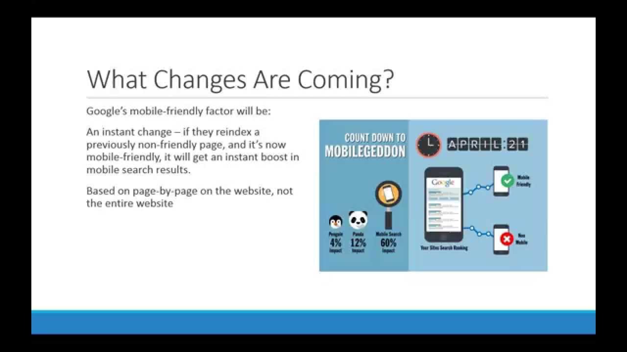
Alrighty. So what is a mobile-aware website? What does that actually mean? So in the olden days— and I say olden, you know, what, 3 years ago? We only had to worry about making sure that our websites worked in different browsers, primarily Firefox, Internet Explorer, and Chrome. Chrome came along a little bit later, so it was— it used to be just Firefox and IE, of course. But nowadays we really have to worry about devices as well. So we've got desktops, laptops, tablets, smartphones. And each device, depending on how they're browsing your website, they may— the people that are on those devices may want to actually see different information and probably want a little different experience on your website. So if you've got a website, and I've been saying this for a while now, that if you built your website within the last 2 years, 3 years maybe, You definitely need to rebuild your website or at least put a different template on it so that it is mobile aware. Because as people are visiting your website, it's like, you know, we all know what that looks like to do the pinch and squeeze and try to navigate little tiny menus on our smartphone or even on a tablet. And it's just, it's just a nightmare trying to use some of the older websites. on a mobile device. So it's, it's an important thing that we need to be paying attention to just from a customer perspective too. So in the web space, there's really 3 different ways to deliver mobile-aware content. And kind of the older way to do it was to sense the device or sense that it was a mobile device, and then you actually redirect to a different URL. So this might be an m.yourdomainname.com. So if somebody is hitting your website with a mobile device, then they actually get redirected over to a completely separate website that is dedicated to mobile. And that's fine, that works. The big disadvantage of doing that is that you have to maintain 2 or more websites. So you've got to maintain your main website and you've got to remember to go in and maintain the mobile version of the website too. So as information changes, you have to do it at least twice. And if you do something for a tablet and a smartphone, then you got 3 websites that you've got to manage, and it just gets really messy from there. There is also a way that you can sense it— sense the device and serve up different content based on the actual device. And I'll show an example of this in a minute. And that also gets kind of messy too because now you've got to maintain the code and the HTML for multiple devices and it just makes it harder to keep track of all of it and keep it coded nice and clean. And the third and preferred method, and this is what really what Google wants to see, I mean Google is okay with any of these solutions but Google really wants to see what's called a mobile responsive design. And using these geek acronyms, CSS3 and HTML5, which is basically the modern version of HTML or the coding for your website that the current modern browsers support. And a mobile responsive design means that it's going to serve up the same content, but it will actually reformat and rearrange that content based on the device design. So the screen width is typically what determines what gets served up, and so certain things will get hidden, certain things will get displayed, certain things will get rearranged just depending on the mobile device and the orientation. So if you've got your tablet horizontal versus vertical, or your cell phone vertical and horizontal. I'll show an example of that in just a second too. So, why is this important? And if you look in your Google Analytics, if you go into the audience tab on the left and then go, you'll notice that there's a mobile tab, and if you click on that, then you can get into the overview of how many mobile versus non-mobile devices are visiting your site. And then you can even actually go into the actual devices and see who's visiting your website on which type of device. And, and I guarantee that the iPhone is going to be at the top of the list. So either the iPhone or the iPad, those are the 2 most popular devices. And if you do not have a mobile-aware website, then you're probably losing people because they're getting your website and looking at it and going, this just doesn't look right on an iPhone. I'm just not going to bother with this. I'm going to back out and go somewhere else that actually has a mobile-aware website. I encourage you to go into Google Analytics and see. I think you'll be surprised at how many people are actually visiting your website with a mobile device. betting that most websites have probably a fourth or a third of your visitors are on a mobile device of some sort. So here's an example of a website that has a mobile website as well as a desktop website. This is a local restaurant where I live in Livermore, popular Mexican place, got really good food. And when you go to their website, casadorosco.com, they've got a decent-looking website. But you'll notice that right there on the homepage is this big old Flash video that automatically plays. And as most of us know, Flash does not work on any of the Apple devices, either iPads or iPhones. And if a third of the visitors to their website are on these devices, all they're seeing is this big black box with nothing in it. So it's completely useless from a mobile perspective. Now, I've used this as an example in the past where one day a couple years ago my wife and I were out walking around downtown Livermore and we decided— we were with some friends— we decided we wanted to go have some dinner and we were just a couple blocks away from Casa Orozco. So I pulled up their website on my phone because I wanted to call them and put our name in. And so I went to CasaRoscoe.com and it was like, oh cool, they've got a mobile version of their website. So I looked at it and that's the box on the right there. And so I was impressed that they had that, but it's probably one of the more ugly mobile websites that I've seen. But then the biggest issue that I have with this, and you can try this yourself, go to the website, nowhere on the mobile website do they have their phone number. You always want to think about your audience. Who is it that's visiting your website? What is it that they want when they visit your website? You have to think about it from what device they're looking at. In this case, we were out walking around, we were just a couple blocks away, and I just wanted to call them and put in my name so that we could get a table because they're a popular restaurant. They don't have their phone number on the website, on the mobile version of the website. It's just stupid. Because here is a perfectly good opportunity for them to capture some walk-in traffic, and they've totally missed the mark. So this mobile version actually shows a copyright of 2010, so they haven't even updated their, their mobile website since 5 years ago nearly, and, and it still doesn't have a phone number on it. So this is a really bad example of or a good example of what not to do. Here's another example, and this is one of my clients, Lam Research. And we built them a new corporate website last year that— and they wanted to make sure that they were mobile aware. And so what we've done is we've built the website so that if you look at it on a desktop or laptop, it looks normal and the graphics along the header actually animate. It's not using Flash, it's using CSS, so no matter what device you're on, it always works. And then as you look at it on a mobile device, and this is what's on the right, it's a screenshot from my phone that shows that the wide menu that works fine on a desktop or a laptop is inappropriate to use on a mobile device like a tablet or a phone. And so this menu actually hides and a different menu pops up that's over here on the left-hand side of the screen that is easy to use with fat fingers. So you're on a small device and you can navigate the menu very easily with small device, a small form factor, and get to the piece of information that you want to. So these buttons that they have up along the top, those get bigger and move over here so they're easy to get to. And then the whole screen rearranges itself so that these text boxes and the graphics and things stack on top of each other so that it makes it easy for somebody to scroll through and look at the information. Information. So this is what a good mobile-aware design of a website looks like and what you want it to function like based on the particular device. And again, always think about your audience and what device they are on. What information is it that they want to see when they're on that particular device? So if you're a restaurant or a store, or something like that, make sure that your phone number, a button to a map of your location, Yelp reviews, whatever it is that you think that somebody on that device is going to see or want to see is available to them front and center. So Google has been looking at this for really a couple years now and probably a little bit longer than that. But officially in June 2013, Google stated that they were planning on rolling out several ranking changes in the near future to, quote, address sites that are misconfigured for smartphone users. So they're really looking at people who are— have websites and making sure that people with a smartphone have a positive experience and are able to navigate the site and get to the information that they're looking for. Last year, Google also started notifying website owners that if the website is not mobile-aware, they're flagging it and telling you. And I've got a screenshot of what that looks like in a second. So, and then in February, just a month or so ago, Google announced that they do have 2 important changes that they're going to implement to make sure that people that are on their mobile devices, specifically phones, are going to be able to get to a website that is going to work for them on those mobile devices. So here's Google Webmaster Tools. If you have not registered your website with Google Webmaster Tools, you really need to do this because maybe you've got Google Analytics installed. That shows you all the traffic and things that people are doing once they're on your website. But the Google Webmaster Tools is another free tool from Google that they give you information and they tell you what's going on with your website from their perspective. They're going to give you some messages that say, hey, we're seeing a problem with this, or we're seeing a bunch of errors on your website. They'll even tell you if you've got malware installed on your website and notify you if somebody's hacked your website. There's all kinds of really good stuff that they're going to tell you about your website that you may not be aware of. So if you are in Google Webmaster Tools, and this is an example of a website where there's a— you can navigate into search traffic and then click on mobile usability. And this is a new tab that's shown up in the last couple months or so. And they're going to tell you whether you have mobile problems on your website. So in this particular case, they've got 137 pages with errors, which is basically in this case the whole website. And so they're showing that the content doesn't resize automatically to fit the device. You've got a small font, touch elements are too close. So in other words, it's too hard to navigate. And, and in this case, they've also got Flash on their website. So that people who are on cell phones and Apple iPhones and iPads are going to see just that black box where that Flash stuff is. So Google is telling people and saying, hey, you've got mobile problems that are affecting your website, and they're letting you know. So if you haven't registered with Webmaster Tools, please do that. To get there, you just go to google.com/webmasters and then set it up from there. The other day I was looking for— I had actually optimized our church's website for Easter services. This was 2 or 3 weeks ago. I wanted to see if it was showing up in the search engines, so I got on my phone. And typed in Easter services in Livermore and hit search. And this is the first time I had noticed that websites that are mobile-friendly have a little tag next to them that shows mobile-friendly. So if you're on a cell phone and you're doing a search, Google is now tagging those websites with a little clue there saying, hey, these are mobile-aware websites. That you can have a good experience with when you visit on your cell phone. This is a real aha. The Asbury Church there, that's my church. I was really happy to see that, hey, we're showing up number 2 in the search results on my phone. Of course, because we had set it up as a mobile-friendly website, that it was showing up as such. So, again, this is another clue that Google is really paying attention to which websites are mobile-friendly and are working well for those mobile devices. So the big question is, are you going to be losing business if you don't have a mobile-aware website? I would say that you probably are. But look at your website, and I'll show you some examples of how to do this. Look at your website on a tablet and on a smartphone. Does your website rearrange to fit the device? Is it— does it have the information available to the specific user? So I mentioned the phone number earlier. Is the information that the person on that type of a device finding the information that they're looking for And can they get to it? There's a way that you can actually make a phone number clickable so that if you are on a mobile device, they don't have to type in the phone number. They can actually just touch the phone number on your website and the phone will pop up a little box that says, hey, do you want to call these people? And then you can click go. So if you look at my website, for instance, BayAreaSearchEngineAcademy.org, and look down in the footer section, you'll notice— and if you look at it on a cell phone, you'll notice that the phone number is clickable with your phone, and you can actually make a phone call directly to the website. So make it easy for your visitors. Can you easily navigate the website using the menu, or has it got a funky menu that's got hover states that If you move off the menu, then it doesn't leave the submenus and things, so that makes it a real challenge to move around. So test it. 30% of searches are done on mobile devices. I mean, just like I showed in the previous screen, just go look in Google Analytics. You're getting people that are coming to your site on mobile devices, and people are doing searches on Google on their mobile devices, especially on iPads. I saw another statistic that showed iPads are the most popular device that's being used in the evening because people are sitting in front of the TV or at the dinner table or wherever. They're not going to drag out their laptop or they're not going to get on the computer after hours. Typically, they're going to kick their feet back and pull out their tablet and get on their mobile device. So if your users are not having a positive experience with mobile search, and more importantly when they get to your website, then you're probably losing customers. You're losing business. They're just saying, you know what, forget this. This is too hard to try to navigate this website. I'm just going to go somewhere else. So here are a couple tools that you can use to test it. This Screenfly tool from QuarkTools is kind of cool because you can put in your URL and then up along the top they've got desktop, tablets, cell phones, TV, lots of different devices. So you can actually see what your website looks like when you go to a specific device and a specific form factor. It's a free tool. And just put it in there and see, you know, if you don't have any of these devices, then you can just go in and test it directly on the Screenfly tool and see exactly what your users are seeing and make adjustments based on what you think that they're looking for. So, and then Eric was showing you guys the Google testing tool. I've sort of had a little bit of mixed results with this. Sometimes, like here, it shows that the blog, my blog, is mobile-friendly and I get a green box and it says, good job. But if you go to my website, which is totally mobile-friendly, it says, no, there's problems. If you look at the Lam Research website, it says that it has problems. So, I'm not exactly sure what's the difference, but you can use that as a data point to make sure that your website is doing what it's supposed to be doing when people are using a mobile device. So, as Eric mentioned earlier, I've got this graphic on the right-hand side here. People are calling it Mobilegeddon. I think it's just a little overblown, a little kind of a strong term, but it is a significant change that Google is putting into place. And allegedly on April 21st, they have announced that they are putting in 2 major changes that the first one will probably affect you. The second one is a smaller thing, but basically mobile-friendly websites are going to get a boost in smartphone search results. So just as I showed you with the church website earlier, if your website is mobile-aware and you've done a good job of doing the search engine optimization and that kind of stuff, but the mobile-aware piece of it is going to give your website a boost on the search results on a smartphone search. So They're going to tag it with the mobile-friendly, and it actually will be a ranking factor that will get you higher in the search results in combination with all of the other SEO and things that you've put into your website. The mobile awareness, I don't believe, is going to affect— I don't believe that it will affect searches that are done on a non-mobile device. So if you're doing a Google search on your desktop or laptop, that— I don't believe having a mobile-aware website will affect those search results. It's strictly on smartphones. And, and they're saying that there are going to be a significant number of websites affected, and I'll show you a graphic in a second on that. The second piece that they're putting in place on April 21st is that mobile apps that are indexed through the Google App Indexing Service will also show up higher in the search results. And this primarily applies to Android apps because the iPhone apps aren't necessarily part of that Google App Indexing Service. So if you've got apps that you've developed for the Android, then those can show up higher in the search results if it's mobile-aware. So here, this particular graphic— and I swiped this off of somebody else's website— but it's the noise that I've heard is that, you know, the Panda and Penguin updates— Panda came out in February of 2011 and Penguin came out later that year. And Panda had an impact to about 12% of all websites worldwide. Penguin was a smaller impact with about 4% of websites. This particular graphic has— it says that it's going to be 60% of search traffic. I'm not convinced that that number is correct. I've seen 40%. I've seen other numbers. Bandied about. But basically, if your website is not mobile-aware, it can affect your search ranking on smartphone search results. So what Google is going to be putting in place is that there are 2 pieces to this. Number one, it is going to be an instant change. So if they have previously indexed your website or, or web page and it was not mobile-aware, then your search result position will be at whatever position it is. But if they come back a month later and re-index that same page and it's now a mobile-aware web page, then that will give you an instant boost in the search results on a smartphone. So it will have an immediate effect once they re-index that particular page. And the other piece to this is that it is based on a page-by-page factor. It's not necessarily on the entire website. So it may be that you have specific pages on your website that are going to be very difficult to make them mobile-aware. And if that's the case and you leave them not mobile-aware, that's okay because the reindexing and search results position will be based on a specific page-by-page basis. So if you've got 5,000 pages on your website and you've got only a handful that are important for mobile search, then work on making those mobile-aware and make sure that they're optimized for mobile searches. And don't worry about the rest of the website because it's not going to affect your overall search ranking. It's only going to be on those specific pages. So that's something that can, especially for people that have large websites, can sort of breathe a little bit of a sigh of relief. So how do you get ready for this? 57% of all the websites in the world are on WordPress, so there's just just millions and millions of websites that are built on WordPress. It's a, it's a good tool. I use WordPress all the time, and there are all kinds of great mobile-aware themes that are available to you. More and more of the big theme companies are coming out with fully mobile-aware templates that you can pretty much just drop into place, change the graphics and the colors, and you're off and running. I'm a big fan of StudioPress, and I use those on my own blog and, and other companies' blog websites and some websites. So they have some really nice templates that work very well, they're easy to customize and so forth. There are others like iThemes and WooThemes, and even if you go into the WordPress.org themes repository, you'll find lots of free mobile-aware templates that are easy to apply. If your website's on a different platform, or if you've got a custom design, or even a custom WordPress design, make sure that you work with a designer that's very familiar with web-aware designs and coding structures. You know, don't just— just because somebody says, hey, yeah, I know all about mobile check them out. Make sure that you get some sample sites that they've done and then go test them. Go put them into the Screenfly tool, go put them in the Google tool, and make sure that they— what they say they are able to do is what they're doing. You don't want to hire somebody that is just saying that they can do it and then they don't really deliver. So you want to make sure that that this is working properly. So that was kind of what I had to cover today. So, Eric, I don't know if anybody's got any questions that have been posted in the chat, or if anybody wants to bring up some questions at this point. I'm happy to answer anything.
Sure. As a reminder, if you'd like to ask a question, go ahead and type it into the chat box, and Jeff and I will monitor that. You can see there's some information there about connecting with Tom.
We've got a couple questions. First of all, Lori says, hi Tom.
Hey Lori.
Daniel says, thanks for sharing. Leah said, what about the plugins like for Like a vent for WordPress, they also need to be made mobile aware?
Yeah, again, if it's important for mobile and specifically cell phone, smartphone users to be able to find those pages and navigate those pages on a smart device, then yes, I would work to implement the mobile-aware versions of that. But sometimes, again, like I said before, just depending on the information that you're presenting, it may just be really difficult or cost-prohibitive to try to convert it into a mobile version. And if you're not getting— I mean, again, you can look at your Google Analytics, and if you've only got 5 people that are visiting that page on their smartphone, then don't bother with it. But if a lot of people are going to that page and it's an important page for you from a mobile perspective, then you want to put some effort into making sure that it's working properly. So hopefully that makes sense.
And your colleague Nancy in Washington, D.C. said, great job as usual. And she said, thank you for pointing out the things that are most important to concentrate on.
All right, cool.
That takes care of all the open questions at this point. If you've got more questions, type them in.
Eric, go ahead. We just brought you on the show so that you can get accolades from all of your fans that you've invited.
Apparently, yeah.
Nice job.
I did such a fantastic job, I really didn't get any questions. I got one question.
I was going to say, Despite the fact that the technology gremlins tried to thwart you, I think those are all a thing of the past.
Yeah.
So, okay, here's a really good question.
Yeah, so I did want to say too, yeah, and I'm happy to answer questions. And if you go to— if you think of a question later, go to my about.me page and you can shoot me an email directly there. I'm happy to answer it. And if you want, I mentioned at the beginning about the 10 Ways to Get Found Online Today. If you have not signed up for that, you can go to that Bitly link and I will send you a report on the 10 different ways of getting found online. So I love getting connected on LinkedIn. You guys were talking about LinkedIn at the beginning there before I got booted out of the system.
Yeah.
So please do send me a LinkedIn request too. I've got— I think I've got 13,000 connections. So, you know, just—
That's why you're a rock star, man.
Yeah, something.
That's a lot.
Yeah.
Here's a really good question, Tom. We expect this to be relevant to mobile search results only. If you have lower minimum traffic from mobile devices, then is this irrelevant?
Yeah, I wouldn't say that it's irrelevant, but I would say that it's less of a priority. I think that as we move forward in time, that Google is going to make this more of a priority, as they have over the last couple years. So I wouldn't say that, you know, I mean, they're saying April '21 is Mobilegeddon and the world is going to come to an end as we know it. I think that's baloney. But it's something that I think that people need to pay attention to and over time start migrating over to mobile-aware websites. And who knows where the technology is going to go What I would suggest as a follow-up to that—
hold on, just another thought on that— is if you've got Google Analytics installed, even though you're seeing minimal, you know, maybe 10% of your traffic now, go back a year and see what that traffic count was. Go back 2 years and see what that traffic count was so you can get an idea on growth patterns.
Yeah.
And while maybe the audience that you're communicating with is a little bit slow to adapt, You might see that the adoption has been 100% or 200% over the last couple of years, and if you extrapolate that out, you might very quickly get to the point where you're going to see maybe 20% to 25%. Do you want to take a fifth or a quarter of all of your website traffic and give them an experience that isn't going to be mobile-friendly?
Exactly.
So look at your trends. Sorry, Jeff, go ahead.
Okay, Daniel asks, does the free report that you've got listed on the screen cover all the information that was included in this presentation?
Well, not specifically. The report is 10 different ways to get found online. Basically, people, a lot of times people think, you know, search engine optimization is really the only way to get found on Google and to get found online. But there's lots and lots of different ways of getting found, so it's kind of an overview and some ideas of other things that you can do to get found in lots of different places, not just with search engine optimization and not even necessarily just with your website.
I'll reference a webinar that we had a couple of weeks ago with Ted Paff, who's the founder and CEO over at Customer Yep, I know Chad. That was a great show that talked about the importance and growing relevance of things like online reviews and ratings and recommendations.
Absolutely.
I don't know if that's one of the ones that's in your report, Tom, but I think that is a good way to make sure that your brand is visible, not just your website, but people are out there talking about you. And if they're not, putting together a strategy that can get your happy customers encouraged to talk about you. So that you get some positive reviews and the rest of the world sees people talking about you in a good light.
Absolutely, it's absolutely crucial. I've written several blog posts about that and have even mentioned the Customer Lobby tool in those blog posts. So yeah, I use it myself for my WSI website.
Let's see, Lori says she always learns something from your webinar. She too is a web designer And she said, for actual coding, what do you recommend?
Ooh, loaded question.
Yeah, that's a— my standard consultant answer is, it depends. I'm not sure if you're asking, like, PHP or .NET or— Laurie, I don't know if you can clarify that.
She followed up and said media queries.
Media queries. Okay, again, I'm not, not 100% clear on what she's asking.
Yeah, I mean, there's a lot of different ways. It depends quite honestly on, you know, what sort of platform you're using. If it's in a content management system like WordPress— I know one of the platforms that WSI uses is part of the Adobe system. We do a lot of work also in platforms like Joomla, .NET Nuke, and others. And all of those have a variety of different ways. Like media queries is just a way of kind of polling and saying, well, if you're on such and such device or you're accessing through such and such a browser, to be able to display a different way. That's probably a little bit more technical than what we want to get into here, to be honest with you, because I'm probably stretching my brain right now.
Right.
There may be some people that actually know what they're talking about that are saying, nope, that's not even really what a media query is, Eric. But fortunately, we've got technical folks that do know that. But those are all things— when you get into things like CSS3 and HTML5, Tom, you had said it. Make sure you've got somebody that understands those things and can be part of it. So maybe there could be somebody— You know, maybe a more technical person that could be engaged. And certainly you're welcome to follow up with Tom or myself, and we might be able to help brainstorm some resources within the WSI network that might be able to support that.
Right. And it may be that the media queries— I mean, that's a couple things. One is that in the CSS you can actually say if the browser is between this resolution and that resolution, then use this CSS information. So that the mobile menu pops up and shows up and the desktop menu disappears and whatever.
Yep.
So that's one way of doing it.
I know when we build now, it used to be that you would build a website and you would build it for the desktop and then you would figure out ways to make it respond to different size screens. And what we're actually doing is we're building sites that are specifically designed for the mobile. Because that is probably going to be— either somebody is accessing it on a mobile device through a data or cellular signal, so you are not going to have a lot of bandwidth, not a lot of data speed. So you want that to be the default that loads first. And then if for some reason the system sees that, oh, you are on a desktop, maybe you are accessing it from the office, or you are on an iPad and maybe that is being done from home on a Wi-Fi, then you make the website think a little bit more and it takes a little bit more processing to load a bigger version and even the bigger version of the desktop.
Right.
There's actually some thought that goes into how you get things to load into a browser to make sure that a mobile person that visits your website isn't standing there for what seems like forever. But 5 seconds browsing a website can seem like an eternity if you're expecting it to pop right up immediately.
Yep.
So there's a lot of that that goes in. So it's not just a click and it's done. But it definitely is something that Google has dictated is important that people think about. So this has been great, a good recap. So thank you, thank you.
Oh, my pleasure.
Cool. We have a large group today, and we've gone over on time a little bit. So thanks, everybody, for sticking around. And Tom, thanks for being our guest again. We look forward to the next time. And Eric, I'll let you take us home.
Yep, sounds good. Well, it was an excellent show. I also want to make reference I know you were rattling off browser names, but I caught— and actually, I luckily had the phone on mute— you said Internet Exploder instead of Explorer. And I know that wasn't a Freudian slip. You intended for that to— so for all of my web development friends out there that experience Internet Exploder the same way, I just wanted to make sure you caught that, because I had not heard that before. So that was pretty good. So thank you for the little Wednesday chuckle. I much appreciated it.
Yeah.
Yeah, so good stuff. We will get this recording out and available online, warts and all. So we did experience some technical challenges, but everybody hung in there. We really appreciate that. So I guess that's it. We'll wrap for this week, and we'll see you next week and every week here at freewebinarwednesdays.com. Until then, have a great week, everyone. Bye-bye.
All right, take care.