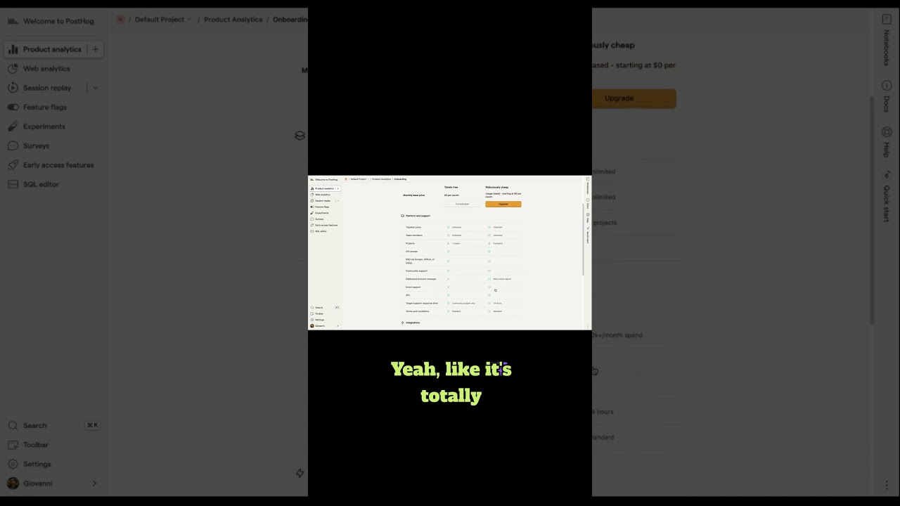
PostHog shows pricing directly in onboarding instead of a separate modal, letting users choose between free and pay-as-you-go with just Upgrade or Skip buttons. It's an unusual move for freemium products that trades immediate revenue for letting users decide when to commit.
And then we see pretty standard, they've got their free plan, they've got their usage-based plan, which is an upgrade. Framed as an upgrade here, even though it could be $0 if I don't use anything. And then you see some of the details we saw on the pricing page. So this seems to be showing everything, not just the things I selected.
Yeah, this one's interesting. It's, um, this is unlike some experiences I've seen before. So it's sort of interesting for a usage-based pay-as-you-go sort of free tier, freemium tier type product that you would have pricing in line like this in an onboarding experience. I think we talked about last time how like it's very e-com focused, like trying to get you to check out. You could easily imagine like this is handled through upsell, like upsell modals and upsell sort of like UX, but like the choice of putting this inline is sort of interesting to me.
Yeah, and actually the only option is to upgrade or skip. It's totally optional, right?
It's like, I like this, the idea that you can skip it. It's like, kind of, I guess I'll just skip it.
Yeah, the only difference is it's going to collect my credit card, and once I go over some pretty generous limits, I will have to start to pay.
Yeah, I mean, I think if I have like high intent to use PostHog, I'd probably hit this moment and I'd probably start to say, okay, like I could obviously stay on the free plan, but I'm going to get rate limited somewhere. And so might as well go ahead and put in my credit card given, you know, there's not going to be some immediate charge. Like it feels like that's sort of the experience. That's the sentiment that this experience is trying to appeal to.