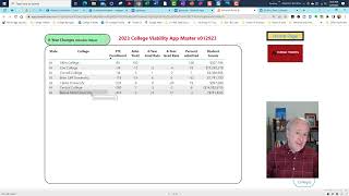
Gary Stocker walks through the 2023 College Viability App, showing how to filter colleges by state, sort by metrics like graduation rates and endowment, and track 6-year trends from IPEDS data. The app lets you drill into single colleges, compare expenses by category, and see 8-year changes in absolute and percent terms.
Chapters
Hi, this is Gary Stocker. Thanks for taking time to take a look at this master version of the 2023 College Viability App. Once I get final feedback and do my final edits, the version you're looking at today will be called the Executive Analysis version of the College Viability App, the 2023 version of that. And you're going to see a lot of fields on the right-hand side, and there are 24, 25 fields, something like that, on the right-hand side. And they're accessible by clicking. But let's kind of step through how to use the application. And then in the email that will accompany this link, I've got some feedback questions I have for you. If you can answer some of them, great. If you can answer all of them, really great. But just kind of get some feedback on, on where the app is and the utility you see in it or not. Before I get ready to release this version. And of course, there will be some parent versions as well that I'll talk about another time. So the filtering is pretty easy, easy. You select a state. So let's grab Iowa. If you want to select more than one state, Control-click or Command-click. So I'll grab Illinois. So I've got Iowa and Illinois, all the colleges. There are 92. You can select just the regional type, and there are 65. Let's just look at the Iowa versions. So there's Iowa Regional Colleges, there are 26. If I wanted to look at a specific set of colleges, I can select those. And again, it's Control-click or Command-click if you're on a Mac. And those colleges will pop up, and you can see I've got 7 to search. And then from there, it's really navigating what you want to look at, and you can play with the fields on your own. A couple of changes to look at on a couple of fields to look at is the 6-year changes. And so I took some important criteria and I calculated the change from 2014 through 2021, the last available data that IPEDS just posted in late December, just to show changes. And the argument that I'm making is, for example, a college like Buena Vista, which has lost 400 students over the last 8 years, that's not a good trend. And you'll see that many, many, many times. But Allen College, you know, has grown their FTE enrollment— and I almost always use FTE enrollment— by about 80 students over 8 years. So 10 students a year, you know, make your own judgment. Admissions yield, again, the popularity indicator. We can see that— looks like Allen has some bad data here— Coe College is down 12%. And again, the admissions yield reflects popularity. It is that function from IPEDS that shows the percentage of students who showed up at a college after they were accepted. The 4-year graduation rate— this is the change. You're looking at negative or positive growth. 6-year, same thing. Percent admitted, of course, is a reflection of selectivity. And then student grants— this is the number that's— that these colleges are providing to students to get them to enroll. You can call them scholarships, you can call them discounts, you can call them grants, you can call them whatever you want. You can sort these, so I can actually click on these and sort these alphabetically by clicking on the column header. I can sort them by largest to smallest just by toggling that back and forth. I can look at the lowest 6-year graduation rates and the highest 6-year graduations. You can always sort that. The biggest change we've made to the 2023 version of the College Viability App is I've created the capacity to drill down to individual colleges. So what you're going to see on the screen now is I have selected some colleges in Massachusetts, and I've got about a dozen of them, and you can see them selected here. They're all regional, and we've got 4 drill-down areas, and I'll show you how to get to those. So I'm gonna go ahead, I've got the 12 colleges selected. Let me just look on, you can look at any of the fields here, but let me just click on Percent Admitted, and we're gonna see all of the colleges listed. And you know, there's lots of ways you can look at this. I can look at Regis College, and they're admitting almost anybody who breathes at 89%, and you can look at Babson, which is much more selective. And let's take a look, why is it that Regis College, maybe, let's look at what's going on there. So we're gonna right-click on Regis College, Again, I'm going to right-click and do that one more time. Right-click, and you're going to get the capacity to drill through. And you're going to see there's 4 different areas you can drill through to. The single college snapshot, so I'm going to click on that. What that's going to give me is a snapshot for Babson College, for Regis College. So it's Regis College in Massachusetts and just all the data associated with the year 2021 for that college. So we can see they've got a pretty low admissions yield at 10%. We can see their fall enrollment's about 2,200. We can see what that change has been. It's gone up over the last 8 years. We can see total enrollment, some different comparisons. We can look at the gender, I think, yeah, women and men percent admitted, just to see if there's any pattern there. We can see the actual, uh, 2021 endowment value. We can look at some student-focused items, the average student federal loan, the unfunded grants, and this is always a fascinating number. At Regis, there was almost $22 million in unfunded institutional grants— call it merit aid, call it scholarship, call it whatever you want— and only not even a million in funded grants where they actually get revenue. So that's one of the four, of the four draw, um, drill-throughs. Let's look at another one. Let's look at— we'll bring up Simmons just because we have it here on the screen. We're going to drill through, and we're going to drill through to the college drill-through. This is essentially the same information. I haven't decided which way to go. This is a button version of that. They call it cards in the app that I'm using. So again, you can see the enrollment, the admissions yield for Simmons, the 4-year and 6-year graduation rates. You know, not bad really in both cases for, for Simmons. That's pretty good. Net assets, total revenues, all that kind of data. The student-focused information, again, pretty similar to what we saw previously, just in a different layout. And I'll choose one or those for the final version. Let's go back again. Let's grab Anna Marie College. And drill through again. The third one is 8-year changes. So now for just this college, for Anna Marie College in Massachusetts, we can see that their admissions yield over the last 8 years from 2014 to 2021 was down 1%. We can see the fall enrollment is up, up, not quite 200. And you can see all the changes across the board. It lets you see over the last 8 years— there's a date range again— what the patterns are. If the enrollment has gone up over the course of 8 years, that's worthy of note. In many, many cases it has not. Then I converted that from absolute changes in this top section to percent changes. So we can see the average net price has gone down for Anna Maria. The students' grants has gone up 67%, so that means they're having to give away more discounted tuition to get folks in the door. The fall enrollment has gone up 16%, not bad over the course of 8 years. Not great, but not bad. Tuition and fees have gone down. So again, you can do all those comparisons. And then finally, let's look at the last drill through. Let's grab Pine Manor College, drill through, and let's look at the expenses per category. And this is different, this is not really part of the app per se, but I want to give users a chance to compare areas of how— where expenses are allocated per support category. Again, this data all comes from IPEDS There's the date range that we have, and we can see in 2014 that 8% of their total expenses were dedicated to academic support. Same number 8 years later, 33% and 33%. So what I look for here is to see any— are there any big changes in any of these categories from academic support, institutional support, instruction, and student services? Then we can look at the absolute values, less utility but still nothing less worth looking at, and we can see that in 2014 Pine Manor dedicated $2,600 per student, per FTE student, in academic support, and then went up about $700 or so the following year. So that lets you compare both the absolute values and the percent change to, again, to see has this college made a substantial change in the way it dedicates its expense resources to pay for its services. Um, click on the home page to go back. There's that same search. We can click on the Clear Search button and start again. and we can look at all the colleges in Virginia. I will show— let's deselect that— I will show that I have both Elite and Super Elite in the database, and there are 1,305 private colleges throughout the United States. Elite— Super Elite is the top 25 in terms of end-of-year endowment from 2021, and the next category, Elite, is, is numbers 26 through 50 in terms of 2021 end-of-year endowment. That's how I differentiated those. So that's how things are set up on the app. Play with it as much as you want. And then when I send you, in the email that I'll send you, look at those questions, the feedback that I'm looking for, and to the extent you can find a couple of minutes to share that, that would be great.