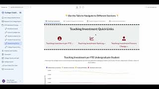
In this walkthrough, the presenter demonstrates how to use the College Outcomes and Financial Health Dashboard. After logging in, the user accesses the Dashboard Home, selects multiple colleges (Andrews University, Bellarmine University, Boston University), and updates the list. The demo highlights six informational sections, including general college data and text‑based analyses such as value‑for‑degree and return on investment. The presenter then shows how to examine the investment in the student experience, displaying metrics like teaching and faculty spending per student FTE, percentile rankings, and percent changes. Finally, the financial‑health area is explored, with tabs for enrollment, revenue, expense, revenue‑to‑expense ratio, endowment, and faculty salaries. Throughout, the speaker notes that any indicator can be expanded via an info button that provides definitions, sources, and calculation methods.
Chapters
Okay, so once you log into your account, you're going to see this screen. To find the dashboard, you're going to go right here to this icon where it says Dashboard and go to Dashboard Home. This is going to take you to the screen where you can add or update or change your colleges. So we're going to pick a few new colleges and compare them to the national median, which you can also select. So let's pick Andrews University, Let's pick Bellarmine University, and let's pick Boston University. So once you've selected your colleges, you click update. It will add those colleges to your list here. You're going to scroll down, you're going to see 6 different areas. This will give you general college information. You can explore that on your own. This will give you a text-based analysis of those selected colleges, so you can look at value for degree, return on investment, etc., etc., and it will give you a text-based explanation for those selected colleges. If you want to go back to your dashboard home, you can click Dashboard Home here and go back. And on any page, you can add or update any of the colleges. And then down here, you can see the other sections here as well. So let's say you want to look at the investment in the student experience. You can click on this. There are selected colleges, and here you can see how much those colleges invest in teaching and faculty per student FTE, that percentile ranking, the percent change. You can do that for all these areas. Finally, we can go back to our dashboard home and look at our college financial health. Once again, you're going to have lots of different tabs up here: enrollment, revenue, expense, revenue to expense ratio, endowment, faculty salaries. You can select those and again go to those different sections and look at, for your selected colleges, what that data is showing. And if at any point you want to see a more in-depth definition, you can click that indicator info button. It's going to give you some additional information— the source, how it was calculated, etc.— for that specific indicator.