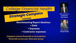
Gary Stocker demonstrates three benchmarking reports in the College Strategic Compass: debt trends and interest rate negotiation opportunities, contractor spending sorted by vendor and service type, and expense categories compared across peer institutions. The tool pulls from audited financials, IRS Form 990, and IPEDS data to help colleges identify cost savings and strategic insights.
Chapters
Hi, it's Gary Stocker with College Viability, back for another in the tutorial series on the College Strategic Compass developed by Matt Hendricks at Perspective Data Science. Today we're going to look at 3 benchmarking reports. We're going to look at debt, we're going to look at contractors, and we're going to look at expenses. So let's get right to it. So you can see that I've selected the debt benchmark on the left-hand side menu over here. And we've seen this kind of layout before. We can see our peer college. And remember, the peer college set can be defined either as statistical using an N-nearest neighbor, or you can also— individual users can also add their own peer group and alternate between those for looking at the comparisons. And we can see the mean for the group. We can see our demo college here for this particular video. And we can see where they are in total debt as compared to their peers. You can see other individual colleges listed down below. You can zoom in on that as appropriate. On the right-hand side, a different representation of the same fact, and it offers a trend, a year-by-year trend for our demo college. And we can see total debt, and for this college we can see that back in about 2016-17 they started taking on a lot more debt, started to manage it maybe a little bit in the last 3 or 4 years. As we see here, we can see the peer group interestingly has been pretty consistent over the entire 10 or 12 years of the tracking. Let's take a look also at interest expense. Interestingly, again, you know, the peer group pretty even, as you might expect. And again, our demo college is actual data for the demo college, but our demo college has had some serious increases in interest rates. There might be an opportunity to bring those down at some point in time. Let's go down and look at the plot. And we have the peer colleges for each of the years that you see down here. We can look at it total debt, which is set up right now. I can turn off the peer group so you can see our demo college where they were and their values for each of the years down below. We have total debt on the y-axis and the number of students on the x-axis for that. Let's jump over to contractor benchmarking. And we can see all of the colleges in our peer group, including our demo college, and we can scroll down to see all those colleges listed alphabetically after the peer group. We can look at different years, so we can look at all of 2023 or 2015, whatever you want. and we can look at by contractors. What I'm gonna do is I'm gonna sort this by contractor, and now we have it sorted so we can kind of scroll through and see which of the contractors have some business across the peer group. West Virginia, Westland uses Latin food, but nobody else does. Alpha Omega looks like at Wittenberg University. But anyway, you can use this to see, Aramark, you expect to be big, they're across a few universities as well. We can also sort this by the amount paid. And we can see that Wittenberg spent $20 million with Dennis Building Construction back in 2019. They built something. But all the way down, we can look at comparisons. We can see the description of the service, the general description. You expect construction amounts to be higher than anything else. And we can even scroll down toward the bottom, and we can see consultants, EAB consultants at Greensboro College, and they spent $280,000 back in 2023. So having looked at the contractors one, these are all contractors over $100,000. We look at both those over $100,000. I'll take a quick look at food contractors here in a moment. Again, same layout. We can see that our demo college is a little bit below the mean, quite a bit below the mean for using contractors. Looks like we have a data gap of a couple years here. That's either from the AI tool that we use or the college just didn't submit data for that. And we can see the peer group. Peer group is always in blue. The college being analyzed in the College Strategic Compass is always in red. Come back over here. Let's look at food service contracts. And again, You can see the comparison, you can see the averages, and you can see where our vendor is. We're gonna do a drill down on those expenses here in a second. And then here again is the plot chart. We can turn off the peers, see where our demo college is a little bit below what the peer group is. This of course is the peer group mean that you're looking at for this set of peer colleges and our demo college. Again, this demo college is one that has been actually analyzed using data from their audited financial statements from their IRS Form 990s and from their IPEDS status submissions as well. And then finally, let's go back up and look at expense benchmarking. A little bit different layout. I think we've seen this in a previous video. We're looking at functional expenses, we're looking at natural expenses, and then as appropriate, we can also look at IRS 990 expenses in millions as well. So the, the second column is actual expenses for our demo college. And total expenses were $47 million. Expected from the peer group was $44 million and change. And you can see a difference. Red is typically not good. Same kind of numbers we see on the natural expenses side. And we can go all the way down. Instruction, you know, $11.7 million. The peer group was $13.1 million, just a little bit below that. Academic support, a little bit higher than the peer group. And on and on we go. Quite a bit more on auxiliary enterprises. It gives a college a chance to look at these comparisons because I have contended all the time, whether it's in these tutorials or elsewhere, it's the comparisons that matter. If you're only looking at your college's data, you don't have any comparisons to look at. What are others doing? Are they doing better than me in some areas? Are they doing worse than me in some areas, my college, in some areas? This tool, this College Strategic Compass, gives you the chance to do that. Look at the national expenses, same kind of layout, salaries and wages, about $17 million. The peer group was about $16 million. You can see it's about a million, not quite a million, in difference to the negative for our peer, for our, for our demo group. Benefits, a little below. Depreciation, interesting, a little bit high, quite a bit higher than the other groups. I don't know what that would be caused by. I have to go back and look at that. Interest rates, um, quite a bit higher. Again, we saw that on a previous chart. This college probably needs to negotiate better interest rates from whoever their lenders are. Or maybe they can't. And you can see the other classifications as well. When we look at this allocation, again, it's year by year. And what I like to do on this is just kind of— this is our demo college is in the orange, the red is these is our peer group, and we can see the overlap here as well. So these are the categories: research, academic support, just a different view. And I like to look at different years, and you see the pattern typically doesn't change much. As I click through some different year options here, when it does change a lot, that's something to take a look at. By classification, let's look at this two different ways. Let's look at, look at it per student value. I'm going to turn all of them off except for instructions. And once they're all turned off, we can see the per student expenses for instruction for all these colleges. Gives you a quick comparison. We can turn off instruction and let's add academic support. Again, same thing. Okay, now compare that by college. Let's go from per student values to raw values. And so now we see the per student values— I'm sorry, the raw values for each of the functional expense. And it looks like we have instruction set up for this one. Same graphic, year-to-year comparison on the other side. We can look at all of these categories. Let's look at academic support. And again, we can see that our, our demo college is a little bit above the peer group. Not a big deal, I don't think. We can look at that in the raw value, and again, interestingly, it's, it's quite a bit higher. That would be something to look at in more detail. Go back to Peer Studio and look at a couple other areas. Let's go down here and look at interest rates. Again, we saw this before. Interest rates skyrocketed back in about 2018, 2019 for our demo college. Might be an opportunity for them to negotiate better interest rates with their, with their lending institutions. And you can look at all of these as well— advertising and promo. Looks like our peer group is spending a little bit more on that, quite a bit more on that than our demo group. There's a per-student value. We can of course look at it at a raw value as well. So how do you use the College Strategic Compass? You use it as a comparison tool. You compare it to your statistical peer group, and we can explain exactly where that peer group comes from. You can create your own more proximate peer group, but the essence of this tool is the capacity to compare your college, your institution, to what others are doing across all of the fields, all the reports I've showed you already, and the ones I will show you with the coming set of demos as we look at things like revenue, apps, enrollment, and things like that. College Strategic Compass developed by Perspective Data Science and Matt Hendricks, who is the founder of that organization. For College Viability, I'm Gary Stocker. Thanks for listening. We'll be back with more in this series of tutorials on how to use the College Strategic Compass.