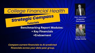
Gary Stocker demonstrates College Viability's Financial Health Strategic Compass, a tool that compares colleges on cash reserves, investments, endowment size, and payout rates against peer institutions. The app helps identify which schools are financially strong or struggling, and can guide decisions about partnerships or consolidation to prevent closure.
Chapters
Hi, it's Gary Stocker with College Viability, back for one in a series of tutorials on the college, on the College Financial Health Strategic Compass. And we're using a college that we set up to demo this application, and we'll have a series of 8 or 10 different tutorials that show functionality which is similar but different reports that can be used in different ways to to assess an individual college's overall financial position as it relates to its own set of peer groups or a statistically derived set of peer groups that I talked about in a previous tutorial. Today we're gonna focus on key financials and ratios and endowment benchmarking. And the software is the software. When we're done with this, if you're intrigued and you would like to see more of a one-on-one demo, drop me a note. I'll make sure to include the contact information in the show notes and we can set up a one-on-one demo for you to ask more questions and dive more deeply into what this strategic compass might look like for your college. So key financials and ratios. And let's take this— start on the top, take a look at cash and cash equivalents. And this is our peer group. As you'll briefly recall, we can select our own peer groups, self-reported. We can do just the statistically determined ones, or I'm going to keep all of them for right now. So we're going to keep all this— all the peer groups, both statistical and approximate. And you can see our demo college is shown in here and the mean for the set of peer groups and the names of the peer groups are all down there. You can zoom in on that if you'd like to, to get a little bit bigger, better handle on what colleges are included. And then really the other graphics, the other visualizations can be used for the same thing. So I've got cash and cash equivalents here, cash and cash equivalents there, and again you can see the Peer group is in the blue always, and you can put on individual data points to see what that peer group value is. And you can see what our demo college is in conjunction with the peers. The bottom one, again, similar pattern. I'll go back to the top item, cash and cash equivalents. And what we can do on this is we can turn off the peer group, right? This is based on the cash at the end of the year, and this is the enrollment, full-time equivalent enrollment for the students in the peer group. And I can turn off the peers So this is our demo college. So at about 550-ish, 500, 600 students, um, their cash— each bullet point shows you what it was. It was $5.1 million here, it was $3.3 million there, and on and on it goes. And then turn the peer group back on to see what it looks like. Now if you want a better handle, I'm going to show you a trick here. Let's go back to the school filter. Let's just look at the self-reported peers. Let's go back and look at that same one. So now let me turn off that smaller sample. There's our college, there's our demo college, and then this is, oops, and then this is all the peers that this college chose as its peer group. And again, you can make your own assessments on this. The values are all plotted. You can see the name of the college, the value, and the year, all that kind of stuff. How can you use this? You can use this kind of data to compare yourself to others in all these different categories. For example, Let's take a look at investments. I'm going to do it all the way across just so we can quickly go through the set. And there's investments all the way across. Okay, we can see Allegheny College is way above this group in terms of investments, but all the other data that suggests Allegheny College is part of this peer group is associated with enrollment and a lot of other factors that we talked in a previous— talked about in a previous video, in a previous tutorial video. And again, we can see the peer group The investments are much higher than our demo college. If you're that demo college, you can ask yourself, how can I change that? How can I make that better? You may want to look at, are there colleges in this group? Allegheny College, Washington and Jefferson, Westminster, Pennsylvania. Maybe there's some partnership opportunities because they have some assets available that this demo college does not have. And then again, the same thing. Let's turn off the peer. There's our demo group. And it's above the run line, the median line. For its size. Turn the peer group back on, and again we can see comparisons. Let's look out here, and are these colleges having trouble? Probably, because they're way below the average. Are these colleges doing well? In this case, yes, because of the, of the term, because of the measure that we're using, which is Investments. And let's look at one more field here. Let's look at the percent change in total operating revenue. Let's Let's turn on the entire filter set here. Get all of 'em out there. And we can see the colleges that we're looking at. Total changes, we can see some have done quite well. Looks like Bacone, that can't be right. Bacone College has closed. That's probably just a data error. Change in total operating revenue, we again see that our demo college has some issues. And let's go down. To this visualization. And again, we'll turn off the peer. You can see that in this case, change in total operating revenue is low, low, low year after year after year. Let's bring the peers back. And again, you can see the clustering around that line, which you would expect. And you can make the decision, is this the kind of data that I want to have from my college as we look at its comparison to others and even the financial health and viability of my college? Let's take a minute there and move on to endowment benchmarking. You're going to see the same visualizations that we saw before, and I'll quickly go over those with different fields. We'll leave the endowment trust, the endowment and funds held in trust, and again, there's the median for the peer group. We could change that to just the approximate ones if we wanted to, the demo college selected. You can see our college is pretty close to the mean on endowments, but in terms of endowment funds compared to the overall mean, You know, it was $50 million in 2020, and for our college it was $47 million. Is that, is that materially significant? That's not my decision to make, but it's one of the way— one of the ways you can use the strategic compass to determine a couple things right off the top. Is, is my college financially healthy enough to survive? And if so, are some of these other colleges strong enough that I should engage in conversations with them about consolidating our services, consolidating our academics, consolidating our operations so that I don't necessarily have to look at closing my college. Go down here, we'll take a look again at the endowment and trust funds held. And for 600 students, you know, our college, our demo college is above the run line. Turn the peer back on. And again, you can get a better feel for that is for all these colleges. Who is this? Randolph College. Yeah, Randolph College in the same area. Probably doing well in that kind of group. Is there an opportunity for consolidation in some form or fashion? One of the many things the Strategic Compass can do for colleges, looking at the data. Let's take a look at one other item. I want to look out— look at endowment payout. Endowment draw is what it's typically called. Let's go for all three fields here. So we can see, as the number showing, it's in the middle, it's a percent. So 4% at our demo college, and others are right around that 5-ish to 6% mark. These are some pretty high draws here, um, not necessarily a good situation. And again, you can see in this case, looking at our, our demo college, that it's— in terms of drawing against its endowment, it's doing all right compared to competitors, you know. But down here at 2 or 3%, is it because the endowment is so low? It's at— I think it's around $40 million, as I recall. Um, and is that a bad draw? Well, 5%, not so much. Up here, when our demo college drew 10% almost of their draw, that's a big draw against the endowment. Maybe that maybe made that endowment plummet quite a bit. There are other, there are other tools that I can show you that will show what that would look like. And then finally, our last one we'll take a look at, percent endowment payout draw, if you will. Turn off our peers, and again, we can see what our peer college is doing in regards to how it it's drawing against its endowment. So today's visualization demo of the Strategic Compass, the college financial health Strategic Compass, has been on key financial ratios and enrollment endowment benchmarking. The next two tutorials— the next tutorial will cover debt benchmarking and expense benchmarking as well. We'll get that out soon. This is Gary Stocker for College Viability. I'll give some contact information in the show notes.