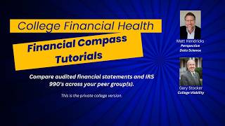
In this video, Gary Stocker of College Viability, joined by Matt Hendricks of Perspective Data Science, demonstrates two free, reporter‑focused tools that simplify analysis of private college financial health. The first tool is a web‑based visualization platform that benchmarks up to 14 financial metrics from audited statements against a median of nine recently closed colleges, allowing reporters to quickly spot red flags or strengths without digging through raw audit files. Stocker walks through the interface, showing how to select a college, hover over data points, and interpret metrics such as net income margin, operating cash‑flow margin, endowment draw percentage, and year‑over‑year changes in revenue, expenses, and endowment value. He uses Lesley University as a cautionary example—highlighting negative income, low cash flow, excessive endowment draw, and revenue decline—and contrasts it with Pace University, which displays positive margins and balanced revenue‑expense growth, illustrating a financially healthy profile. The second tool is the 2024 Private College Viability App, which provides free, downloadable IPEDS data (2015‑2022) for 181 private colleges across several states, enabling users to view eight‑year trends, identify growth or loss, and generate visualizations for reporting. Stocker emphasizes how these tools empower journalists to ask data‑backed questions of college leaders, craft more nuanced stories about institutional viability, and ultimately inform readers about which colleges are financially stable versus at risk. Contact information for further assistance is provided.
Chapters
Hi, it's Gary Stocker with College Viability. I do the weekly College Financial Health Show every Tuesday morning, 10:30 Central, live. With Matt Hendricks from Perspective Data Science. The old-fashioned and most common route for reporters to get audited financial statements or IRS Form 990s or even the messy iPads data is one still in use. This brief video, though, will show you how to use two new financial college data tools to make your reporting job, to make your reporting job easier. And both are free to reporters. The first is a data visualization tool that lets you compare up to 14 different data points from audited financial statements. There's some serious technology going on behind that. So there will be no need to wade through the Federal Audit Clearinghouse to find those statements, read them, figure out what they mean. It's all there for you in the visualization. Each visualization, each visualization includes a data comparison of recently closed colleges. So you can easily see how your story's college or colleges compare to a set of 9 recently closed colleges. I will also show you the 2024 College Viability App. You will be able to get quick and easy access to the most recently reported years of data from IPEDS. Right now it's from 2015 2022. Let's go ahead and get to the demo. So you're looking at the screen for Perspective Data Science and their private college financial benchmarking. I'm going to start off by showing the 9 colleges, 9 recently closed colleges. You can see the college names here and the year they closed here. There's a reference in every one of these visualizations to this set, the median for this set of 9 private colleges. I'm going to use two colleges as part of this example. The first is Lesley University in Maine, and you can see it here. It's struggling financially, and I'll show you why. And then I'm going to show you Pace University in New York State, which is doing much better. You can see the basic layout of the screen right here. I've selected Lesley University, and I'm going to report for you on just 9 of the 16 different comparisons, visualizations that Perspective Data Science has. Those are net income, Operating Cash Flow Margin, Percent Endowment to Expenses, Percent Change in Total Revenue, Percent Change in Total Expenses, and Percent Change in Endowment Value. There, of course, are others to use. We can talk about those at another time, but just to give you a, a feel, a perspective on how to use this data, I'll just use that set of reports. So each report has the name over here. The top graph is the Net Income Margin. The years are 2016 through 2023. And this is the actual value, the net income margin, in this case as a percentage. The red line that you see in every one of the visualizations references that set of 9 private colleges that have recently closed. So bottom line is you don't want your college to be mimicking this red line at all. And you can see in the first example, really in the first couple of examples, for Lesley University, they are way too close to mimicking what closed colleges have done. We see here in the net income margin, And we see it here on the operating cash flow margin where it's considerably below what the closed colleges have been. Now right off the top, does this mean Lesley University is going to close? Absolutely not. It doesn't mean that in any way, shape, or form. But it certainly means, and you can use this in your reporting, that Lesley University, as we look at this, has some serious issues associated with cash, effectively. I also want to point out you can put your pointer on top of each one of those data points to see what it is so that you can see in 2023, Lesley University had a net a negative net income margin of down almost 19%, a little over 18%. You can see that the closed colleges had a median value of essentially zero, negative 0.7 in 2021, and Lesley University was at about 5%. So you can compare that all the way through. The small, the large dashed line is the 25th percentile. The solid line is the 50th percentile, and the smaller dashed line is at the 75th percentile for all of the charts that you'll see. Of course, the values are different for each one of the reports. So let's look at, for Lesley University, the percent of the endowment appropriated for expenditures, sometimes called the endowment draw. You can see way, way, way out of whack. Lesley University is way, way out of whack. They are above the 75th percentile. They're taking way too much money out of their endowment for operations. You can see the closing colleges weren't even drawing that much out of their endowment. Not a good indicator for Lesley University or any college that gets out of whack. The typical draw is in the 4, 4.5, maybe 5% value range year in and year out. And as I scroll up a little bit, this is the percent change from 2016 to 2023 in the endowment value. And we can, can see the 75th, 50th, and 25th percentile. And look how low Lesley University is, even again below where those closed colleges are. Draw your own conclusions, but now you're equipped with questions you can ask these university officials and the data behind it. And if you need more guidance, feel free to reach out to me. I'll have my name and contact information as well as that, as well as that of Matt Hendricks as well, so you can reach out for more guidance on how to use these charts and graphs, these visualizations, and maybe even what kind of questions to ask the colleges with really bad numbers in particular. And then I want to look at the change, the percent change in total operating revenue. And again, from 2016 to 2023, this is the percent change. And so we can see for Lesley by clicking on that dot, it's down 19%. So the total operating revenue is down 19%. Closed colleges was down not quite that much, essentially the same thing though. And you can see how far below they are below the 75th, 50th, and 25th percentile. But I always like to match, and something you can do, they're down 19% on revenue. Look at expenses, they're essentially flat. They're down 1%. So this puts you in a position to say, hey, you're so far off on revenue match to expense match, what kind of layoffs are we looking for? What kind of cutbacks are we looking for? This gives you some concrete numbers to use in asking questions of these college leaders. So I've changed the college to Pace University, one that's doing well. And we recently reviewed Pace University on the College Financial Health Show. I've got the net income margin, and you can see it is strong, positive about 5%, above zero more years than not in a tough market. You can see the cash flow again is positive, way, way above what the closed colleges are. And then when we look at total operating revenue, it is up about 17 points, 17 percentage points, and expenses up about 16 points. So a nice match, revenues up a little bit more than expenses. This is what— this is the profile of what a financially strong college can look like. There are, of course, many other issues, but this visualization, these comparisons give you the chance to compare strong colleges, and they are out there, with those that are not so strong. And then just a quick show and tell on the 2024 Private College Viability App. This is one for executive analysis. This is the one that I'll make free to reporters. It normally costs colleges $1,500 to access this version or the public college equivalent. And you can see I selected some colleges, private colleges from Pennsylvania, Ohio, Iowa, and other places. And there were 181 colleges I selected. I've got data, IPEDS data from 2015 to 2022. We've done some calculations. So we can click on the 8-year change and see which colleges have grown. And from those tests, from that set of colleges in those states, we can see which ones have grown. Great, congratulations. We can click on that again and flip it the other way, and we can see which of those colleges, and there are many, who have serious actual losses and the percent losses as well. And if you're looking for visualizations, This is a little bit ugly because there's a lot of colleges. This is a way you can get the visualizations for use in your reporting as well. And then all the data that's available, you know, I'll just pause here. You can look at all the data points that are available to compare the last 8 years' worth of data. And if you need guidance on any of these fields on any of those reports, again, they all come from the IPEDS data that colleges have submitted themselves to the National Center for Education Statistics. Reach out to me and I'll give you that email address. It's gary@nces.ed.gov. At collegeviability.com. So what does this all mean for you and your work reporting on the financial health and even viability of colleges? Colleges are spinning stories. You know that, I know that, and there's nothing wrong with that. But now you have access to resources that can lead you to better questions and even better reporting, I would argue, in your regions. These questions can help inform your readers about which colleges are financially strong— and there are many— and which are riskier to choose— and there are many more of those as well. Let me offer a perspective. Many, many more colleges will close. There are just too many colleges and not enough students willing to pay to go to those colleges. And almost all of the at-risk colleges are small. And many are in non-urban areas of the country. Use the data from these free financial tools to help you inform your readers about the financial health and viability of colleges. As needed, consider me a resource. My name is Gary Stocker with College Viability.