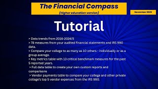
Gary Stocker demonstrates Financial Compass, a $219 app that lets college leaders benchmark their school's finances against peers. Compare net income margin, student revenues, and vendor spending across up to ten similar institutions using data from audited statements and IRS filings.
Chapters
This is Gary Stocker with College Viability. This tutorial will share the updated functionality of the Financial Compass, the higher education version. This brief tutorial will show how to use the app and provide some of the use cases for the Financial Compass. It is reset to $219, a much lower price point that will make the app available to a wide audience of college leaders, trustees, faculty, staff, students, and their families. Let's start out by looking at the layout of the screen. And this is the Financial Compass, the higher education version. Webster University is our focal school, focal college that we're gonna study. And we can list up to 10 other colleges. I'll show you how that works in a second. You can see I've listed a benchmarking graph. And in here we have 71 different reports, 71 different fields you can take a look at. And you can look at different combinations of displays, and I'll talk about that here in a minute. And the basic layout is our target college. This happens to be Webster University here in Missouri. And then the 25th percentile of all private colleges, the 50th percentile or median of all private colleges, and the 75th percentile of all private colleges. So let's look at how we can compare different colleges. Here's a set of colleges we have set up. There's our first college and there's 3 comparison colleges. I've got those turned off to start with. We can actually turn those on. Here's college number 2. and it shows up in the dashed line that reference here. We can turn that off or on. You can see how that shows up. Turn that off. We can look at another university. Turn that off. We can look at a fourth university. And you can see how you turn it off and on provides some guidance. And we can turn them all on. As you can see, it gets pretty messy pretty quickly. But one of the things that we can do is we can display the national percentiles or turn that off. It's a little less cluttered. Let's turn that back on. Let's turn off the display for each selected College, and let's just look at the group average for those 3 colleges that we showed right here. So this is where you would choose your peer set, and it can be up to 10. And what we're looking at here is the average for the net income margin for that peer set. And we can look at another measure, and there's unrestricted investment income, there is our target college Webster University, and there our comparison group. So now I've changed the report, the field to look at is net student revenues, and and that's a combination of net tuition revenue and auxiliary revenue in millions of dollars. We can look at the raw value, and our target college had $175 million in 2016, and that value was $129 million almost in 2024. We can look at different views on that. Let's take a look at the per student, and we can see that on average, the per— in 2024, that value was $20,000 almost $500. We can see the percent change, and this gives us a standardized comparison. And again, we have the 25th, 50th, and 75th percentiles, and we can see that our target college has struggled with net tuition revenue and auxiliary revenue over the last 9 reported years. And then finally, another standardized measure, same target college, 25th, 50th, 75th percentile, and we can see that based on their per $1 million in operating revenue, this college compares favorably with most other private colleges in the country. The next table is a set of key metrics for our target university. These are fields from audited financial statements for the most part, and there is some use of 990 data from the IRS and some use of IPEDS data as well on these fields and others throughout the app. We can see the name of the factor, we can see data for fiscal year 2020 all the way through 2024, we can see the mean value for that 5 years and the percent change. So a quick look for our target university. This could be your university. And in a heartbeat, you can look at a 5-year trend of good or bad for these kinds of measures, these kinds of metrics for your organization. I will note that the functions you see here, the buttons for download the graph data, there will be the opportunity to download that with a more comprehensive version of the application. And more information on that will come in the coming weeks. Next, we're gonna look at the full data table. And from here, we can do a lot of filtering and sorting based on our needs. And here again, I'll— here's 71 reports. Available. They typically are matched up to what you would see on a financial statement, IRS 990 forms, and other data sources as well. I have set this one up to be all of Missouri colleges, and there's an easy way to do that. And I've set it up for just the year 2024. I've done it here, and by default brings up students. Then I've added my own reports, my own fields for net income margin, net student revenues. Make sure that's part of the app as well. In addition, we can sort this by school type and see the different types We can sort this by any of the fields up there just by clicking on the header. The last table in the Financial Compass app is vendor payments. This is from the years 2016 to 2024, and it pulls the top 5 expense items as referenced on the IRS Form 990s. I brought up one college, Westminster College in Missouri. You can sort this any way that you would like. It provides capacity for years. I've got all the years on there. A number of students comes up as always, and I can sort this by vendor. I can sort this by description. I can look at the amount available. Now, in general, what we're looking at is the darker the color, the more of an outlier a value is. For, for example, in 2021, the EAB Consulting Services at Westminster College was way above what would normally be expected for private colleges throughout the country, more than a standard deviation or half the standard deviation above what is normally expected. So the darker the color, the more of an outlier a value is. And in many cases, The values are just what you would expect based on no color, based on no color reference at all. And finally, as an ease of use function, the audited financial statements for each of these years is quickly referenced in the bottom of that. You can click on any of these links and it will take you to the financial statement for your target college, in this case Webster University.