How to add Up/Down as a visual in your table | MS Excel | Ira Edu-Tech | #shorts
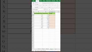
In this short Hindi tutorial, the presenter explains how to create an up/down visual cue in an Excel table to show price trends. The workflow starts with having two columns – Purchase Price and Last Price. A custom function (using an IF statement) is written to compare the two values, returning TRUE when the last price is greater than the purchase price (indicating an upward trend) and FALSE otherwise. Based on the Boolean result, a button’s appearance is changed: if the condition is true, the button is set to display an upward arrow; if false, a downward arrow is shown. The speaker walks through writing the conditional formula, inserting the button, and linking the button’s visibility or icon to the formula’s outcome, demonstrating the complete setup for a dynamic trend indicator in the spreadsheet.
Chapters
More from Deven

Our bodies are at work, but our souls are already on the garba floor💃✨️ #iraskills #navratrispecial


One Formula. 🔥Unique Brands #ExcelTips #ExcelTricks #DataAnalysis #iraskills #explore

Comment "Google" to get all these Free Al Tools by Google.🔥#iraskills #google #explorepage #upskill