I Tried Data Visualization for 30 Days Here's What Happened

13 Jan 2025 · 0 min

0:07

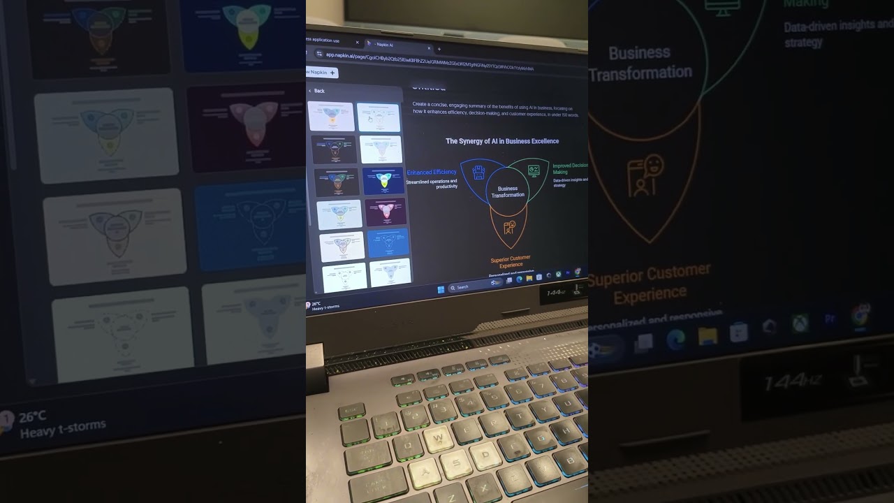
Data visualization turns raw numbers into patterns you can actually see. The hosts spent 30 days testing it and found that graphs let you spot trends like sales spikes instantly, making complex data simple to understand.

More from Deven

0:38
youtube.com

One Formula. 🔥Unique Brands #ExcelTips #ExcelTricks #DataAnalysis #iraskills #explore

1mo ago
0:57
youtube.com

Comment "Google" to get all these Free Al Tools by Google.🔥#iraskills #google #explorepage #upskill

1mo ago
0:48
youtube.com

ChatGPT, Claude ya Gemini? 😳 AI Expert ne pick kiya sirf EK tool…

3mo ago
0:49
youtube.com

Stop Googling. Use This AI Instead

3mo ago
0:29
youtube.com

Comment "Link"

3mo ago
youtube.com

AI Audit Consultant: Small Businesses Ka Time & Paisa Bachao, Client Paao

3mo ago
youtube.com

AI Se Better Output Chahiye? Prompt Mein Yeh 3 Cheezein Add Karo

4mo ago
youtube.com

Have you tried this feature of Notebook LM???

4mo ago
youtube.com

Tag 😂

4mo ago
youtube.com

Bad Vs Good Vs Great Al tools in 2026

4mo ago
youtube.com

Who’s still making slides manually? 👀

4mo ago
See all content