In this video, Igor Ivitskiy explains why the conversion numbers shown in Google Ads often differ from a business’s actual sales. He demonstrates, using a two‑campaign example (a broad prospecting campaign and a branded‑search campaign), that Google’s dashboard mixes observed conversions with modeled (estimated) conversions. The prospecting campaign has a high proportion of modeled conversions, inflating its reported performance and causing automated bidding systems to shift budget toward it, even though its real cost per customer is higher. Ivitskiy shows that this bias compounds over time, especially when mixing campaign types with different visibility. He shares a practical fix: calibrate each campaign’s reported conversions against real leads/orders from the advertiser’s own system to compute a calibration factor (real ÷ reported) and use these calibrated figures for budgeting decisions. He notes that the issue is most severe when mixing high‑visibility (branded) and low‑visibility (prospecting) campaigns, and cites forensic analysis of over $770 million in ad spend that confirms the pattern.
Chapters
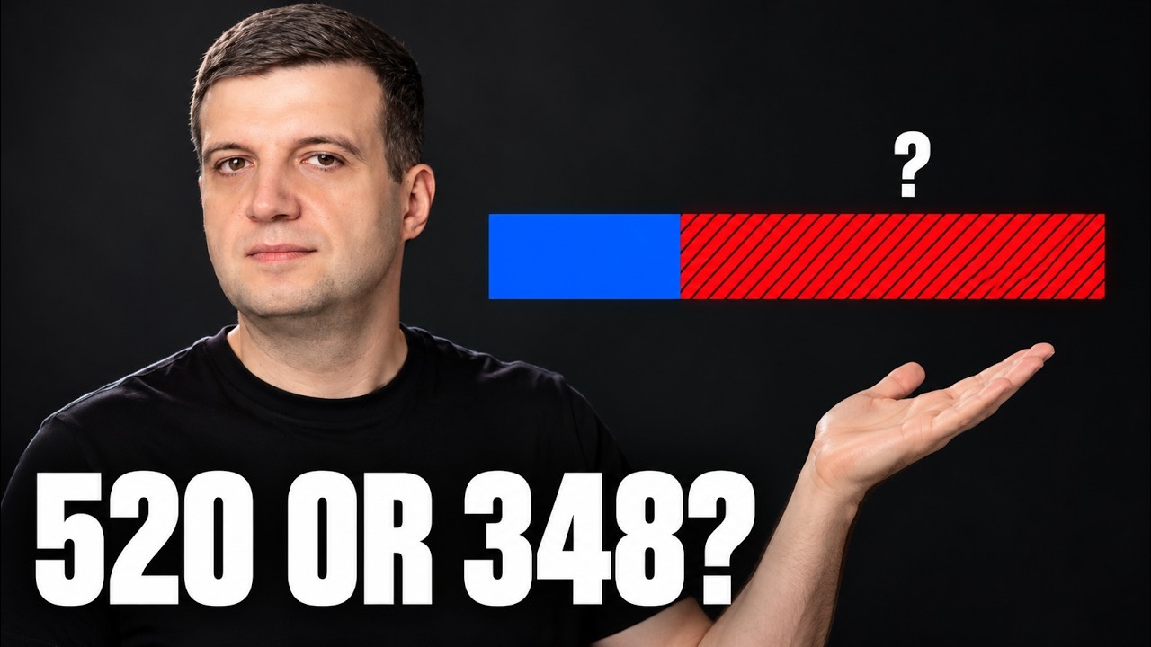
Your Google Ads account says you got 520 conversions last month. Your own records say something smaller. Most people assume that gap is a tracking bug and they go hunting for a broken tag. In the next few minutes, I'll show you why both numbers can be correct at the same time and why the gap is not random. It quietly moves your budget toward your worst campaign. Here is how those numbers Come apart. Here's the situation on screen. 2 campaigns, $50,000 of spend each. Campaign A is broad prospecting. It reports 520 conversions at $96 each. Campaign B is branded search, 500 conversions at $100 each. Look at that as a manager for 2 seconds. A delivers more conversions, and each one costs $4 less. A wins! Any human and every automated bidding system moves money toward A. Now, the belief underneath that decision. Most owners think a conversion in the dashboard is a customer. One line, one person, one sale. And it feels obviously true because that's how the number is presented. 520. Not about 500. Not roughly 500. 520. Printed with the same confidence as your bank balance. Here's what's actually inside it. Every conversion count you see is 2 things added together: the conversions the platform actually observed— someone clicked, came back, bought, and the whole chain was visible— and the conversions it could not observe. So, it estimated them. Different browsers, different devices, privacy settings, a long gap between click and purchase. The platform models those, and it has to. That part is not a scandal. If nobody estimated the unobserved sales, every channel with poor visibility would look worse than it is, and you would underfund things that actually work. The problem is that the 2 numbers are printed in the same font. Look at the bars. In Campaign A, 208 conversions were observed and 312 were modeled. 60% of that number is an estimate. In Campaign B, Branded Search, where somebody types your company name and buys, 450 were observed and only 50 were modeled. Same dashboard. Same styling, completely different amounts of guessing. So, now let's ask the only question that matters. What did the customer list say? Look at this screen. Campaign B, about 495 real conversions. Against 500 reported. Close. The model was roughly right. Because there wasn't much to model. Campaign A about 348 real conversions against 520 reported. The estimate overcredited by 172. Run the cost per customer again with those numbers. Campaign A costs $144 per real customer. Campaign B costs $101. So on the dashboard, A beats B. B by $4. In reality, A costs $43 more. So, every dollar the system moved from B to A bought a $144 customer instead of a $101 one. And reported that as an improvement. And here's why this compounds instead of averaging out. The estimate has the most room to be wrong exactly where the platform sees the least. So budget flows towards the campaigns with the weakest visibility, which are the campaigns whose numbers are most modeled, which then report even better. I've done forensics on over $770 million in ad spend. This is the pattern that makes an account look better every month while the business feels flat. If your dashboard and your profit and loss Have been telling different stories. This is usually where it starts. So, what do you actually do? Not distrust the platform. That's useless. Calibrate it. Here is the check. It's on the screen. Take last month. For each campaign, count the real leads or orders in your own system. The one that pays you for the same period. Divide your number by the reported number. That ratio is your calibration factor. Do it campaign by campaign because the whole point is that it will not be the same everywhere. Where the ratio is worst, that campaign's reporting is the most muddled, and that's where your budget is quietly going. Then use the calibrated numbers to compare campaigns, not the raw ones. That's it. One afternoon and a spreadsheet, no data team involved. One honest limit before you run off and do this. If every campaign in your account is the same time, all branded search, say, then the estimate is inflating everything by about the same amount. Your absolute numbers are wrong, but the comparison between campaigns still holds. This problem bites specifically when you mix campaign types with very different visibility, which is most account running Brands+ Prospecting. The full 2-campaign case is on LinkedIn, link below. Subscribe, and the next time your dashboard and your bank account disagree, you will know which one is guessing.