In this video, James Helliwell critiques Bank of America’s recent bear‑market warning, which claims that 70% of the bank’s proprietary indicators signal an upcoming downturn. He explains that the warning is based on standard macro metrics such as consumer confidence and credit conditions, but stresses that the bank’s model is just one perspective. Helliwell then contrasts the BofA signal with his own regime‑based framework, which categorises the market into expansion, slowdown, and contraction phases. Using back‑tested data from 2006 onward, he shows his model would have delivered roughly 6% higher compound annual returns and reduced drawdowns versus a plain S&P 500 hold. He visualises sector, country, and asset‑class rotations through quadrant maps, highlighting that tech has moved from a leading to a weakening position while healthcare remains strong, emerging markets are losing ground as the US dollar strengthens, and the UK may be poised for a modest recovery. Factor‑level analysis reveals a shift from high‑beta, growth‑oriented stocks toward low‑volatility, dividend‑yielding, and value stocks, reflecting expectations of higher rates and inflation. Throughout, Helliwell advises investors not to panic‑sell but to stay invested by tracking where professional money is rotating, using the proprietary tools he demonstrates (with a free‑trial link). He promises a follow‑up video on stock‑selection within the identified sectors and regions.
Chapters
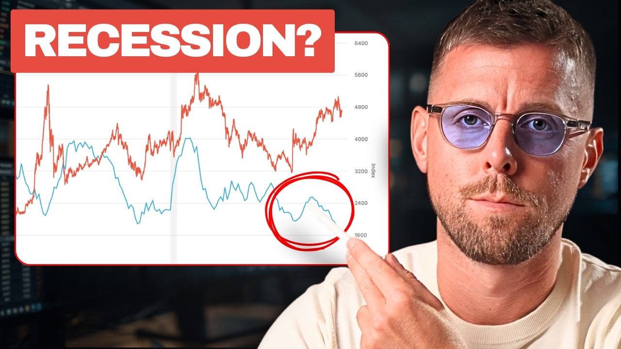
Bank of America just told their clients to take profits with 70% of their indicators warning that we're entering a bear market. But selling now could be a mistake because beyond the headline, the report actually tells a different story. And after 15 years of investing, managing 8-figure funds along the way, I know that the first move is usually going to end up being the wrong move. So in this video, I'll show you exactly what the report said and just as importantly, what it didn't. And how to stay invested without panic selling or holding on to the stuff that's about to get hit. But first, we need some context here. This warning didn't come on CNBC as some hot take. It was based on a set of indicators that their quants have used to flag previous bear markets. Now, the exact details the bank's keeping proprietary, but we're talking things like consumer confidence, credit conditions growth, nothing really out of the ordinary. But having gone from just a handful of these flashing back in the spring, now 7 out of 10 of these bear market signposts, as they call them, are in the red. And historically, that's what you see right before the market rolls over. But this is just one bank's model, and even if it's been right before, it could be early, it could be wrong, or they could just be talking the book this time. So before any of you panic sell, let me show you how it lines up with my own model and the track record that gave me as a pro. So consider these the regimes that the market goes in. We have expansion, slowdown, and then contraction on the right-hand side. And you can see that currently we are still in expansion. And the green highlights show you the points in time where we were also in the same regime. And generally speaking, the market has risen with an average return over the next 3 months of around 3%. So until or unless we switch into slowdown, this suggests remaining not only in the market, but also in the pro-cyclical or more growth-oriented sectors. Now you might be wondering, well, James, all well and good, but this is the quant team that you're going up against. Well, I've done my fair share of macroeconomic research and backtesting and I built a few models in my time whilst running funds, and this was one of them. So clicking into the backtest tab, you can actually see the edge by looking at the regimes would have delivered about 6% greater compound annual return every single year going back to 2006. Just as importantly, it reduced drawdowns significantly compared to otherwise just owning the S&P, for example, and not giving a flying filly about what the regime was saying. Now, of course, you won't know it's the top until the market's already fallen, but historically, that's unlikely to happen for as long as we're in expansion, just as the numbers have shown you there. And whilst Bank of America could be right, they're the only one of the major banks saying sell, and my model just doesn't agree with them, at least not yet. And there's something else in here that's also getting buried by the headline, and this is where I think the guys have nailed it. If you read past the first line, the analysts still see upside, but it's not in the one area that's been going up. It was never sell stocks, but rather take profits and put the money to work elsewhere. But where exactly is still a mystery, because retail investors like us can't see what hedge funds are buying, at least not in advance. And by the time the next analyst report's making the headlines, the opportunity's already gone. So let me show you something else that I've built to see what the pros are rotating into without needing to see the order book. So what we're looking at is a map of the S&P 500 sectors compared to the performance of the broader market, the S&P itself. It's split into 4 quadrants, so just think of these as corners. In the top right, that's leading, so these are the sectors that are beating the market. In the bottom left, you're on the complete opposite, and these are the sectors that are lagging behind the market. And the idea is that this will cycle round a little bit like a clock from leading to weakening before ending up lagging behind the market. So let's take a look at what the bank was saying about tech. We've been up in the leading quadrant, not surprisingly, for a number of weeks, but in fact just this week we've crossed into weakening. This is definitely aligned with the warning bell that Bank of America have been ringing here. In terms of where the money might be rotating towards, healthcare is the only other sector in the leading quadrant. So if you pull up a chart on, say, TradingView, a pickup notably in the last couple of weeks. But there's something more in this. If we look at a couple of the other sectors that might potentially be turning around here, It seems as though these sectors and this entire rotation is expecting higher rates. And this, of course, has been driven by inflation now hitting, I think, a 3-year high. And that, I think, is the reason why we're also seeing higher rate expectations and that rotation underway in the sectors that generally fare better when interest rates go up. So the tech leadership's been questioned exactly as Bank of America was saying, and that money seems to be shifting into things like healthcare, albeit it might still be too early for the likes of financials and utilities, with them yet to cross over into the leadership quadrant. And remember that in trading, being early is often the same thing as being wrong. So where do we invest right now? So at the top we've got a bunch of different tabs, and in this case I'm going to look into countries to begin with. If we take emerging markets, for example, compared to EFA, which is the developed markets excluding the US ETF. We can see here that there is another one of those rotations taking place very clearly out of emerging markets, which is another one of the higher beta, riskier, racier bets that tends to be correlated. So in other words, perform well when tech is also going up and growth is going up. How about getting out of emerging markets compared to the ETF that we've just seen, the MSCI World excluding the US? It appears as though we might be setting up for a correction in the recent outperformance of emerging markets versus developed markets. Again, going back to my experience of trading global macro, we need to look at the dollar because the dollar tends to weigh on emerging markets. So if it's going up, emerging markets are likely to be under pressure. And it appears to have been basing out. This was catching a falling knife, but now the knife, having shaken around, has kind of been settled on the floor, so to speak. And it could be that the risk here is actually to the upside in the dollar in the near term, and that will put further downward pressure on emerging markets, or EEM. So this rally could potentially be capped. Now returning to the map, what else do we see here? The UK appears to be cycling round. It's just about to cross into improving. I'd love to see the UK make a comeback and end up leading the world once again. I'm not sure that's going to happen, but this could be an interesting one to have on here. And if we're more selective about which countries or regions within emerging markets that we want to be away from. Taiwan is one of the outliers that has been leading for a number of weeks, I think a number of months, given its exposure to Taiwan Semiconductors and the tech trade. But now too is turning down, and just like the tech sector is crossing from leadership into weakening. And this could be a big, beautiful rotation, not to get too Trumpian about it, where we're getting out of tech, we're getting out of emerging markets, and specifically Taiwan, and perhaps looking at developed markets outside of the US and at countries such as the UK. So if we pull up a chart, let's take a look at the FTSE, and we do see some consolidation here, but usually that sets up a continuation of the trend, and the FTSE has otherwise been a very strong performer, I believe amongst some of the best performing markets last year. So I wouldn't write this off. But we don't even have to remain in equities. We can return to the map here and take a look at the asset level rotations between stocks, bonds, anything on here. And what we can see is that indeed the US dollar is actually really turning up now. This is compared to a benchmark, and in this case the S&P 500. Now on the other side of that, once again we have emerging markets. So just think of that trade and what I explained earlier about a strong dollar hurting emerging markets. This is a completely logical rotation, and it reads to me, just as we saw with the US sector rotation, like we're going to see higher rates based on higher expected inflation. And you can see this in the factors too, a rotation out of high beta, so high-risk stocks, and into low volatility and the safety of dividend income strategies. So the complete opposites— out of risk and into safety. If we look at a chart on TradingView, let's take my old favorite, high beta to low volatility. These two were involved in that rotation. Here we can see the correction, and perhaps the other would be to look at momentum versus dividends, for example. It's a similar picture here. But I think the clearest one here is this. It's simply value versus growth. You can see the rotation so clearly. Growth had been leading up until a week ago, and on the opposite side, we've seen an equal move with value jumping from lagging straight into leadership. So value versus growth, all the hallmarks of reflation. And higher rates. So rather than the S&P, let's look at the Russell 2000 value versus the equivalent growth index. Now this chart, when you really zoom out, obviously looks a bit crazy, but a similar trend took place around the dot-com bust as money fled from tech and valuations and growth stocks in general. As this line is rising, this is value outperforming growth. I haven't really got the right annotation on there. And when this is falling, it means that growth stocks are faring better. But the key trade here is the one we saw just after the pandemic when inflation came roaring back and the Fed began to hike rates at the fastest pace in 40 years. So Was Bank of America right to sound the alarm on tech? I think they probably were. But the answer was never to panic sell and to remain in cash because as long as you can see where the money's moving, you can stay invested. And the tools that you've just seen do exactly that. And there's a link below if you want to check them out. I won't labor the point, but you can also get a 7-day free trial there. But knowing where the money's going is only the half of it because picking the wrong stock, even in the right sector, could still see you lose out. So watch this video next where I'll show you exactly what to look for to find the best ideas in any sector or region if you're ready to look beyond the S&P.