In this 30‑minute presentation, former professional trader James Helliwell argues that the $100 trillion global bond market underpins mortgages, jobs, equities and the entire financial system, yet most investors lack a practical grasp of it. He begins with a concise primer on bonds, explaining that they are debt instruments whose yields represent risk and are inversely related to price. He shows how inflation erodes the real value of fixed‑rate debt, making longer‑tenor bonds especially sensitive to price‑level changes. Helliwell then links central‑bank base rates (using the U.S. Fed funds rate as an example) to bond yields and to the equity risk premium, illustrating why rising rates can make bonds more attractive relative to stocks. Moving from theory to application, he introduces the ISM Purchasing Managers’ Index (PMI) as a leading indicator of U.S. business‑cycle health and a proxy for inflation via its price sub‑components. He explains the 50 pivot (expansion vs contraction) and the 46 threshold that historically precedes recessions, noting that the PMI can forecast growth or disinflation roughly nine months ahead. He then translates these macro signals into concrete investment tactics: (1) value stocks tend to outperform growth when 10‑year Treasury yields rise; (2) financial sector equities outperform in a rising‑rate environment, while tech underperforms; (3) emerging‑market equities suffer when the dollar strengthens and U.S. rates climb, creating a divergence with the S&P 500. Finally, Helliwell showcases a momentum‑rotation tool that visualises sector and geographic leadership on a clock‑face diagram, allowing investors to follow the market’s rate‑driven rotation without deep‑dive analysis. He offers a free 7‑day trial for the tool and encourages viewers to apply the described lead‑indicator framework to improve portfolio returns, even if they only hold stocks.
Chapters
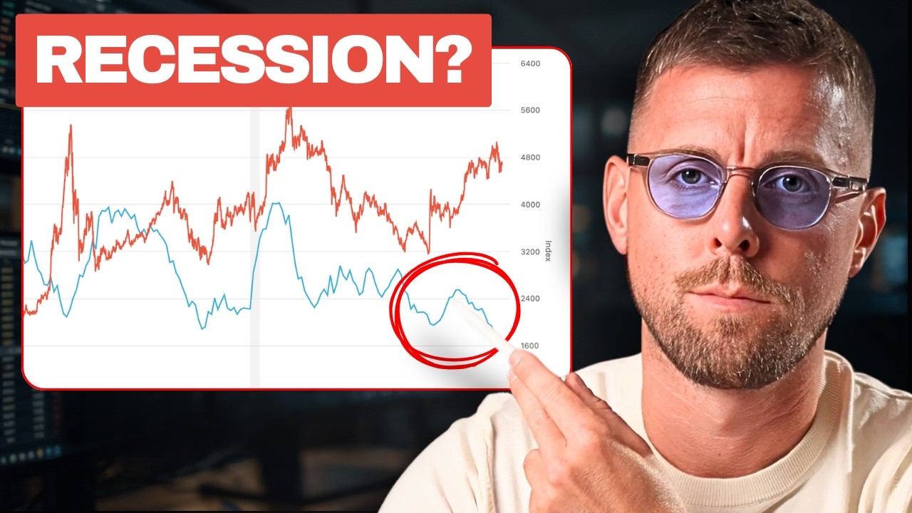
There's a market worth over $100 trillion that impacts your mortgage, your job prospects, your stock portfolio, and in fact, pretty much the entire financial system. But the reality is that a lot of people don't know how this market works, and most videos out there are just getting bogged down in theory rather than showing you how to apply this information to the real world. I'm James Helliwell. I'm a former professional trader, and in this video, I'll show you how to get better returns by understanding the bond market. The indicators that drive it, and how you can trade it even if you only invest in stocks. So let's understand first of all, what is a bond? In essence, it's debt. Governments are gonna borrow to provide welfare, and that's usually repaid on the basis of tax income. And corporations are gonna typically borrow to expand. If there is a gap between the debt that they've got to repay, and the money that they have coming in, that is where things get risky for bondholders because as debtors, they might not be able to repay. So that is represented by the rate of interest that you will receive as the bondholder for taking that risk. And that is known as the yield. This relationship between price and yield is inverse because if you, let's say, get, I don't know, a coupon of 50 cents or whatever it is, that would be a 6% annualized yield. Now, if the price changes to 200, the yield therefore has halved. So the reason the price has gone up is because the bonds are in demand, which means that investors are more confident than they were previously in that debt or in the debtor's prospects, the ability to make those repayments. So yield therefore equates to risk. That's what you need to understand. So inflation benefits debtors. So in this case, the company or the government, or if you take a personal loan out, you as the loanee, because let's say you borrow, I don't know, £100,000 or dollars today. If inflation is at 5%, the value of that debt a year from now, if you made no repayments, hypothetically, would be 5% less than it was at the point that you took out the loan. So inflation benefits debtors, and this is another one of the reasons why the elites tend to prefer debt. There's buy, borrow, die as a strategy, and it's also highly advantageous from a tax perspective. Now, on the other side of that, if I've lent you 100 grand and I'm going to get back 100 grand that is only worth 95% of that, then I've lost out. So that's a bad thing for the creditor or the bondholder. So that's the significance of inflation and the longer the tenor or the term of the bond is, the more time inflation, higher inflation, or as we're about to come onto in a minute, higher rates have to compound against us. So that's why longer tenor or longer-term bonds, let's say a 30-year government bond rather than a 10-year government bond, will be all the more sensitive to changes in either inflation or interest rates. So getting down to rates, everything is tied to the base rate. For these examples, we'll probably talk about the US. So in this case, we're looking at the Fed funds rate. Now, from 1981, was it, through till 2021, 2022, rates basically went to zero. So if the base rate at the central bank is falling and going close to zero, it should bring everything else down with it because the next safest thing looks like pretty good value if the yield doesn't change, right? So let's say a corporate bond in shares in, I don't know, Nestlé or Apple or whoever, If they're paying you 5% and the base rate went hypothetically from 3% down to zero, then all of a sudden Apple being a pretty safe bet and therefore a low-risk debtor, they look way more attractive on a relative basis than they did before. So when rates go up, the opportunity cost for, let's say, owning stocks as an alternative to the safety of bonds. Has also increased. So stocks and bonds are linked. If you take the inverse of the PE, you can work out something known as the earnings yield based on the power of a company or the market's overall earnings. If held in the same way that you're just holding a bond, say through to maturity of a 5-year, 10-year, 30 years, whatever the term is, don't get too bogged in that. But let's assume that the equity yield is 6%. And bond yields previously were at 3%. If they now change to 5%, then the so-called risk-free rate based on the principle that governments don't default and are therefore the risk-free asset for the sake of getting an extra 1%, is it really worth taking all of that additional risk in investing in stocks? Probably not. So that's why you need to pay attention to what's going on with interest rates. And in other words, bonds, yields, we can kind of use interchangeably with rates here if you are investing in stocks and really any asset. Okay, so that's the theory at least, but now we need to go onto the application. So let me now share with you some of the indicators that I've used over the years to try and anticipate the direction of bonds, of interest rates, and therefore stocks and everything else that's linked to the risk-free rate using lead indicators. The first thing that you need to know is that the market moves based on expectations. So in other words, What's already known to the market is already in the price. What we need to do is use lead economic indicators to try and anticipate where inflation will be, where growth may be, and therefore where interest rates are likely to be. And that way we can figure out bonds. Now, I know that probably sounds complicated, so let me show you some practical examples here. The first is the ISM PMI. So this is a lead indicator of the US business cycle. What you can see is that this oscillates either side of 50. If I just get a horizontal line on there, it should make it a bit clearer and we'll stick that at 50. Now, in reality, recessions don't tend to occur until or unless the ISM, this indicator, has dropped below 46. So whilst 50 is the pivot between expansion and contraction in the economy. Just because you're below 50 doesn't automatically mean that you're going to see a recession. It actually has to fall lower than that. But by the by, this lead indicator can help us to determine growth or contraction usually 9 months in advance. So if the indicator is telling us when it's well above 50, that we are seeing an acceleration in growth. Just looking a few months ahead, it's likely that the economy is improving or about to improve, and therefore there's less reason to hold the safety of bonds and more reason to consider going into stocks for that equity risk premium. That's the first thing to note. But what about inflation? The ISM is actually made up, if I pull this up now, of a bunch of different indices or subcomponents, one of which is prices. So this is measuring sensitivity within the survey relating specifically to price pressures. There are two versions of this indicator. We can combine the manufacturing prices and the non-manufacturing or services prices component. And what this is going to do is give us a proxy for inflation. Remember that this is a lead indicator. So when this is above 50, in just the same way as we looked at a moment ago with the composite, this gives us an indication whether pricing, uh, pressures are increasing or whether they're decreasing. So obviously when it's increasing, there's a likelihood of inflation, and when it's heading lower, the chances are that we could be heading towards disinflation and below 50, perhaps even deflation. So we can factor this in and therefore compare this to the bond market. So those are the two key things to know. Now we should look at a few ways that you can trade this because otherwise we're still in that trap of that's nice to know, but what the hell am I meant to do with it? You don't have to be a bond trader to express this stuff. Remember, it's all correlated. One example of this might be value versus growth. So let's overlay interest rates. We'll use 10-year government bond yields, for example. As yields rise, value should begin to outperform growth, as we can see here, for example. That's when we saw yields normalize or head higher. Quite fast. Should interest rates actually fall again, this would be a huge tailwind for, for example, tech stocks. So that's the first relationship. Value will do better when rates go up. Now, the other trade that we might look at is within a sector. So let's say financials. You can see that correlation ever so clearly. So banks, other financial stocks tend to outperform when interest rates are rising and they tend to underperform the market as rates are falling or heading lower. When it comes to geographies, we can look beyond sectors and consider the performance of, say, emerging markets. The idea here is that emerging economies will go to the World Bank, maybe to the big US institutions typically, and borrow in dollar terms. So when interest rates rise, of course, they're massive debtors. That's not a good thing. But if the dollar strengthens, it means that the amount of dollars that they have to repay, and therefore the value of that dollar loan is moving against them. So you can see the performance of, say, EEM compared to the S&P here. And a lot of this will be driven by growth prospects, but also moves in the dollar and interest rates. So if rates go up, the dollar should go up. So the two are basically the same thing. Let me just flip this one round so we'll do it the other way. So it's S&P US versus emerging markets, and you'll see that as the dollar strengthens, US stocks outperform emerging markets. So what I actually want to wrap up with is a tool that I've built that doesn't require you to get so deep into the weeds. You can instead just look at the rotations. Which are all ultimately driven by this, but we don't really need to know the reasons why when we can just follow the momentum instead. So let me show you a couple of examples from that. Now think of it like a clock. So in the top right-hand quadrant, you have the countries that are outperforming, in this case, the global equity benchmark, the MSCI World Index. Below that, Taiwan in this case, and EM equities are actually rotating into weakening. And then this should continue round in a clockwise fashion to then lagging behind the MSCI World and eventually recovering upwards through improving and beginning the cycle again where they'll eventually go into leadership. What I want to do though is bring this back to interest rates. I mentioned financials in the beginning. So when financials are outperforming, it suggests that the market expects higher interest rates. 1, 2, 3 to go. About 6 weeks ago, they were in fact lagging. Now, at the meantime, or simultaneously, tech stocks, which tend to get hit or face a headwind as interest rates rise, can see them heading in the opposite direction. So what this tells me is that the market expects higher rates and we're rotating out of tech and looking at things like financials and healthcare, for example, which are the sectors that generally perform better than the market when rates head higher. And I could pull up examples, some commodities styles. You can see a preference for income crossing over again in the last few weeks from lagging now to leading, whilst some of the steam is coming out of momentum, beta, which is just a proxy for growth, and indeed catching growth itself underperforming the market here. There's something going on here with interest rates. If you want to check out these tools, there'll be a link in the description where you can get a free trial for 7 days. You should Click up there.