This JP Morgan Chart Will Change How You Invest Forever
Former trader James Helliwell shows why average investors earn just 3.6% yearly, then walks through a three-stage market-cycle framework that predicts sector winners in each phase. His backtest model turned £10k into £90k versus £43k for buy-and-hold, with half the drawdown.
Chapters
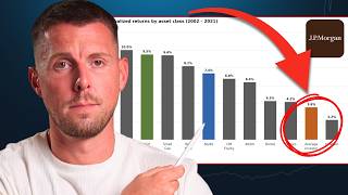
There's one chart I want to show you that I think explains more about why most people struggle with investing than almost anything else I've ever seen. This is JP Morgan's 20-year annualized returns by asset class. REITs, emerging markets, the S&P, everything is in there. And then right there at the end is the average investor earning just 3.6% per year below stocks, below bonds, and barely above inflation. They underperform consistently enough that you have to ask, why? I'm James Helliwell. I'm a former professional trader turned financial educator, and in this video I'll be sharing the system I've built to help you make sense of the markets, understand the cycle, and profit from these trends that predictably play out over many months. And to do this, we need to look at 3 things: the market cycle and its different regimes, the rotations that play out below the surface and when to move on them, and thirdly, how to bring all of this together and optimize your portfolio for inflation. Let's begin with the first of these because I'm not a maniac who begins at point 2. So here's the tool I've been building based on what we're gonna be going through in this video. The 3 stages of the market cycle: expansion, slowdown, and contraction. And you can see at the bottom of each of them, if we take expansion, how the market on average over the next 3 months has returned just short of 3%. It spent 46% of the time range here in that mode. Now the next regime, slowdown, occurs about 41% of the time, and the average forward 3-month return at that point is less, as you'd expect, but still positive at 1.3%. The third stage, contraction, which you can see highlighted here in red, is when we need to be a little bit worried about remaining in stocks. Our expected forward return goes negative at -1% on average over the next 3 months. And that happens just 12% of the time. So what does that tell us then? Well, the market isn't random. First of all, it moves in phases, and those phases are predictable enough that if you know which one you're in, you can start making better decisions and get better returns. The mistake most people make though is thinking that everything goes up in the long run and that they'll be able to hold through the inevitable slowdowns and the contractions that we've just seen along the way, which always leads to mistakes when your cognitive biases take over which lead you to overreact or freeze. But here's where it gets interesting, because knowing the macro regime is only half of it. And unless you understand this next bit, you could still be leaving serious performance on the table. See, within every regime, not everything goes up equally. Some sectors lead, others of course lag. And the difference between owning the right expression of each stage versus just buying the S&P and hoping creates this gap that compounds over time into something pretty significant. As I'm about to show you, the featured ratio here shows the sector ETF Industrials, XLI, versus the Consumer Staples ETF, XLP. And this ratio, again with the same green shading indicating when we were in expansion, shows you how industrials have tended to outperform staples by about 1% over the next 3 months. Now, in a slowdown, this is where people aren't running for the exits and betting on a recession. Was still expanding but at a slower pace. So that means that you generally want to go to companies that have more durable growth. So that might, for example, be a time to have a look at staples over other things. But here, this is where quality plays into its own. So durable companies that are capable of growing earnings throughout different market conditions, both in an expansion and slowdown, the returns have been positive. So what is the best place during contraction? Well, although the overall market might see a negative return, gold has tended to outperform, in this case, small-cap stocks by 6% over the next 3 months, which has occurred during contraction 14% of the time. And the other alternatives on the right-hand side might be things like long-term Treasury bonds. So we're talking the 30-year, which is like TLT, or alternatively just 10-year Treasuries. So the key here is to layer both the macro regime with the best possible expression within that. But there's one more variable we haven't looked at yet which could give our returns a third source of edge— inflation. And it changes everything because even in the same regime, two investors could get very different returns depending on their expression. Whether we're seeing expansion or slowdown or contraction, we need to factor this into our positioning. You can see the US CPI in orange and then the three regimes. So when there's upside risk, which has occurred about 20% of the time, the neutral position which we're currently in occurring about 25% or one quarter of the time, and then deflation, which has actually been the dominant regime over the last 20 to 25 years that this chart is representing. So to break this down a little bit more clearly, let me pull up a chart from TradingView. So the idea is that when inflation risk is increasing and the white line is rising, we should also see metals and mining companies begin to outperform the consumer. Because after all, if you own a gold mine and you're pulling gold out of the ground, then inflation's a pretty good thing for you. But on the other hand, as a consumer, when prices are rising, you're probably going to have to rein in your spending because your budget is squeezed. So that's not a good thing for consumer stocks. And there's a few more ways that you can cut this, which maybe I'll save for another video. But for example, if you're going into a slowdown and it favours going into quality stocks over anything else, the problem is that tech tends to underperform when inflation is rising. So again, you've got to think, whilst the growth in theory might be more durable, it is still at threat of inflation. So here's how I use my model to apply the 7 factors that I look for to find quality stocks, but eliminating tech. So at the top you've got the sector filter, and then we get our list of results. One of them, for example, you can see here, we get the radar chart, which basically shows the fundamental profile relative to the market. You can see shaded just inside that, or to another competitor. So this really comes into its own during a slowdown and potentially in a contraction too. So now we've got these two axes to work with, the regime and the inflation signal. And together those two things narrow our decision-making down enormously. We're no longer having to choose from thousands of ETFs and left worrying if we're holding the wrong ones. We're working from a shortlist now of what has historically led in this specific combination of conditions. But you'd be right to think this all looks good on a chart, but how do I know if it actually works in a real portfolio? So I've built a backtest here. So what you can see is, first of all, your preferred risk asset. So by default it's the S&P 500, but you could flip that over to the NASDAQ or MSCI World as you wish. You can then also choose your safe asset, whether that's the 10-year government bond ETF or the long-term bond ETF, and then your preferred slowdown weight or the target weight for your portfolio, whether that might be 60/40, 50/50, or some other combination like 80/20. Now the most important things here are the summary data below. So you can see the equity curve in orange and how that would've compared to a buy and hold strategy over the same period. So this model would've compounded at almost 9% compared to 6% for buy and hold. So 3 percentage points per year higher, which really adds up. The maximum drawdown would've been reduced by half at about 28% compared to almost 53% for buy and hold. So on the right-hand side, you've got some other stats, but the most important one is at the end with the final value of your hypothetical investment. Finishing up at over £90K compared to £43,000 for buy and hold. That's starting with £10,000 investment originally. And by all means, have a play around with this. There's, as I say, a link in the description where you can check out for free. And if you're not convinced just yet, then watch this video next, which YouTube thinks you're going to love. And if you binge watch enough of these, then you'll probably want to work with me anyway. Apparently it takes 7 hours. So lock in and I will see you on the other side.