#26 AI for Good Specialization [Course 1, Week 2, Lesson 2]
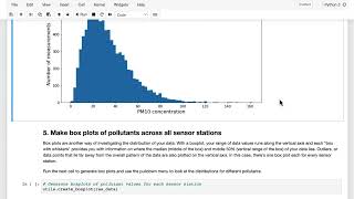
A walkthrough of data exploration for an air-quality dataset in Bogota. You'll import packages, load 160k rows, check for 10-20% missing values per column, and build histograms and scatter plots to spot outliers and skewed distributions before modeling.
Chapters
In this video, I'll walk you through the first part of the data exploration notebook for the Bugatta air quality project. Here you'll be looking at some summary statistics and visualizations about the data to get a better sense of the characteristics of the dataset itself, plus any challenges that you might face in running analyses over the set. Okay, so here we are inside the notebook. First off, here at the top of the notebook is a link to the website hosted by the city of Bogota, and you can also view this website in English. And here you can see some more details about the air quality monitoring network in Bogota, the rmcab. And this is where the data set comes from that you'll be working on in these labs. You can explore this site to see what their mapping application looks like today and get some sense of how they're using this data. You can also download any of the data if you like, by going to reports up here and then station report. Jumping back into the notebook, the first thing to do will be to run this cell to import all the necessary packages, just like we saw at the start of the previous notebook. And by importing this one called utils. Here I'm importing all the functionality that is defined in this file called utils PY that's in the same folder as your notebook. You can see what's in the utils PY file by clicking on the jupyter icon up here and opening the file. The way we've set up these labs is that for each notebook we've defined various functions here in the utils file that you will use. And if you're already a Python programmer, you might find some of this stuff useful in your own projects, both the visualization tools as well as the modeling functions. So please have a look heading back to the notebook here. We'll just run this first cell to import the packages. Then I'm going to read in the data set with this cell, and what I'm doing is reading it into a variable called raw underscore data. What I'm also doing here is printing out how many rows are contained in the data set, as well as the contents of the first five rows of data to spot check that everything was read in successfully. And you can see that this is the same data set that you were looking at in a spreadsheet previously, where you have various pollutants in different columns, as well as a station identifier and a timestamp listing the date and time. And in the following cell, this command prints out how many data points are missing from each column. And so each of these numbers will give you a sense of how much missing data there is in each column. So you should be able to see that with 15 to 30,000 missing values per column in a data set of roughly 160,000 rows, you're missing between 10 and 20% of the data across various columns. So this will be a significant issue in your analysis and recall. This means that it is likely that between 10 and 20% of the time, various sensors tended not to be able to produce a reading for one of the pollutants that they were trying to detect. Replacing missing values with an estimate will be one of the challenges that you'll tackle in the next notebook. When you run this next cell, you'll see the distribution of PM2.5 values for a particular station plotted here in a histogram. Viewing the data like this can give you a sense of the distribution of values. For example, I can see here that the PM2.5 at the USM station covers a range of around zero to probably around 70 there, with a peak at around. What's that, about five. So we have a very uneven distribution, which is skewing towards a lower value. And this is obviously a good thing. We want a Lower value of PM2.5 Most of the time. You can use these selectors here to choose a different station or different pollutant and investigate the distribution of each pollutant at each station. It's important to get a sense of what the distribution of your data looks like across different features, in this case, different pollutants and different sensor stations. In this way, you're able to familiarize yourself with the characteristics of your data set as you consider whether AI might add value to the project that you're working on. When you run this next cell, you generate another type of graph next, known as a box plot for a particular pollutant, PM2.5 in this case, and now for all the stations at once. So you'll have the station name on the X axis along the bottom here, and the PM2.5 values and ranges on the Y axis here. The way that these box plots work is that the horizontal line in the middle of each box shows that median for the distribution. And the extent of the shaded box shows the range that captures 50% of the data around the median. Or to put it another way, the second and third quartiles of the data, individual data points, are also plotted here along the vertical axis. This plot is essentially showing the same information that you're looking at in the histograms but now in a slightly different way. If you imagine you're looking down from on top of the histograms, then you can see the range of values covered along the vertical axis and get a different perspective of what the distributions look like, including the full range of the data and any outliers. So when I look at the data here, there are a couple of things that give me pause all around the data being very sparse at the higher values. So this is good for the city of Bogota and the citizens there. The the cases where PM2.5 is above 50 is pretty rare and above 100 very rare. And so while that's good for air quality, what it does mean is that we don't have that many data points to train on at the points where the air pollution is the worst. And so that tells me that I don't expect my machine learning model to be as accurate in predicting missing values or predicting the values in between stations when the pollution is potentially at its most dangerous. And as we'll come back to later in the lab, we'll talk about how inaccurate predictions when the pollution is bad, whether that's a false positive or a false negative, could potentially be more harmful for a real world application. The next cell in the notebook allows you to create scatter plots for any two pollutants and compare the distributions to one another. Now you can see that you have one pollutant along the x axis and another along the y axis. And each point shows the value of each of those two pollutants for a sensor measurement made at that particular time and station. First, we can look at PM2.5 plotted against PM10, and not surprisingly, there is a strong positive correlation between the two. I recommend that you click around and have a look at different pollutants across different stations and see which of those correlate. Get an intuition for how strongly they might correlate and also where the sum might be a negative rather than a positive correlation. Looking at individual scatter plots and histograms and other visuals like these is a really common step in what's called exploratory data analysis. So this is where you're trying to get a sense of what the characteristics of a data set is. So please join me the next video to continue your exploratory data analysis and we'll wrap up this lab on exploring air quality data.