Lauren Bateman uses an AI tool that grades YouTube thumbnails on nine metrics including clickability and curiosity gap. Her Canva thumbnail scored 88/100, then 90/100 after adding a thicker outline, question mark, and channel branding. The tool rates readability, contrast, and emotional impact to help you test what actually works.
Questions this video answers
88 out of 100.
90 out of 100.
80.
85.
Before: 95 (implied); After: 98.
Chapters
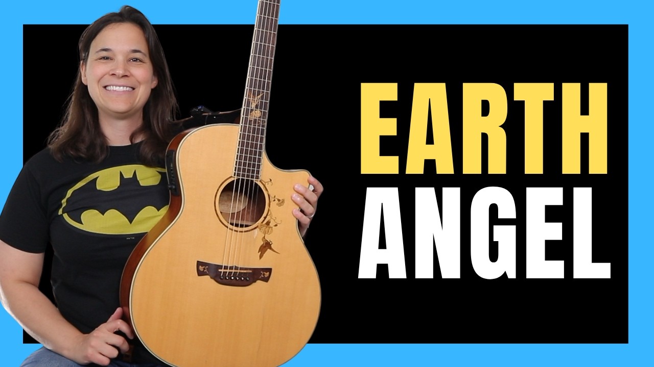
Today I'm going to put an amazing AI tool to the test and I'm going to give you access to this. We're going to see if we can use this to create the ultimate thumbnail for our YouTube channel. So basically I've pulled up chat GPT and I will give you the link to this thumbnail grader. I'll put it in the link in the description below. So definitely go and check that out. Alright, so we've got the thumbnail grader and basically we're going to attach a file. The file is going to be our thumbnail. So let me pick a thumbnail. So I've uploaded a thumbnail here and it's going to ask you for your website. If you have a website, put that in. If not, you can use your YouTube channel. I am going to use my official website here that goes with my guitar teaching channel. Alright, so here we go. I've just put this in. It took about like 30, 40 seconds for it to analyze this thumbnail. And you can see it's going to give me a lot of data. Overall, it gave me an 88 out of 100. So basically got a B on this thumbnail. And you can see it's not a crazy thumbnail. This is something super simple. I made it in Canva. Okay. And I just had an image that I took at the front of the video. We removed the background, we put a color behind it and we just added some bold font and text onto the thumbnail. So you can see here it's going through a number of metrics. Clickability, visibility, standout factor, curiosity gap, color and contrast. So what do all of these mean? Is you know how clickable is the thumbnail? That's the whole point of the thumbnail is to get the click. And it's saying the thumbnail title of seven chords equals a thousand songs is intriguing and suggests valuable information, giving the viewers a strong reason to click. Adding a small graphic or visual cue related to popular songs could amplify Curiosity. So it's just keep telling what you're doing well and it's making suggestions for things that you could do better. It likes the bold red and white text. It says it stands out good against the blue blue background. A darker outline on the white text might make it pop even more. So that's a great suggestion. The concept of learning 1000 songs with just seven swords is compelling and promises a big payoff. Okay, so well done on the Curiosity gap. The focus design is talking about how many elements, so there's three Focal points on this thumbnail, it's saying my face, the text and the guitar. The guitar is kind of shoved in the corner, so I don't know if I would really consider that a main focal point. But it is there and it says it's, it's well balanced, so that's great. Something I'm noticing here that the thumbnail misses out on is the emotional impact. Okay, you can see emotion here. Emotional impact. I don't really have like this very expressive face on my thumbnails. I'm never good at doing that. I'm trying to do it more in the business channel, but it's just saying, you know, if you had something that was a little bit more exciting, it might draw people in a little bit more. The scale is good, meaning you can see my face clearly. The text is good. You can read the text. It's, it's not really, really tiny font. It's very readable. So that's good. It's the only thing I think I scored 100 on, so I'll take it. Expectation. It says the thumbnail clearly communicates what the video is about. Meeting viewers expectations accurately and there's no misleading elements. You don't want to do bait, click on thumbnails. People are going to click over, they're going to leave quickly and that's going to tell YouTube that your thumbnail really isn't delivering on the promise that you said you were going to deliver in the video. So we definitely don't want to do that. It's also saying the text is concise. We don't want tons of words on our thumbnails. It gets hard to read, so less is better. In that case, branding, alignment. It gave me an 80 because the thumbnail itself isn't really consistent with what's on my website. Now if I gave it my YouTube channel instead, it might give me a better rank. And when I upload the next video we're going to see, I'm going to actually give it my YouTube channel versus my website and see if the branding is a little bit more on point. So overall, 88 score, not bad. And then down here you're going to see a suggested prompt for a new optimized thumbnail. Again, you can take some of this stuff like, you know, small musical notes around the text to imply movement and excitement. That might help, that might distract, I don't know. That's something you would have to test. So what I'm going to do now is I'm going to take a few of those suggestions that they gave me. And I'm going to upload this to Chat GPT again. So I'm going to make the, the coloring around the font a little bit bolder. I'm going to put a question mark after the seven chords and see if that makes things a little bit more exciting. And I'm also going to run it my YouTube channel versus laurenbatement.com to see if the branding will line up a little bit better. So you can see here my clickability went up just a little bit more. The curiosity gap is much higher here. 98 versus what did I get before 95? So not that much higher, but I mean overall. So I went from an 88 to a 90, so I just got a little bit better. But maybe that little bit is what's going to help. Again, where am I losing? I'm losing on the emotion and the excitement and maybe adding some more emotion into this would be helpful. So you can see here it just made the font a little bit thicker like it suggested. I added the question mark and just kept it really, really simple. But you can see by adding in just a couple suggestions from this AI tool, I was able to get a few extra points on my thumbnail. And if I really sat down and took in count some of the other things and maybe did a new picture and made an exciting face or something, I would get higher into the 90s. But you can see how this a valuable tool because it's going to tell you what you're doing well and where you can make improvements. And you're going to have to ab test depending on your audience and figure out what works for your channel, what doesn't. And on this, the branding went from an 80 to an 85. So I didn't get that many more extra points by using my YouTube channel. But you can see how you have to have a human element when you're analyzing some of this stuff as well. Now, if you're interested in getting even more views and more clicks on your videos, more thumbnails are not the only thing that is important. So go watch the video over there to learn the eight mistakes that you do not want to make in your video titles here on YouTube, go watch that video right now.