Don’t Miss Out On More Views! YouTube Thumbnail SECRETS
Lauren Bateman shows how to fix thumbnail mistakes like cluttered images and hard-to-read text. She walks through bold, high-contrast designs that actually work, and how to use TubeBuddy to test which thumbnails get more clicks.
Chapters
We all know that content is King on YouTube, but if you're missing out on this one skill, nobody's going to be watching your content, period.
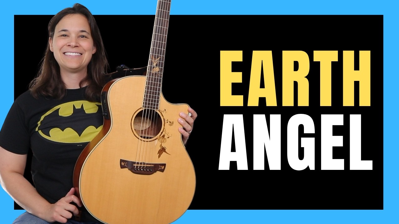
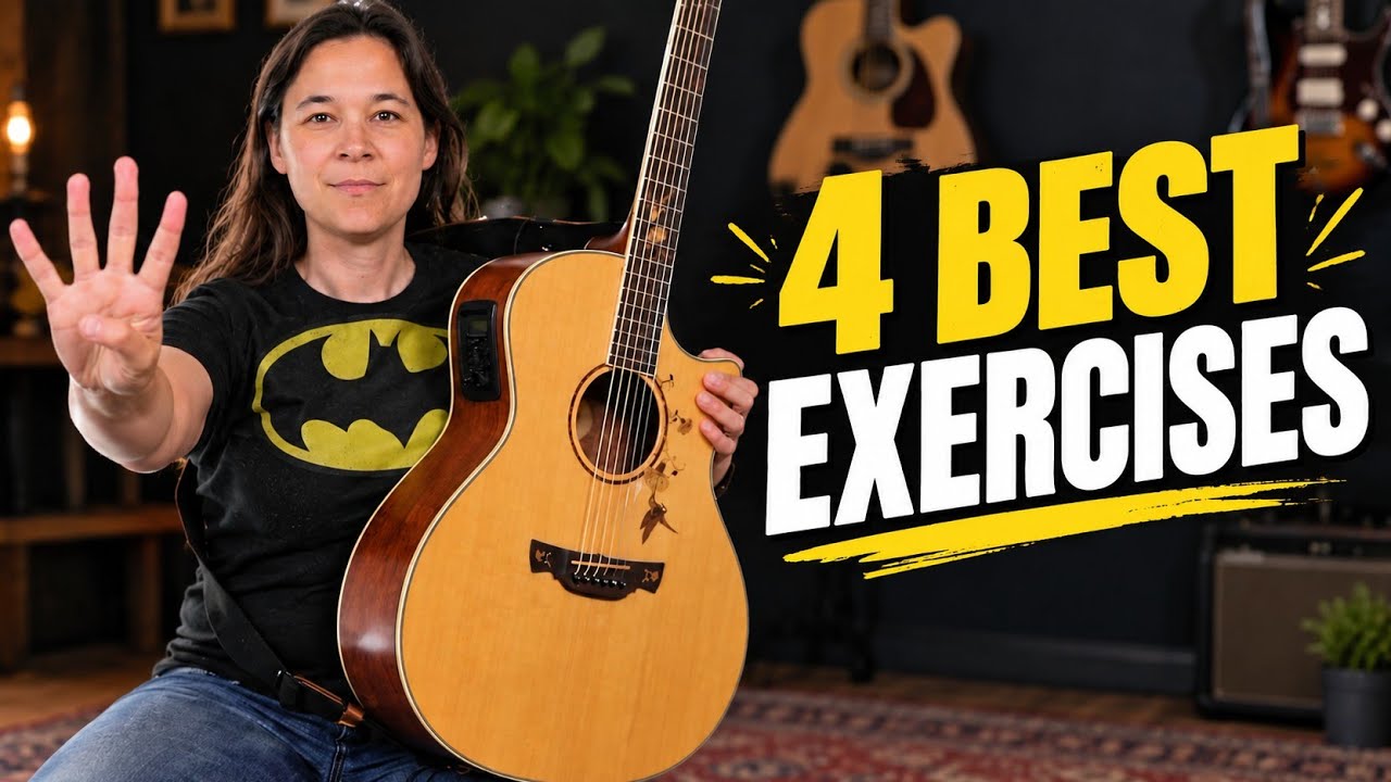
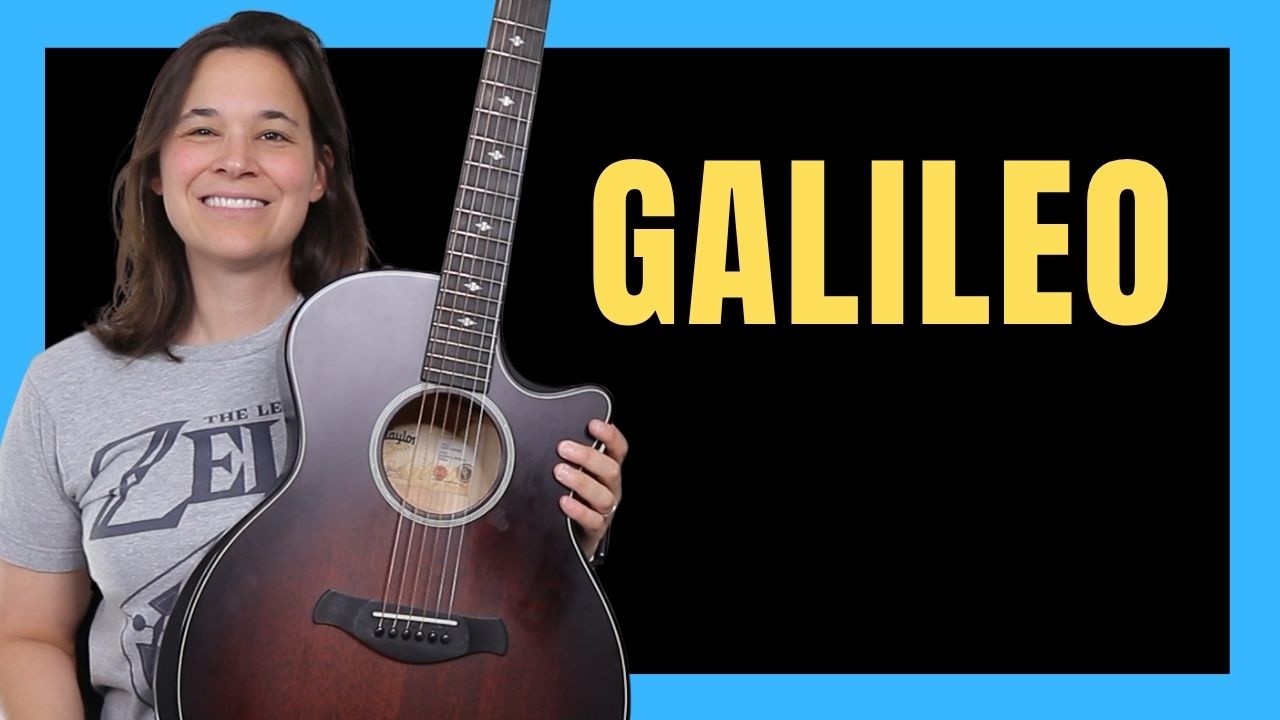
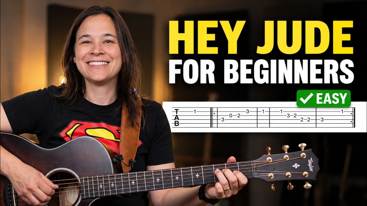
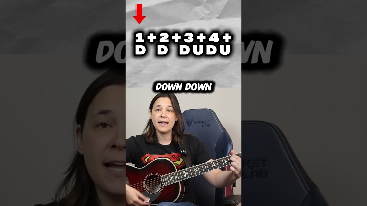
There's so many YouTubers that focus on, you know, what's the best camera equipment for me to get and you worry about making the content right. And while the content is important, if you don't have great thumbnails, nobody is going to click on your videos to start with. All right, so in this video, what I'm going to do is I'm going to show you how I went from doing the typical mistakes, the things you need to avoid doing in thumbnails, and I was doing them all. So I'm going to show you what those are. Click through rate is one of the most important factors on YouTube outside of watch time. But again, nobody watches your video. You're not going to get any watch time. So I'm going to show you the mistakes to avoid when doing thumbnails and I'm going to show you how you can improve them. I'm also going to show you some software where you could a b test your thumbnails to see is this working? Is it not working? Let's find out right now. So I'm going to show you some comparisons of old thumbnails versus how we're doing things now as well as what we are testing because we're always testing to try and see if we can get a better click through rate on something. Remember, if you get a thousand views and you get a 1% click through rate, that would only be 10 views. But if you got a click through rate of 10%, that would be 100 views. So you can see how working on your click through rate, even getting an extra percentage point on your thumbnails would help you get a lot more views over time. So in this first example, this was how I did my old thumbnails. Okay, you can see there's a lot of text. This is a huge mistake that a lot of new YouTubers make. They put way too much text on the screen. I even have my website. I don't know why I have my website on the thumbnail. I thought people might want to know the website. Nobody cares. Don't put your website on the thumbnail. There's a cool picture of me with the guitar. That's great. But you know, I probably don't need Guitar Lesson because I'm holding a guitar lesson. And maybe, maybe I could just put Guitar Lesson in the title. So you see the new thumbnails we're Using we've got brighter colors. It's easier to see me. I'm holding the acoustic guitar, so you can obviously tell it's an acoustic guitar lesson. And instead of having guitar lesson on the thumbnail, we just said, hey, this is for beginners. I noticed when I put the word beginner on my thumbnails vs not putting the word beginner, we will get more clicks. Now you have to make sure that the video is for beginners. If it's an intermediate lesson and I put beginner on it, we're going to piss people off. So you want to make sure that the thumbnail and the title work well together. But you can see how this is just a much cleaner design. And we're working on editing that. I'll show you in a bit. The next one I want to show you is like a versus. Now, I kind of size these this way because that's probably about the size of a thumbnail. All right. And that's what happens. Look what happens to this text when it gets really small. Just gets hard to read. So less text is better. Can read five words at the most. And you can see in this example, sometimes you don't need any words. All we have here is verses. This one I've got versus time signature. Lesson number three. I got my logo. I got this three, four, and four, four time signature. I kind of got a crappy thumbnail. At least I stopped to take a picture for the thumbnail. A lot of people don't do that. They're trying to pull a image out of their file, and, you know, you end up with a thumbnail where you're like, you look like that as opposed to a good thumbnail. So stop. What I usually do is before I record a video, I just take a freeze frame and we take a picture and we make a thumbnail out of that. Now this one, we used some stock photos. It was just verses. It was using a thumb pick versus finger picking. So you can see how the image kind of tells a story. It's really focusing the person's attention. Again, this next one, I think this was one where we. We just pulled a frame out of the video. You can see I'm not even looking at the camera. I kind of pointing at my hand. I got this little X thing over that. I think there again, there's just too much going on versus something. Something simplified like this, where we have an arrow point pointing at my hand. You can see also, we've boosted the contrast. I also did some a B testing to see if There was a difference on the background color. And I'm going to show you how to do that in a little bit to see, you know, did a different background color make sense? But you can see how this is much clearer. And I think this video was the secrets to playing a B7 chord versus, you know, why does my guitar sound muted? I probably could have come up with a better thumbnail for that. Now here's a newer example of one that I did very, very recently. So this was the old video. Very similar video. You know, thumbnail is a little bit similar, but you can see this picture is pretty washed out. It's pretty washed out. And I have faster fingers in one week. Well, instead of putting faster fingers in one week on the thumbnail, I actually moved it to the title. So the title is Faster Fingers in one week. But down here, it's just number one finger exercise. And you can see how number one is popping out. We're using much bolder fonts, fonts that are easier to read. So if I scroll back, you can see how like, you know, that is pretty easy to read. But compared to this right here, this text really pops out. So that's what we're trying to do now is really focus on making our text readable, legible, making things pop, using that yellow color on dark backgrounds to stick out. And you can see again, we've boosted the contrast a bit here on the hand and the fretboard so that your eye is really drawn to the hand. And like, what the heck is going on with this third finger? Well, that's part of the exercise. So how did I decide what, what colors to use? I even changed the color of the T shirts I was wearing because I noticed when I would wear brighter color T shirts in my thumbnails, we would actually get more clicks. Now, how do you go about testing this? I'm going to show you a really, really cool program that you might want to look into getting. So this is a really cool program called TubeBuddy. If you're interested in getting it, I'll put my affiliate link in the description below. If you're interested in supporting the channel, definitely go and check out this program. I have the Legend license. That's the license you need to do this. A B test, but even the pro license, there's a lot of really cool keyword search stuff that you can do with this program. So let me show you how to a B test using TubeBuddy. So you can see here I have a bunch of different A B tests. Now this was one we were doing. Here's the left side. Here's the right side. You can see here on the right side here how the text pops out. It's much easier to read versus the smaller text on the left side. Now, did it perform much better? I mean, we're talking about 3.23% versus 3.44%. Like, is that better? Well, let's click in on the data here.
So you can see I ran this test, I think I ran it for 14 days, and it's saying it's not really considered statistically significant, but they're 88% sure that your variation will perform better than the original. So it's saying in general, you know, this option performs better than that option. In this case here below, we tried a couple things. One with me and a great warmup or just my fingers with the arrow. And of course, having me in the thumbnail helped make that click through. Rate is actually almost a half a percent higher. That's a lot of views. That's a big difference. And you can see this variation was 25.2% higher than the original. I would think that would be statistically significant. Let's check.
And yes, you can see here, this is considered.
And you can see here, this is considered statistically significant. Now, you guys may not know I took a lot of statistics in college. My background is actually in science, so I used to do statistical analysis all the time when I worked for the pharmaceutical company. All that statistically significant means is that they're doing math. They are using numbers and data to tell you, is this really a difference? Or it's not different at all. So this is telling me mathematically, they have used algorithms and numbers and figured out that, yes, you definitely on this one want to use the variation. So you can see here, we can set the video to variation. It's going to update that thumbnail. And you will now be using the new thumbnail versus the old thumbnail. Other things we tested. We did a Halloween video. And I was like, well, you know, what if I put. What if I be funny? And I put this. Put Jason's face on my head for this Halloween thing, as you can see, people didn't like seeing Jason's face as much as they like seeing my face. So we went with the variation on this one. So here's another example. We took the same exact picture, the same exact text, and we just kind of made the background a little darker so that the font could pop out a little bit more. And we made the font easier to Read it only got like 0.10% more. So it's probably not really statistically significant. But hey, I'm going to take more clicks anywhere I can. Here was that earlier thumbnail that I showed you, the one with the hand. We tested a black background versus because the hand really sticks out on the black brown background. So we tested that against the blue background and people in general tended to gravitate more through the blue background. It was only 0.2 something percent difference. But again, we're going to take the higher percentage. So these tests that I'm going to show you right now show you having simplicity in your thumbnail. So you can see on the right or the left side here, all of these thumbnails have kind of like background. It's really, really hard to read the text. Now we weren't testing changing up the text yet. We were just changing like what if we just remove the image from the background and make these clearer? The pictures are the same. The text is the same. We did add beginner on First Noel. Okay. Because I said beginner does help. We also added beginner here. So you can see there's a half a percent increase. This one is almost a whole percent increase. We took away the picture of Guns N Roses in the background and we just put the title here. Same with First Noel. Again, half a percent difference. This one, not so much difference. But from this we gauge that, hey, it's much better to keep your thumbnails clean than cluttered. Again, here's another one. This was a huge difference. You know which pick this was the original thumbnail. 1.25% click through rate. That's horrible for click through rates versus this one. It was there's no words. It's just two pictures of two pics with the verses in between. And it got 2% more. Almost 2% more click through rate. That's a lot of views over time. 141% increase in engagement on this thumbnail. Hope you see how important it is now to have great thumbnails. But there's something else you need to put some time into and that was making sure that you have amazing titles to go along with your thumbnail. So click on this video over there where I'm going to be going over the five principles you need to have in place to have an awesome title.