Best Strategic Metric for Cybersecurity
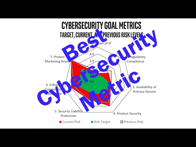
Matthew Rosenquist shows how a radar chart displays cybersecurity program health to executives. Green area shows target risk, red shows actual risk, and the gap between them drives decisions about resources and risk acceptance. It requires clearly defined security goals and consistent measurement to work.
Chapters
This is the best cybersecurity metric that I use as my go-to graphic when talking with executives and boards. Because showcasing strategic value of cybersecurity is challenging, being able to quickly provide a status overview is key. This is my favorite visual to present operational updates to business leaders. It uses the radar chart, or sometimes called a spider graph, as a foundation, and it's a cybersecurity leader's best friend. So let's explore what it shows, why the drives conversations that are just so important, and how to put one together. First, a caveat. This is not a magic graphic that replaces all others. It should be one tool in your toolbox. Okay, so we really wanna be able to use this in conjunction with other graphics and text, but don't be surprised if it does become the crown jewel of what you focus on because it helps to convey the right level of understanding to your audience. And as a preferred tool to facilitate good business decisions by those executives. This graph is easy to create in Excel or other tools, but generating accurate numbers in a consistent manner that underpin the graphic is a different topic, and I'll leave that for a later discussion. So here's how to build one, and it's super easy. Let's start with the structure. At the edges of the radial points are the stated goals of the cybersecurity program. These can be 2 or 3 or 5 or 10, however many there are. And these are the specific high-level objectives that cybersecurity is working to manage. Now, I believe defining these goals is paramount to success as it forces an initial discussion with business leaders to define the trade-offs between the costs of security, the friction it will introduce, and the resulting residual risk that is left over. We can never get it down to zero, so we need to have that conversation. And there absolutely is a relation between these aspects, between the cost, friction, and resulting risk posture. At the end, right, when you're coming up with these goals, essentially you're defining that optimal optimal balance between all of these things. And it is absolutely key. No matter how good you are at cybersecurity, if you don't have clearly defined reasonable goals, you will fail. I won't cover how to define and establish those in this video. We can leave that for another day. Okay, so with the goals being represented by the radial arms, we can populate the first area that's gonna show up. And this is gonna represent the desired target or the desired acceptable risk. So based on the goals you've already talked about, you found that optimal level of what you're shooting for, right? Based on the cost and friction trade-offs, and this is where you wanna be. Okay, great. So this basically represents those risk goals in a numeric way based on the willingness to invest resources and absorb accompanying friction that security controls will bring into the party, if you will. This is where we want the organization to be. So we're gonna paint it green, although you can paint it whatever color you want. I like green. Landing anywhere in this green zone is acceptable. Although if you're too far into it, it may actually indicate you're overspending. But again, that's a different topic. You really wanna get your risk lines into the green. So that's number one. The second area we're now going to paint in is we're going to establish an area that depicts the current risk level. And we'll paint that red. Again, I like red, use whatever color you want. Again, these numbers should be generated in a consistent manner with proper analysis using a framework or tool that delivers confident quantitative results. And it needs to do it in a consistent manner. That's why you need a framework, otherwise you'll get all over the place. The key is the red area which exists Right, because it's going to be under the green area. Any of that red area along those radial lines, well, that represents the residual risk that you really want to close, you really want to get rid of. And there can be many reasons why it currently exists, which drives discussions. This is where the eye goes to, and where you see red chances are something has to happen or is happening. Presenting to an executive like a CEO, they must understand, right, that there is a certain amount of risk. And if that delta does exist, they're probably not educated in all the complexities and dependencies of cybersecurity, nor do they want to be. So this is not about a master class in teaching your executives how to be cybersecurity security professionals. No, this is really intended to help them understand what they need to, to make good business decisions. And when we see a big gap, right, and it's gonna be showcased by the amount of red, then the discussion can focus on the decisions around that, what to do. Now, these two areas drive some of the most important discussions, the delta between the green and the red. First, an acknowledgement of where the organization is at with respect to security goals. Second, the level of risk which is desired. Third, it gives the executives enough information to start asking questions or making business decisions. Executives really only have a few choices. If they see that red, they can do a, a few things. Number one, they can decide, hey, we need to invest or reallocate resources, maybe reprioritize them to mitigate or transfer the risk to be able to close that distance. And that's a legitimate discussion to have. The second thing they may do is they may accept some or all of the risks, all of that you know, red area, which essentially is then deciding we're going to move the green area outwards because you're now redefining what that optimal desired risk is because they're willing to accept more. So the red area shrinks only because the green area grows. And again, if we're talking about the senior-most executives of the company, they have the ability to accept risk., and it may be on behalf of the owners or the shareholders, but that's part of their role. So that too is something legitimate. Now, the third is not quite as productive. They can simply deny that the risk exists, which then kind of requires a short primer session on how these numbers are calculated, right? If an executive is just in pure denial, Well, then you have to show them those frameworks in how it's calculated and the confidence. And no executive really likes that exercise, and often it's a one-time event just to level set on the methodology. Okay, the last aspect that we're gonna add here is really about showing history. What we'll do is for the last period that you took your measurements or that you presented, and that could be a day, week, month, quarter, year, whatever is good for you, but essentially it's the last time the audience saw it, right? You want to show them what was the risk line at that point in time. And I often choose it as a line versus an area so that we can delineate what the current risk level in red is compared to that line. So we basically get to see how the risk level has changed over time, over that last time period. And it can tell many different stories, such as how the team has reduced the risk to get closer or maybe even achieve the target, right? And this is always a fun one to have. If you had red in the previous cycle, and now you've gotten it all the way down into the green, congratulations, it's a great success story. Unfortunately, it doesn't always happen, right? The second thing it can show is how the risks are increasing, right? So how potentially that red area is growing. And that may be due to internal factors, such as non-compliance to policy, or potentially some kind of business decisions that are being made that are adding on more of this risk. And that type of exposure then pushes that, that red zone to expand. It can also be due to a rise in threats, which look to cause impact, and that can be both internal or obviously external. So if the attackers that are coming after you from the outside, if they are getting better with their tools or better with their capabilities, capabilities to do phishing, or they have access to more vulnerabilities or something like that. Yeah, the risk goes up. There can also be internal risks. Let's say you're shutting down a particular site or a particular product. There may be workers that are emotionally tied to that, and they may not particularly like that. That too can raise the risk of insider incidents. So there's lots of things that that line moving outward can show. And here is where we explain the conditions and the factors, and then we follow up with recommendations that this audience, this executive audience, has the power to enact. And again, the audience doesn't have to know all the gritty details, right? They're looking to you to be the expert. They're looking to you to summarize those in ways that they understand and then give them options and recommendations. Now, finally, that line from the previous period may not have changed at all, which could be good if the line is in a favorable position to start with, or it could be bad if you were expecting improvement. If it's the latter, again, it becomes an opportunity to discuss the barriers, the priorities, the lack of resources. So, from a leadership perspective, it really kind of drives those conversations, the ones, and sometimes they're tough, but the ones that need to be had. Now, I normally accompany this chart with a few bullets that highlight the most interesting areas on the graph. And that then drives the structure of the discussion. In fact, how I order them is really how I want the story to unfold. But they really tie back to all those interesting points that my audience is probably going to pick up on and want to know. Now, this graphic is, it's fairly easy to understand when audiences are first exposed to it. Sometimes they have to be walked a little bit into it, but normally it's not too bad. But over time, audiences begin to see much more depth and ramifications as a result of more insights about cybersecurity, which enables them to understand better and actively participate in more relevant discussions. Essentially, you're teaching them. By using such an easy to adopt and understand graphic. Okay, so that's it. The data format is simple for the graph to work. You may need to play with, you know, what the area, you know, colors are and line versus area fill-ins. And those are all minor tweaks. Those are easy. And if you are going to use this, I suggest you make sure you have a really good set of cybersecurity goals. Okay, this is, this is the biggest failure. Again, we have to have those. There has to be clarity. They must be clear, relevant to security, measurable in some way, meaningful to the organization, and attainable with the limits of resources and business friction that you're allowed. Right, that you're afforded, essentially. Secondly, have a good assessment framework to generate consistent and comprehensive scores that populate this chart. Your chart's only as good as the accuracy, right? Neither of these two prerequisites are easy, but there are resources and tools that can help. And if you're interested in how to measure operational risk in an automated manner as they align with the most valuable asset chains of your company, reach out to Mercury Risk and Compliance. We are doing some really innovative stuff in this area. Well, that's it. Hopefully you got something out of it, and I'll see you next time.
More from Matthew

The Future of Cybersecurity: How AI Is Exploiting Technical, Behavioral, and Process Vulnerabilities