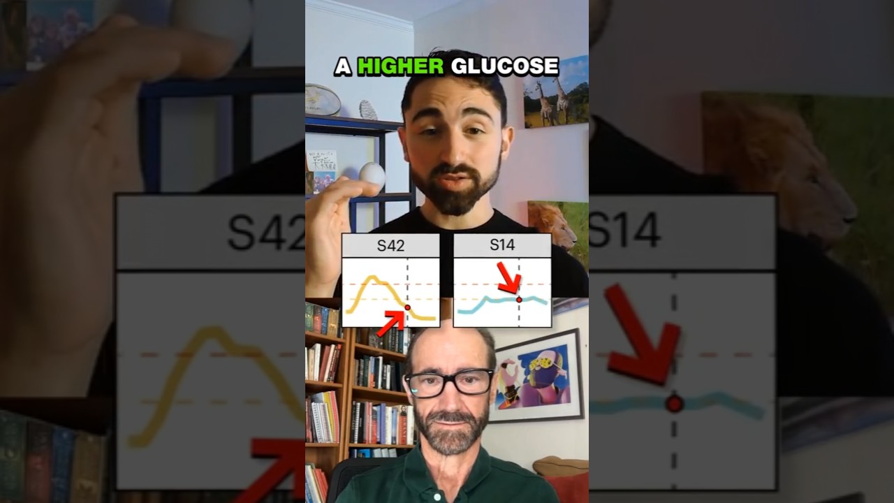
Two people with similar 2-hour glucose readings show completely different blood sugar patterns: one spikes above 200 mg/dL, the other stays flat. Standard diabetes tests miss this difference, catching only the endpoint. Continuous glucose monitoring reveals the real story.
Chapters
You showed all the different glycemic curves from participants in your study. I'll put up two side by side now, but it's been S14 and S42. And what I want people to notice is often diabetes can be diagnosed by an average blood sugar, or if you do something called an oral glucose tolerance test where you take, you know, a carbohydrate glucose challenge and that at key time points measure your glucose. So say at 2 hours, what is your glucose? And then you can help, you use that to diagnose diabetes. But if you look at the two, um, participant curves I'm showing, you're going to see their CGM curves in blue and yellow. And at the 2-hour mark, the person who is the yellow curve has a lower glucose. The person who has a blue curve actually has a higher glucose. But if you look at the shape of the curves, the yellow curve has this massive spike over 200 milligrams per deciliter, and the blue curve is like flat as a pancake. But the point is, if you're not looking at the shape of the curve. If you're not getting continuous glucose data, you completely miss that, and you will conclude, oh, the person on the blue curve has worse glycemic control, even though it's way better.