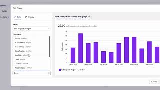
The video provides a concise walkthrough of Jellyfish’s core engineering‑management features. It begins with the Allocations view, which displays custom work categories (e.g., roadmap, support, infrastructure) and creates virtual time cards by integrating with Jira and Git to quantify effort. It then moves to the Metrics dashboard, where leaders can select up to four top‑line metrics, view trends over time, see an allocations chart, and examine sprint‑completion details. The Benchmarks tab lets users compare any tracked metric—internally or against a broader pool of Jellyfish customers—via supplemental bar charts. Next, the Lifecycle Explorer visualizes the software development lifecycle across four stages (Refinement, Work, Review, Deploy), highlighting bottlenecks and trends with a trend graph. Finally, the In‑Flight Deliverable dashboard shows deliverable status and projected timelines; the Scenario Planner enables what‑if modeling of developer count, retention, and scope to adjust delivery forecasts. The presenter invites viewers to explore a browser‑based product tour or visit jellyfish.co for more information.
Chapters
In this video, I'll be giving you a brief tour of the core work areas within Jellyfish. Allocations is a view that shows the different categories of engineering work which teams are investing their time in. These are custom categories, but commonly include roadmap, support, and infrastructure. By integrating with systems like Jira and Git, Jellyfish creates virtual time cards for the type of work engineers are doing, and shows how much time it's taking them to do it. Let's navigate to the dashboard that leaders use to measure and optimize their engineering operations. This is Jellyfish's metrics view, where you can gather engineering insight on the organization, group, and team level. You can set the 4 top-line metrics you deem most important and understand how they're trending for the given period. You can access even more metrics via the menu tab. There's an allocations chart that shows the work breakdown for this team, as well as a detailed sprint completion view if you scroll down. Let's see how these metrics stack up against the wider industry by navigating to the Benchmarks tab. Benchmarks are available for almost every metric tracked within Jellyfish, including allocations. Using the dropdown, you can set whether to compare these metrics internally or against a pool of other Jellyfish customers. Selecting a given metric opens up a supplementary bar chart which lets you evaluate how your teams are performing compared to the average across the wider industry. Let's dive a bit deeper into the software development lifecycle and head on over to the Lifecycle tab. This is the Lifecycle Explorer, which lets you examine every stage of your software development lifecycle to look for bottlenecks, indicators, and trends in how your development is progressing. Jellyfish categorizes these stages broadly as Refinement, Work, Review, and Deploy. You can track the impact of your lifecycle process decisions using the trend graph below. Finally, let's see how you can plan, track, and accelerate the delivery of deliverables in flight. This is the In-Flight Deliverable dashboard, where we can see a summary of the activity associated with a given deliverable. Glancing at the delivery timeline, we can see this deliverable is projected to miss its target date. Drilling into the Scenario Planner lets us see what vectors we can model in order to ensure this project is delivered on time. The Scenario Planner allows us to model different actions to understand their impact on the delivery timeline. We can model the number of developers, developer retention, or deliverable scope. That's all for now. Want to dive deeper into Jellyfish? Take our browser-based product tour linked in the description, or head over to jellyfish.co.