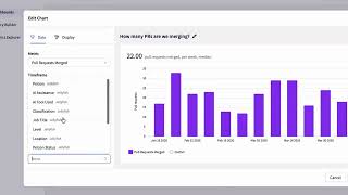
The video provides a rapid walkthrough of the Jellyfish engineering management platform, highlighting its three core workspaces—Engineering Alignment, Org Health, and Delivery—accessible via a persistent sidebar. It introduces the Allocations metric, which models daily engineering effort by ingesting signals from developer tool stacks and can be viewed by strategic objectives (Themes) or at the team level. The platform can overlay engineer cost data to generate financial reports that accelerate software capitalization. The Engineering Team view showcases a suite of KPIs (story points, issue resolution, commits, etc.) with historical trend analysis, meeting‑time tracking powered by Google Calendar, and the ability to annotate key events. Benchmarking tools let leaders compare their team’s resource allocation and performance against industry peers, displaying internal and external median metrics across organization, division, group, and team levels. The Deliverables page offers an overview of active releases, scope breakdowns, heuristic completion dates, contributor effort, lifetime cost, and detailed burn charts for releases and constituent epics. The DevOps workspace presents core DORA metrics (Deployment Rate, Lead Time for Changes, Failure Rate, Time to Restore Service) with time‑series visualizations, deployment details linked to CI/CD tools like CircleCI, and customizable filters for organization‑wide or repository‑specific analysis. The video concludes with a call to try a browser‑based tool, schedule a live demo, and explore additional product videos and resources.
Chapters
There's a lot that's changed in Jellyfish since we last released a product overview. So this is Jellyfish in 5 minutes, more or less. We're starting on the homepage where you can access Jellyfish's 3 core workspaces broadly focused around engineering alignment, org health, and delivery. No matter what screen you're on in the app, each work area is just a click away thanks to the sidebar. Let's drill into the analytics, starting with allocations. Jellyfish ingests signals from developer tool stacks in order to calculate a model of the day-to-day work of engineering. We call this metric allocations, and it highlights how engineering effort is distributed across strategic objectives that are defined by your engineering organization. You can view this data in a few different ways. For example, you can switch over to the Themes tab to see how resources are allocated in the context of product objectives. You can include engineer cost data in this model. By correlating financial information like engineer cost with an hourly understanding of which engineers are working on what projects, Jellyfish can reflect the cost breakdown of software development, automatically generating reports that can drastically speed up the process of software capitalization for finance. Next up, let's take a look at the Engineering Team view. We can see another allocations diagram, this time reflecting the effort breakdown on the team level. There's a variety of metrics along the top around story points, issue resolution, commits, and more. These are all clickable, and each KPI contains historical trend analysis. Click here to add in key event dates and see how the KPI has performed since that date. You can also keep track of how long your teams are spending in meetings. Driven by Google Calendar, Jellyfish excludes certain event types in order to get an accurate view of the time your team actually spends in meetings, including a month-on-month trend percentage. That's a snapshot of this team, but how do they stack up against their industry peers? To find out, let's head over to the benchmarking tab. Benchmarks enable engineering leaders to maximize performance and strengthen their assumptions by using context-driven data from across the industry. We can see how this team allocates resources to strategic objectives in comparison to their industry peers. Benchmarks are available for almost every metric that's tracked within Jellyfish. With a cursory glance, you can see percentile performance for each metric using the visualizations here. Selecting a given metric opens up a supplementary bar chart and see how they're performing compared to averages across the wider industry. Jettyfish also calls out the median metric performance. There's a card for internal median, powered exclusively by your organization's data, as well as the external median. Driven by Jellyfish's industry-leading customer base who are also utilizing benchmarking. Using the dropdown, you can access these industry-wide contextual insights on the organization, division, group, and team level. Next up, let's take a look at the Deliverables page. Here we can find an overview of every release currently in flight with a detailed scope breakdown based on the work involved in each deliverable. Jellyfish can heuristically project its completion date. Let's drill into one of these releases. We can see the progress of the release and its contributors, lifetime cost, and total engineering effort. There's also a detailed burn chart so you can understand how resource contributions have been trending over time. You can get the same view for all the epics that make up the release with even more detail available if you drill down. Finally, let's head over to Jellyfish's DevOps work area. We can see a set of core tracked DevOps metrics, which includes those defined by DORA, so that's: Deployment Rate, Issue Change Lead Time, Failure Rate, and Time to Restore Service. Each includes a time series visualization and a card overview, that automatically calculates for the period you're viewing. Clicking into deployments brings up an in-depth view of the data which drives this analytic. Jellyfish works with a large variety of CI/CD tools. We can see the name of each deployment, when it occurred, whether the deployment was a success, which teams were involved, and if we click the source, we'll be sent to the deployment within CircleCI. Returning to the DevOps dashboard, If we open the filter tab, we can apply filters on the organizational level, but also on the repository level for a given Jira board, which is a handy way to slice and dice a more granular understanding of your organizational delivery. These filters are fully customizable and specific to your given development stack and team needs. Need more than 5 minutes? Take a browser-based product tool or schedule a live demo by following the links in the description. That's all for now, but be sure to subscribe to our YouTube channel. We've got loads more of in-depth product-related videos, including an explainer of our core metric allocations. And visit jettyfish.co to learn more.