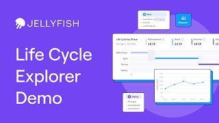
Jellyfish's Lifecycle Explorer visualizes your software development cycle from issue creation to deployment, breaking down time spent in refinement, work, review, and deploy phases. It automatically pulls data from Jira and Git to spot bottlenecks like excessive work-review overlap, which signals rework and longer cycle times. Track trends over time to see if your process is improving or getting worse.
Chapters
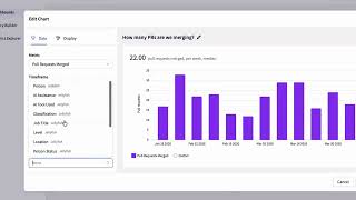
Software development isn't a linear process. Good ideas take time to plan, and there can still be bottlenecks, overlaps, and gaps along the way. If you just use metrics to focus on speed, you can end up with hastily planned, bug-ridden, rubber-stamp software being rushed out the door. Crafting the right balance between speed and care is what defines an industry-leading delivery process. And there's no better way to achieve that balance than with Jellyfish's latest product feature, Lifecycle Explorer. Let's take a look and see how it works. We can see a snapshot of this team's lifecycle for the given period. This includes the total lifecycle, on average, the time it takes between issue creation until the final deployment or PR merge. The issues included in the calculation are linked here. as well as those that were excluded with an explanation as to why. If we look at the lifecycle by phases graph, we can see the breakdown of each stage within this team's software development lifecycle. Jellyfish categorizes these stages broadly as refinement, work, review, and deploy, highlighting any gaps or overlaps between each phase too. The amount of time being spent in each phase is automatically tracked via signals from your source control and issue tracker, such as Jira and Git. Lifecycle Explorer is all about interpreting indicators of possible bottlenecks and making proactive decisions to head off any impact they may have on both the health of your team and on your delivery. So how do we interpret this data? If we look at this team's work phase, we can see well over half of it overlapped with review. This could indicate a lot of rework, as the code was still being reviewed while being worked on. Rework is a potential leading factor in the month-on-month increase in average cycle time. If you want a longer purview of how your lifecycle is trending, check out the trend over time graph. Use this visual to get a better overall sense as to your software development process health. This chart is useful to understand if the problems outlined earlier are getting better or worse, or if it's just outliers that are skewing the data. You can view this trend data across your entire lifecycle or for each development period. That's all for now. We've only scratched the surface of lifecycle Explorer. If you'd like a deep dive into the bottlenecks, indicators, and possible solutions that jellyfish's Lifecycle Explorer illuminates, check out this video. Be sure to download our latest ebook, How to Use a Lifecycle Explorer: A Guide for Engineering Teams, both of which are linked in the description. And for everything else, head on over to jellyfish.co.