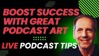
Rob Greenlee breaks down podcast cover art design, from series artwork to YouTube thumbnails. He covers color, typography, and readability at small sizes, then walks through tools like Canva, Figma, and AI generators like Midjourney. Test your art on actual devices before publishing.
Chapters
Well, welcome to Podcast Tips with Rob Greenlee. Thank you so much for being with me here tonight. It's great to have you here and, and following along this journey in episode 45 of this live show series that I've been doing coming up on a year. So the topic tonight is is creating impactful cover art for your podcast or show, and we're going to really dig deep on that tonight. So, um, hold on and, and we will ride this ride. I know probably many of you have been down this path a few times, but if you're new to podcasting, um, then you've likely had a, you know, along this journey of creating a new show kind of a, you know, what I would call kind of a light bulb moment and you're ready to start a show. But if you have an existing show, maybe there's some things to think about your existing artwork that you have with your show. And maybe there's some things that you can tweak and improve. You know, I think cover art is really, I think, one of the top couple of things that you need to get right with your with your show and your podcast because it is kind of like your marketing billboard, right, of sorts. It's what really gives that first impression of your show. And, you know, some people have the talent to do it and some people, you know, don't have as much artistic talent, so they need to get help or they need to take advantage of a tool that can help them kind of down that journey. But it's really important to be kind of I think as well as your content, but it needs to align with your content. But you need to be thinking about ways that it can improve. And I think that there's kind of a more complex situation going on out there right now, especially with podcasters, as there's this increasing pressure around doing video and audio as a podcast that kind of presents some other challenges because there's kind of three big levels of art that you need for— there's probably 4, but, you know, artwork for your website, you know, your social media branding, and some of these things can be repurposed. But you have kind of like your, your series art that you have, like your master artwork. And I'm going to show you some examples of, of some good ones out there and some options, and just to kind of spur your your enthusiasm for trying to tackle this challenge, but there's also episode-level art too. So you've got that, plus if you're going to do video, you're going to also have to deal with the YouTube type of art, which are commonly called YouTube thumbnails. And I'm going to show you some examples of that as well in the show today. And, you know, like I said earlier, really The first impressions are really the most important here with, with trying to attract new audience. And that artwork needs to pop. You know, if you can envision driving down the freeway and you see up, you know, you look up and you see this big billboard, right, that's in front of you going down the freeway. A lot of the kind of ways of doing this kind of align with that, right? And And in the early days of my work in the marketing field, I did kind of design billboards for some of the companies that I worked for. Back in those days, we were doing television, radio, and billboards and bus boards. So, you know, it got me thinking along these lines early on, but it's been difficult. And I think it's for many others difficult to translate this into the digital content world. Especially if you have a background and maybe doing more offline stuff. But, and I do think that these concepts that I'm going to talk about tonight are constantly evolving and changing, but at the bottom line, the goal of COVID art is to, is to build your brand and to build a connection with audience. And if you can build connection with audience And these are all things that I'm working through too, even with the show that I do here. I mean, I started out with completely different art when I was in partnership with StreamYard, and, and now I have it, you know, I'm not affiliated with StreamYard anymore, but, but I, I refashioned all the artwork and, and I have a completely new, new concept. But there's, there's a lot of risks that go into having poor design. Right. You know, if you have a poor-looking cover art design that doesn't help the audience understand what your show's about, or increasingly, you know, thumbnails for YouTube is really kind of really focused on episode level. And I'm going to show you some examples of that here, too. And, and, you know, if it's not done right, can misrepresent your brand., and I do believe that it's okay to kind of evolve your, your artwork over time. Now, these are kind of bigger picture things to, to think about here, but I do think that they're, they're important to actually consider. And I'm also playing around with a second camera here, and this, this one actually kind of gets in the way of my microphone because I have it off to the side. But, but you can also see that this is kind of a side topic too, but if you use multiple cameras. And I'm starting to get involved in some projects that are involving with multiple cameras, and it shouldn't take away from what you're doing. It should add a different kind of visual element to what you're doing. And I can go back in the, the StreamYard platform has this ability to tap into multiple cameras and still do it through a browser. But anyway, that's a little bit of a sidelight to this topic. But it's really so important that you get your, your visuals and your graphics and all this stuff really, really nailed and, and down. Because like, like I've created the, the images like in the upper, upper part of this up here with my, my name and my show, and then I've kind of simplified it, right? I really focused it down to just the core of, of what, what I'm trying to do. And I think You know, you've probably seen this artwork that I use as a thumbnail, and I think that I can probably get rid of the other portion of me. So let me get into that. And okay, let me see if I can remove that. I think there's just a little bit of a conflict there. So anyway, about how I'm using these tools to do kind of a, you know, a two-camera shoot. So I need to learn about how to effectively use these tools. But here, let me bring that cover art or that thumbnail back up so you can see what I'm talking about here. And it's also kind of— it's important to kind of see what I'm doing here. And I created a very simple artwork here. That, let me see if I can get that a little different here. Oh, nope, I'm playing around with this a little too much, I think. Yeah, let's just talk about this and, you know, to really focus on the key message, boost your success with a great podcast art, and then just have the name of the show below, an image of me and some colors that are consistent with the colors of the show itself. And I think that's really the key takeaway from that. So I think it's simplicity on the YouTube side, but then if you look at the artwork that I've created for the podcast, so I'll bring that up to the stage here so we can see that. And let's see if I can show a different representation here of that. So now it doesn't seem to want to do that, but anyway, I can, I can do this so you can kind of see what I'm trying to say with this. So I took that artwork that I had, that thumbnail art, and I basically made a smaller version of it so it would be consistent. And I've been updating this with my, my podcast side of this because I'm also making an audio and video podcast. As well. So that's, that's part of what I'm doing, um, here is, is doing a live show, recording it, and then putting it out as an audio and video podcast. So you can get this in the Apple Podcast platform, but, um, that is a kind of a more complex way of doing it, you know. Doing this show live gets it out to all of the social media platforms, YouTube, all these, and makes it available for instant replay right after the show's over with. So I don't, I don't really have to get it put out as a podcast, but this is an additional layer of distribution that I can have for this show. So let's, let's go ahead and I'm going to jump forward and bring up kind of, you know, some screenshots of, of what Apple is doing with their podcast stuff. So as we think about COVID art, so let's go ahead and add this to the screen here. And this is the top charts for the Apple Podcast platform. And so you can kind of see what I'm talking about here. There's basically just very simple messaging up here and it's, you know, very simple text. It may be a little hard to see, just because of the size of the image, but it's, you know, simple text, very colorful, it pops off. And in some ways this is a good example because the shows that are on here are very successful shows, but some of them are kind of weak in the concepts of putting together cover art for a podcast because at a small size, just like what we're seeing here, they are, they can be difficult to read, right? And I think that's one of the key things that you have to think about with this is that you have to really kind of make them pop, right? So let me pull up another version from Apple Podcasts as well, and we can see some more of them. Now this is top series, so these are kind of like kind of like storytelling podcasts of sorts, or, or audio dramas, those kind of things. And there is a difference between the kind of top charting shows and the complexity of, uh, of some of the artwork that is being done around, um, you know, like a, like a serial, or, you know, like what's on the, on, on the screen now, you know, the podcast, uh Noble, I guess, is in Serial, is right there where there's a little bit more complexity to the artwork and the fonts seem to be a little bit smaller. And so that can be a disadvantage as opposed to what we saw with the other Apple Podcast artwork here. You know, like the Joe Rogan Podcast, you can see up in the upper left-hand corner is very big, has a big logo. You can see Joe's face, and that shows the biggest one in the world, right? And then, and then as you move across, the, the up first one really pops. Dateline kind of pops a little bit. Pod Save America pops a little bit, though it could be a little bit more impactful. That, that yellow tends to kind of bleed in a little bit visually with the blue. So As you think about these type of art, they basically draw a certain amount of attention to them. So let's kind of move on a little bit here and start talking about some of the critical elements of creating podcast art, right? So I think that there's some basic fundamentals that we can, we can walk through. And, and before I do that, I wanted to share something from the, the past. Um, back when I was in high school, I owned a Plymouth Barracuda car. And, and I just happened to— I was looking this up on my bookshelf behind me because there's a model car version that's very similar to the, the car that I had back in 1972. I know I'm dating myself to some degree, but, um, this is it. In the context of COVID art, this is some artwork that was done for model cars, right? So you could get this kit on— this is basically a small reproduction of the Plymouth 1971 Hemi 'Cuda, which is a a, what's called a Barracuda is what, what the brand was from Plymouth back in those days. And so you can kind of see how it's very visual, and that's what we're going to talk about in relation to the YouTube thumbnails and how different they are. But this is a kind of a key takeaway: make the image simple, pop, let the image tell a story, and then just let the, the text kind of overlay. And this is more of a pitch for, for the YouTube type of situations. And I'm going to talk about that a little bit more here later on this, but I can, I can, I can give you a little bit of a tease on that about what is actually going on with that. But maybe I'll wait on that. A little bit, I did want to kind of just run through some of the critical elements of podcast cover art. Okay. And I think the really the first one is title. What's the title that's on your artwork? Right. What's the words that are used? And, and is the title on your artwork or the name of the show, is that a clear reflection? In some ways, this gets into kind of another layer around, well, what is the actual show name? I mean, and that's an important component of this, right, too. It needs to be short and concise, you know, and this is more than just about your cover art. This is about Basically being able to create all your marketing messaging and having keywords in there that are important for your show, right? Just like I showed you with the, you know, with the COVID art for this program. This is, you know, it's a clear and concise name. There's not a lot of characters, there's contrast. And so when you make this image smaller, It's readable, right? People can, can read it. I, I haven't cluttered it up with a bunch of other text, so it has a focal point to it, right? It's me. And a lot of people don't know, associate my name with my, my face, but what it does is it adds an element of personhood, right? There's a person behind this. And over a period of time, what you're doing is you're, you're building your visual personal brand with your audience and in association with that topic of the show, which is very descriptive to what I do with this show. I've got a version of this art that says live audio podcast tips, and I have one that's live video podcast tips. And those are in the Apple Podcast ecosystem, two separate RSS feeds. That one has the audio, the The one that says audio has an audio file in there, and one that says video has a video file in there. And but my topic is about that. It's about also about doing live video podcasting as well as doing live audio podcasting, because really they're all the same thing when it comes to this show. So, so it's, it's very meta for what I'm trying to do here. There's no doubt about that. But, you know, so those, those names, that, that name of your show is so important. And so there's, like I talked about earlier, there's the name of the show and then there's the episode titles, right? And there's two different kinds of artwork that you can make. You can make the episode artwork for YouTube or for your podcast, and all the hosting platforms support episode-level art, and Apple encourages it. You know, I think it's a, it's a smart thing to do. I haven't started making episode-level art for this series yet, but I, I would like to get started with it. I just haven't made a template for it yet, but I actually probably have it already because I'm making one for, for YouTube right now, right? So I'm, I'm already doing a really episode-level art right now to create this for YouTube. So really all I would have to do is just resize this image to being a square image and all of a sudden, pow, you know, I've, I've got my episode level art. So it's, it's really about— and this is what I've been trying to do too, is, is to create all the content at once just like this. Now there's some inherent disadvantages to doing all your content live. But I, I do think that there's some advantages too. So I wanted to welcome, uh, Irina Friedman Watts, who has joined me and who joined me and made a comment here. I think it's clear is what, what she said. And her podcast is Better Call Daddy. It, it is clear, you know. Live Podcast Tips is I think as clear as I, I could be. I think when I started this show with StreamYard, I probably would have had probably, you know, more success probably if I was a little bit clearer in what I was doing with my artwork. Um, and, and, uh, Arena's comment here is, daddy is a good word. Well, I think it also maps to some other very popular podcasts out there, Arena, that maybe people are associating with you with, and I think that probably helps your show a little bit. So I agree. I mean, I've been a guest on your show before, so I, I totally agree. It's a, it's a fun concept that you're doing with the name of your show, but you know, the episode titles are increasingly becoming important, and, and I think it's okay to, to really focus on those again and, and really kind of get, get a little deeper with those. Especially because of YouTube. So if you're already doing it to go through the process with YouTube, you might as well do it with your podcast too. And that's, that's where I'm going to get to, probably starting next week, is I'll start— my first thing is I wanted to revamp all my artwork, um, to be this new design that I've been starting to work with the last few episodes, and then transition, um, over to taking that design and making episode artwork out of it too. And then I can— everything will be all aligned at that point. So I think it's very important to, to potentially have a subtitle too. But if you can accomplish everything with a main name and a main title, like what I've done with Live Podcast Tips, then, then there's no reason to have a subtitle. But some shows maybe have a a name that's not as easy to, to understand what the scope of this show is, right? So you have this range of situations that are out there around creating a show name, and sometimes it's helpful to have like a few keywords underneath your show name that kind of give deeper context to what that show is. Now granted, that's going to over— that's going to complicate your artwork to some degree, and it may present some challenges, um, around keeping the, the size of it consistent, right? Um, but that's— that may be worth, worth, you know, doing. So it's just a matter of, of if you think that, um, that it's worth doing. And I think that's, that's That's gonna be up to you as a podcaster to make that determination. So, and then the next one here is style. What's your style? Style aligns with a lot of different things. It's things like this background that I have here. If I were to go to this and see myself twice, but I— you can see what my background looks like, right? And so that's, that's, that's kind of a key thing. It's the branding of it. And I created the, the, the lights behind it too that match pretty close the colors of the branding of the show. And then I have this kind of this green, black, and red color scheme with the show. So you have to kind of align with all this, and then you think about your cover art. Does it consistently align? And I think there is a case to be made here that, you know, alignment of colors, and like I've done with this show, maybe help, maybe give a little bit air of, you know, professionalism, I guess, or quality. But I also see a lot of shows that are very popular And I've started doing this to some degree myself. I got a new camera that I can hold in my hand and go outside and get 4K video and stuff. And I'm starting to play around with just getting out of the studio. And I think I talked about this last week a little bit, getting out of the studio and trying to produce content out in the real world. I'm doing that with a, with a, another kind of video series that I'm doing on on the YouTube platform called Behind the Wheel, and it's actually taking video of me driving my Tesla Model 3 with Full Self-Driving. So I've been doing a lot of that lately. But anyway, to get back on to the topic, I tend to stray a little bit. Sorry about that. But so style is really important and how you do the show is important too. So You know, the other thing to think about too is like I had in the image that I brought up there, you know, there is a component of, you know, what's the elements of your artwork, right? What kind of, what can I say, what kind of photograph do you want to have in there? How impactful is that? And does it help build the brand? And what other kind of visual elements do you have in your artwork that maybe accent things or bring an emphasis or pull the eye? These kind of things are things to think about as well. So I do think that those are important and for you to to think about that, right? And then the, the next thing, the next couple things I want to talk about is color and fonts, right? So those are important pieces to the puzzle here, and I do have an example. So if I want to get into colors first, you know, one of the things about colors is that certain colors invoke a certain emotion. And a certain kind of feeling about you and about your brand and about your show, right? So, you know, these are, these are important things to think about. You know, all of us have our favorite brand or colors, our favorite kind of designs, our favorite kind of themes, things like that. Like, I'm going to bring up a color wheel here for us to talk about, but Just in a general sense, you know, base colors like red, uh, tend, tend to invoke kind of passion or danger kind of impression, right? Blue represents calmness or technology, and yellow oftentimes conveys like an energy or a happiness. And there's other colors too. Let me pull those up and it can give you a little bit of a of a, of a show of this, and it may be a little hard to read here. So let me, um, that may not have turned out just the way I would have liked it, but let me pull it up a little bit larger on my screen so I can actually read it a little bit more. So at the top of the image, you've got pink, right? So pink tends to be feminine. It, it's playful. It has kind of a gentle, soft, compassionate feel to it. Red tends to be, like I was saying before, passionate, powerful, strong, and it has a lot of kind of desire to it, right? But it also has a strong pop. People notice red probably more. Orange tends to be courteous, confident, and have some energy behind it, is vibrant, and is social, right? And then there's yellow, which is joyful and has some energy to it, is bright. Green is fresh, wealthy— I guess it's the color of money, I guess— and growing and organic and And I believe trustworthy too. Blue tends to be loyalty, tranquil, calm, all those things that you might want. And it tends to be a little bit on the male side. Purple is noble. I think it's magnetic of sorts and has some I don't know what's the right word to, uh, lustrous elements to it. It's very creative. You know, brown is, is earthy, grounded, uh, and really, really conservative. It's of the earth, right? It's very base. Uh, white is really— it's considered to be a non-color, what it is. And it's very, um, I guess the right thing to tell me, it's kind of, you know, it's innocent, right? It's clean, right? And black is sophisticated and dramatic and those type of emotions. Gray and silver tend to be reliable, solid, those kind of concepts. And gold is, is, you know, wealthy and is viewed as, as kind of a rich color. So these are all things to think about as you think about your brand and what you're doing with your brand. So let me take this back down again off the screen here. I was going to show you— actually, this is I was going to show you this a little bit later in the show, but I guess, okay, let's move on and talk about the next thing here. I need to get back to a smaller screen. So, color is important. So, and then let's talk a little bit about fonts. I think fonts are also a very significant part of this whole process, and it sets a tone, you know. Key tips to these are, you know, to avoid overcomplicated fonts. They need to be clean and readable, and readable is really what works the best. So if you think about it from the standpoint of, of, you know, you know, I hate to keep bringing up this artwork, but, you know, it's, it's a simple font, right? It's not complicated. It doesn't have all, you know, cursive in it. It doesn't— it's not fine. It's all bolded and strong. And I think that is, um, I think generally that's what you want in your podcast art. So let me bring up another— there's an image here that I want to bring up here. Maybe a little hard to read, so I'm going to expand it again so I can, I can take a look at it here. So there's like, uh, 5 different kinds of fonts that are out there. There's the serif fonts, Times New Roman, Georgia, And those are very, very common fonts that people use in their podcasts, and they have the emotion of trustworthiness, traditional, professional. And I think that has a connotation to a certain types of genre of content, right? So, you know, that is an important piece of this. And then the, The second one on the list is— and let me pull this up here a little bit more— the second one is the sand surf fonts, and that's Arial, Helvetica, and Verdana. And those are— those have an emotion that are modern, clean, and friendly, and, and is best for contemporary or approachable content. So, you know, there's a bunch of different fonts that you can use, and I'll see if I can put this in my show notes for the episode so you can kind of see these. And then the, the next one, the third one down, is script fonts. That'd be Brush Script, Pacifico. Those tend to be elegant, personal, and and Romantic. I would, I would kind of maybe stay away from these to some degree unless you can get a script font that's bold, that is easy to read. Not, you know, these over-fancy cursive fonts can be difficult to, to read. So especially at small sizes. So you just have to keep that in mind. And then number 4 on the list is the display fonts. That's Impact, Lobster, Those are really basic fonts. They have bold, attention-getting. They can also be rather fun too. And then number 5 is monospaced fonts. That's Courier and Consolas fonts. Those tend to have, have a motion around technical, retro, and minimalistic. So That one, that one sounds like it could be a good candidate. So, you know, fonts are important to consider too, but I do caution against getting too elaborate with the fonts because I'm not sure that they really kind of drive the kind of easy communication that you would want in your podcast cover art. So let's go ahead and move on from fonts and and start talking about some tips and tricks around creating effective cover art. And I think that there is some big picture things to think about. And then I wanted to get into kind of the dos and don'ts of COVID art, as well as talk about some platforms that are available out there that you can take advantage of. But before I dive into that, let's, let's pull up a little bit of a showing. A little bit. I went into ChatGPT and I've been trying to pull podcast artwork, especially episode-level artwork for a while now. And I've been playing around with the 4-point Omni version. I know that there's always new versions coming out, and I made a query earlier today trying to get a sample for you to see of what it can potentially generate. So I, I think a lot of people would like to be able to get their episodes, their episode descriptions, and their, their summaries, and then to create some episode-level art through these AI platforms. And I think the thing that I, I have been taking away from this for a while is, is that these are, these platforms or these AI tools are less than optimal for doing this currently. If you look at just this example, so I had it create 9 different Or actually, I think I asked for 8 and it created 9. So it doesn't always follow your instructions very well. I asked for 8, but it gave me 9. So it just— it's an example of what I'm talking about. The artwork, maybe from a distance at a small size, maybe it looks like it may be okay. But when you go in and you actually look at what it generates, you know, you do have to prompt it. In a certain way to be able to get it to do certain things. I mean, you have to be pretty descriptive with it. But the problem with it is even if you're precise and you're repetitive about what you want it to create, it just doesn't have the ability to get it done. Like, some of these are pretty close to being right. Uh, many of them have a real problem with spelling. Most of the time it tries to spell things, it gets it mostly right. It really messes up in the smaller text, and you can't really even tell it not to have smaller text. It's going to do what it's going to do, and it's going to make— each time it makes one of these, it creates a different version of it, so you can't really make changes to an existing piece of art just by telling it, you know, spell this word right. Like, if you can see the artwork that's to the right and in the middle, it says Science Unplugged, but both of the words science and unplugged are misspelled. So you can ask it till you turn turn green, no pun intended here, to change that. And it'll come back with another result that maybe it'll spell science right, but then it will misspell unplugged differently the next time. And then there's other words like matters, right, that it seems to get right, or mind. Or with seems to get right, but it has a hard time with words like Chronicles or, you know, like up in the upper right-hand corner it says Digital Chronicles, and it looks like that that's spelled right, but there's some mistakes in that. But there's underneath it, there's other mistakes where the letters are kind of garbled and not really legible, right? They don't really communicate. And oftentimes what you have to do with this art is that sometimes you can get one that represents the, the main theme message of the artwork, but then you have to go in, uh, in an image editor and actually edit it or completely remove it completely from the, the actual experience. So, and it— that's not very helpful for your time. So that's kind of what I've, I've gone through with these tools, and I'm— and it's not always great. Um, you know, it would be great if you could think about this and, and, and really have, have a tool that you could use. Maybe someday we, we will have one of those. And I wanted to I also prompted ChatGPT-4 Omni about why it struggles to get these images correctly, and this is what it told me. It told me, I apologize for the issues you are encountering with generated art. The AI creating these images sometimes interprets details differently from expect— from your expectations, especially with text or specific design subtleties. Text is— text in particular can be a challenge for AI, often leading to visual inconsistencies or unintended fonts and spellings. I understand how important it is for these visuals to meet a professional standard, especially if you're using them in a show presentation. So it, it has a second paragraph here. It says, if you'd like, I can adjust the prompt further to emphasize precise, uh, text clarity and layout. Alternately, I could create a simplified template or text that allows for easier editing for you to plan to refine the design prompt afterwards. Let me know what you prefer. So what the AI is trying to do is give me a, maybe a more efficient prompt to use with it to be able to create what I'm looking for. Now granted, I've done this before where I've taken that prompt and I put it in there, and it tends to still make the same mistakes. So it, it can be a little frustrating. But, you know, in a couple of years, you never know. I think we could have terrific artwork that comes out of these AI platforms. And there's, there's other art too. Let me bring this down and let me see if we can come back and get, get on track here. But so let's talk a little bit about the tips and tricks for creating effective cover art. You know, one of the things to think about as well is whatever name you come up with, you really should do what's called a title search or a— I think it's a basically a name kind of copyright search to find out if a title of something is already being used by someone else and they have the the copyright claim on it at the state or national level. And also to avoid stealing, um, different designs out there. And, you know, it's okay to get inspiration, but don't copy what other people are doing. You know, originality is important. And I'm going to show you a little bit later here what what can happen at Canva. And I do think that there's some things to take away from that around any kind of template that Canva has. You can get in and edit that template, and I think that is the thing that you have to really think about is, is you may like kind of like a template design that came from someone else, but when you try and use it, I would plan on making a lot of changes to the colors and the, the layout of it. So you have a concept that you're trying to replicate to some degree, but not completely, right? So, you know, I think it's really, really key to, um, to do original artwork, um, but also keep it simple too, right? So you have to really, really think about this stuff and, and think about what what you can do that is consistent with your brand. And, and, and also, like I've mentioned earlier, is don't clutter your artwork. So any image that maybe you get out of a template-based platform, you know, be thinking about what you can remove from it, right? But still have the same impact that you want. And then also, you know, keep it simple, obviously, is what I'm really saying here. Because you want to drive home that core message like what I showed you with my live podcast tips artwork is just keep it very simple. And then also test it with various sizes of the versions of it, right? So you get a kind of a layout that you like or a series of them that you like, and then just kind of take them in your image editor and just shrink them down to like 75 pixels by 75 pixels or, or at a small size that you might experience them on a mobile phone, on YouTube, or in Apple Podcasts. Or Spotify or any of these platforms and just make sure that they're readable and they have the impact that you want, right? So I think that's a great thing to do. And also research your competitors. Go out there and find out what other people are doing with their art and not copy them, but just take some elements of what they're doing and take a little element from another person or see how they're simplifying, right? And how they're presenting visual elements that are compelling, but yet, you know, maybe are consistent with your brand and what you're trying to accomplish. But going out and looking what other people are doing is a big part of this. And I think it's great if you can do that and spend that time to do that. And you should really do that with the name of your podcast too, and also with the episode concepts or the show titles and things like that. What is resonating with these platforms, you know, and YouTube is a terrific platform to go out and just do research on show ideas. You know, how well have the shows with this topic done on YouTube in the past? You know, what keywords are they using in those? And then also, you know, per Apple's artwork guidelines, there's a couple of key things that I would like to recommend to you is that it's always helpful to have kind of like the, the lower 10 or 15% of your image, like the bottom of the artwork for your square artwork to be kind of blank, lacking in text, right? So it doesn't have text on the lower part of the image. So like if you look at my artwork here, there's an open area, you know, my shirt and this artwork down here, which isn't possibly getting covered up because when Apple plays your podcast in certain environments in their app, they will have a little progress player that goes across here and that could cover up your artwork, you know, your text. So you don't want to have text in the lower quadrant of your artwork. So you want to kind of keep that area clean if you can. You know, some people don't, and that's okay. And you can't use any kind of weapons representations in your podcast artwork, and you really shouldn't give any calls to action, right? So if you're doing a live show at a certain time, you can't really put in there that the show is live at a certain time. You know, or, or, you know, I, I can have live in my cover art, but it doesn't give an action from the standpoint of a time and a place to go. So you can't put in your artwork like live on YouTube or, um, or, or available at, you know, 6 PM every Wednesday night. Um, I would not put any of that in your cover art. Um, for, for really for Apple Podcasts. So even though this show is live, I could put on there that this show is live usually on Thursday nights at 7 PM Eastern. I could put that on the other, on, on the podcast cover art, but Apple will never feature my show if I do that. And then don't ever use the term generally to refer to your show as a podcast in your cover art. Now granted, I'm I did it in my cover art because the topic of my show is podcasting, right? But generally you don't want to do that. So you, you know, if it's in the podcast catalog, you already know it's a podcast. So you don't have to, you don't have to name your show like such and such name podcast on your artwork or even in the title of your show, because if it's in there, it's already known for being a podcast. So don't be redundant on that. But the reason I do it here is because that's the topic of the show that I have, podcasting, podcast tips, right? So it depends on what you're, what you're doing with your show and how that is relevant to the topic of the show. And so let's go through some dos and don'ts, some more dos and don'ts, I guess, to some degree here. Be— to do here is be very intentional with every element of your show. Why is it in there? And each color, each font, image should be there to support the podcast message if you can. You know, even with my art, you know, like all these visual elements, like these, the slashing black on the green and the fading in the background, those probably are unnecessary. So I would probably be okay removing all that. It just creates a little bit more of an attraction to the, to the artwork and makes it a little bit more like eye candy. It makes it interesting to look at. But if I were to remove these green dots and the green kind of slashed lines and that green kind of fading background that's in my my cover art for my podcast, um, that would be okay too. And I think it would look— it would really pop a lot. So, you know, that's not a bad way to go about it. So, so be, be very intentional. The, the artwork needs to tell a story, right? And that artwork also gives a consistent feel for the coloring brand of my show, right? So that's, that's the only real benefit there. And use contrasting colors, right? So I have red, black, some white in the visual image of this, but, and in this kind of fluorescent green of sorts. And those are all just elements of the, of the show that I've built over time. And also test how your artwork looks on a variety of devices. You know, like I mentioned earlier about checking the The size of the art is important as well in various screens and stuff, and it's going to look different on a laptop than it's going to look on your phone or your tablet, right? And also, the things not to do is don't overcomplicate it. Don't overcomplicate design. I think I've been pretty clear on that. You know, simplicity is key and Don't always follow platform guidelines for art, right? I mean, sometimes the platform people don't understand how to do that. And don't always copy popular trends either, blindly just copying what other people are saying is what you're supposed to do out there. One of the things that you're striving to do as well is be unique, right? Do something a little bit different. So, you know, let's, let's move on a little bit here and let's, let me go through, let's go ahead and talk about ways that are available out there to create your podcast assets, right? And there's some platforms out there I'll go through pretty quickly, some top tools. And, and not going to talk too much around the strategy of the COVID art, but let's, let's talk about the number one tool, which is Canva. That's what I use to produce the artwork that I have for, for my podcast. And I'm going to bring up a screenshot of a bunch of Canva templates, right? And what you can do with these templates is that every element in the template can be changed or modified. So all the text— so I'll bring it up on the screen here. So all the text, all of the, all the graphics, all the graphic elements, the coloration of the background, all that stuff can be modified in the platform. So you can take these core design, you know, I have up on the screen kind of a screenshot of, of their template page for, for podcast art. These are podcast art that are sized 3000 by 3000 pixels, which is the standard out there. And all those thumbnails that you see on the screen right now are all customizable. You can swap your image out, right? You can also take your image and strip out the background of the image. So let's say you, you took your— a picture of yourself doing something somewhere else. You can take the background out and then you're the only one in the image and everything behind you is transparent. And so whatever's in the image behind you stays behind you, right? So you can kind of superimpose yourself over the top of the graphics that are in the template, right? So you can change the colors, you can change the, the, the text on the fonts. So you can see one of these, one of these templates on the screen has, you know, the ones that you notice are the ones that have bold text, right? Bold, large text. Um, one of them on the screen, the only word that's readable on the podcast is the word podcast. And I don't think you want that. I think you want the bold text to be the name of the show, you know. And what is the, the name of the show? You know, I think, you know, that's an important thing for you to communicate. And many of these artworks have bold text in it. So one at the top left is What Really Happened? And another one over is The InstaPlot, right? That's probably a storytelling podcast, right? And another one is Scary Cinema, right? So that's rather large. The problem with that is that it's kind of thin character text, which makes it hard to read, and the characters are very close to each other. So when you get it on a small screen, it's probably hard to read. So, but the image on the far left, what really happened, is easy to read. It pops, right? So that's what you need to think about. And what are the visual elements? And even like the one down below where it says mindset mentor, it has an image of the host probably behind it. And it has that clearly messaged. That probably mindset mentor could probably be bigger and a little bit bolder, and it would stand out a little bit more. So you have those elements to it too. And then here's another group of examples, right, of different kind of artwork that you can use with your podcast. So you have, you know, the one that's— that really jumps out. Actually, there's like 3 that really jump off the screen to me here. There's kind of like a greenish yellowish one that's right in the middle on the lower row. It's called Tech Vision. And then one at the far right, which is kind of pink lettering with a black background called Daily Talks. That one really pops because it's big and bold. And then the one on the upper right-hand corner is titled in large bold characters behind the host of the show, which is kind of superimposed over the text, which is possible with Canva as well, with that kind of transparent background around you, is the word gossip, right? So I get a sense that that show is about gossiping, right? The podcast art below that one that says Daily Talks doesn't really say about, well, what are they talking about, right? So that's the other part that you have to think about with this is that, well, what's the messaging? And then there's other podcasts on this that, um, again, it's bolded the word podcast, right? Doesn't tell you anything about the topic or what the genre of it is. And when you're going through a list of, of podcasts to consider watching or listening to, it helps to have some sort of context to what's going on in the podcast. So I would say out of all these, the one that says Tech Vision is probably the clearest one of them all. And then the the word gossip is also really clear too. And then the pink one toward the middle on the top row, Lexi knows best. That still doesn't tell me what that show is about other than it's Lexi knows something best. I don't know what that something is, but that's the challenge of this stuff, right? Is how do you communicate what the show is about while at the same time making it bold enough and small enough in text that you can actually get a benefit from it. So, I think that's the, that's really the most important piece of this. So, let me go ahead and pop back. And Canva is really, really good at this, right? They offer these tools. Those are the tools that I'm using. And the, the other tool that's out there is the Adobe Express tool, which is, which is formerly called Spark. Um, and it's basically a kind of a trimmed-down version of, um, the Adobe, um, kind of Photoshop and, and that platform. So this is a more simplified version of, of, of that, and it does come with some podcast cover art templates in it. So that'll help you as well. I think it does help creators to have access to templates, but it doesn't remove that unique style that you need to bring to the artwork. And then another platform is called Figma, and that's F-I-G-M-A, and it's also, you know, a a collaboration tool to create podcast artwork as well. So you have Canva, the Adobe Express platform, and you have Figma, which I think Figma might be owned by Adobe now, I believe. So those are a couple of tools that are coming from Adobe. And then there's obviously Photoshop and Illustrator, which will be listed here in a second. And then there's also stock image and icon libraries out there as well. And one's called Unsplash, and Pexels is the other one. And so they offer high-quality images for free. So Unsplash and Pexels, that's P-E-X-E-L-S, and Unsplash is the other one. So they offer a vast library of high-quality images for free. So, and then also stock photos and custom text and overlays you can, you can work with. And then, um, then another one's called Noun Project, uh, and it's a, a platform that offers various icons to represent your show theme. And concepts visually. And those are probably like a clipart type stuff, I would imagine. And then let's, let's dive into the, the AI tools. There's, there's Midjourney and there's DALL-E, which is run through ChatGPT as well as Copilot in, in Bing. So you have that, and like I mentioned earlier, those are a big gamble to actually work with. And so I've already talked about those. So Midjourney is a really good tool to create graphics. It's probably better than the DALL-E or the ChatGPT. So I just happen to use the ChatGPT because I'm already using it for the text side, right? And hoping that it will get better over time. So, but it, it hasn't really got there yet. So, and then the, the other one that I wanted to mention here too is, um, is a platform called, uh, Looka and Designhill, but I have not tried either of these. So if you look at Hooka, uh, Hooka, it's based, or Looka is what it's called, not hookah, but Looka. That's L-O-O-K-A. And then the other one is Designhill. And these are AI tools, uh, really kind of designed to create logos and brands, right? Brand— it's a brand and logo creation platform, has templates, color suggestions, and design concepts. Based on your input. So you basically tell it what you want and it will create them. These are also AI platforms. So, and then the other kind of leader in the kind of professional design tool stuff, and these are what like a graphic artist would use, which would be like the Adobe Photoshop and the Illustrator programs. They both have massive learning curves to them, so it's, it's probably difficult to to kind of learn how to use these quickly if you need to get artwork done out. Plus, they're expensive tools. They are not inexpensive tools, but they are professional tools. So if you did want to invest time in learning these tools, you could really create some amazing vector-based graphics that you could use in a whole bunch of different use cases where it could be in print, it could be in on, on videos. It could be in all sorts of different sizes and dimensions. You could make posters out of it. That's— you can probably do a little bit of that in a Canva type of a platform. So I think you can get that kind of level of, of quality, right, that can be turned into a variety of different products like t-shirts or mugs or, or other types of you know, like prints or output into canvas or all sorts of different kinds of products could be generated through Canva as well. So, and then there's also the freelance designers out there through like a Fiverr or an Upwork. There you can certainly, if you don't feel confident in creating your own artwork with some of these AI or Canva-type platforms, You can certainly hire a freelance designer. It can be a cost-effective way to get a professional quality cover art made for you and give you a variety of choices. So like, like maybe they, they give you like 10 different options of different types of COVID art that follow your, your unique objectives of what you want in your cover art, and then you can pick the one that you want. Or some combination of them. And I think that can be a very helpful, helpful thing to do. So, so I think the key takeaways here are keeping it simple, clear, and appealing, and also on brand with the fonts that you want and that are able to communicate what you want and that also represent the content that you have and test them. And so that is the key kind of takeaways from what I'm talking about here tonight. Now, I did want to talk a little bit about YouTube thumbnails and how those are maybe a little bit different than what you might imagine. And so what I'm going to do is I'm going to pull up a a couple of videos here. Actually, I was going to pull up kind of a screen share of some YouTube thumbnails that are out there that are popular. And I would highly advise that you do that. Go to YouTube and just scroll through and really absorb the type of artwork that is popular up there and then look at the play counts and things like that of what type of shows are, um, are popular based on their, their cover art graphics, right? So I think that's an important thing to, to go do, and I think it will help you a little bit with your podcast cover art too and, and how you come up with that. So, so let's go ahead and pull that up on the screen here, and I will scroll through that so you can get a get a good idea of what we're looking at here. And yeah, okay, let's go ahead. And so what's on the screen right now— it looks like Todd is live, or it started playing Todd Cochran, so, which is my co-host on my podcast. So, so you can see his artwork here is AI created, right? So it has a lot of small text on it, and it's not really ideal, I don't think, for YouTube, right? Or as podcast artwork. And as you can see, since it's AI generated, there's a lot of misspelled words on this image too. So I think in the next couple of years it's definitely going to get better and artwork is going to continue to get, get better out there. And here, let's scroll down beyond that. So you get to another kind of artwork out there that has fairly small images on it and pretty small text. I would recommend that they up their font size quite a bit. And the actual photographs of their guests need to be quite a bit larger to actually be seen. And then here's another one. This is an example of what I'm talking about, is that, you know, the images on here are large, right? The host has a shocked look on his face like, oh, you know, and And in some ways, this isn't really— the look on his face isn't really appropriate to the content, but I think what it does is it pulls the eye, right? But as you can see, it's kind of visually interesting. It's got a central figure on the right and then a very clear, simple message on the left: one actor, any role, right? And then down below, you're adding kind of more context to what's in the video, which is Runways Act 1 will change Hollywood forever, right? And this video's had 16,000 views based on this presentation. And it's a good example of what's going on over there on YouTube. And then here's another one from the Impact Theory Show. They lied to you, and it has a picture of, uh, Eric Weinstein, I believe, is— or Brett Weinstein on the right. It's a big image of him and big bold text on the left, they lied to you. And the, the, the logo of the show is in the bottom left-hand corner, and which is always the best place to put a logo, is down the bottom left-hand corner if you can, because as you can see on the right there's a, there's basically a duration number. This particular episode was 1 hour and 27 minutes, right? So they've got an image on the right that has kind of like a lighter background that kind of plays up the face. And then on the left, it's a little darker shade, which makes the, the, the white text really pop off of the image. And then down below, there's more context, right? The subtitle is down here in the title of the episode in text. It says, 'The Brink of Collapse: Liberals and the Government Have Become a Cancer to Society.' You know, so that's the real topic of the show. And then here's another one, 'It's Over,' right? Black background, white letters, a central figure. It's probably the host of the show. And the subtext of the episode is, goodbye courses, here's what I've built instead of $1K per day at 52. So I'm not sure entirely what the context of that is, but it's been seen 8,000 times. So whatever he's doing here is working. And then the Impact Theory artwork here, Tom Ballou, who's the host of this, of this show, has had 101,000 views. So it's actually more effective than this one has been. And then there's this one here who has, uh, has really, um, not really a, a good kind of COVID art for this. It really needs to have a, a picture of Elsie in here and the picture of the host and what the topic was that they talked about in the episode. So this, this particular one is actually just a trailer. It's only 59 seconds, so that's a pretty short— it's only had 22 views in, in one day. So, you know, that one obviously is not performing very well. It's very short content. And then there's, there's this one with the redacted, uh, podcast, um, It has two large photographs on it and a central kind of focus and an arrow pointing to it. Um, and this one's had 44,000 views. And then another one with our two presidential candidates here in the U.S. and the decision, right? And this one has, has had 752,000 views, almost 3/4 of a million views. It's only a 14-minute video, but it's, it's a very impactful visual image that tells about what they're going to talk about, and that's the presidential election race here in the U.S. So that's, that's kind of what, um, what I'm talking about here. Let me pull this down and pull myself back over here, and we can kind of kind of wrap up the, the show tonight. I think I've gone into a lot of, um, deep detail on cover art and podcast artwork and, and what might work and what might not work. And hopefully, hopefully you have a better understanding of the, of the spectrum that is available out there. It's, it's a very creative, um, need right? So you have to be focused on what you're trying to accomplish, um, and keep it, uh, keep it compelling, keep it simple, um, and, and evolve it over time. And I think you'll find what you're looking for over time. And so, and I want to thank you for being with, with me on the show, um, here either live or if you're watching this as an on-demand playback., and as an audio and video podcast, uh, it is, it is terrific to, to be here. This show is available off of my YouTube channel at, uh, youtube.com/robgreenlee, and that's spelled with two Es. And then I can be reached, um, at my email, uh, rob.greenlee@gmail.com, or on X @RobGreenlee, and And I also have a website. Go to, go to robgreenlee.com. And if you want to see all of the past episodes, audio and video of this show, just go to podcasttips.blueberry, B-L-U-B-R-R-Y,.net, as I have it imposed on the screen. And, um, and you can watch all the past episodes right there. And So I hope you have a wonderful evening, and I will be back next Thursday for another episode of Podcast Tips with you. And this time I will actually be on Thursday, not on Friday like, like I am tonight, which is not my normal time, but I had to because of Halloween. So I hope you all have a wonderful evening, and thank you so much for being with me on the show today. And it was great to have you here, and and, um, spending so much time with you talking about a very important topic in the podcasting space, and that's cover art. So good night. Thank you.
More from Rob
Future-proofing with Delphi AI/Human clones: your podcast as a personal LLM | New Media Show
How sports reveal what AI spectacle gets wrong #Technology #Sports #Commentary