Linda Ardisani walks through QuickBooks Online's redesigned interface. The Homepage is now the Dashboard, Customers moved to Sales, Vendors to Expenses. Bank Rules are now visible in Banking, and the Reconcile screen separates payments and deposits more clearly.
Chapters
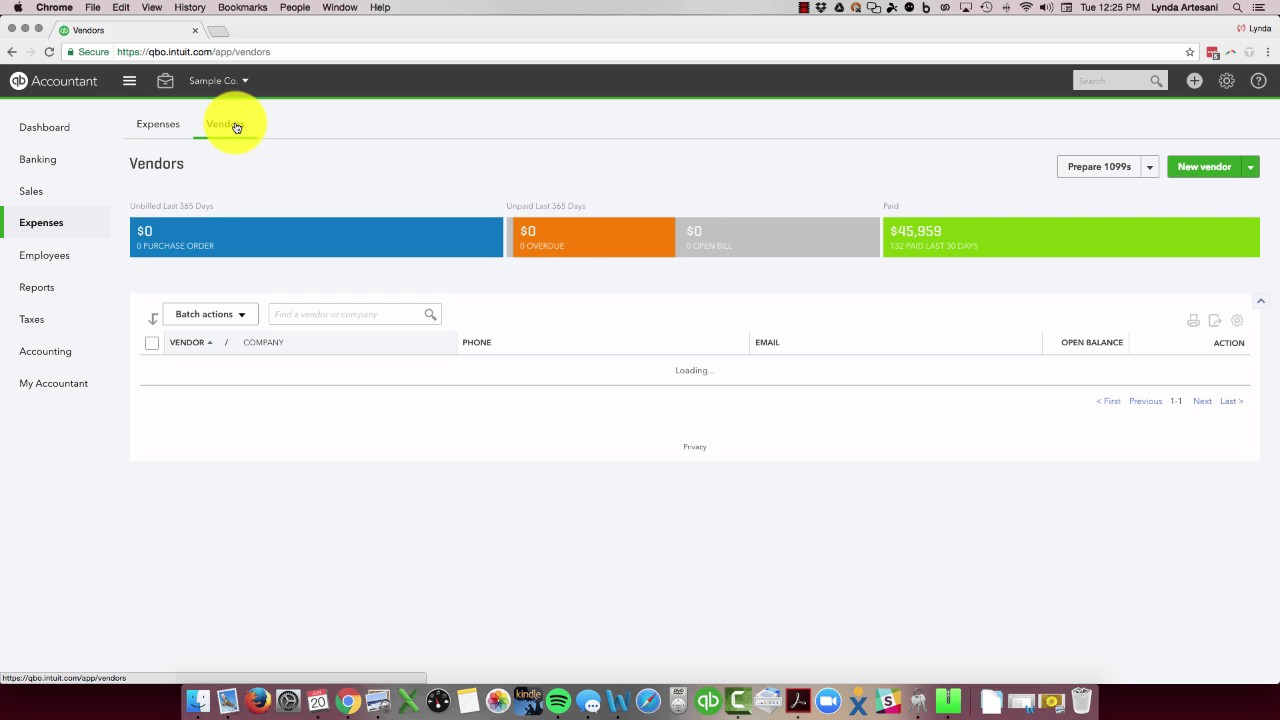
Hello there, Linda Ardisani, Ardisani Bookkeeping. I wanted to do a quick, just a little overview of how to navigate around the new look that QuickBooks Online has. Many of you woke up last week to find that perhaps you couldn't find your customers or your bills and vendors, and the screen changed and you weren't happy about that. I did see that quite a bit on the Intuit Community Forum where people couldn't find things. So I wanted to take you here to the screen to show you how to navigate in there and show you a couple of the changes. Not a big deal, but they're here. So you may have logged in and noticed it didn't say homepage anymore. It now says dashboard. That's kind of streamlining what other web-based programs are. That's really just a word change, not a big deal. It's your homepage. However, it's kind of in line with what other programs use in their, in their terminology, so I think that's a good change. You might have noticed there's no more Customers. The Banking tab is here now. You could always get to it before by clicking here and bring it up on the screen, so not a big change. However, they did unhide Bank Rules. It used to be under here to manage your rules. The Bank Rules are here, so you can now look at the screen to see what your rules are and what you have. So that's kind of a nice feature that they kind of unhid some of the things that were hidden. We'll come back to this page, but where's your customers? So here's your Sales tab. If you click it, logically that makes sense. That's where your customers are, correct? Right? So you have to kind of think in those terms. But then I get this really big long sales listing that's not real helpful to me. I don't use it that often, but some people do. So if you want to come to your customers, here they are. So you'll see all your customers listed here. It's a sticky tab, so if I climb into Expenses, where is where you're going to find your vendors, they're going to be here. I can climb in here and just click on it. Now if I go back to sales, you'll see that it stayed on customers. It only stays for the day though, so don't get too excited about it. The next time you log in, it's going to bring you back to the all sales. I did see on Facebook that someone, I believe in Canada, had this view and then logged in and it's changed now so that customers is first. It makes sense. You really think Customers, you're going to find your customer, then create your sale, and then having the products and services is nice to have here as well. That used to be under the gear wheel, but now they have it here so you can access it a little bit easier. One of the things I'm very excited about is that if you come into reconcile now, some of us, not everyone, but some of my clients and not my file yet, but some of us have the new reconcile screen, which used to be screen that we had before if you weren't using the labs, and now it's back. What's really wonderful about that is you can come onto the screen and then you can see if you want to just look at payments, you can just show payments. If you want to just look at deposits, you can see clearly what downloaded from the bank and what had some rules attached to it. Deposits, you can see all the transactions and you just select with the dots. And I just find this to be easier. It kind of helps you work through it. So I'm happy to see that feature back. And I could probably do another video and get into that more with more detail. But that basically are the changes that they did. It was minor changes, but I know a lot of people were upset when they logged in and couldn't find their customers— customer list or their vendor list because it was removed from a toolbar that a lot of us use. So hopefully that helps to explain some of the changes. Bear in mind when you come online, yes, it's an extra click to get to your customer tab, but whenever this changes, myself included, I was like, oh God, put it back. I don't want to see it. I don't want to have the extra clicking, but you get used to it. So try to open your eyes to that and try to be okay with the changes. There'll be always changes coming because QuickBooks Online is ever-evolving. My opinion, getting better and better every time you get into the program. So hopefully that helps. I'd love to hear your feedback. I will provide a link to Facebook. It's the easiest way to get in touch with me, or if you would like to perhaps suggest another video, I would love to create it for you. Thank you so much for following my, my blogs, and we'll hope to talk to you again soon. Thank you. Bye now. Bye.