How to use the NA Function () to improve your graphs
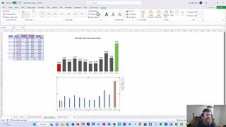
Learn how the NA function cleans up spreadsheet graphs by hiding data points instead of deleting them. The tutorial covers actuals vs forecast charts, highlighting max and min values, and using interactive checkboxes to toggle data series on and off.
FPNA guy here. I'm super excited to show you three graphs that you can create because of the NA function. The NA function gives you the NA error, and I'll explain how that works later. But first I want to show you these three graphs. So the first one we're going to walk through is what I call an actuals and forecast. So this is the first graph. This comes to us from Chris Riley. You'll notice we have the actuals in one color, the forecast in another, but it all looks like it's part of one line. I'll explain how using NA allows you to do that. So that's the first one. The second one I want to go through here comes to us from Leela Gharani. And in this example, we can see that the max and min is highlighted in a different color than everything else. So walk through how to set up that. And the third one here comes from Chandu. I took his course, highly recommend it. And here you'll notice we can compare different cells against different categories. So we can take cells and compare it to cogs, our gross profit, or customers, or, you know, just customers and cogs. We can click on or off whatever we want. And how we create that is using na. So I'm going to briefly walk through how you create each one of these to give you an idea of how it works. So let's get started with Chris's example. So first, before we get into the details of the example, let's see how the NA function works. We can actually see it here on this page. If I type na, you'll notice I get na, right? So why is that important? Why does that help me? Well, let's go. What happens if I put zero here in this formula and let's say I put zero here? Notice. Just notice. What happened is that first point went to zero in each case and that messed up the graph. So I'm going to hit Ctrl Z. So anytime you have zeros, let's say I had zeros on each of these, right? It now messes things up because it shows 0,000. And if I did zero here, right, same thing. So what happens is NA doesn't display on a graph. So what I've done is I've written a formula here. The first formula says, hey, if a three equals actuals, then give me the actuals. So, right? If a 3 equals e 2, then give me C3, which is the actuals. Otherwise give me the error na. And so I take that formula and I copy it all the way down in the next formula, it was a little trickier. I did a nested if here and I'm going to split it so you can see what I did and I'll explain it to you. I'm sure there's probably an easier way, but it was the way I did it is I first said, hey, look, if A3, so if that equals forecast, then give me D3, which is forecast. So you can see down there in that case here gave me forecast and all these. And then I said, hey, if the max axials is equal to b3, give me the axials, give me e3, otherwise give me na. What that does is it allows both points to be here. So see, if I delete this right now and I only have the one, you'll see this line doesn't come down to that point. And so what I'm doing is I'm basically making that line go up to meet this one that comes down to 275 by putting it the forecast. Right. See, if I, if I take it away again, if I take it out of the forecast, you'll see the line doesn't come up. And so that's why I write that formula to say, hey, whatever the max axles is, actually put that one there. So they meet at that spot and then it continues on down and the rest of it is just equal to forecast. So right, if I was to graph just this here, which is what some people would do, let's just say I graph it. What I get is I get this, which is two lines and so I can see, hey, actuals, I can see how forecast trended. But sometimes you don't want that. You just want to see what the actuals were and forecast all in one line. So, so that's the first one and how you can create it. The second one is what I call a max and min where it highlights the main color. So let's start here and explain what's going on. So if I was to create a graph here, you know what I'm going to take out next year for a minute and we'll add that back in here in a second. So you can see that adjusted. So let's just say I start with the month and gross cells. So 8 insert recommended chart. We're going to do this, we're going to see this looks like this. But I don't have a max, I don't have a min. So now what I've done for the max is I've added a formula here that says if Max gross cells is equal to D4. Give me D4, otherwise give me an error. So you can see the 37 worked. If I change this to 5,000, you would see 24 now becomes the max. If I change it to 15,000, right, you'll see it's still the 24 there. And so I can adjust that however I want. So we'll go ahead and change that back to what the number was there, the 37,000. So that's the first thing I did is I did a formula that said if max gross cells equals the the first element, return that. Otherwise na. The next formula is the exact same, except for it is the min. So now what I need to do in this graph is I need to add those data elements. So let's go add them. Let's add max cells here and we'll just go ahead and select this and you can see it. And so we'll add. It doesn't quite look like what we want yet, but let's keep going. Now let's add min. There's the min cells. Let's come down here. Let's take this. And we've added the min cells. And so we can see min there, we can see max there, but it doesn't look anything like this. So let's walk through how we're going to get it set up. So the first thing I always like to do is I like to get rid of grid lines and I like to get rid of this. If I'm going to use data labels, which I'm going to. And I like to get rid of my outline. So I've done that. Next, let's see if I can figure out how to fix these. So I'm going to hit Ctrl1 and bring up this format. So you see here where there's this series overlap. What happens if I overlap the series? Notice the orange and this gray, which are the max and min sit exactly on top of the others. Okay, that's what I want. So we've done that. Let's do a few other things now. Now let's look at our gap width. I usually like a gap width of about. Oh, that's not quite what I wanted. I accidentally hit series overlap instead of gap width. So we'll go back to 100 there. I like a gap width of about 70%. So I'm going to go ahead and hit 70 now. You can see it looks like that. And then all I need to do is add data labels here. And I like to enlarge these. We'll Say bold, know size 12. And then the next thing we'll do is we'll come in here and we'll change this format to be. We'll go with this gray here. Our lowest, we'll make red. So we'll make the shape fill to be red, and we'll go ahead and do the shape outline to be red as well. And then here we'll do green. So we change it to green. Change it to green. And the one thing we missed here on this one is we forgot to make sure both our fill and our outline were the same color. And there we go. Basically the same graph. They look slightly different just because they're not the same size at the moment. But you can see we just created that graph quite easy. So anytime you want to show max and min, you really add something. Another thing you could do, you could decide to, hey, I don't want to show those data labels. Maybe all you want to show. So if I go to data label, if I unhighlight that, if I highlight just this and add a data label, and just this and add a data label, I could show just the max and the min if I wanted. Right. If that was the case, I would add the axis. But you have a lot of options, and it really makes it stand out what you're doing. So there we go. The third graph is a little bit trickier. It took me a while to learn this one. So let's say I have this raw data. I have months, sales, cogs, gross profit, and customers. Right? Normally I would just take this, insert this into a chart. So I come here, I've inserted it into my chart. If I wanted to get rid of one of them, I would normally come in to select data and say, oh, I really didn't want cogs, so let's remove that. I really didn't want customers. Let's remove it. Well, I've learned another method to do that. What we have here is we have some little boxes, developer boxes. So if I come to developer, I can insert on the developer ribbon, I can insert a box. So let's see, this is a checkbox. So, right, I have a checkbox here. And in this case, you know, we'll say the first checkbox is named cog. So if I click on it, I can come to Format control. And you'll notice there's a cell link to C19. So we'll look at that in a minute. But you can see value unchecked linked to C19. So let's see if. Let's See what happens when I check it in C19? C19 changes to true. So let me highlight that. So, right, I have my checkbox here and I can do the same thing here. If I take this checkbox, right click on it and say cell link. And if I linked it here as an example, F19. Notice. See there it's true. There it's false. So all we have is a checkbox that's displaying the word true or false. So now I'm going to show you the next step. But first we're just going to go ahead and get rid of this so we don't need it. So you can see there, if I do this one, you can see it change to true. Change to true. So all I needed to do to set this up was create a simple formula that said, hey, if C19, which is the link, if the link is true, then give me P3, otherwise give me NA. As soon as I click on it, everything's N A, nothing shows up. Next column, same thing, you can see the formula there. And last column, you can see the formula there. So basically, by using a simple from the developer ribbon, a simple form control checkbox, and then linking it to a cell that says true or false, I can rewrite an easy formula that says hey, if C19, right. And basically it automatically knows true false. So it's saying, hey, if it's false, give the second argument. If it's true, give the first argument. Since the word's true, it would give the first. In this case, since the words false, it's going to give the second, which is na. When I change the word to true, it's going to go ahead and give the values over here. So those are three ways you can use NA to really enhance your graphs. Go ahead and share in the comments. How else do you use na? I'd love to see the ways you use them. And again, I want to thank the three people who taught me these ideas. So this one is thanks to Shandou, this one here is thanks to Leela Gharani, and the first one is thanks to Chris Riley. So please go ahead and share. What are some of the ways you enhance your graphs by using the NA function?
More from Paul




Trust and Leadership Lessons for FP&A From 100+ Top Leaders with CFO Jon Laudie