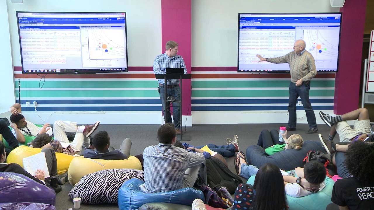
This content was created by Tim Draper. This content was uploaded by Tim Draper. This is a YouTube demo video titled "How the profit velocity software works | Michael Rothschild" (uploaded June 17, 2016). It’s a product demonstration of the Profit Velocity Accelerator platform led by Michael Rothschild and an unnamed presenter (Speaker A). Using a demo plastics-manufacturer dataset and interactive topo maps, they show how the Profit Velocity metric and on‑the‑fly simulations (e.g., 10% price cuts with 30% volume increases) reveal counterintuitive outcomes—cutting price on a high‑margin item can reduce profit while cutting price on a low‑margin item can raise overall profitability. The session is aimed at executives/operations teams to illustrate granular, interactive analytics for better pricing and portfolio decisions.
Chapters
No problem. So this is Profit Velocity Accelerator, our software for the most part. We're gonna do a really quick example. Michael and I were talking a little bit this morning about what does it kind of take or what do we want to convey. And I was thinking what's not only applicable to our story but probably will be applicable to all of your stories as you go on. Really, 2 things that jumped to me is you want to either solve someone's pain like one of their pain points, come up with a solution for them, or you want to educate them and teach them something new. And with our software, I really feel like we do a great job of doing both of those. So here we're looking at our demo database. It's based on a plastics manufacturer. Starting at a very high level, you can see we have some of our data. It's all customizable. We can pick whatever columns and data values we want, basically whatever anyone gives us. And we've got our topo map over here on the right. Because we're summarized, it's just one big bubble right now. But I'm going to drill in and just say, okay, I want to analyze this business. I'm going to go look at different markets that they sell to. And as we drill in, we see our topo map's going to update. We can see, okay, various profit velocities by each of these different markets. Up here we've got food and beverage. Down here on the bottom we've got automotive. If we want to continue to drill in, because as Michael was saying, the devil's in the details, Let's go look at the customers of different building materials. Again, we've got a nice topo map. You see the spread. There's really not a lot of tight banding around our blue line, the average PV. In terms of just teaching businesses something, we're going to do a very counterintuitive example here. We're going to start looking at this yellow bubble here. Parent 8. And we're gonna compare this guy to our much lower margin product down here, or customer, pardon me, this purple bubble, parent 29. So, if we look right here— oh, you guys can't really see that, can you?
Just pull this over and make that bigger.
Okay, there we go. So, we're comparing this yellow bubble And this purple bubble here. So our yellow bubble, we can see, is much higher margin at— if we look at the second line, our variable contribution per unit is $12.38.
So the setup here, just to comment, is the normal thing when you're trying to figure out what to do is we need more volume, so let's cut prices on the high margin Because we've got room, we'll make more money, we'll get more volume because we cut the price. We certainly aren't going to cut prices on the low margin product because it's very low margin. We can't afford to do it. It's just the way it is.
Exactly. So we're going to basically do 2 simulations here. A 10% price cut in order to increase demand by 30%. So we're gonna start with our high margin product thinking, okay, that's what we wanna sell more of. So I'm gonna just come in here. I'm gonna drop our price down from $31 down to $27.90. And as we make our updates, this is a good example of how with a lot of these manufacturing companies, there's always the question of how much is that choice going to cost us or how much is it going to make us? So, we can see, all right, that 10% price cut is going to drop our revenue and profitability by a little over $100,000.
Yeah, I'll just point it out here. You keep moving.
Yep.
So, this is a summary of actions so they can instantaneously see that they're— that cost them $100,000 worth of profit. Just cut the price on that.
So, now we're going to bump up the number of units since we've increased demand by lowering price.
And that's arbitrary. We're just using an example.
And this is actually a really good counterintuitive move here where net revenue has gone up by $144,000. So your sales team is going to be really excited. They think they're making a lot more money. That's maybe what they get compensated on. But their variable contribution has actually dropped by $12,000. We just calculated that. Yeah.
Profit is also down.
So the sales guy's doing better, but the business is doing worse.
Happens every day, everywhere, all the time, without exception.
So now I'm gonna discard these edits, and we're gonna try the counterintuitive example of going after the lower margin product. So we're gonna go to our purple bubble here with a cash contribution per unit of about a little over $8. And we're gonna do the same 10% price drop for a 30% increase in volume. So again, with our 10% price drop, Discount, we're gonna see this actually drops our net revenue and our variable contribution by even more. So the first example is a little over $100,000. Now we're almost up to $150,000. And we're gonna bump our volume up again by that 30% increase. Now what we see is our revenue almost goes up by $300,000. And our variable contribution, or cash, is now positive $17,000. So if you compare that to the negative $12,000 before, not only now are the sales guys making a lot more, but the business is also more profitable. And this is the kind of thing that I think gets lost a lot, especially in executive meetings, you know, when decisions are being made, because they don't have a granular level of detail and visibility into their business, let alone the capabilities of doing these kinds of simulations on demand.
Generally in the real world what happens is people have spreadsheets, printouts, there is no interactive graphics. If I'm a senior executive in a company, if you ask them how many products they have, I often do that, they'll say, oh, you know, we have about 100 different products. The way they group them in kind of product families, yeah, they have 100 different products. They actually have 10,000 different products, but they don't think in terms of the microscopic SKUs, because the human brain can't handle that much detail. So they never even look at reports to show that, much less make it interactive where you can zoom in and figure this stuff out. So, you know, we could go on for hours. In the demo, you're seeing 1/10 of 1% of the functionality of the system, but it highlights this issue of getting a counterintuitive result. From what you've always done. Given the— once you have the access to the curves, the Profit Velocity metric, you see things that you couldn't possibly have seen before.