Iconography | Landing Page
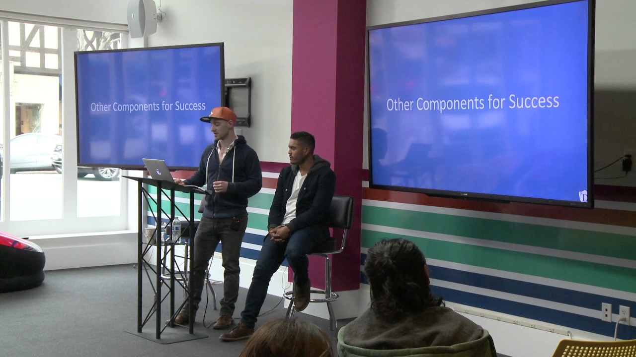
A workshop on landing page design covering iconography, social proof, and branding. Use PNG icons from Noun Project or Flaticon, keep visual style consistent, and choose testimonials with numbers and faces over generic quotes. Logo types include wordmarks, lettermarks, and combination marks, each with different scalability and emotional impact.
Chapters
And another thing that you notice is that they've got the icons above the features and benefits.
So when using icons, I recommend using PNG files. They're just the highest resolution you can get. Avoid PDF by all means. It just comes out really pixelated. These are also resources I love, mostly the Noun Project. nounproject.com, you have a whole bunch of designers that just upload their icons. You can pay or you can download it for free. It's honestly maybe a few dollars, and it helps the designer out. But they have a bunch of packages you could just download and easily use. And they come in PNG files, AI files, Photoshop files. And then these are also other resources too— Flaticon, Icons8. And then dribbble.com. Do you guys know what Dribbble is?
No.
It's an online site where people or designers put their portfolios up. A lot of times they come up with these icon packs and you can just download a zip file for free.
And then actually a tip that I would say about iconography, I do a little bit of design work myself, and one of the tips or tricks that I use in Illustrator, I don't know if you guys have used Illustrator before, if you haven't, go on YouTube and teach yourself just some of the basics. You can go onto Google and look up like pencil icon, and you'll get a bunch of different icons, and you can take it into Illustrator, and there's a feature there that's called image tracing. And what it'll do is it'll actually trace out the image and turn it into a vector, and then now I can manipulate it, I can change the color of it, I can like all the different pieces of it. And it takes 2 seconds, and it is extremely helpful if you wanna— Really make sure the icon matches your brand.
Right, the coloring, yeah.
Which is what you're going to talk about in a second.
And then also with that, the color, make sure you know your hex codes. That's just a really specific code of your color. So this, for me, I think is a good example of the icons. They're uniform. They all match the same style. And then the colors are all the same as well. And like we talked about, we have your value here, and then a little explanation with just one sentence. Another example. Except, for me, this is a little bit too much text.
It's just the point of keeping it consistent. So the icons don't look like they're from 3 different icon packs. They all look the same.
Right.
And the last one for key components of a successful landing page is some sort of social proof or testimonial. So this right here is a good example of a testimonial. They've got a number to their happy customers, so like 300,000, and then they also have a video here from Reno, and he is talking about why GetResponse helped his business. And on that note, a lot of people when they read testimonials, sadly they don't believe them. Mainly because when you just have a, hey, this product is great from guy at doodle.com, like that doesn't really tell me anything about who that is or why they're saying about it. So this is a decent example of a more trustworthy testimonial. They have some guy's face, a well-known person from TechCrunch, and it says, hey, Neil, or whatever this platform is, increased increased my traffic by 30% within 2 months. So they give you factual information about what the service does or accomplished from a large company that's trustworthy. So now all of a sudden when you're reading this, you can be like, oh yeah, this has worked for someone who's large, who is trustworthy, and I can put my faith in it knowing that this platform worked for them. And then Basecamp actually does a crazy thing where they have, Their testimonials over here, and they do what I said you shouldn't do, which is just put the quote and then the name and the company. However, they have hundreds of them, and this just keeps scrolling on forever, which I guess— It's a lot of testimonials. In this quantity, like, it's hard to argue with compared to like one random quote on your landing page. So if you're gonna do it, put— like it goes on forever. Put real facts and who the person is that it helped. It's even better if you can get a video of that person saying what your company did for them and how it helped. But testimonials are great because it adds social proofing. We all want to be part of something and it helps add— Social proof. Value to your product to know that other people are deriving value from it. So here's another couple key components for your success. So logo and branding. This is actually an entire workshop, side workshop that I do. I'm just gonna go over it real quick. So we've got some logo recognition. Starbucks, Nike, Twitter. These are really big brands that are iconic because they have great branding behind them. What a logo does not do is establish the emotional corporate image as a whole or establish the visual aspects, the overall visual aspects of the brand. Those are brand traits. What a logo does for you is identifies the business at its simplest mark. Here are some of them that I designed. Didn't even need that to be in there. So, there's a couple different types of logos: wordmarks, lettermarks, brand marks, combinations, and emblems. Wordmarks are just a logo that is the actual name of the company. Good logo design involves a small twist. Does anyone know what the twist in the FedEx logo is? Yeah, with the box.
The arrow?
Yeah, so they actually have an arrow in there letting you know that it gets from point A to point B, which is kind of cool. Each one of these have some sort of small twist in it. So Microsoft has a little dent in the middle. There's a lot of negative space going on. It's just adding a little twist to your logo to make it stand out. Lettermarks are companies that have acronyms. So IBM, CNN, EA. They didn't want to make a logo for Electronic Arts, so they just shortened it to EA. Brand marks are logo identities. So, the apple from Apple. Batman, his symbol is actually a brand mark. The shell from Shell. Even the Pepsi thing is very identifiable. So, combination marks combine either an icon and text. So Burger King is a good example. You can— it's got Burger King in letters and it looks like a burger. Goodyear has got the shoe which can stand out on its own or the Goodyear. And Whirlpool has a nice balanced logo. And the final one is an emblem. Like Starbucks, they've got the emblem that they can slap on all their cups, on all their brands. Harley-Davidson does a great job with that too. And then UPS, has the emblem that they actually put on the person too, which adds credibility to the delivery person. So, some of the— do you guys all have logos for your businesses? Yeah.
Yeah?
Do you feel comfortable with them? So, a couple good design points for logos are balance. This is a really bad example of a logo. It's not a balanced logo. The font is different between the NYC, the T, and the AXI. It's also different font weights, and it just doesn't really— it's just a bad logo. Size matters. Does anyone know what that—
Is that a reason why it's so identical?
This?
Yeah, when I see it, I instantly know what it is.
It's probably because of the coloring.
Because I know one of my friends from France was telling me that because people like balance, so when they send an email, they— in German it's very accurate, right? So they intentionally spell something wrong. And that click-through rate is actually a lot higher.
When they spell something wrong?
Yeah. So they intentionally put a wrong spelling in there.
Email, like, about this. I feel like that one, in that case, it's because people like to feel like they have discovered something that no one else has found out. So they want to click through and tell them that they spelled something wrong. There's something about people where they want to tell you that you did something wrong. I'm not saying that this is an unrecognizable logo, but as far as design standards, it's not the best. Also, size. You have to pay attention to what the size of your— how it reads at different sizes. So, does anyone actually know what that logo is in the corner? Apple's first logo. What is it?
Apple's.
Yeah, it's actually Apple's first logo. Now, had they stuck with that instead of changing it to the apple, I don't think it would be as recognizable. So just be aware of your icon at different sizes. Colors are super important. So the color of your brand actually gives out different messages. Depending on the color, it sends a different message to the customer. So yellow at the top, we can see, is with optimism, clarity, warmth. Orange is friendly. Reds are exciting. Reds are actually the most eye-catching of all logos. Pinks and purple are creative, imaginative, wise. Blues are trustworthy. Facebook has a very trustworthy brand, which is strange because everyone always complains about them collecting data on them, yet for some reason we trust Facebook. Green is peaceful, health, growth, and whites and blacks are neutral. Grays are neutral. Calm, balanced. What colors do you guys have in your logos? I know that you've got greens. So, you're sending a peaceful growth health message to your consumers.
And also money is green.
And also money is green, which is true. Shi, do you have a brand logo color? Yeah, we do. What color is it?
It's a mix of blue and yellow.
Blue and yellow? Does that fall with like the branding image that you want?
I think so.
You think so?
Yeah.
Trust and—
Because our logo is based on a duck, but iconized, right? And we're in the airlines. So it's blue sky, trust, beautiful user-friendly interface. So I guess it's kind of a— when we designed it, we didn't think about this. But thinking about it right now, it kind of matches.
You're blue? I feel like that's a good color for the senior market. Or like a gray, like the calm, balanced. How about you, Jonathan? We call it the material design colors options. And we're having changes, like from red to something else. What color is it?
Different colors.
Oh, OK. It's different depending on—
Yeah.
What about you guys? We have a combination from blue to green and 2 different steps in between. So it's like blue, lighter blue, kind of turquoise green. And does that match the type of emotion? Very much. Yeah. And then also on that note, when you're When you're choosing more than one color, I'm sure your designer made sure they were complementary or tertiary colors. There's actually tools you can go on, like color.adobe.com, and you can pick out a color, and it'll tell you the secondary, the tertiary, and all the different color matches for it, which is pretty neat.
Also, along with color—
More from Tim

He Sold His Car to Build This Startup, Then Pitched It for $1M 😳 #Startups #AI

This Startup Moves Your Crypto BEFORE Hackers Can Steal It 😳 #Crypto #Cybersecurity



15 Months Without Refrigeration?! This Startup Thinks It Can Go Global 🥥 #FoodTech #Startups