This content was created by Tim Draper. This content was uploaded by Tim Draper. This is a YouTube presentation titled "Startup Design Approaches and Why they Matter Long Term | Mediacamp\'s Dave Austin" (posted June 14, 2015). The excerpt captures a talk by Dave Austin (Speaker A) about product and UX design practices—right-sizing design, designing for senses, pixel-level decisions, presenting appropriately for different audiences, reuse and consistency of interface elements, and trade-offs for shipping features—with brief prompts and questions from an interviewer/moderator (Speaker B). The talk includes examples from Keynote and iDVD and is aimed at startup designers and product teams.
Chapters
Design approaches. So that was about whole product. I could go on forever, and please interrupt if you have any questions. I want to talk a little about design approaches and thinking about how you create product and what you do. I want to talk about scalability, scalability of design. It's really important to do the right size design. How many people here are designers or think of themselves as designers? Okay. You should all have your hands up, because you're all freaking designers. Some people specialize more so than others. I'm not a designer, but I am a designer. If that makes any sense. I was not trained as a designer. I've done, you know, as you could tell in my presentation, I'm not a designer. I'm not a designer. But I know good design when I see it. I was taught that. You can learn good design. You get— you learn, and the best way to learn that is by good mentoring. I got mentored by one of the best. Right-sizing design is really, really critical. If you are trying to present something, and the most important thing about this is telling the right story and knowing your audience. Who are you going to present your design to? If this is something that's going to go out to the world, it needs to be pixel perfect, because people in the world in general cannot do the leaps of vision that you can potentially do because you know the problem space or what's going on. Sometimes you can, in your teams, you can just do whiteboard quick things, wireframes. I could never show Steve a wireframe. Never showed Steve a wireframe. Not that he couldn't get it, but that wasn't what was important to him. He figured you already did the wireframes. He assumed you already figured all that out and tried all the different iterations. What you're focusing on now is the much harder problems. Because the reality is one of the most harder problems is in where his value was. He could tell you whether the aesthetic was good, whether the interaction was good. And that's— so knowing that audience and who to present to is really important.
Yeah.
So thinking about using the right tools for your audience and what you're trying to do with design is really, really, really important. And the best way to find out that is to see who goes before. Learn from your peers. Learn from people who are— if somebody's presenting to somebody else, if I have to give a— I didn't get to do it for this, and I looked online to see who's been presenting to you guys. I said, OK, great. I said, 4 billionaires, great. Well, I'm not going to quite— I feel honored to be in that. I'm not a billionaire yet. Apple was very good to me, but not quite that good. But to think about who you're trying to talk to, what are you trying to express, what will take your words and your drawings and your pictures and your imagery, and what will cause the smallest amount of friction to get it into the other person's brain? It's really important. So think about that. So think about whether or not— and what are you trying to get out of it? What kind of feedback are you trying to get? Are you trying to get pure, do I like the color? I can go on a long conversation about color. That's another story. Or is it, do I think this interaction's right? Or do I have the right feature? Think about what feedback you really, really want. Know the questions. Know what you want the answers— answer to before you— before you even start doing your design. It's really important. And I went backwards again. I'll talk about the design of this clicker sometime.
Okay.
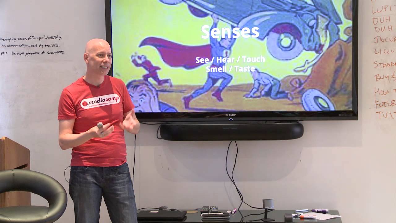
Users. I hate this word. They're people. They're not users. To me, again, I think words are really, really important. I think humans, saying human-centered design, is even more desensitizing to the reality that these are people. These are what we— when I think about a product, what I'm doing is I'm thinking, anytime I put a product in front of somebody and they're interacting with it, they are giving me their soul. Because they're giving up their time, their energy, their eyeballs, everything for me, for what I've created. I don't want to waste that in any way, shape, or form. I want to think of them as a person. So I want to do everything I can to make their life better through that. And to me, that's not a user. It's not a, I look at them through a two-way mirror and try to see what they do with my product. That's desensitizing. That's a removal from. The products I created at Apple were the products I wanted to have. Everybody was taught at Apple to create the product that you want to have. You want to use it. You want to be able— this is something that's important to you. It's not just— and you're trying to feel what other people would want to do. It's really important. And I went backwards again. Senses. Product design today— Is all about these senses— seeing, hearing, and touching. Touch is new, relatively. For me, it's new. For you, it's old. But for a long time, we didn't have touch, other than maybe a mouse. But there was no— it was not the same. Everything in the product, you have to think about is how these senses work. There's still 2 other senses that we ignore. Today. Who knows what happens in the future? It's kind of weird, but maybe. But they're implicit. We try in product to indirectly affect smell and taste. I was doing themes for iDVD back in the day. And we were doing some themes on a beach. And it was all about the sound, the texture, The color of the sand. I won't tell you how many iterations on color of sand we went through for this. Because we wanted to make people viscerally feel that they could smell the ocean. They could taste food. And you're trying to bring that full senses. The more you can fully have a product that fully engages all the senses, Will allow you to potentially help the person accomplish something they couldn't otherwise. Yeah.
I agree, that makes a lot of sense as well. Do you have any examples?
Just gave one. I always fall back to Keynote because it's the one, it was so critical to my learning how to design product and be involved in product design. Again, I was not, you know, I wasn't pushing the pixels. Designers were, but I was intimately there working like crazy. It was thinking about— a perfect example is when we were doing Keynote, we were talking about how we even— everybody knows how Keynote, you can take the slides and you can put them underneath each other, hierarchically do the slides, and you can open and close them, and how that animation should feel when you open. We did so many iterations on how that should work and feel to get it to feel like a real thing. To get the speed, get the animation. It's all about getting that so it delights. It goes back to— if you can delight with your experience, then people feel like it just works, and they don't even have to think about it because it just smoothly goes. It means that feature that could have been something that got in the way because it's cumbersome, you've got to do it a lot, instead became enjoyable. That's a huge difference. I don't know if that helps, but I'll think of some more.
Sure. Can I find that online?
See what— find what online?
A specific example of something like you were describing, a tactile experience or something that emulates—
I'm sure you can. You can find anything online. I can't think of anything off the top of my head. I'll think about it. It's a good question. Happenstance. I use happenstance because serendipity's been stolen by somebody. I think happenstance in product design is critical. Because you've got to be open to surprises. You have to be willing to accept that something from the outside is going to affect what you're doing and may change your direction of what you're trying to accomplish. So the most important thing is to pay attention. This goes back to me, in my mind, to context. Be willing to broaden your context and think broader than just the current problem space. Because it may— I remember when I was doing DVD Studio Pro, I came in to fix it and it was trying to ship in a few months and all the people were so close and we had all these features and we had to get them all done. I said, well, this feature here we're never going to get done. We need to let that go. And it's really hard when you're really close to a problem to say, this is a key important feature. It was in the previous version. It's like, no, no, no, but it's not used that much. It's going to cause you not to ever ship. In a timely manner. And you need to be able to have that context. So be open to those kind of things. Be open to thinking outside a little bit. I did it again. I hate this. I do not like this clicker. I'll go on record. How am I doing? I'm doing OK. I can go a little over, I hope.
Yeah.
OK, good. Thinking about pixels, thinking about— so this is more of the visual design. The way we started every design of every product I've worked on— I should be clear on that— every design I've worked on since I drank all the Kool-Aid was to think about starting blank and think about each pixel you put on the screen. And if it's not absolutely needed, you don't put it on there. And you place each one with thought. We spent so much energy looking at— and it's like we think about a new feature we wanted to do. For Keynote, we had a resize. Where are we going to put this resize thing to scale? And for a long time, we had, well, you can go out from the menus. You don't really need it, but we need to access it. It's like, how do you put that there to make it simple, small, and not in the way, and minimize and not take other real estate, which is actually the next topic, is really, really important. Because every single pixel you put on the screen is taking the concentration and focus of the person who is trying to look at the product. If you focus on getting the functionality to be minimal pixels, then you can spend some energy on the pixels that make it aesthetically pleasing because you have more pixels to play with. This goes into also thinking about horizontal and vertical, which it used to primarily when I was doing desktop software, it was really, it was this space, it was the vertical space that was the critical space because you have less of it on a screen, right? Obviously when iPhone came, it became the other problem. It's your horizontal space that you're limited in. Since real estate is also precious, how you use that real estate How many vertical lines you would have, and how much you're actually breaking up the space. Really important to think about. It's really important to think about how do you reduce and reuse parts of your interface. If you have a part of the interface that could be smaller, could be done with less, try that first. And then try reusing it in other parts of the product where it makes sense. The more you have your interface consistent across is really important.