U.S. postage stamps go through a rigorous design process involving the Citizens Stamp Advisory Committee, which receives 40,000 to 50,000 public suggestions yearly. Designers like Carl Herrmann and Terri Noyes navigate the challenge of fitting detail into a 1 by 1.5 inch canvas, working through multiple rounds of review before stamps like the Elvis series or Duke Kahanamoku reach mailboxes.
Chapters
The history of stamps is a very interesting history, and once you start delving into it, it's really a fascinating story. One of the interesting things about my job and the design process is that it's a continual education for us. The first stamps were issued in 1847, and they were all very very famous presidents and politicians, and that went on for many, many years. It was assumed because it was a U.S. security, much like the dollar, that we needed to have famous politicians. In the late 1860s, somebody had the innovative idea of creating more interesting subjects, but the amazing thing is the American public wouldn't accept it, and they went back to politicians and to presidents on stamps. And that went on until 1892 when the very the very first commemorative stamps were issued, and they were issued for the 400th anniversary of Columbus's landing. So subsequently, they started adding more interesting subjects. But then in the '30s and '40s and then on up into the early '50s, Congress exerted more influence on the program. Congress was looking for ways to promote specific industries, and one of the industries they wanted to promote was the poultry industry. While it was an interesting graphic design, the American public says, "What is a rooster doing on a stamp?" And that has changed our whole process. Whether they knew it or not when they created that stamp in 1948, it did revolutionize how we develop stamps and subjects. The stamp design process is really a very challenging one and a very complex one, and that's why it takes so long, usually a year and a half, to design a stamp. But there may be a misconception that because the Postal Service is a giant corporation and we have approximately 800,000 employees nationwide, that there must be a giant group within that giant organization that creates this plethora of stamp designs. That's a misconception. It's a very, very small group within the Postal Service. There are only 8 people that develop stamps that are on staff to the Postal Service. Yes, we have an extended family of people that are contractors to us. We have the 6 art directors that are under contract. I'm extremely proud of that small group. And the photo assist research team, they in turn will do all the research for the art director and for the illustrator. And the production house that actually scans all of the artwork for us and gets it ready for the printer. The process begins actually with the American public. The American public submits suggestions to us, and our office receives anywhere from 40,000 to 50,000 suggestions and letters to our office every year and to the committee. The Citizens Stamp Advisory Committee, when it was formed in 1957, was put together to help make the selections for the Postmaster General. Part of that process is to narrow it down, and we have a set of criteria that the committee has developed over the years. And basically what they do is they help us focus on a national scope. The assignment of topics, once the committee chooses a subject, that's one of the more interesting challenges for the stamp development staff, is to turn the subject over to one of 6 art directors. The art director then develops his concepts. Then they seek out either an illustrator or a photographer or graphic designer that they feel would be the best person to create this art for us. Howard Payne, one of the very first art directors to work with the Postal Service on the stamp design process, predates me. Howard has been revered in the design community because of his many years as art director for National Geographic Magazine. And he is amazing in his intuitiveness when it comes to designing stamps. And his contributions to the stamp program have been invaluable. We lovingly refer to him internally as Father Art Director.
For a long time, the Citizens Stamp Advisory Committee, uh, was besieged by requests to do a stamp honoring Elvis Presley. They all said, we don't need to do Elvis, let's put him off. But the Postmaster General had a different idea, and he wanted to do, uh, a series of stamps honoring one of our nation's biggest exports, which is music, popular music. And he wanted to do a series series of stamps honoring gospel and rhythm and blues and jazz and classical and Hollywood music and Broadway music, starting with— guess who— Elvis Presley. And for the first time, the Postal Service issued a little postcard voting ballots. Do you like the young Elvis or the old Elvis? The young Elvis won hands down. My theory was in design that they would all be the same size and format. They're all semi-jumbos, and that they would all have, uh, they would look like record album covers of the '70s or '60s, which had a lot of torn paper. That's my ephemera and my collection of old things coming to the fore. I save paper ephemera. Ephemera means something that is used only briefly, like a trolley transfer or a ticket stub. And all of those things have a certain magic to me because they're printed and they're dated. Stamps are very ephemeral. You put it on an envelope and hope that it gets there the next day, and it's canceled and it's beat up and it's— the envelope's torn open. And in a way, it's done its job of delivering the mail, and most stamps are thrown away in the wastebasket.
The 6 art directors that work with our staff are a really diverse group, and I consider them family. Carl Herrmann is one of the most unique individuals I've ever met. He's a wonderful person and a lot of fun. The first time I ever met him was when he joined our group. I had heard of Carl for years, but I had never really worked with him, so when he came to our first meeting, I just fell in love with him, and Carl does some very innovative things for us in the stamp program.
I think my favorite assignment of all the stamps that I've done was doing the stamp for Duke Ahanamoku because he was my hero when I was a lifeguard back in the '50s. When I prepared to do the Duke stamp, I did a lot of research, took a look at some of the early posters of the Duke. As a surfer, I had a real opportunity to show off this sport. I met with Ken Oster in Laguna Beach, and we put together a sheet of 20 stamps. We had shooting the pier, we had hot-dogging. The more I looked at different things, the more I realized that we had to put something together that respected his background as a swimmer, As an Olympic champion, as the person who introduced surfing around the world, and an outrigger canoe paddler, he was everything in the ocean that you could ever want to be. I realized we were putting together more of a portrait, so I assembled the pieces so you could see him in the tank suit, could be a swimmer, a surfer, or a paddler, and combine that with some surfers coming in on a wave on the right-hand side and have a background of his beloved Diamond Head and Waikiki Beach. I ended up going to Michael Dee's, who was the greatest portrait artist that I know, and I knew he would do a great job. You try not to show something that's been seen many times before, but you try to combine the elements of a person's life and show it in a proper way. And I think it did true honor to one of my early boyhood heroes.
One thing that I do when I'm painting a stamp is I have to constantly be aware of how it's going to look at stamp size. I generally will paint at roughly 4 by 6 inches or 6 by 9 inches, I think, is the largest stamp I've ever done. But you have to constantly imagine what it's going to look like when it's reduced. So towards that end, I keep a mirror by my side at all times when I'm painting, and I'm constantly holding the mirror up over my shoulder and looking at the stamp to see how it will look when it shrinks down. I don't know what it looks like to my neighbors who see me in the middle of the night with a mirror looking at myself, or so it must seem, but it helps you see what the image will look like when it's condensed down to stamp size. The stamp that I'm most proud of, I think, is one of the first stamps I did was of Tennessee Williams. When I painted it, I was living a couple of doors away from where Tennessee Williams wrote The Glass Menagerie, so I felt he was watching over my shoulder a little bit, perhaps. I've always been a big admirer of Williams, in particular of his play A Streetcar Named Desire. So I depicted a portrait of him, but in the background I depicted a streetcar. If you've ever been to New Orleans and you see the streetcars at night, they give off a beautiful glow. So I spent several hours in a rather risky part of New Orleans photographing the end of the streetcar line. And if you look at it under a magnifying loop, it's not visible to the naked eye, you'll see a single solitary figure sitting on the streetcar, and that's meant to represent Blanche DuBois, the heroine of Streetcar Named Desire. And that's one of the things I like to do in my stamps is to put a lot of very subtle detail in there to kind of lure the viewer into looking at it more closely. For the Tennessee Williams stamp, I purposely chose a palette of deep greens and blues with a little bit of an orange glow. I have to say I was inspired a little bit by the painter Whistler, who did a lot of nocturnes, night scenes, that use those same kind of luminous blues and deep greens. Color is very crucial to the stamp, but I also feel that the detail is what draws people in and makes makes them linger over a stamp. So it's a combination of those elements, both color and detail and design. A good stamp is an icon that will stick in people's memories for years to come, if it's done well.
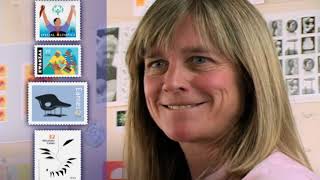
Terri Noyes, another one of the art directors, has brought so many innovative designs to the Postal Service's stamp program. She has such a classic feel for design, and I stand in awe of her not only as a designer, but a person who can manage to maintain a career and raise 5 children and still do such outstanding work. When she brings the designs to the table, not only will she do a version, she will do 6 versions in searching out the best possible design solution.
Over the years, I've been given many different assignments with the Postal Service, and we've all had our dogs, believe me. Certified Public Accountants was a hard one. The social causes are perhaps the toughest, but once in a while something comes your way that you just pounce on, and for me that was the Calder stamps. I had known him as a child growing up, and my father had commissioned him to design a stabile, his very first stabile, for our courtyard in the house I grew up. I was a pretty little kid when all this was happening, but I grew up watching the stabile being put together and put into our courtyard, and then playing underneath this piece of modern art my entire life. I used it as a fort. I put my turtles on it to bake in the sun, sometimes overbaked. So here I had this great opportunity to represent Calder on postage stamps, and it turned out that it was far more complicated than I thought it would be. The hardest pieces to bring down to stamp size were the mobiles. And I wanted to get those mobiles onto stamps. The problem with a mobile is that when you shrink it down to stamp size, all the little wires that connect these, these shapes together completely fall apart. So we beefed up those tiny little wires once they were small and made it really read the way it would have had it been large. The other issue was scale. There was a real scale difference. He has huge stables in the middle of of cities, and he has tiny, tiny little maquettes. Put a huge stabile and shrink that down to stamp size and put that next to a mobile, and it looks like a toy. You had to be very aware of the scale of each of the stamps when they're next to each other. The image that worked the best at stamp size was the little maquette, the one that was almost stamp size in reality. And it had the key colors of Calder. It had the red, it had the yellow, it did not have the blue, but it had the right spirit. That's what I was after, just bringing across that joie de vivre, that wonderful sense of fun that he had.
Phil Jordan. I've known Phil for, oh, close to 30 years, and he is a very warm individual who has an incredible wealth of knowledge about piloting, being a pilot in his own right. He has his own plane, so he was a natural to do the aviation stamps for us, and he's done some other wonderful stamps for us over the years. When we begin the design process, one of the first things we do is we turn over what material we have to our research team. Once we begin doing the research, we find that it's a fascinating subject and well worth telling the story.
You can trace the history of this country very easily through postage stamps, and it's certainly true in aviation. There have been numerous Wright Brothers stamps, there have been numerous Lindbergh stamps. All of the high-water marks of American aviation have been included in stamps. From my standpoint, I consider powered flight to be the most significant technological advancement of the 20th century. Century. The invention of 3-axis control by the Wright brothers is the same control that's used on the space shuttle today, and every single aircraft that has existed since then has flown with this. It was absolutely the, the most fundamental decision they ever made in the process was to add that third axis control, which was a rudder to prevent the aircraft from sliding in the air. First powered flight is a giant step. The Wright brothers succeeded where other people failed because they knew what it took to make this happen, and it wasn't the motor that took it to happen, it was the control of the aircraft. It's interesting to know that there are no patents for the 1903 Wright Flyer. All the patents were on the 1902 Glider. So they took the 1902 Glider and with some few changes, they knew they were going to fly. But in getting into this thing, people are absolutely wrong about the weather at Kitty Hawk. Nowhere in the Wright journals do they mention cloud cover, rain, or anything of that nature. They only talk about the wind, which was absolutely essential to the process. And so we tried to run down the weather report, if it existed, and it did. It was absolutely clear on the 17th.
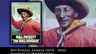
Every single stamp design that we do goes through a great deal of verification and research to make sure that it's authentic. In 1994, the infamous Bill Pickett incident happened. I was awakened by a phone call. It was 5 o'clock in the morning. We had a major mistake on a stamp. It seems that a relative of Bill Pickett said, That is not Bill Pickett. That is his brother, Ben Pickett. We were told by a genealogical firm that there were no known living relatives of Bill Pickett. And the actual photograph had written onto the negative, "Bill Pickett," and it listed all of his claims to fame. And he is imprinted on my mind forever because he changed my whole work style and the work style of the U.S. Postal Service. We will not only research the original photographs for the artist to work from, but once the art is done, then it will be sent out to an average of 3 different experts on that subject. The collectors love it when we make a mistake because it becomes to them a collectible.
Must be a gene somewhere for people who collect stamps. There's some desire to have you know, one of everything. And I collected as a young boy. I started in the Cub Scouts. I think there was a merit badge or the equivalent of a merit badge back in those days. You should collect stamps because it's fun, because they're pretty, because you learn history, because you like the subject matter, because you just like the content of the stamps, but not because you think you're going to find great riches Most stamps that have been issued in the last 60 to 70 years are not worth a lot of money. It's only when something comes along like an inverted stamp. In some of the runs, they would get the sheets upside down on the second pass, and so you would have a— collectors call it invert, which are stamps of great rarity, and they're worth a lot of money today. The one that's the most popular here in the United States is something called the inverted Jenny, which is an airmail stamp issued in 1918. Depending on its condition, sold for about $150,000. Back when they were issued, they were 24 cents if you were the lucky person that found those. Only 1 pane of 100 of those stamps were ever found. I would venture to say that people who have collected stamps have a much greater appreciation for our history and culture than those that haven't.
Dick Sheaf has hundreds and hundreds of postage stamp designs, and he established many of the design parameters for some of our current series, such as the Black Heritage Series and a number of others. I think one of the most unique things about Dick is not only is he an ephemera collector, he brings a lot of that ephemera to the table in the form of designs. A number of the love designs that have been done over the years The Old Glory stamps that he produced are from his personal collection.
The Old Glory stamp prestige booklet that contains 5 different stamp designs, and it's about the use of the flag as a symbol and how that has appeared in American culture over the last, say, 200 years, starting with the early political uses and political campaigns, Harrisons and Lincolns and others, and then through the Civil War period The flag was a very much used patriotic symbol, in the North anyway. Then through the Victorian era when chromolithography came in and all of a sudden it was possible to reproduce images and artwork in color and there was a huge explosion of that. A fair number of them were promoted using the national symbols of the eagles and the flags and the Uncle Sam who'd come along by that time. And followed it with images from the '40s and the '50s and the '60s and up through contemporary images, one of the last of which I guess was my guitar, my old Martin D-28 that I bought back in 1970. And so when this assignment came along to do something about Old Glory, I started rummaging through my accumulations of things and found that I I had quite a bit of it and was able to pretty much put the booklet together and some of the stamps from things in my collection. So some projects are already of personal interest, but equally interesting are the ones that we know nothing about. It's really, for me, the most fun of this is finding out about the subjects.
Ethel Kessler has done tremendous work over the years, and she is the diva of stamps. She'll kill me for saying that, but we think she's a great person and know that we're going to get great designs. One of the first projects that she worked on was the breast cancer semi-postal stamp, which was one of the most highly visible stamps that has ever been produced by the Postal Service.
There is something that, that I'm very in touch with, which is that all of life happens for a reason. It's quite interesting. There's not usually an answer to why did I have breast cancer. No se puede esconder, you gotta get over that one. You got it, deal with it, move on. And if you're lucky enough to move on. So I had breast cancer and not long after that was asked to be one of the art directors for stamps. And not long after that, Congress passed a bill that there would be a breast cancer semi-postal. And I am so fortunate to have been in the position that I was in and asked to design that stamp. It's just phenomenal. But then the task is daunting. How do you communicate something that is generally so feared and so destructive to families? How do you communicate that in the size of a stamp? We tried different routes, but the idea of really making it hopeful, like there's a possibility of finding a cure, was the right approach. We have a similar illustration, and it has a Target there in her breast, and it was like, oh my God, not the Target! But we took the Target away, and that's where we put the type. Um, she had a very deep blue background, sort of like a moon and sky. It's like, "Oh, it's so depressing." But with the added color range that we've used, it's glorious. If you look at the drawing, it's the goddess Diana taking an arrow, pulling it so that, you know, she's going to fight the fight and protect. And by the same token, it ends up being the stance of a breast cancer self-exam. You take away the type that we have, and it's "Fun to fight, find a cure." There's no breast there. Can you imagine that after having breast cancer that you actually have a reason why you had breast cancer? So that I could come back as an art director for stamps and be able to take my experience and communicate that to the world in some way.
What we're taking is a little 1 by 1.5-inch piece of paper and making into something that reflects American culture. And they're iconic in their own nature, and we like to refer to them as the nation's calling card. So when you see them on your mail, they are really reflecting what America is all about.
I am PBS.