
Cytely - Phagocytosis experiment tutorial
A tutorial on analyzing phagocytosis experiments with flow cytometry and microscopy. Learn gating strategies and data visualization to separate real signal from artifacts when measuring how cells take up fluorescent beads.
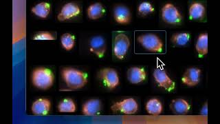
Have you ever done a phagocytosis experiment? Run it on your flow cytometer and gotten some really nice results. But you're still unsure of where exactly the signal comes from. Is it actually from your prey or from somewhere else, like artifacts or autofluorescence? You can, of course, get around this by using microscopy, but the analysis process is just a nightmare. And to get reasonable statistics, you would have to spend days here. I have a sample consisting of THP1 cells that have been given fluorescent beads opsonized with an antibody. We can see the THP1 cells have a cell mask here in orange. We have a blue nuclei, and then we have the beads in green here. Here we can see an overview of the entire sample. The cells are evenly spread out. We have some that are completely negative for the beads, while others are really positive. And the amount of beads they have taken up seem to vary a lot between the cells in this specific sample. I'm interested to see how the area affects the amount of beads the cells have taken up. But if we look around this sample a bit, we can see that we have some cells that are cut off and we have some cells that may be a bit out of focus and some that are really big as well. So to get rid of these, I'm going to make a scatter plot where I use the area of the cells I found versus the mean W intensity of them. So in this 2D scatter plot, we have these dots here to represent a single cell, each of them. And we see that we get a cluster of cells over here. So I'm going to select that using a gate. And that means that only the cells that are within the gate are displayed down here and will be displayed in further 2D scatter plots that I make. So this looks a bit better here. I seem to have only cells that are of interest. We can see that some of them have this green haze, and that means that they are negative as the green is normalized to the brightest pixel in the in the image. Now I just want to look at the positive cells. So I'm going to make another scatter plot where I select the prey, some area prey being the beads in this case, I'm going to plot that against the prey mean intensity. So you can see that we have what looks like a single cell down here that's negative for beads entirely. But if I select it, I can see that it actually contains 120 cells. So this would then be my negative population in the sample. And from the images here, we can see that it looks like it actually is negative. We have some cells where we have beats in proximity, but as they are not attached to or associated with the cell, it's not counted as a positive. So if this is my negative population, this will be the positive one. And I can immediately see that I have 82% positive cells here. Some cells where we have beats in proximity, but as they are not attached to or associated with the cell, it's not counted as a positive. So if this is my negative population, this will be the positive one. And I can immediately see that I have 82% positive cells here. So now as I said before, what I'm interested in is to see if the population that have taken up just a few beats differ in size from the ones that have taken up more. So I'm going to select the cells with a very low prey some area. And from the images here, we can see that they seem to contain one bead up to perhaps maximum of maybe 10 beads or something like that. So this I will then define as my low uptake population. I'm also interested in the distribution of prey mean intensity of this population. So I'm going to make a histogram where I select prey mean intensity. I can see that I have a peak over here, while I have a few cells that have a really high mean intensity here. I'm going to make a table where I select the area. I will also select some other parameters like the mean Fitzi signal, the prey mean intensity and the prey sum area. And we can see that the mean area is 183.6 square micrometer. If I then instead select the the high uptake population, which will be this one here, I can see that the area increases to 199.7 square micrometers. So we can see here that the bigger cells have taken up more beats compared to the to the smaller ones, which probably makes a lot of sense. But I'm going to go back to the original population here. So now I also want to look at the ficus doses as say, specific values. So I'm going to press here and then I get this, this table. So here I can see the total cell count of the entire experiment. I can see the total prey count as well. And then I have imlp, which is simply the prey count divided by the total cell count. I also have some specific values for the population that I have selected over here. Here I get total association, which is 19.3%. I get total associated prey area, mean associated prey area and associated prey signal and finally we have something called phagocytosis score, which is simply the total association multiplied by the associated prey signal, which is a good way to normalize values between datasets. So, as simple as that, I can get all the important values that I get from flow cytometry. I can verify manually that I am indeed looking at actual beads that are being taken up and not just some autofluorescence or artifacts. I can easily make these specific comparisons that I'm interested in. On top of that, I also get these effect sources as a specific results. So I'm going to paste this data set in one of the comments so that you can explore it for yourself. And perhaps you can find something else that's really interesting in the data set.
More from Karl
3 new features: Polygon gating, High-res re-imaging, Expanded file format compatibility