This YouTube tutorial (by Alberto Costa) explains why sector analysis matters when selecting stocks and demonstrates free tools to assess sector strength. The presenter compares resources (Zags.com, Finviz) and walks through the Sector SPDR site—showing the Sector Tracker (time-range performance), Heat Map (color-coded performance), and Sector Charting (overlaying sector ETFs). The video also notes the US market sector taxonomy (10 sectors, some labeled cyclical vs defensive) and suggests using sector ETFs and chart indicators (e.g., 20-period exponential moving average on TradingView) to judge whether a sector is in an uptrend before going long.
Chapters
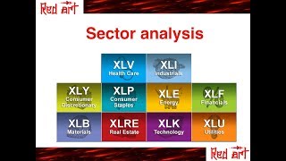
Hi everyone. Welcome to this new video on sector analysis. I've already touched this topic in the past when I was speaking about Zags.com for example. That is a website where you can find information about the sector of your stock. And also finviz.com if you don't remember, you can watch those. And why this is important because usually when we want to buy a stock, for example, if the sector is strong, it's more likely that the stock we are interested in is also following. And at the same time if the sector is weak, then I would not buy. Maybe it's good to look for weak sectors if we want to short sell. Now as I mentioned, we have already seen Zax.com and Finviz for finding out if the sector is strong or not. Today I'm going to show you other two tools. One is similar to finviz, I would say and the other one is more visual approach. Okay, now before starting as usual, the disclaimer and before moving to these two resources, I want to give you an overview of the sectors in the US market. And in order to know if the sectors are doing well or not, we can use the etf. So the exchange traded funds that are tracking those sectors. So as you can see here, there are 10 sectors. Now it depends on the resource that you use. In Finviz, for example, they divide the US market in nine sectors. Here we have 10, but more or less they are similar. So we have energy sector, industrial, healthcare, financial, real estate. Then we have consumer discretionary that sometimes are called services. For example in finviz they use services, utilities, technology, materials and consumer staples that sometimes are called consumer goods. And if you notice some of them are highlighted in red, others in blue. What is the difference? So those highlighted in red are cyclical. It means that when economy is doing well, usually they are outperforming. But when the economy is doing bad they are also underperforming. Whereas the defensive sectors are those that are, you know, when economy is really going well, they usually underperform, but they are more stable when the economy is doing well. Okay, so just notice this. So this division intent sectors is the same used by the website that I'm going to show you now.
So that's the website, it's called sector spdr. And as you can see here we have the 10 sectors that I just showed you, right? And they also give a description on the right. If you put your mouse here you will also see the summary of the names. Okay, so when you go to this website I will put the Link in the description you will see this and let me show you what I think is interesting here. So the first thing is under tools, okay? The sector tracker that I open here, if you remember the video on FinViz, this is quite similar to what we have there. So we can choose the one day or five days, one month. And here you see the performance of the sector, right? So for example, you may notice if we take the three months, we can see, I don't know, technology is doing well, right? Then we go back to one month is doing even better and five day still the top performing. So it seems that technology is quite strong recently, right? But for example, consider utilities. Three months performance was not the best, but was good. One month very bad. And one week also quite bad. So utilities probably at the moment is.
A sector to avoid, right?
If you want to go long of, you can also visualize this information in another way. If you go to a heat map here you can see the same thing with colors, right? So green as they tell you here, green is good and red is bad. And then again you can choose your 1 month, 3 months, what you want, right? And finally they also have this, that is quite cool, the sector charting. Here you can compare the performance of sector with a chart. So for example, we mentioned before technology and utilities, let's see how they look. So we remove this, we click on technology and now you have technology. You click also utilities and. And you can clearly see that technology is doing much better than utilities, right? And then you can add, if you want to add financial, you can, you can do it. And if you want to remove, you click again. It's really interesting to compare the sectors. Another thing that you can do with this website, if you click here, the symbol of stock, you get something like that. I try with Google, so they give you some financial information. But I think finviz is much more advanced. What is interesting here, they tell you the sector of the stock, right? So if you want to invest in a stock, you may say, okay, I want to check if the sector is strong. And the question is, okay, what is the sector of this stock? So you can have this information here, right? And remember that if you go on finviz, like here, I check Google again, you can see the sector here. And this one if you remember, is the industry. As I said before, there may be some small differences between the classification of finviz and sector spdr, but more or less they are matching. And it really depends which tool you want to use. So remember, when you want to go long, it's a good idea to check if the sector is strong, right? So remember there is this ranking list of zags. There is the finviz performance. You can use this one, you can have the overview here and you can check if the sector is doing better and better moving from for example three months to one month to five days. You can compare the sectors with the charts. Another way you can do that that I want to mention is by looking at the chart of the.
The etf.
So for example, well, let me just reload this. We were speaking about Google, right? And Google belongs to the technology sector. And if you remember technology sector, the ETF is xly, right? Now what we can do this by the way is Trading View is a quite interesting website where you can have, you can chart, you can see the chart of your stocks and you can also add indicators. If you remember my video moving averages, I say that when the price is above the 20 exponential moving average that can be an indication of an uptrend. So an easy way to see if.
The sector is doing well or not.
Is you can add. Let me find moving average exponential, right?
And.
That'S here. But this is the nine days so we want the 20. And again remember these lengths depend on.
The.
Time window you are interested in. If you are more a short or medium, let's put it red. So for example here you see that clearly the price is above the 20 exponential moving average. The moving average is sloping up. So it's a quite bullish indication, right? So if you want to go long on a technology sector, there is a confluence in a way, right? So this chart is telling you that the sector is doing well. Here you can see that for example you look here. In the last three months, one month and also one week it was doing very well. You can even do the charting, right? And then you can compare with the other sectors. I mean I don't show you all of them but you can see that is basically one of the best, if not the best. So actually you can add all of them. So yeah, it seems is actually the best. Okay, so that's all. I show you the a few ways that you can use to find out if the sector is strong. So the first one is using the sector SPDR website where you have different ways to visualize data. Or if you really like chart and moving average you can use TradingView. And probably in the next video I will show you how you can combine all those information to get a clear indication, right? Because now you may be confused. There is zags, there is finviz then we have this tradingview with a moving average and then we have a sector spdr. So how can we quickly find out if the sector is strong by combining all this information. So I will make a video to show you that. But for now already with those tools you will have a clear idea if the sector is something that you can consider for going long or or if it's better to avoid because it's doing very bad. So thank you for watching. If you like this video, you can like it and subscribe to this channel. If you want to be updated when I will upload new videos and see you next time.