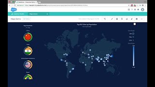
A short product demo (YouTube) for Einstein/H Chain Analytics showing geographic data visualizations and chart customization. The speaker demonstrates built-in country/state maps and custom map uploads, latitude/longitude bubble maps, auto-zoom and projection options, and general chart-editing controls (titles, colors, axes, legends, tooltips, markers).
Chapters
H Chain analytics allows you to look at your geographical data in a lot of different ways. Here for example we're having a call path map that is leveraging either the full country name or the 3 ISO code and that comes out of the box. You can either look at your vacancy utilization on any metrics you want and drill into different part of the world. You can also upload your own custom maps to focus on regions based on your business or leverage the out of the box state map and even get deeper and further with the custom maps. Like here for example where I'm listing all my different buildings downtown San Francisco. And as usual in HTML analytics you can really see and drill in and out by clicking on the other parts of the dashboards. And there's a lot of ways you can leverage the power of custom maps. Here for example we're looking at the store complex where you can see the different stores and how they're performing against their quota. You can focus on different sales manager or even focus on different stores. See here for example why does the book haven doesn't perform properly? That's not it. You can also look at your geographical data based on longitude and latitude. Here for example, I'm having a bubble map of my top 50 cities coming from open source data sets placed on the map based on the latitude and longitude. A lot of aspects of the maps are very easily configurable in anchain analytics. Here for example, I can change my projection type to really fit the way I want to look at my data or I can change the map type or select auto zoom that would allow me to directly focus on the area where my data is. For example, if I were to focus on China and only have Chinese city, it would automatically zoom in into this area. Same for India United States. At the end of the day with just one button I can have my map adapt to my data and there's so much more of my visualizations I can customize. In Exchange Analytics I'm looking at different metrics from Opportunities which is bound to 2000 by default and I can augment this number manually if I want to. I can go in edit mode and take the customization to the next level. I can change the title or change my color palette or go deeper and choose how I want to display my different metrics, whether I want to look at all my data or make sure I just preserve the labels in my visualization. I can go to the axis level, change my legend positioning or even customize my tooltips so that I can have more information. As I'm hovering through my chart, not only I can customize how my data is visualized, I can also provide some contextual information. I'm explaining here where my forecasted value is coming from. I can also provide my sales total for today. Note that the markers are actually available on all the chart types, be it a pie chart or any other charts that Ansthain analytics would recommend. The beauty of H Chain analytics is that you can access all those advanced customization in every chart so that you can easily take your analytics app to the next level.