An admin builds a custom Einstein Analytics dashboard from scratch, grouping opportunities by stage and adding cross-dataset filters. The demo includes a live REST API integration for stock quotes and a preview of the Event Monitoring app for tracking user activity and system usage.
Chapters
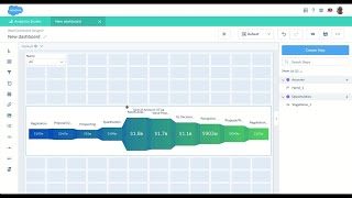
Now that I've shown you how to create an out of the box app, let's see how an admin would go and create their own custom app from scratch. So assuming you have some data sets already set in the system, the admin would click Create Dashboard. Then they have some dashboard templates to choose from to get started even faster. But for this example, let's just go into blank dashboard. So I want to look at my pipeline. So let's look at my opportunity data set. And we want to look at the sum of amount grouped by stage and filtered on open opportunities. But I want to see my stages listed in the order that they're listed in my sales process. So to do that, I can actually order by another measure by adding it in a compare table. So let's do my maximum sort order per stage. Let's filter it for my open opportunities and then let's order it ascending. Now that's great. But now I have this additional measure in here that I don't actually want to use on a chart. So let's go ahead and hide that. And now I have my data in the order that I wanted. So now let's choose a visualization. So right here I see suggested charts. So I might not know what are all the options that come with Einstein analytics. So I can click suggested charts and I can see all the examples of the best charts that match the shape of the data that I have. I think at the top, this new origami funnel chart gives me exactly what I need because I can see from left to right how my stages are based on the total amount. And I can identify where the funnel is actually the thickest and might need the most work. So I'm actually going to include that. I can make it bigger on the chart. I don't really care to have this legend, so I'm just going to go ahead and turn that off because I've got my labels right there. So this is great. But I want to add some filters for this. I actually want to do some filters based on certain accounts. Now, not all my opportunities may have accounts, so I want to make sure that I pull my accounts data set that may not have opportunities and I'm going to add that as a filter. It's a list filter. So I'm going to change data sets. I'm going to choose accounts. From my sales analytics app and I want the account name. Great. Now right away, you see this data set was opportunities and this data set is accounts. So if I try to filter, I don't See anything change and that's where dataset connections come in. So without having to do any code, I can connect my data sources, give it a name and choose the first data source. So in Opportunities data set I have a field called account name and I want that to map to the account data set name field. And if I close that, let's just make this multi select right away. If I click on an account or multiple accounts, you can actually see how that faceted. So now I have two data sets that are completely different and I'm faceting them without having to create any code. I added a few more filters based on the business requirements such as being able to filter by product name and close date and I think I'm about ready to share this out. However, I want to make sure that the end users don't have any questions when they come to this dashboard. They know exactly how it works. So now I have the ability to add an external link and I'm going to link that to a help that I've built up. So in this case I'm going to change this to help and I'm going to use URL. In this case I'm going to paste in the URL for the help site that I've set up and when I view this you can see when I click the help, it pulls up this page that tells them exactly what they need to do. I've shown you some examples on how to build dashboards using data sets that live in Isine Analytics. However, did you know that you could build a dashboard that doesn't even require a data set that lives in Einstein Analytics? In this case, we're making a real time REST API call to a site market on demand to get data based on stock quotes. We're pulling specific stock quotes and we're ordering it by date to show trends. In this case, I can see how Salesforce is trending over time. Now let's see how this works. This Apex class actually does a REST call to market on demand to grab some data, package it up in a specific format and pass it back to Einstein Analytics. We unpackage the data, which looks just like the data that came from a regular query. So the widgets already know how to process it. And I can create my same filters to go through the data and dynamically change my chart. As an admin, I'm very interested in how my users are using the system. Let's look at what the event monitoring app has for us. Right here I can look at the Einstein analytics event monitoring app this is just a single view of our event monitoring app, where I can actually see the details of Einstein analytics adoption. What are the trends by user interaction and performance? And because this is an Einstein analytics app, I can drill down and look at each individual specific user as well. Let's take a look at what else is in this app. I'll open this up in Analytics Studio in Presentation mode, and right here I can see there's several other views that are available in this app. For instance, I can look at Apex execution and again drill down to the details and filter by profile or role. I can also look at usage by reports, by setup, audit trail, who's logging in, And who might even be logging in as other users. All of this + dashboard files, lightning Trust, and much more available in the same event monitoring. Applause.