Accessibility 101: Build your accessible website | Full Course | Wix Learn
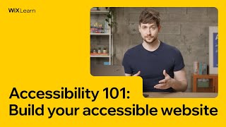
Henry from Wix walks through building an accessible website step-by-step, covering WCAG alignment, color contrast, alt text for images, captions for video, form design, and how to use Wix's Accessibility Wizard. Learn practical techniques to make your site compliant with accessibility guidelines.
Chapters
Foreign.
Hi, my name's Henry and I'm a learning designer at wix. For much of my career, I've developed and written courses to improve inclusion, diversity and equal access to education. One of our most basic objectives here at WIX is to positively contribute to the creation of an Internet that everyone can access, use and benefit from. That's why in this course, I'm going to show you how to build your site for accessibility. I'm going to do this by rebuilding my own site from scratch within the WIX editor. You can follow along and build your own site from scratch if you like,
or you can just add all of
the features that your site needs to become as accessible as possible. You see, according to the World health organization, over 1 billion people worldwide have a disability, and that number is increasing. So, in terms of web design, we generally think about four different categories of disability. We've got visual, which means things like blindness or heavy sightedness. We also think about auditory, and that can be things like profound deafness or hard of hearing. And we also think about motor limitations. So that can be something, anything from full paralysis to just minor limited motor function. And then we also finally think about cognitive disabilities, and that can include things like adhd, dyslexia, or autistic spectrum disorder. Now, of course, accessibility isn't just about people with permanent disabilities. It's about catering to those who may have temporary and situational limitations as well. Studies show that at any given time around the world, 25% of the global population has a permanent, temporary or situational disability.
So why would we exclude potentially a
quarter of the entire global market from accessing our website? And disabilities aren't the only numbers increasing either. More and more countries around the world are creating laws to enforce web accessibility. So not only is it important from a moral standpoint, but no matter where you are, web accessibility either already is or soon will be the law. But look, it doesn't have to seem like this daunting task that you've got to take on, because it's actually pretty simple, made simpler still by the fact that we at WIX have designed loads, I mean, dozens of templates that you can use that are already accessibility ready. We've also designed all the of our features to be accessibility compliant and to help you create a website that your users can actually interact with and access. So the way that we do that is we align all of our products with the web Content Accessibility Guidelines, or WCAG for short. So these guidelines are published by the Web Accessibility Initiative, and they can help site Designers like you to audit a website for accessibility. Now, the beauty of these guidelines is that they can help device manufacturers to meet your website in the middle. Basically, there are loads of different assistive technology devices like screen readers, dictation, eye gaze machines, and there's loads of bespoke ones as well. You could make one as well if you wanted to. But most of these device manufacturers will also build their devices to meet WCAG in the middle. So when you design your site with wcag, you can meet every single one of these devices without ever having to think about each one individually. Now, I'm going to start building my website from scratch.
But with wix, you don't have to
if you don't want to. If you'd like to use one of our Accessibility ready templates, all you've got to do is go into Create new site in the templates menu. Just type accessible and return and you'll find dozens upon dozens of different accessible templates that you can use to start in a really good place. Now, before we move on, I do
need to say this.
We at WIX cannot guarantee that your site will be compliant. That's not a disclaimer, it's just that we can't. No one can. Every single region has different laws on accessibility, and in the states it actually varies from state to state. And it can depend on what website you're using. For example, is your website hosted in Canada, but user facing in the uk, but you pay someone else in South Africa? Well, all of those things contribute to what rules you need to use on your accessible site. So we're going to show you how to make your site accessible to your users. If you really want to be legally compliant, you can hire a professional, legally qualified accessibility advisor, who understands your local laws.
Now, the first thing we're going to set up is our site language. And this is really important for accessibility for a number of reasons, but mostly it's because assistive technologies like screen readers, when they interact with your website, they're not interacting with the text on screen, as maybe you see it. They're interacting with the text through the HTML code in the background. And in the HTML code you will find a little attribute called a lang attribute. It'll say something like lang. Yes, for Spanish. Now that is how the speech engine in the screen reader knows what language your site is supposed to be written in. Great, that's perfect. Except if your site is written in English and the lang attribute says Spanish, then it's quite possible that your screen reader is going to read The English with Spanish pronunciation, that's going to be pretty frustrating. So let's dive right in and change our site language. So first of all, we'll go up to save and just save our site. Now we'll go up to site my dashboard. Next we're going to go to settings just over here. Then we'll go to language and region. And here you can see my site is already set to English and that's perfect because my site is going to be written in English. So now I'm going to go back to my template. The next thing that we need to set up are our pages and page titles. Now, your main pages in your menu are not necessarily the same as your page titles. And we'll get into to that in a second. Go up here. Go to Manage pages. Now, you can see here that this is written in all caps. You want to keep sentence case. That basically means that you have a capital H and a lowercase om e. I'm going to change that now. Now, I already know what pages I'm going to add to my website, so I'm going to add them. Now, your site's probably going to be a little bit different because everyone is contact page. Now I'm going to ask you to add one more page. And this is a page that everyone should add to their site. It's probably the only page that will be identical across everyone's website. And that is an accessibility statement. So for now, just add a blank page, Call it accessibility statement, Move it to the bottom of your list, hit these three dots for more actions, and hide it from your main menu. The reason I'm hiding it from my main menu is because it's going to take up a lot of space. But your accessibility statement, you generally want to have that available on every single page as a link. So instead I'm going to put it in my footer menu. Now, the next thing we need to talk about are page titles. What page titles? But we already did those. No, we actually didn't. These are the page titles in your editor and they're what's going to show up on your main menu that your users see. However, before your users ever enter your website, they're going to see a link in a search engine. And that's what we mean when we say page titles. To change those, we go to more actions SEO basics. And this currently is what my users will see. It's not very informative at all. It doesn't tell them what my website is or where they're going to be. Going. So we go down here to the page title. Now, my bakery is going to be called Henry's Bakery. I know. Super original. And we're based in San Francisco. Now, you'll see this theme come up a lot again and again. You don't have to copy this. You don't have to put your business name and your location. You just need to understand the purpose of the page and communicate that to your user. So now I'm going to add this to every single one of my pages. We go to more actions, SEO basics. And paste. The next thing we need to do is add our main menu. So X out of all of that stuff, click on your header. I'm going to change my header design to something super simple. I'm just going to have a black top and a black footer and that will do me. I know that's going to contrast really nicely. It's going to be really simple, easy on the eyes. Now, to add your main menu, go to the add panel, go down to menu and anchor. You've got loads of options here, themed menus, horizontal menus, vertical menus. I'm just going to pick a really simple themed menu and you can drag that up, wait until you see attach to header and then let go. And that click means it's worked. Now change the design. So that the text is in good contrast with the background. I'm going to change my on hover to this color so it's slightly different from my main text color. So people know where they are. They know that they're hovering or that they've clicked, but so that it's not so different you can't see it because it's too dark. And I'll make this a little bit smaller as well by dragging this box in. Awesome. Now, to be completely compliant with AA standards of WCAG and generally just to be kind to your users and give them enough navigation, you need to add one more method of navigation that's available on all your pages. So you can add something like a footer menu or a search bar, but I'm going to actually add both of them just to show you how you can do that. So first of all, to add a footer menu, you just add a text box. So you can go up here, go to themed text, choose that, drag it down, and then move to footer again, just like we did with our header. You can change this text to white, And I'm going to write home. Awesome. Now, currently, this isn't linked to anything, so I need to link it so I can do that by going to this. Well, first highlighting my text, then going to this link icon. Which page? Choose home and I'm done. Now you'll notice that WIX has automatically underlined this. That's really important. You'll see on a lot of websites, links will just be highlighted with a blue color or some other color to indicate that they are a link. Now, while that works for a lot of people, not everybody sees color in the same way as you might think. So you always want to add some sort of formatting or textual symbolic element to show people that it is definitely a link. Awesome. So here you can see I've set up all of my footer links, including that link to my accessibility statement. Because it's in my footer, I know my users are going to be able to access it on every single page of my site, which is awesome. Now I'm also going to add a search bar up here. So go to add. Scroll down to menu and anchor Site Search and tap on Site search. Now I'm just going to change the design so it's in line with my theme. I'm going to change the background to white. I'm going to change my icon to this color. It's quite nice. And make sure my placeholder text is also that color. So it's all nice and uniform. Perfect. I'm going to go back to my homepage now and take a look. So the search bar is done, the footer is done. So now I know I've definitely given my users enough options for navigation. The last thing I want to talk about is this subscription field here. Now, what I'm about to tell you is true of basically every form field. It doesn't matter if you're doing a contact page or if you're doing a subscription field, it's all the same. A lot of the time you'll see something like a disappearing placeholder text here. It'll say something like enter your email, but as soon as you start entering your email, it disappears. The thing is, that can put a lot of cognitive strain on some users and it can be frustrating for most people. So just put a permanent field title up here and then people will always know what's meant to go in that box. The last thing I'm going to talk about with this form is the submit button. If you go to Submit message, you'll see that we have two options here. For this message here to pop up, you've got set time or always. Now we've given you the option to set the Time, because sometimes that really is the best option. But generally, let's say you're filling in a form and you hit submit, especially if it's a long form and then it says, oh, great success, and then it disappears after five seconds. What if you fill in the form and then a pot boils over or you hear a noise outside or whatever. Maybe you just look away for a second and then you look back at the screen and the submission message is gone. Did you submit your email? Did you not? Did it work? I don't know. So then you're going to have to refill the whole form again and do a duplicate. So generally it's just better to set it, as always. So first go to site design, site theme and customize. Now, you've got two options here, colors or text. We're going to start with colors. Now, if you wanted to, you can click change on color theme. And we provided a bunch of different color themes for you to choose from right out of the box. I've actually chosen my own color theme with my own colors, so I'm going to use that now. So you'll see down here, these are all the colors of our theme in these boxes. Now, to the right of each of those, you'll see a shade adjuster and you've got five shades of each of the base colors in there. Now let's just, in our heads, number them from 1 to 25. So, so that's 1, 2, 3, 4, 5, all the way up to 25. So in that the colors that are important for us are numbers one, number four, number five and number eight. So number one is our background color, number five is going to be our main text color. Number eight is going to be our action color. So if we put a themed button into our website, it's going to be that color. And then number four is sort of like an extra accent color that sometimes gets used when you download an app. So for example, in my Wix Restaurants app that I downloaded and added to my website, the prices might be displayed in accent color number four. Now, I'm going to add all of my own colors from the color palette that I chose earlier. And you can feel free to do the same on your site. The way you do that is you hover over this box, edit the color, and then you change the hex code. There's one more thing we need to do to make sure that this is accessible. We need to make sure that our colors, number four, number five and number eight, all have a minimum of 4.5 to one color contrast with our background color one. The way we do that is we can minimize this and go to the WebAIM color contrast checker. This will make sure that you've got the correct color contrast between your colors. So our background color is already set to white, which is what we're using as well. And so we click on this color box in the foreground, go to the eyedropper. And now I'm going to hover over number five, my main text color. If I check it here, it's got a contrast ratio of 21 to 1. That's perfect. So now let's check number eight. And that's 4.7 to 1. So we're close, but we still pass on a AA standard and that's all we need. So now I know my site color theme is accessible, but now we're going to set up our text theme. So go back and then hover and tap on text. So you'll see that my text theme is already set to Helvetica Bold. But just like with color themes, WIX provides you with loads of other text packages that you can just use straight out of the box. Now, when you're choosing your text theme, you need to choose something more sans serif than serif. Let's let me explain that a serif font is something that's got ticks and tails, like say, Garamond or a Times New Roman or even really good example here is Inknot Antiqua. That can actually increase the cognitive load on your users. If you've got it everywhere, all over your site, it's just too much information. So what you want to use is something like Helvetica Bold or even Roboto or Avenir Tahoma Verdana Open Sans. These are all good options. Now, if you really wanted to use a serif option, you could use something like Inknut Antiqua in your main title for your whole page. So it stands out, but you don't want to overload your website with it. For the moment, I'm pretty happy with Helvetica Bold. There's an old saying in accessibility, if in doubt, go with Helvetica. And it rings true here. So the other thing that we need to think about is our text size. Not so much worried about these heading tags here, but in our main text, we don't really want to go any lower than 16 pixels for, say, paragraphs that people are going to read. So you can use something smaller for, say, your footer text, say 14 pixels in your footer text. But any smaller than that and your text might be illegible on certain devices. Now, the reason why we measure in pixels is pretty important. When you use a word processor, you'll often see your text size regarded to in points. But the problem is 14 point size in Garamond is not the same as 14 point size in Roboto. It just isn't. Whereas pixel size, that's actually a reference to the screen and that never changes. So that's why we use pixels instead. And there we go. That's our text theme setup and our color theme setup and we're all ready to start getting into the main site. In this lesson we're going to talk about heading tags and page structure. I'm going to show you how to add the correct heading tags to your content. Now, you'll remember from lesson one, I spoke about site language and the fact that machines don't necessarily interact with your website in the same way that humans do. So when a machine reads your website and looks for structure, it's not seeing what you see on the screen. Instead it's actually reading the HTML code. And in order to tell it what headings and what's a heading and what's a paragraph and what's a quote, you need to actually add the tag to tell it that. Otherwise it won't know. So let's dive right in and I'll show you what I mean. You can see here that I've added a load of content. I've added the main title of my homepage, Henry's Bakery. It's the simple pleasures in life, a little slogan. And then in my next strip, I've added fresh from the oven to your doorstep, which is a title which contains Sourdough bread, cold brew coffee and Pretzel paradise. If you scroll down a little bit further, you'll see about our bakery. And a paragraph and another button here I've added a load of more content, but let's scroll back up to the top. Highlight Henry's Bakery, scroll down to SEO and accessibility and you'll see here the option to choose HTML tag. You go to the drop down menu, you see options H1, H2, H3. Those are all heading 1, heading 2, heading 3, all the way up to heading 6. P for paragraph, then block quote. Now these are the tags that you can add to your page to give your content some structure and to tell both people and machines what's what on your page. Think about when you go to say, look up a soccer game from the other night on a website. Let's say it's a sports website or a News website, the H1 of the page would be news. However, there's loads of different types of news so contained within that. You would have lots of H2s, like weather, sports, world events, they're all H2s. So, well, obviously you want to go to sports, so you click on sports. Well, now you've got loads of H3s, haven't you? Because you've got soccer, basketball, baseball, whatever, and that's how this structure works. You're basically drilling down. Now, the reason why this is especially important for accessibility is that a lot of people who use screen readers and other assistive technology can actually navigate your website just using headings. So your screen reader user could just say type 2 and then it would jump them straight to a H2 heading. For example, if they did it on my site and I had this heading set to H2, which I do, they would jump straight to that heading and then if they went to the next H2, it would take them to this heading. And this isn't much different from how sighted users skim Internet content. In fact, that's pretty much what we all do when we read online. So by adding these headings, our assistive technology users can do exactly that when they're reading your content as well. Let me give you a clearer example in my blog section. So I'll go up here, go to my blog, and you'll see here that I've actually written a blog article about three types of ancient wheat that we no longer eat. Next, I'm going to go to edit post. Now, in the WIX Blog editor, your title of your post will always be set to H1 automatically. And that's awesome. You don't actually have to do anything. Your paragraphs will be set to paragraphs, and you can change that up here. Paragraph. Now, in this, I've got my H1 and then my next title, just like when we were talking about books, Wild einkorn is a H2. So if somebody came into my website to read about three types of wheat, but they don't want to read my introduction, they just want to hear about the three types of wheat. They can just type two, jump to my H2. Wild einkorn. No, I don't care about Wild Einkorn. What's the next one? Next H2. Wild Emmer. Don't care. What's the next one? Coruscant. And they can jump through your content that way. Now, the last one that we're going to talk about is a block quote. So here you'll see I've got a quote and I've separated it from my main text with a block quote tag. The way you do that is highlight the text that you'd like to be a quote and you just tap these quotation marks here. Now you can do that in the main editor away from the blog. I'll just go to my homepage and you would change that in here to a blog quote. And that is pretty much how you add a heading and structural tag to your content in HTML through wix. When you write content for your website, you want to make sure that as many users as possible can feel comfortable interacting with your text. But now we're going to take a look at our actual content, so let's dive right in. So here you'll see I've written a little about strip about my bakery and I can already tell that this is pretty good. So let's read the first sentence. I started this bakery with one goal in mind, to bring back the high quality breads our ancestors ate. It's a nice short sentence and straight afterwards I jump down to a new paragraph and that's really important because in this, in this section I actually only have one point per paragraph and that makes it easier for people to parse through. Let's go to the next sentence. We may have an eclectic variety of choices, but all of our breads are made with the same three basic wheat water skill. So you see there I've added a bullet list. Now we can use other types of formatting and break up our text in various ways. And that helps people to scan the text and also to keep their place. The last thing we're going to talk about here is this link here. So learn more about our bakery here. I could have just highlighted the word here and in context that would make sense, but actually out of context that makes no sense at all. So instead I've highlighted the whole thing. Now it's time to take a look at my next section of text. Gluten free products. I'm just going to read the first paragraph for you. When my doctor told me that I was a celiac and therefore couldn't eat delicious gluten filled products anymore, I was crushed like you wouldn't believe. Because I'd just finished four years at cooking school and a master's in baking, which had been the culmination of my life's passions. So that's a really long sentence. You'll see with the earlier example, most of our sentences came in under 15 words. Sometimes they're a little bit over, sometimes a little bit under. But 15 words is a good sort of range to have your sentences in. This is a lot more words than 15, and it makes it a lot harder for people to read. There's another problem with this paragraph as well. When my doctor told me that I was a celiac, you see, nobody is a celiac. Nobody is wheelchair bound. We are not defined. Our existence rather, is not defined by the diseases we have or the limitations to our mobility. So instead of making those assumptions and attributing someone's existence to their disease, we can say someone who has celiac disease or somebody who uses a wheelchair or a wheelchair user. Further in this section, we've got words like wouldn't. That's called a negative conditional contraction. Now, negative conditional contractions have been shown in studies to increase the cognitive load on readers, especially those with cognitive limitations. So we don't really want to use them too often. Other contractions are fine, I'll, I'd. They're all cool, so you can feel free to use them. But try and steer clear of negative conditional contractions. Let's move on. If you saw me at a restaurant, I'd be that guy asking the waiter or waitress to fill the table with bread. So there's no need for that gender specificity there at all. You could have said server or attendant if you don't like the connotations of the word server. So further down you'll see that I've used words like afterthought or a cash grab. They're hyphenated. Sometimes you will have to use hyphenated words. Gluten free in certain brands of English is an example, because hyphens can confuse screen readers and they can also confuse sighted readers. Later in the section we've got GF breads. So people use acronyms all the time, and sometimes it's appropriate and sometimes it's not. But. But when you use an acronym, you need to be aware that not everybody knows what an acronym means. And just because you know what it means, it doesn't mean everybody else will intuit what it means. Let's go further down and you'll see things like, just take a look around, you won't be disappointed. Instead you'll see lovingly crafted breads, cakes and pastries. Why not pop in the store and check out our range? That's fine, but it's just a short walk from the station. So we're assuming that people reading this can walk, see, and look, but we should never do that because some people will be using screen readers. Instead of saying you'll see lovingly crafted breads, you could say, you'll find lovingly crafted breads. Both people with sight and without can find things. And also stylistically it just sounds better. And then finally, we've got this link here. We've already spoken about inline links and that they should make sense out of context. But another thing is that they have to come at the end, end of a sentence. So click here, you gluten free fanatics. If I wanted this to be my whole inline link, then I should highlight the entire thing so that the action is actually in the highlighted link and the link is at the end of the sentence. But this sentence also doesn't make any sense as a link. Click here, you gluten free fanatics. Tells me nothing about where this link will take me, even if I highlight the whole thing. So that needs to change. The final thing to notice about this text is it looks a little bit different to this, doesn't it? Up here we've got all these lovely jagged edges. But down here our text is what's called justified. Justified text is when you push all of the spaces between your text and your letters so that the sides are all flat and straight. Now you used to get that in a lot of old newspapers. You still get it in newspapers today. That's really bad for online writing. Never ever justify your text in online writing. Okay, so this is a complete disaster. I'm going to go and fix it. So here you can see I have fixed it. It's a lot shorter. I've removed the justification. And if you read through it, you'll notice that there is one point per paragraph. The sentences are all below 15 words. And you can see down here my inline link. Check out our whole range of gluten free products. Makes sense out of context. And that's it. There's a fundamental rule that you need to remember about alt text that'll help you choose what kind of text you're going to write. And that's communicate whatever the purpose you meant the image to serve. So if you meant it to do one thing, explain that meaning. You don't necessarily need to describe everything in the image like a synopsis. And with that, let's jump straight in. So you can see here that I've added a bunch of different things, a bunch of different content images, this little gingerbread man, my background image, to my website. Now I'm going to talk through a few different types of Alternative text. And we're going to start with this one here. This would be the most basic kind of. And it's just an image that communicates the vibe of my restaurant that I want to communicate to my screen reader users and those who cannot see the image. So all we have to do is tap that, go to Settings, and you'll see here under image text, what's in the image. Tell Google that's where we write our alt text for this kind of image. Now, I've written here our famous gluten free spelt loaf in a rustic setting. That's pretty good alt text. You see, what I could have written was sourdough bread sitting on a wooden shelf surrounded by 1, 2, 3, 4, 5 other loaves of bread. The wood is grainy. I mean, we could have written an entire essay just about this picture. But that's actually not the point of alt text. What I did instead was communicate the meaning to my user. That's the important point to remember. Let's have another look at a different form of alt text. Down here I've got an image that has text in it. In this case, we need to quote that text in our alt text. So just like the other, we click on it, we go to settings, we scroll down a chalkboard sign with writing colon, welcome, please come in. And that's it. It's brief, it's to the point and it communicates the meaning of the image. And that's all we have to do. The next piece of text that I'm going to talk about, alt text rather is decorative. So in here we can add a description. Except we're not going to because this is a decorative image. So anytime you have an image, your screen readers or your search engine crawl bots, they're going to try and read that image and they're going to find out what kind of image it is. We always need to tell them what the image is, but in this case I'm going to tell them to ignore it. Usually you would just actually put in a line of code to tell them to ignore it, but with wix you don't have to do that. All you've got to do is make sure that your alt text is blank and then we'll do the rest. Now, the next type of image I'm going to talk to you about is an informative image that's at the very bottom here. I've got an email icon next to my email address for my business. Now, it's not actually an email icon, is it? It's a picture of an envelope. So what kind of alt text would I write here to communicate that there's an email address next to it? Well, I guess I could just write envelope, right? Except that doesn't really communicate the meaning of the email address. So what should I write instead? Well, the purpose of it is to tell my users that next to this envelope icon is an email address. So instead of writing envelope, which is literally what's in the image, I'm going to write the meaning, which is email. And it really is that simple. Now, up here you can see that I've added my business logo, but I've also, if we go into settings, you can see I've linked it to my homepage. This is a pretty common convention. This is what's known as a functional image, an image that does something when you interact with it. So in this case, I've told them what it is and I've also told them where it goes. That's the most important thing about functional images. We need to tell them what it is and what it does. And it's not just about logos that are linked to the homepage. There could be other items like an icon, menu item that opens up or does something else. We need to tell people what these interactive elements will do before they click on them. You'll also notice here that I've put in a comma, so screen readers will actually obey punctuation. So in this case, my screen reader is probably going to say something like graphic Henry's bakery logo homepage. If I didn't have that comma there, it would say something like graphic Henry's bakery logo homepage. And the other thing is, the screen reader will tell them it's a link, so you don't need to tell them it's a link in your alt text. And finally, we're going to talk about complex images like this graph. So sometimes you'll have an image that's so complex you cannot describe it efficiently in alt text or adequately. So when I click on this, I'm going to tell my users generally what it is, give them the gist. A graph showing celiac and gluten trends over time, that's fine, but it doesn't actually communicate the lesson that I want them to take from this graph. So how can I do that? Well, the thing is, we're talking about general accessibility. It's very easy to get stuck into thinking of screen readers as the only accessibility option and the only thing we need to consider. But that's not true. There's many reasons why you might want to give a better explanation of this graph. And instead of only having it in alt text, you can have it in your main description text in the main text, which is what I've done here. So I've given it a title. Celiac and Gluten Trends Graph this chart shows US trends for wheat flour consumption since 1800 and the global incidence of celiac disease per 100,000 since 1950. And I go on to say some other important things. Now bear in mind, again, I'm not literally communicating every single data point from this graph. I'm only communicating the things that point to the reasons why I put it there in the first place. But if you did want someone to know who couldn't see all of the data in this graph, what you can do is make an accessible data sheet. So something like an accessible Excel sheet where you actually input all of the data from the graph so that someone using a screen reader can actually interact with that and consume that information. And that's pretty much it. That's all of our alt images and alt text. There are a few more do's and don'ts that you should be aware of. Do try and keep your alt text below 100 words, because any more than that can actually disrupt your user experience and your flow. Also, use simple words. First of all, they're shorter so they save your characters, but also they're easier to understand. Don't keyword stuff if you're trying to capture an audience for your bakery website, don't add bread, white bread, brown bread, spelt bread just to get that keyword. First of all, it doesn't actually work in terms of SEO. It's not going to help you. But also it's really confusing and really frustrating to people using screen readers because they may actually have to sit there and listen to that over and over and over again and just doesn't make for a good user experience. And always, always, always. I've said this before and I'll say it again. Remember what the purpose of your image is and that's it. So in the last lesson we talked a little bit about alt text, but there are also other forms of alternative media that you need to consider when you use them on.
One is podcasts.
Podcasts are extremely popular these days and unfortunately not everybody can experience them through their hearing. But one thing you can do to increase accessibility is to provide a transcript to your users so people can read your podcast rather than trying to listen to it. Another form of alternative media are video captions, so let's say you add a video to your website. Well, not everybody can hear that video. Well, you can get captions for that video and then provide them. Now bear in mind, there's a difference between captions and subtitles. So the other thing that you might use as well is live streaming, like Twitch, for example. Now you can actually add auto generated live captions to most videos, for example, you've probably seen them on YouTube. There are a few other things we need to consider as well. If you're going to put a video on your website, or audio, or any other sort of playable media, try to steer away from having it Autoplay. First of all, most people find that really annoying. If they want to play it, they'll play it. If they don't, they won't. But the other thing is as well, in terms of accessibility, a lot of people with cognitive needs, well, they can find that more than just annoying. It can really upset them. So if you are going to put something in and you must absolutely autoplay it, make sure there is an easy, easy to see way to turn it off. The next thing we're going to talk about are animations and Parallax. For that, we're going to jump straight into the editor.
So if I hit preview here on
my website, you'll see that my background moves at a different speed to my foreground. And that's basically what Parallax is because of that motion and that difference and the contradiction that can cause people to get confused in their heads, not on purpose, completely subconsciously, and it can actually cause motion sickness. So back to our editor here. Although it looks great to a lot of people, you want to use this pretty sparingly only when it really adds to the effect. Now, thankfully, a lot of OSes like Mac OS and Windows will allow their users to turn on reduced motion. So that will actually stop Parallax backgrounds from running. Great. But that can also cause another issue when you use animations in the wrong way. Let's go back into the editor. I've set up an animation down at the bottom here for my coffee banner. Jump start your day with a cold brew coffee. Just reveal straight onto the screen. It's great. No issues there. If someone had turned on reduced motion, one of two things would happen. Either we would see the whole banner without the animation, which is great, or it's quite possible that the reduced motion would tell the code that animates the text not to run at all, and then we wouldn't see it. It's in terms of this banner we don't really lose a whole lot of functionality, so it's pretty much fine. But let's take a look at another example. You see there, my form field is actually animated, and if that animation doesn't play, that means my user won't actually be able to put their email into the field. Alternatively, on some websites it might just show you the end result. But the thing is, when you animate and a user turns on reduce motion, you can't really predict how your website's going to react. So the best rule of thumb is
you can use animations.
Absolutely do. That's why we provide the option for you to do it. But just use them in places where you're not necessarily interacting with anything functional, and then you're pretty safe. Now we're going to talk about pinning and zooming back to the editor. According to wcag, users need to be able to zoom in to up to 200% without any loss of functionality for
that site to be considered accessible.
I'm going to show you an example of how pinning can overlap functional elements on zoom. So I'm going to take my logo
here, right click, make sure it's showing on all pages, and then pin it
to the screen
and I'm going to put it into the correct position.
Now let's preview our site and see
what happens when we zoom.
You see, now that it's pinned, the logo is actually moving across the screen. Now I'm at 200%. Not only is it covering my about strip, but it's also covering my contact. So if I click that, it's just going to take me back to my homepage.
Let's say I go to the shop
and then I click that and it's going to take me back to my homepage.
So whenever you're going to pin an
element, and also do feel free to pin elements, but just make sure that they don't overlap with anything on zoom.
Now, the fundamental reason why you would have an accessibility statement is to show your users that you care.
It's to show them that you took
the effort and spent the time making your website accessible so they could use it easier. It's also in some places a legal requirement, but really the main point of it is to show that you put the effort in for your users. It's also a place where your users can find your contact information if, say, they find a bug in your site or they want to know if something is a limitation or, or if they're maybe making a problem on their end. It's really helpful for a lot of reasons. So I'm going to show you how to do that. Now we're going to jump straight into our screens. So here you see I've gone to the W3.org website and I'm on the Generate an Accessibility Statement page. If we go down here, there are lots of form fields that you can fill in. Name of your organization, Henry's Bakery. Address of your website or mobile application, www.henrysbakery.com if you ever get confused about what's supposed to go in each of these fields, you can just click this plus minus tab. And here you'll find all of the information that tells you what you need to specifically put in that box. When you're finished, go down to the very, very bottom, go to preview your Accessibility Statement and you get the option to download it as a HTML page. So I've already done my Accessibility Statement and here it is, I've downloaded it as a HTML page and I'd like to add it to my website. So I'm going to right click and I'm going to go to View Page Source. And this is the page that you get. And this is all of the HTML from your Accessibility Statement document. Now all you have to do to put this onto your website is press Command A on a Mac or Control
A on a PC and that will
highlight all of the text.
Then Command or Control C and that copies all of that text.
Now we'll go back to our editor and open up our Accessibility Statement page. Go to the Add panel, go down to Embed, go to Custom Embeds and embed a widget. Now drag it up a little bit and make it nice and wide. You want to give your statement room to breathe. Now go to Enter Code and Command
or Control V and all we have
to do is press Update and our Accessibility Statement goes straight into into our widget. Now we just need to make our widget big enough and reveal the rest of our statement. And there we go, super simple Accessibility Statement into our website. And I bet our users are going to be really happy that we put it there. In this lesson, I'm going to show you some advanced accessibility features that you can access right from within the WIX editor. Let's dive straight in. First go to Settings, then go down to Accessibility Wizard. Now we're going to do a whole lesson on the Accessibility wizard in a little while, so don't worry about that. Just for now. First I want you to go to the More Actions button and then go to Advanced Accessibility Settings. Now, you'll see four options here. Visual Indicators, Skip to Main Content, Automatic DOM Order, and Accessibility dev tools. First, we're going to talk about Visual Indicators and Skip to Main Content. Both of these options are turned on by default, and if yours are turned off, you should 100% turn them back on because they're so helpful for accessibility. Let me show you why. If I go to preview,
the editor
is going to show me a preview of what my site will look like when I publish it. So some people use keyboards to navigate a website. The only thing is, how do you know where you are on a website when you're just using a keyboard and not a mouse? Well, that's what the visual indicators are for. So if I press Tab, it's going to take me through my website and it's going to highlight all the interactive elements like links and buttons and menu items. That's what that little blue square is. Now, if I want to move backwards, I can press Shift Tab and it's going to move back through all my options. Now, the first thing that you should come to is Skip to Main Content. And that is awesome. We've already added it for you in the WIX editor, but a lot of sites don't even have this option. When you press the return key, it's going to take you into the main content of the website. Now, for my website, that's probably not that big a deal. There's only about five or six options that you have to tab through. But for other websites, like, say, a government website, there could be up to 50 different menu options before you ever even reach the main content. So this is really, really useful. But let's go back to our other options. We've also got an option to turn off automatic DOM order. Well, what's DOM order, you ask? So DOM stands for Document Object Model. It's basically the tree structure of all of your content as it looks within HTML. So at the moment when I look at my site, I see certain elements coming before other elements, and that's called the visual order of the elements. But that's not necessarily the order that the DOM will read them in, because that's going to go by whatever order you wrote them into your HTML code. So let's say you put in
order
online this button here before you put in Henry's Bakery. Well, the DOM order is going to tell all the machine readers to read order online before they read Henry's Bakery. And that's a problem for accessibility, because if someone's trying to navigate with an assistive technology, it's going to dart them all around the page to the wrong places. So at wix, we've created automatic DOM order, which does actually reorder your DOM order in the order of the visual placement of the elements on your screen. And that's awesome. However, there are a few reasons why you might want to turn it off. So I'm going to show you how to do that. Just go to that toggle switch and turn it off. Now, to reorder your dom, go to Tools and Layers. Now, you can just drag and drop all the elements of your site into the right order. However, I'm going to finish this with a caveat. If you don't know what you're doing with DOM order, absolutely don't do this, because every time you add a new element, you're going to have to manually reorder it. First of all, that's really hard to keep track of. And if there's nothing unconventional about your site, there's really no benefit to it. However, if you know what you're doing and you know why, you would need to turn off DOM order. Now, you know, for me, I'm just going to turn it back on. And finally, we have Accessibility Dev tools. So these expose advanced accessibility tools right within the editor. Generally they're turned off by default, but when you do turn them on, by turning this toggle switch, you're going to get some advanced accessibility options for for custom elements. So let me show you. If I go to this strip and right click, I now have the option of Accessibility. So I can click that and it gives me the option to add an attribute. So what is an attribute? Well, there are many and they differ depending on what element you've clicked on. So in this case I can add an ARIA label, tabindex, aria Live, a role, and a bunch of other ARIA elements as well. Another caveat. If you don't know what an ARIA attribute is, the general consensus is don't use them. Because although ARIA attributes are really important for accessibility, we.
More from Cardinal



Chef Noah was tired of dull tools - so he made his own #cooking #knives #chef #fyp #kitchen #shorts

every day Chef Noah wakes up and chooses violence... professionally🔪 @forgetotable #knives #chef
Mother Nature knew what it was doing with these color combos #graphicdesign #design #designinspo

Trying Modern Bread & Bagel for the first time 🥯 #nyc #glutenfree #food #shorts #foodreview