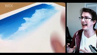
In this instructional video, artist Justin Donaldson demonstrates a concise technique for painting realistic clouds using gouache or poster color. He begins by emphasizing the importance of thoroughly wetting both sides of the paper to extend the working window and prevent hard edges. A thin white base is applied to establish the sky’s gradient, after which a blue (or any chosen sky hue) is laid down. The core of the method is the “charging” technique—applying wet paint onto still‑wet paper to create soft, natural edge transitions that mimic cloud forms. Donaldson explains how to manipulate water volume, brush pressure, and timing to achieve varied edge softness, highlights, and shadows. He warns against intervening while the paint is half‑dry, recommending either waiting until fully dry or restarting to avoid uneven results. Throughout, he notes that the principles translate to other media (watercolor, digital, oil) and points viewers to a longer, 1.5‑hour tutorial on his website for deeper exploration.
Chapters
Good morning, everyone. My name is Justin Donaldson, and today I'm going to show you one of my favorite things, painting clouds. Let's get to it. So I've been painting these clouds lately and I love it. I love it. And I've been getting a lot of questions about how I get this kind of effect. See gouache and poster color and even watercolor, they don't really naturally want to do things like this where we have a big variety in edges and edge control. So the bigger variety that you can get, just, you know, the better the clouds feel. And I love that epic cloud feel. If you want to go and dive into lot more of these ideas about clouds in, in theory, in digital, in oil, in whatever medium you want, I have a full hour and a half tutorial that you can go through on my website. I'm gonna put a link in below. If you just want to look at this one technique, let's go for it. So this is the painting that I'm gonna do with you guys, and I'm super excited to show you how this is done, done. So let's get to it. So as we're here in gouache and poster color, I'm going to use Postacolor today. But you can use gouache just as easily. It's going to do the same thing. One of the first things that we're going to do is wet the paper. So we've got to keep the paper really rather wet to begin with. Gouache and poster color, watercolor, they're very easy to make hard edges with because you put the paint down and it dry, you really have a small period of time in which you can do something soft. So if we wet the paper, we have a longer time period in which to do it. So let's go ahead and do. Both sides. Mind you, if I have water on the bottom of the paper, it's going to seep through and it's going to feed the top of the paper without having the top of the paper be wet and have this sheen on it that's going to stop the paint from actually settling on the paper. So that's going to give us a longer time period in kind of this secondary wet zone where things are still loose and soft, but they're not just spreading and scattering on top of the surface of the paper, which is often what happens when we put a lot of water on the paper and it's debilitating for a while if we're not using it. So water on the top and the bottom of the paper. And we're going to do it. Right. So as I just mentioned, we're going to wait for the water sheen to be removed from the surface. So it's the minute that the paper becomes less reflective, that's when we can go down and start painting. Alright, so here we go. The paper is wet, but not too wet. So let's get to it. So the first thing that we've got to do is put down a layer of white. Right? This is going to serve as the base for the gradient of the sky. And I'm gonna do it. I'm just gonna apply it all down as if. As if I don't have mountains in front of it, as if I don't have skydawn coming down on top of it, basically all the way to the top. Then let me grab our color. Now, honestly, it doesn't matter what the color of the sky actually is. You can choose any kind of color you want. It's probably gonna be a blue. Just letting you know. Then we can start to paint into it. That means that we're gonna get a natural gradient. I think the brush I'm using is a bit stiff, so I'm getting some interesting stuff going on here. But let's. Here we go. You know, it doesn't matter if it's perfect to begin with. Nothing is perfect to begin with. So now that I have a softer brush, let's do this thing. All right, so we have a sky gradient. Let's see if we've got a nice picture up here. It's a bit reflective, don't you think? All right, so we've got this next stage is I don't have my big brush. You know what? That's okay. Next stage is removing some of this paint. Now the good news is that a lot of the paint that I put down was white because it was white and not another color. That means that when I'm removing the paint, the amount of colored paint that I'm removing is smaller than if I had put the blue down first, had the blue soak into the paper, and then tried to paint white into it. So at this point, another important idea is that we don't need to be afraid of all of this water that I'm. All this extra water that I'm putting down. Don't need to be afraid about it because it's actually going to help us in the next step. Not that I try to intentionally put a bunch of water down, but as I'm sitting here trying to remove paint it's okay, it's okay. You can be alright with that. Alright, so we've got that. Now get our white. And this is part of the trick here. Everything is still wet. We've got this white. This is one of the best parts. It's called charging. When we have wet paint. Going into wet paint, you start to get these edges that are. Let's zoom in a little bit. Start to get these edges that are a very natural transition in between. And I'm experimenting now with how much water I put in, how much of this charging I'm doing. So that it's not necessarily my brush pushing against the edge of the blue that's creating kind of that final edge shape so much as it is me having like a little wave of paint being pushed ahead. And like everything with water media, as it dries, it's going to get a little bit darker. Okay, let's see if we can do a little more exciting stuff, maybe. Have a little extra paint go up. And as I'm working now, I'm really making sure that I'm not pushing paint to the edge of the cloud. I'm going to allow the charging of this paint to really do the work. Because as the paint comes in and mixes, like I said before, that's, that's where you get these beautiful edges, beautiful transitions. That is just like Shouts clouds. I love it. As it all dries and the paint starts to tone down. Let's see. Can we get closer than that? There we are. And as the paint starts to tone down, I can put in some of the highlights by putting in extra paint and extra thick paint. But this essentially is the basis of this technique. There's so much beautiful stuff you can do here. And from here on out, the. Everything's drying, you start to get hotter edges. Everything starts to. You start to have this period where you can transition to a little more defined forms and interesting stuff that you can do. And the more like everything, the more variety you can have in edges, the more variety you can have in, in shape and value all of this stuff the better. So just have at it. Have at it. Oh, that was nice. As I'm coming in here and throwing all of this paint in this, there's like really wet area. It's, it's doing all this beautiful charging. So this is the basis of the technique that we have with these clouds. Maybe I'm going to come in just for the sake of doing something interesting and let's put in a little, some like shadows. So one real key thing to do when we're dealing with these clouds is don't freak out halfway through when gouache, watercolor or poster color starts to dry. It doesn't dry evenly. So you're going to get this, you're going to get this ugly stage where everything is half done, it's very half baked. And the worst thing you can do is adjust it when you're half baked because half of it looks good, half of it doesn't look good. It's in transition. And if you try to adjust things to match and be coherent at that point, you're just setting yourself up for this like continual failure. So if you get halfway through, just leave it alone and let it see. Don't try and fix things in between, Fix things when everything is dry or start again. If you start again, you'll probably learn a little bit more. So this is the basis of the technique. As I said before, I have a full tutorial on my website about painting clouds and it doesn't. And that's mostly about the ideas behind paint clouds. So whether you use this medium or other mediums, it doesn't matter. It'll be valuable to you. I hope this has helped you. This is definitely one of my favorite things to do and the further I get into painting clouds, the more satisfying it is and I hope it can be super satisfying for you as well. Alrighty guys. There we go. I hope you enjoyed. I hope that you get to take this practice and practice it, figure it out. See, see how you can just level up your game with gouache or poster color or even just take the ideas of this to digital oil or wherever. I mean, there's so much that you can do and I hope you, you do it. I'd love to see it. Feel free to let me know. And once again check out the full tutorial on my website or just follow along and have a good conversation with me. I'd love to hear everything that you guys think. I'll see you later.