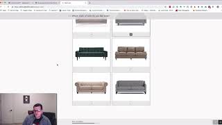
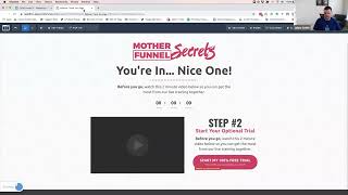
Short discussion (video transcript) contrasting 'ugly' versus 'beautiful' design in marketing funnels. Speakers argue ugly designs can convert but only when the hook/copy is extremely compelling and the interface is very simple (headline + email input + submit); beautiful designs generally lend credibility and trust, making it easier to collect leads.
Why ugly designs.
Work and why you shouldn't do it this is going to.
Rub some people the wrong way, but I got to say it Ugly designs.
Work only in certain circumstances. They only work when the hook is so compelling that your prospect has an intense need to see what's on the other side of that call to action.
That's not always so easy to pull off. Your ugly design.
Needs to be very simple to work.
Usually just a headline and an email input.
Field and the submit.
But beautiful designs, on the other hand.
Immediately lend to your credibility. People inherently assume that if something's aesthetically pleasing and professionally.
Done, that.
It'S more trustworthy.
That gives you a little more leeway.
To get your message out there, get them to pay attention and collect the lead.
So if you can pull off killer.
Copy like the Kiss Test how to tell if she's ready to be kissed, then ugly designs might work for you.