2019 Summit Presentation: Leveraging Data
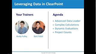
Neil and Andy walk through ClearPoint software for managing project data. They show how to load data, calculate variances, track project completion, and link projects to objectives for performance evaluation.
Go, let's go over to clearpoint, it'll go ahead and refresh for us automatically. And now our data is here in clearpoint. All the calculations took hold, our evaluations evaluated, our charts charted, and that all that leaves for us is just to leave our analysis. So it can really save you a ton of time, even in simple monthly data entry, if you imagine doing it to several measures every time. So as an admin, there's a very important screen for you in system settings, admin options, that is the data loader tile. So inside of here an admin can see all of the packages that exist in their account. So it'll be your packages as well as other users and you can see who owns them, what PC they're on, etc. If I wanted to edit a package, I can just click this pencil icon, I can change the name of it, where it lives, the machine ID, the package owner, etc. So for example, if someone leaves your organization, like let's say Jenna was leaving clearpoint, I could move this to Rachel. And now the next time that Rachel logs into clearpoint, she will see this package. Sorry, the next time she logs into the data loader, she will see this package there and she will be the one able to upload it. So it's really convenient if someone leaves the organization. Question we often get is, can there be multiple people who own the same package? The data loader only has one to one relationships between users and packages. However, what we recommend doing is duplicating a package. And now if I edit that duplicate, I can change the owner to Neil. So now Neil and I have perfect copies of the same package. So when either of us log into the data loader, we will see the same package. So if I was sick today when I needed to do this webinar, Neil could have gone in and uploaded the Citizen Satisfaction Survey data for you. The one other thing I wanted to touch on in admin options for the data loader is this blue rocket ship button. What this does is it flags a package as ready to run. So sometime in the next five minutes, if your computer is on that data loader is going to run automatically and upload that data. So just one other way to save yourself a little bit more time is once you create your packages in the data loader, you don't have to use it anymore. You can simply rely on, you can simply rely on the admin options rocketship button and you just queue them up to upload and you don't even have to log into the Data loader. Before I hand it over to Neil, you probably noticed I have this huge upload for training package inside of this package that maps to over 100 series for the 50 or so participants at the summit training where this was originally presented. So that whole upload was all done in just a matter of a few minutes. So save Neil a ton of time before he gets into complex calculations on our measures and our projects.
So now that everyone has data in their actual and target, why don't we walk through how we can create series calculations and evaluations for our measure. So I'm going to head over to the measure that Andy was referring to called retention rate that was used. They used the data loader to bulk upload data for now. It's great to have data in your actual and target, but creating calculations and new series allows you to see trends in your data and gain key insights from the data that you have. So the first thing we're going to do is add a variance series. A variance series is a straightforward, easy to create calculation that gives you insight into how far off of a target you were for any given period. So to create a new series, I can scroll down, double click on my data table and then you'll see an add series option. So if I click this button you'll see the add series window. To name the series, you just type in the field and I'll call it variance. For data type, I'm going to select percentage because in this measure retention rate is a percentage. So I want to be consistent with my calculations. Once I have my name and data type, I can click into the calculation tab. I'll be prompted to save and then you will be greeted by the calculation tab and you'll see below the calculation wizard. This is how we can piece together the variance calculation which is actual minus target. So the drop down we'll want to focus on is this series drop down which is where we can piece together this calculation. If we click this, select measure series drop down, we can select actual and then hit insert. And then above in the calculation text.
Field you'll see a three part token.
The first token, the first part of the token is the measure id. So this tells the calculation which measure in the account you should be looking at. The second part is actual or the name of the series that this calculation is going to reference. And then the last part is the aggregation. So this is telling the calculation that for this measure and this series give me the current period. So that is the first part of the variance calculation. And then to Create the second part, which is minus our target. We can first hit this minus sign and then from the series dropdown, select Target, then hit enter once again. So now you'll see that I have my actual minus my target. And now this may look a little bit like gibberish, so if you want to put it into terms of your data, you can use this test button. And your test button then shows you how your data or how your calculation would look based on the data you have in the table. So right now for June, I'm at 82 minus 97, which gives me my variance of negative 15. So now that we know our calculation is set up correctly, we can hit save. And then you'll be able to see a grayed out series for variance, which means that this is a calculated series. And now we can. Another series we can create is calendar year to date. So calendar year to date is good for instances where you may not have a defined target, as historical performance is generally a good indicator of future performance. So to create a new series, we can also go and edit the measure and click into the series tab. And this is the Manage Series page for this measure where you can control all the series which are calculated or manually entered. And then you can also create different types of evaluation criteria. But to create a new series, we can hit the plus icon. Then again, we'll name it calendar year to date. I'll just abbreviate it. For this example, for data type, I will select percentage and then I'll head back over into the calculation tab. So we want to create a calendar year to date average of our actual series because we want to see how we're performing on a year to date basis. So for our series we're going to select actual, but then for this final drop down to aggregation, instead of current period, we're going to pull in our calendar year to date average. If we hit insert, we can see that the ID and series are the same. But instead of current period, you now see calendar year to date average, because now the calculation is going to perform a year to date instead of just pulling the current period. So I'm going to head over to the measure that Andy was referring to, called retention rate that was used. They used the data loader to bulk upload data. For now, it's great to have data in your actual and target, but creating calculations and new series allows you to see trends in your data and gain key insights from the data that you have. So the first thing we're going to do is add a variance Series A variance series is a straightforward, easy to create calculation that gives you insight into how far off of a target you were for any given period. So to create a new series I can scroll down double click on my data table and then you'll see an Add series option. So if I click this button you'll see the Add series window. To name the series, you just type in the field and I'll call it Variance. For data type, I'm going to select Percentage because in this measure retention rate is a percentage. So I want to be consistent with my calculations. Once I have my name and data type, I can click into the Calculation tab. I'll be prompted to save and then you will be greeted by the calculation tab and you'll see below the calculation wizard. This is how we can piece together the variance calculation, which is actual minus target. So the drop down we'll want to focus on is this series drop down, which is where we can piece together this calculation. If we click this, select measure series drop down, we can select actual and then hit insert. And then above in the calculation text.
Field you'll see a three part token.
The first part of the token is the measure id. So this tells the calculation which measure in the account you should be looking at. The second part is actual or the name of the series that this calculation is going to reference. And then the last part is the aggregation. So this is telling the calculation that for this measure and this series give me the current period. So that is the first part of the variance calculation. And then to create the second part which is minus our target, we can first hit this minus sign. And then from the series dropdown select Target, then hit enter once again. So now you'll see that I have my actual minus my target. And now this may look a little bit like gibberish, so if you want to put it into terms of your data, you can use this test button. And your test button then shows you how your data or how your calculation would look based on the data you have in the table. So right now for June I'm at 82 minus 97, which gives me my variance of negative 15. So now that we know our calculation is set up correctly, we can hit save. And then you'll be able to see a grayed out series for variance, which means that this is a calculated series. And now we can. Another series we can create is calendar year to date. So calendar year to date is good for instances where you may not have a defined target, as historical performance is generally a good indicator of future Performance. So to create a new series, we can also go and edit the measure and click into the series tab. And this is the Manage Series page for this measure, where you can control all the series which are calculated or manually entered. And then you can also create different types of evaluation criteria. But to create a new series, we can hit the plus icon and then again we'll name it Calendar year to date. I'll just abbreviate it. For this example, for data type, I will select percentage, and then I'll head back over into the calculation tab. So we want to create a calendar year to date average of our actual series, because we want to see how we're performing on a year to date basis. So for our series, we're going to select actual, but then for this final dropdown of aggregation, instead of current period, we're going to pull in our calendar year to date average. If we hit insert, we can see that the ID and series are the same. But instead of current period, you now see calendar year to date average, because now the calculation is going to perform a year to date instead of just pulling the current period. So now that this single token set up, we can save, then save again. And then in our data table, you'll see the running percentage of our year to date performance. And now that we have our variance and year to date series set up, or in any other example, any new series you create for a measure can also be enabled in that measures chart. So in this example, we have our actual charted against our target, but maybe we also want to include our calendar year to date series to see how our monthly performance performs against our year to date performance. So to edit and enable the series, we double click on the chart, head over to the chart series tab, and here you'll see we only have actual and target selected currently, but we can include calendar year to date. We'll assign it just a darker shade of blue, and then we can hit save. So now in the chart you can see that for the light blue section, we can see how we're performing on a monthly basis. But then the darker blue also shows you how you're performing on a year to date basis. And now we're in June right now, but you can see that the calendar year to date series is repeating through the months of 2019. And maybe in your chart you only want to show a calendar year to date value when there's actually data in your monthly series. So to fix this, we can create a different type of calculation, and that's called a case when and we can do that for our calendar year to date. So if I head over to my calendar year to date series and double click on the header, we enable the editor and then we can click back into the calculation tab. So I'm going to remove what we currently have in this field and build a case when calculation, which is the equivalent of an if then statement. So to begin, we type the words case when and we can put our first line of criteria. So we only want the calendar year to date calculation to run when we have monthly data. So the first line of criteria is the case when our actual is null, which says when the actual period actual for your current period is blank, then give me a blank value and then we can write our other statements. So else in all other scenarios, what do we want it to do? We want it to run the calendar year to date average. So I'll hit insert and we'll wrap this calculation up by hitting end. So if we translate this to an if then statement, it's really if the actual period actual for my current period is null, then give me a null value and all other scenarios give me the year to date value. So once I'm satisfied, I can hit save. And now in the chart you can see that the year to date isn't running for periods where there's no monthly value. And then your data table is also going to show as blank for periods.
Where there's no actual value.
So that's great. So now that we have our data configured, we can also create evaluations to avoid having to manually update the status each month or quarter. So to create an evaluation, we can edit and head back over to the series tab and we'll edit our calendar year to date series. Under the calculation tab you'll see an evaluation tab. So we can click into that and we'll see all of the status indicators that exist in our account. What we want to do is create criteria for the four important statuses. So to begin we can enable each of them. Then you'll see a few extra pop ups populate on the right hand side and this is where you create the criteria. So I want to be on target when our year to date is greater than or equal to our target. I want to be caution if we are greater than or equal to our target. And then for a calculation we can say times 0.8. So if we're within 80% of our target, we can be on caution will be below plan for anything less than our target and then no information will leave as any, which is just the Criteria that exists at the bottom for all scenarios where there's blank data. So the way the evaluation criteria works is it'll read from top to bottom. So if the first line of criteria is not met, then it'll look at the next line. It'll work its way down the list. So now that I have my criteria set, I can hit save. And then the last step is from the top evaluation option. Instead of manually evaluate, we'll want to choose the new year to date evaluation that we created. So once we hit save, you'll see that our measure is now evaluating based on the criteria that we set, and our chart is now populating. So this measure is ultimately configured with new series, a modified chart and automatic evaluations. Now we can look at how we can turn an ordinary project into quantifiable support of our overall objectives. Project evaluations can be used to track and evaluate quantitative data that deals with project management for elements like initiatives, milestones, action items, or risks by leveraging master measures. So I'm going to show you a basic example, just to show you some of the simple functionality, but then Andy's going to get into a little bit more complex of an example. So if I head over to my office redesign initiative, we could see a pretty normal detailed page of an initiative with percent complete start and end date, and a Gantt chart. If we want to turn this into a automatically evaluated initiative, what we have to do is link it to a MasterMeasure template. So if I edit the initiative, click to the Edit Initiative tab, you'll see for evaluation, MasterMeasure, it's not currently evaluated, so we can select the basic project template. Once I do that, this initiative is successfully linked to this MasterMeasure template. However, you'll notice that right now we don't have a data table and we don't have a chart that I promised would be possible with the master measures. So what we can do is edit the layout. We can search for data to bring out the data table, and then we can also search for our project chart and bring that out. So now you'll see that our initiative has a chart and a data table. But one thing you may notice is that this chart and the chart and the data table have a lot of periods that may not really overlap with the scope of the start and end date of the project. So to fix this, we can assign an initiative a reporting frequency like we would with a measure to get the data table showing the right periods. So from the edit, initiative Blue also shows you how you're performing on a.
Year to date basis.
And now we're in June right now. But you can see that the calendar year to date series is repeating through the months of 2019. And maybe in your chart you only want to show a calendar year to date value when there's actually data in your monthly series. So to fix this, we can create a different type of calculation and that's called a case when. And we can do that for our calendar year to date. So if I head over to my calendar year to date series and double click on the header, we enable the editor and then we can click back into the calculation tab. So I'm going to remove what we currently have in this field and build a case when calculation, which is the equivalent of an if then statement. So to begin, we type the words case when and we can put our first line of criteria. So we only want the calendar year to date calculation to run when we have monthly data. So the first line of criteria is the case when our actual is null, which says when the actual period actual for your current period is blank, then give me a blank value and then we can write our other statement. So else in all other scenarios, what do we want it to do? We want it to run the calendar year to date average. So I'll hit insert and we'll wrap this calculation up by hitting end. So if we translate this to an if then statement, it's really if the actual period actual for my current period is null, then give me a null value and all other scenarios give me the year to date value. So once I'm satisfied, I can hit save. And now in the chart you can see that the year to date isn't running for periods where there's no monthly value. And then your data table is also going to show as blank for periods where there's no actual value. So that's great. So now that we have our data configured, we can also create evaluations to avoid having to manually update the status each month or quarter. So to create an evaluation, we can edit and head back over to the series tab and we'll edit our calendar year to date series. Under the Calculation tab, you'll see an evaluation tab. So we can click into that and we'll see all of the status indicators that exist in our account. What we want to do is create criteria for the four important statuses. So to begin, we can enable each of them and then you'll see a few extra pop ups populate on the right hand side and this is where you create the criteria. So I want to be on target when our year to date is greater than or equal to our target. I want to be caution if we are greater than or equal to our target. And then for a calculation we can say times 0.8. So if we're within 80% of our target, we can be on caution. We'll be below plan for anything less than our target. And then no information. We'll leave as any, which is just the the criteria that exists at the bottom for all scenarios where there's blank data. So the way the evaluation criteria works is it'll read from top to bottom. So if the first line of criteria is not met, then it'll look at the next line. It'll work its way down the list. So now that I have my criteria set, I can hit save. And then the last step is from the top evaluation option. This instead of manually evaluate, we'll want to choose the new year to date evaluation that we created. So once we hit save, you'll see that our measure is now evaluating based on the criteria that we set and our chart is now populating. So this measure is ultimately configured with new series, a modified chart and automatic evaluations. Now we can look at how we can turn an ordinary project into quantifiable support of our overall objectives. Project evaluations can be used to track and evaluate quantitative data that deals with project management for elements like initiatives, milestones, action items, or risks by leveraging master measures. So I'm going to show you a basic example, just to show you some of the simple functionality, but then Andy's going to get into a little bit more complex of an example. So if I head over to my office redesign initiative, we could see a pretty normal detail page of an initiative with percent complete start and end date and a Gantt chart. If we want to turn this into a automatically evaluated initiative, what we have to do is link it to a MasterMeasure template. So if I edit the initiative, click to the Edit Initiative tab. You'll see for evaluation, Master measure, it's not currently evaluated, so we can select the basic project template. Once I do that, this initiative is successfully linked to this MasterMeasure template. However, you'll notice that right now we don't have a data table and we don't have a chart that I promised would be possible with these mastermeasures. So what we can do is edit the layout. We can search for data to bring out the data table, and then we can also search for our project chart and bring that out. So now you'll see that our initiative has a chart and a data table. But one thing you may notice is that this chart and the chart and the data table have a lot of periods that may not really overlap with the scope of the start and end date of the project. So to fix this, we can assign an initiative a reporting frequency like we would with a measure to get the data table showing the right periods. So from the Edit Initiative tab, I can select the quarterly project reporting frequency, which is one that we created for this example. And then we'll see that our data table and chart are now showing the quarters of 2018 and 2019, which align nicely with the scope of our project. So now we can work on just entering data in this project. We can imagine that this would be a percent complete. So we'll keep the scope of this data entry for a percent complete as if that's what you are updating. So if we think about the months of the quarters of 2018 and 19 and we evenly distribute this by eight months, we can consider our percent complete like this with a measure to get the data table showing that right periods. So from the edit initial. So that would be my target. And then for my actual, I can also enter in data to see how I was performing. And I can also, like I said, manually evaluate and hit save. So obviously manually evaluating an initiative is what you guys are used to, but as I promised, we can also automatically evaluate these initiatives. So if I head over to admin Options Master Measures and then I edit the basic project template, which is the one this is using, I'll have a series tab which is controlling what I see in that data table to create the evaluation criteria. We do the same thing as I walked you through earlier by editing the actual and heading over to the evaluation tab. I'll evaluate my four series so it creates the criteria that I want. I can hit save again for evaluation option instead of manual, we'll want to use the newly created criteria that we set. We can hit save one more time. And then if I close and head back over to Office Redesign, you'll see that in my data table I'm now have an actual that is automatically evaluated based on the percent complete and how far off of the target it is. So now that we have these series, we can create charts to visualize our project for items like this with percent complete or with variance or budget, generally on top of good charts. This gives you a great additional visual aid that you can have to take your projects to the next level. And now I'm going to Hand it over to Andy who who's going to walk you through another complex example of how you can use project evaluation.
Thanks, Neil. Now, for those of you who found this feature to be totally eye opening and has you trying to imagine all the ways that you could bring data to life in your projects, this next example is for you. So to begin, I'm just going to go to this initiative in my account called Continued Off Continued Education Program. And if I look in the data table, we can see all the different series that we have here. Neil looked at more of the evaluation stuff. I'm going to focus on doing some complex calculations and bringing this measured data, or excuse me, project data to life on your initiatives. So I'm going to go ahead and head over to admin options so I can show you how this is set up. If I go to my advanced project.
Template.
We can see that I have first this actual percent complete series. This one is raw, like an actual that you would enter values into, followed by a planned percent complete complete and a percent complete variance. These three should be kind of grouped together. The planned percent complete is a special calculation type called a reference series where you can look at the calculated field or a custom field that uses a number format of something like your initiative. So in this case we're using this elapsed percent complete field which essentially gives us how much complete should you be with this project assuming a linear completion rate. So if it's a 10 year project, after year one I should be 10% done, year two, 20%, etc. Complete and a percent complete variance. These three should be kind of grouped together. The planned percent complete is a special calculation type called a reference series. So that just kind of gives us an even completion planned target rate where you can look at the calculated field or a custom field that uses a number format of something like your initiative. So in this case we're using this elapsed percent complete field which for percent complete variance. This is actually a calculation that we have between our actual, which is that raw, that actual value and and our planned or target. So Neil showed a variance earlier. This is doing that, but it's looking at our actual versus our target for percent complete. The next six series are going to be grouped together as well. So essentially gives us how much complete should you be with this project assuming a linear completion rate. So if it's a 10 year project, if I look down at the end here first, we'll see that we have this total budget series. This is for year one, I should be 10% done year two, 20%, et cetera. It's also using reference series based on the custom field that we have on the detail page. So I can go in, enter my project budget and it'll pull into this data table. This is important. That just kind of gives us an even completion planned target rate for percent complete variance. This is actually a calculation because I'm going to use this for most of the rest of these calculations in this budget family. So the first series that we have is our raw actual series dollar spend. How much have we spent on of our budget have we used? Up next is an actual dollar spend year to date? This is just doing a calculation of our actual spend series followed by our plan spend series, which is also a calculation. But this one is based on the length of the project that we have between our actual, which is that raw that actual value and our planned or target. So Neil showed a variance earlier. This is doing that, but it's looking at our actual versus our target for percent complete. The next six series are going to be grouped together as well. So if I look down at the end here first, we'll see that we have this total budget series. This is how much we should have spent for this period. Assuming again a linear rate of budget spend. This is sort of like the money equivalent to our planned percent complete. Up next, we have our spend variance. This is looking at our actual dollar spend and our planned dollar spend and telling us what the variance is. It's also using reference series based on the custom field that we have on the detail page. So I can go in, enter my project budget and it'll pull into this data table. This is important because I'm going to use this for most of the rest of these calculations in this budget. And then finally, and this is perfect, probably the most important series to note here family. So the first series that we have is our raw actual series dollar spend is this percent budget variance. If I edit this series, we will see that it is going to take our dollar spend variance and divide our planned dollar spend to turn our dollar spend and now our variance into a percentage so that we can see what percent ahead or behind are we on our budget, just like we can with our percent complete. How ahead or behind are we there? So if I click cancel, I'm going to go back to that detail page so I can take a closer look with data in it. Here we can see that our variance is giving us the difference between these two. Our actual dollar spend is summing up in the year to date. Here's Our planned dollar spend, which is multiplying our million dollar budget by our planned percent complete. So it's figuring out that linear rate followed by our dollar spend variance, which is the difference between our actual year to date and our planned spend followed by this percent budget variance. And this is what is giving us our dollar spend in a percentage. So I'm going to go ahead and how much have we spent on our budget have we used? Up next is an actual dollar spend year to date? This is just doing a calculation of our actual spend series.
Followed by our.
Plan spend series, which is also a calculation, but this one is based on the length of the project. This is how much we should have spent for this period. Assuming again a linear rate of budget spend, this is sort of like the money equivalent to our planned percent complete. Up next we have our spend variance. This is looking at our actual dollar spend and our plan dollars. There's some data now if I do 79% and 80,000 spend, we can see that our percent complete variance looks like we're ahead by 5%. And then we're actually under budget by 10% as well, which is obviously awesome spend and telling us what the variance is. And then finally, and this is probably the most important series to note here. So I'm going to scroll up and look at these two series. These two families is this percent budget variance. If I edit this series, we will see the series separately. So on the left we have a percent complete. We can see how far it is going to take our dollar spend variance and divide our planned dollar spend to turn our dollar. How complete should we be? And what is our actual. And then on the right we have our budget spend. What did we anticipate spending and what do we actually spend? One thing you probably notice with these charts is it's kind of hard to appreciate the difference between your actual and your planned values. So that's why I want to take a look at this chart spend and now our variance into a percentage so that we can see what here that's pulling in our percent. So percent ahead or behind are we on our budget? Just like we can with starting with our blue, we can see how what percent, sorry, what percent ahead or behind schedule were we. And then with the budget, what percentage ahead or behind on our budget were we. Are we overspending here? With our percent complete, how ahead or behind are we there? So if I click cancel, I'm going to go back to that detail page so I can take a closer look with data in it. Here we can see that our variance is giving. We can see that we're trending in the right direction here. And so what this really allows you to do is use data to evaluate these projects. And what I've shown you in this example here is how you can take something like a dollar, like a budget spend and chart it in a way that tells a story similar to how a percent complete might. And I know this is just one way the difference between these two our actual dollar spend is summing up in the year to measure a project. There's lots of other things that that you can do date. Here's our planned dollar spend, which is multiplying our million dollars as well, like quality. Did anyone get injured? Stakeholder satisfaction, output performance, whatever that project is for, et cetera. So hopefully this kind of gets the wheels turning in your head for what could be possible if I wanted to go ahead and budget by our planned percent complete. So it's figuring out that linear rate followed by our dollar spend variance, which is the difference between our actual year to date and our planned spend, followed by this. Build something out in my project tracking that I do in clearpoint to bring it to life a little bit more. So currently this is being manually evaluated, which hopefully everyone is familiar with. But one of the cool things that you can do in evaluation budget variance. And this is what is giving us our dollar spend in a percentage. So I'm going to go ahead and enter some data now. If I do 79% and 80,000 spend, we can see that our percent complete variance looks like we're ahead by 5%. And then we're actually under budget by 10% as well, which is obviously awesome. So I'm going to scroll up and look at these two series, these two families of series separately. So on the left we have a percent complete. We can see how far this also applies to project evaluations. Is if I have two series that are evaluated. So my percent complete variance and my percent budget variance, the ones that we saw charted together, I can choose to use something like a best series or a worst series evaluation. So it will give me whatever the worst score is between any evaluated series. So if we always want to look at our worst and complete percent complete variance is awesome. Like we're way ahead schedule and where we thought we would be. But our budget variance is horrible and it's red. This will evaluate to red because that's the worst series. So this is just one way to, if you have a lot of different ways that you try to factor in the score of a project or its performance. We have some different options in here that could make how complete should we be and what is our actual and then on the right we have our budget spend. What did we anticipate spending and what do we actually spend? One thing, you make that more flexible for you. Okay. So the final evaluation we are going to look at is doing it with objectives. I'm not going to get too deep into it, but can at least provide a little exposure here. Since we've been talking about the different evaluation options Neil looked at, probably noticed with these charts is it's kind of hard to appreciate the difference between your actual and your planned values. So that's why I want to take a look at this chart here that's pulling in our percent so measures. And I did initiatives so well, Neil and I did initiatives so we'll starting with our blue, we can see how what percent. Let's go into our objective called we have the best team. And from here we can see that here's the measure that Neil helped what percent ahead or behind schedule were we and then with the budget what percent with and the initiatives that we worked on so we can see that they're linked here. So by simply linking an element to your objective, this makes it possible to evaluate ahead or behind on our budget were we are we overspending evaluate that objective based on the performance of those linked elements. So if you wanted to set up an objective evaluation, all you need to do is come up and click the edit icon. We can see that we're trending in the right direction here. And so what? And if you go to the links tab, there'll be a checkbox up here for Enable automatic evaluation. If that is not checked, you simply just see this really allows you to do is use data to evaluate these projects. And what I've shown you in this example here is how you can take something like a year links but if it is checked, you will see each of the like a budget spend and chart it in a way that tells a story. Linked elements have a weight score that you can give it. So I could say hey, I want these to be 5050 and then it will multiply that weight by the status score, which is similar to how a percent complete might. I know this is just one way in this case, yellow is two. It'll give me one because it's 50 right. To measure a project, there's lots of other things that you can do. So 50% times two for yellow again is also one. So our total score is two. Okay, well what does that mean if we go to the evaluation criteria tab, this is where we can actually set criteria for how this objective should evaluate. So you as well like quality, did anyone get injured, stakeholder satisfaction, output performance or whatever that project is for, etc. So hopefully this kind of gets the wheels turning in your head for what could be simply just check the boxes much like you would in measures and you say okay, it's on possible. If I wanted to go ahead and target when it is greater than or equal to three, let's say yellow greater than or equal to two, etc. So it's really flexible to do whatever you want. You might be wondering why is the score for Yellow two? This is something you can control in admin options if those values don't really line up for the way that you think about your different statuses. Maybe green is 5 and yellow is 3 and red build something out in my project tracking that I do in clearpoint to bring it to life a little bit more. So currently this is being manually evaluated, which hopefully is one or something like that. You can totally change all of that and customize it for everyone is familiar with. But one of the cool things that you can do in evaluation for your account if you want to. But now if we go in and change the evaluation for our this also applies to Project Evaluations initiative. You can see our score is now 2.5. All right, so that's all that I have. But before we end it here, I'm going to hand it over to Neil to show off one last treat that we have in clearpoint for you. If I have two series that are evaluated, so my percent complete variance and my percent budget variance, the ones that we saw charted together, I can choose.
So one additional calculation that you may not have seen with our standard calculation wizard is a calculation called Aggregate Status. So if I head over to a measure that we have called Project Counter, you can kind of see some of.
Its cues to use something like a best series or a worse series evaluation. So it will give me whatever the worst score is between capabilities.
What it is doing is counting all of the statuses of the different projects that exist in our account. So with all of the attendees for training, you can see that we have a total of 94 projects or different initiatives in this account with the different statuses and how they are broken down.
The way it works is if any evaluated series. So if we always.
You can see if I click on the above target series, it's going to look at all of the scorecards in our account and it's going to look at a specific element which we've dictated as initiative and then it's going to look for a specific status indicator.
Want to look at our worst and complete percent complete.
So this series specifically is looking at all of them. Pulling in all of the on variants is awesome.
Like we're way ahead schedule and where.
We target projects we have and giving us a number that same setup is used for caution below target and no information. And then we have a total that looks at all of our projects together and then we can leverage HTML with data fields to pull in tokens that look directly at the data table. So anytime thought we would be but.
Our budget variance is horrible and it's red this will evaluate to red because that's the worst series. So this is just one way to if you have a lot of different.
That you enter in percent complete for a project and that in turn automatically evaluates your project that also in turn automatically runs to this counter that will then update the HTML with data fields. So you have that nice that summarizes.
All ways that you try to factor in the score of a project or.
All of your information in one place. So again, this is one cool way that you can automate that process all the way from manually entering in data and initiative that can roll up all the way to automatically evaluating your overall projects. And then you can also have that influence and kind of create this pretty dashboard that shows you how all of your projects are doing at once. So as you can see, there's performance.
We have some different options in here that could make that more flexible for you.
There are numerous ways to leverage data that already exists in your account. Andy showed you how you can connect the data loader, which can be a huge time saver when uploading data into clearpoint. Whether that's on on a monthly or quarterly basis, we can leverage normal data in our measures and create calculations and evaluations to see how we are objectively performing. And then we can even use okay.
So the final evaluation we are going to look at is doing it with.
The projects to track quantitative data and have that tie into our overall evaluation of our objectives. So thanks again for your time today and we hope you can take some of this information and translate it to your accounts. Happy reporting objectives.
I'm not going to get too deep into it, but can at least provide a little exposure here. Since we've been talking.
More from Ted




AI in Local Government: How the City of Durham Analyzes Strategy, Risk & Performance

How Coral Springs Won the Baldrige Award — Blueprint for City Excellence | ClearPoint Strategy


AI, Data, & the End of Gut-Feel Strategy: Why Strategy is Becoming More Data Driven
Strategy Needs Accountability: How to Drive Project Follow-Through and Execution